It looks like most of the members who have posted here agree that it's not an authentic card. That was my gut instinct right off the bat, but it had nothing to do with the proximity of the marking at the bottom, and any obstruction of where the word reprint
might be. In this instance, it was pretty easy to see that, and disqualify the card, or at least raise serious doubts. But there will be cards where that red flag isn't obvious, and as hobbyists, we need to look elsewhere. I always start with an examination of the typography. Usually, I will compare the card I am considering to another example from the same year and set under a loupe, or a microscope.
I'll explain why I felt that the DiMaggio card was a reproduction.
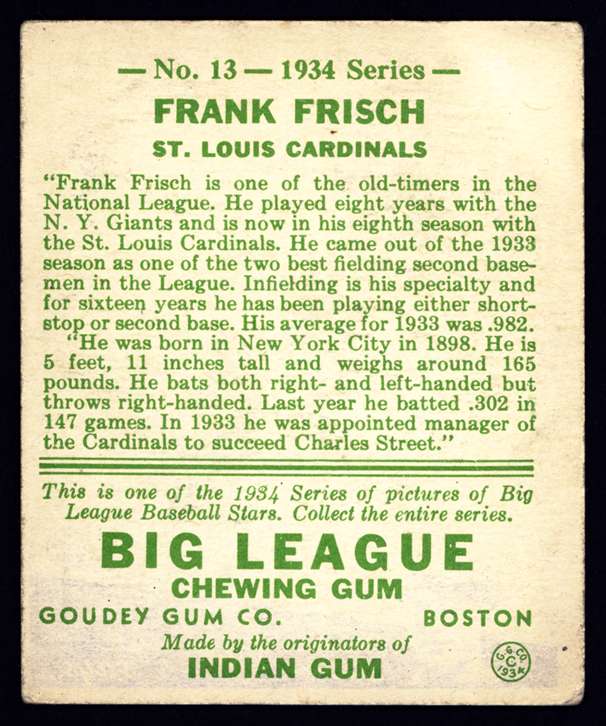 This is the back of my 1934 Frankie Frisch Goudey card, scanned at 600 dpi.
 And now, the back of the 1938 Goudey Joe DiMaggio in question.
Now, before I go any further, having provided the back of one of my cards, I have to say that the extent of my experience with Goudey cards doesn't go beyond 1935. I've never handled a 1938 Goudey card before, let alone this DiMaggio. But I do know the company had been having financial problems. 1938 marked a return to color cards after two black and white releases. So, I do not know what corners might have been cut in 1938 in an effort to cut costs. I'm not familiar with any changes in production technology employed by Goudey. This is purely speculation. But, in this case, speculation would be enough to keep me from buying the card, if it were something available to me.
Typically, when you see inconsistencies in typography quality, it's a sign of a reproduction. And it's my opinion that is what is being witnessed here.
The bold sans-serif font used by Goudey in the element we will be examining is a 50 point Franklin Gothic SB. I don't happen to have a license for that
exact font. What I do have, and am using here, is the Franklin Gothic medium font. I am using a faux bold effect on it to more closely approximate the one used by Goudey. It's pretty close, though as you can see, it's not quite as heavy, and there are some slight inconsistencies in character tracking.
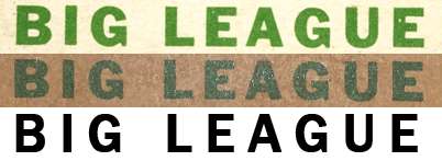
Now that we have this comp set up, look at the rendering of the Big League logo on my card, compared to the DiMaggio card's logo below. The picture of the DiMaggio was taken with a camera, and we know that a flash was used, as it's obvious on the card front provided. Still, I think there are some flaws obvious in the characters themselves. Inking inconsistencies, or little breaks in the letters.
More obvious though, at least to a trained eye, are differences in the letters themselves. Look at the first E in "league". The intersection of the top horizontal bar, where it meets the vertical bar, is not clean. The interior angle created should be close to 90 degrees. It is in the second E at the end of the word. Also, looking at the second E, the middle, shorter horizontal bar appears rounded at the end. Look, too, at the "A". On my card, the two vertical bars meet, creating an interior point inside. The "A" on the DiMaggio does not do that. It appears that the two bars are intersected by another horizontal bar before they meet.
Now, could these issues be attributed to issues within Goudey's production, or quality control measures in 1938? I suppose so. But if I were in the market for this particular DiMaggio card, the "little things" popping up, which would appear even more obvious under a loupe, or a magnifying glass, would absolutely preclude my buying it. When you add in the writing conveniently placed where the word reprint would appear, it's just too many warning signs for me.
Edit: I hope this helps.
