Here's something else I'll add:
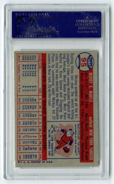
The 1957 Topps card backs are probably the best looking card back ever created for a Topps set. The red and blue is the perfect color scheme for gray stock cards (84 and 91 was the only other time red and blue was used and they look good too). Many of the card backs from the 50's-80's are little better looking than a newspaper article.
The card number in the baseball, while not unique, is a perfect design. Not to mention the text and standard cartoon. Plus, 1957 was the first year for the innovative lifetime stats.