Quote:
Originally Posted by benjulmag

Sometimes the explanations that are simplest and right under our noses are easiest to overlook. What Ted is saying here sure makes a lot of sense to me. And it offers a rational explanation why the Plank card appears in both the 150 and 350 series.
Ted, any thoughts if what you are saying is correct might account for the color tones of the 150 series Planks being more vibrant than the 350 series?
I do not profess to be a T206 expert so do not know if such difference in color vibrancy is typical with other T206 subjects or is limited to the Plank. Is it? If so, one would think it has something to do with the discontinuance of the card.
|
Hi Corey....it's been quite a while since we have last spoken....great hearing from you.
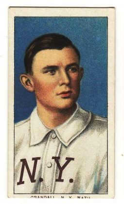
My experience looking over 1000's of T206's these past 40 years is that PIEDMONT 150, SOVEREIGN 150 and SWEET CAPORAL 150 T206's are generally richer in color (especially blue)
than their T206 counterparts with SWEET CAPORAL 350 (Factory #30) backs
For example......
.


.

Regarding ink colors, what has mystified me more so is why the 150 Series
** cards are lacking the rich dark BLUE color seen on numerous subjects in the 350 Series
and 460 Series subjects....such as:
150 Series................................... 350 Series.................................. 460 Series

.
 **....Note
 Waddell (portrait) is the only 150 Series subject printed with dark blue ink.
TED Z
T206 Reference
.