|
|
|||||||
| View Poll Results: Was this image used as a reference for the #61 1934 Goudey card by the artist. | |||
| YES |
|
27 | 67.50% |
| NO |
|
13 | 32.50% |
| Voters: 40. You may not vote on this poll | |||
 |
|
|
Thread Tools | Display Modes |
|
#1
|
||||
|
||||
|
Good afternoon Gents,
I picked up this fantastic Gehrig photo this month. Do you think it was used as the reference for a 1934 Goudey card by the artist? Why or why not? Ben
__________________
[I]"When you photograph people in colour you photograph their clothes. But when you photograph people in B&W, you photograph their souls." ~Ted Grant Www.weingartensvintage.com https://www.facebook.com/WeingartensVintage http://www.psacard.com/Articles/Arti...ben-weingarten ALWAYS BUYING BABE RUTH RED SOX TYPE 1 PHOTOGRAPHS--->To add to my collection Last edited by Forever Young; 12-15-2012 at 11:22 AM. |
|
#2
|
|||
|
|||
|
yes, striations in the shirt match pretty well.
|
|
#3
|
||||
|
||||
|
I am Not a photo guy but collected some photos with regard to them being made into cards. As I did it, and as is with this photo, I would want more of an exact match to say this is definitely the right photo for the card. However, I am not 100%, it's just a guess. Travis could be right....
__________________
Leon Luckey |
|
#4
|
||||
|
||||
|
Looks pretty close to me.
__________________
Looking for'47-'66 Exhibits and any Carl Furillo,Rocky Colavito and Johnny Callison stuff. |
|
#5
|
||||
|
||||
|
I'd say you've got a match, Ben.
Sometimes, I know it can be hard to tell what's what when it comes to cards that have been illustrated. That's usually so because when these artists were hired (whether freelance or out of source), the art directors (or whomever was the acting art director) would most likely provide each artist with the photos they'd be using for reference, or access to someone who had them. And most certainly, they were also given certain parameters to follow in terms of size and dimension. Because of that, certain changes were made to these illustrations. The best example I can think of off the top of my head is the '51 Bowman Mantle rookie card, as well as the photograph that was used to make it: 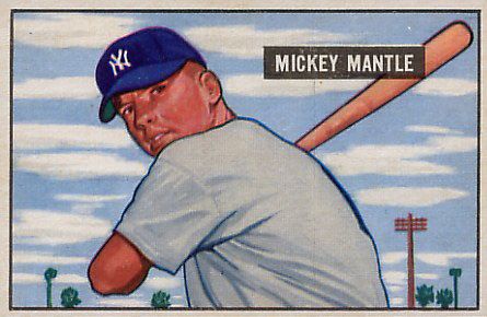 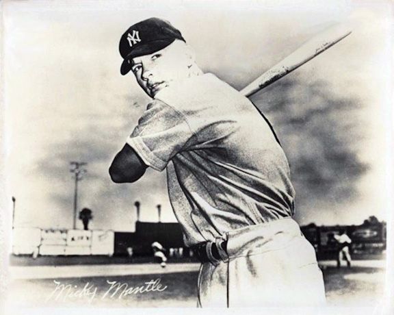 I think it's fair to say that the card was illustrated with the photo as reference. They do look very similar: the pose, the likeness, the uniform folds, positioning of the bat, etc. However they ARE some subtle differences that were made by the illustrator with the final product in mind - the final product being a baseball card that is only a fraction of the size of the photo, as well as the original painting. If we look at the bat in both images, you'll see that the photo has the branding on it, and on the card, it's gone. There's no doubt in my mind that that was done either because the artist knew that having even an indication of the branding might compete with the nameplate on the card, but most likely, he/she knew that the image was going to be shrunk down so much, so that fine detail would end up being lost. And then there's the issue with the palm trees and the telephone pole. In the card, they're placed in spots that are different from the photo. In this case, the artist probably just wanted to take some of those background elements and pop them into that small rectangle, mainly to give a sense of space with the whole thing. You'll notice that if the photo was cropped just like the card, all of that stuff is either not visible or in a different place: 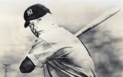 So, with that in mind, I think you can take a lot of that same thinking and add it to the Gehrig photo and card. You have the jersey folds being incredibly similar, and even the way the pinstripes fall on them. The hands are the same, as is the positioning of the bat. And, the lighting on the jersey is also very similar in both the photo and card. The face, although lit differently than the photo, is angled the same and though stylized, still exhibits the same characteristics of the real portrait. The hat that Gehrig wears on the card is a bit different than what he has on the photo, but I think that just goes back to the particular dimensions that the artist had to work with. If the hat was depicted as it was in the photo, it would be cropped across the logo, something that I'm sure wouldn't have made the Goudey people happy. The artist most likely made the adjustment and lowered the thing to fit into the whole frame - a bit of license had to be taken with the look of it. Long story short, since an illustration is going to differ a little bit from the source, you can't say with 100% assurance that it's. But, if we all agree (not just from what we see on the boards, but even in the books that we've read - Yee's book comes to mind) that that Mantle photo was used to make the Bowman card, then the same should be said for this Gehrig photo. From an artist's point of view, Ben's Gehrig photo HAS to be the one the illustrator had in hand while he/she was painting the original artwork used for that Goudey card. I'm not sayin'. I'm just sayin'. Graig
__________________
Check out my baseball artwork: www.graigkreindler.com www.twitter.com/graigkreindler www.facebook.com/graigkreindler |
|
#6
|
||||
|
||||
|
Quote:
I was hoping you would give your opinion on this one. Thank you for your point of view on this as an artist. Travis and steve.. I agree with you and purchased it because of this. Leon, I completely see what you are saying. I knew there would be some with your opinion. I created the poll to see the breakdown of both views.. Thanks! Ben
__________________
[I]"When you photograph people in colour you photograph their clothes. But when you photograph people in B&W, you photograph their souls." ~Ted Grant Www.weingartensvintage.com https://www.facebook.com/WeingartensVintage http://www.psacard.com/Articles/Arti...ben-weingarten ALWAYS BUYING BABE RUTH RED SOX TYPE 1 PHOTOGRAPHS--->To add to my collection Last edited by Forever Young; 12-15-2012 at 02:28 PM. |
|
#7
|
||||
|
||||
|
Another nice pick up Ben! I would say you have close enough of a match. The illustrator most likely used his/her artistic license for embellishment. Given the angle of bat, the position of the Horse's head, the uniform's creases and their shadows; just to point out the obvious evidence...I have say its a match my friend.
__________________
Cur |
|
#8
|
||||
|
||||
|
The only nitpick I have is that the bat goes under his chin in the photo, and right into his chin on the card. Probably just artistic license, as the others have pointed out. If I had to vote, I would say that this photo was used as the basis for the Goudey Card. Great find...
On a separate note... this is for horzverti. Not meaning to hijack the thread... I just couldn't resist (given your Avatar!) |
|
#9
|
||||
|
||||
|
Quote:
I would love to see some of your recent pickups...do share. Perezfan-Monkeys are funny.
__________________
[I]"When you photograph people in colour you photograph their clothes. But when you photograph people in B&W, you photograph their souls." ~Ted Grant Www.weingartensvintage.com https://www.facebook.com/WeingartensVintage http://www.psacard.com/Articles/Arti...ben-weingarten ALWAYS BUYING BABE RUTH RED SOX TYPE 1 PHOTOGRAPHS--->To add to my collection |
|
#10
|
||||
|
||||
|
Same photo-shoot, different photo.
I would state the same even if it was my own photo - I've had several Reulbachs that were very close to the T206 card, and I really wish they were the original photo, but they are just very close. I have an entire file of 'close but no banana' T206 photos. Here's a good example that I recently mentioned to Tim - I still need to provide him with the actual image used, which is pictured below. Sure, the artist could have used the top photo and come up with the one to the right of it, so without the existence of the bottom photo, we would never know for sure. Same goes for the Gehrig photo. Also, I realize that in the case of this particular card, it wasn't a matter of an artist painting the card image using the technique used for the Gehrig card, but you get my drift. Ben, sorry about overreacting to your post the other day. Take that or not, but my comment is sincere. 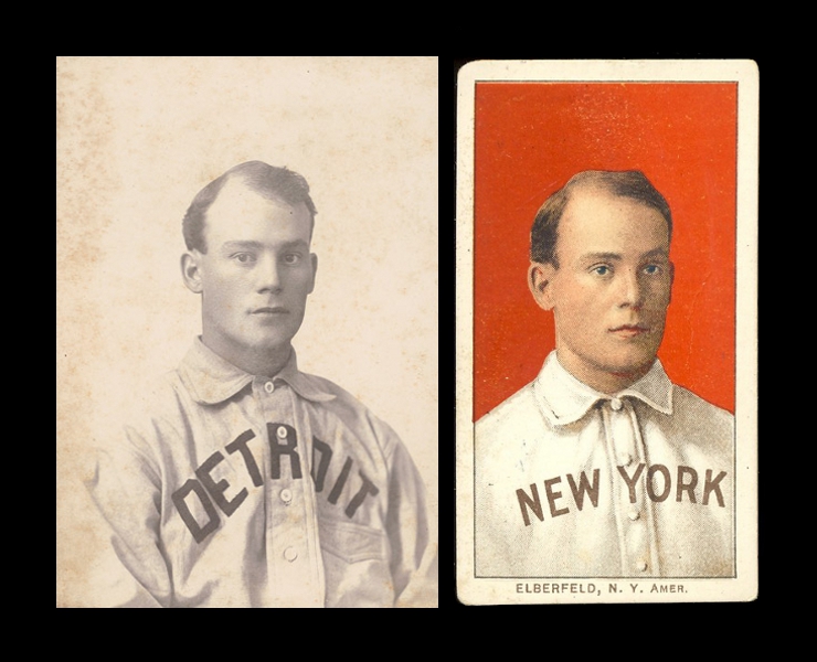
__________________
$co++ Forre$+ Last edited by Runscott; 11-30-2014 at 12:34 PM. |
|
#11
|
||||
|
||||
|
Quote:
|
|
#12
|
||||
|
||||
|
Quote:
Another way of trying to determine the likelihood that it's the original photo, would be to look at other original photos used by artists to create the '33 and '34 Goudeys. This would tell you how much artistic license they were likely to have taken. I agree that it's a great pick-up.
__________________
$co++ Forre$+ |
|
#13
|
||||
|
||||
|
I don't wanna create any waves or anything, but I just thought I'd put this out there as some food for thought. And in no way is this meant to attack anyone.
In that '33 Goudey set (as well many other period illustrated ones), you have a lot of examples of familiar photos being used for reference in the illustrations. Check out these Ruth cards and photo: 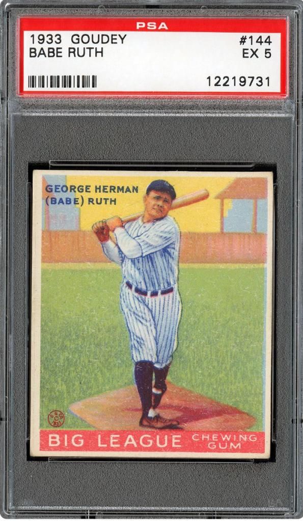 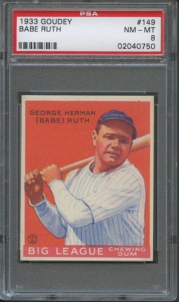 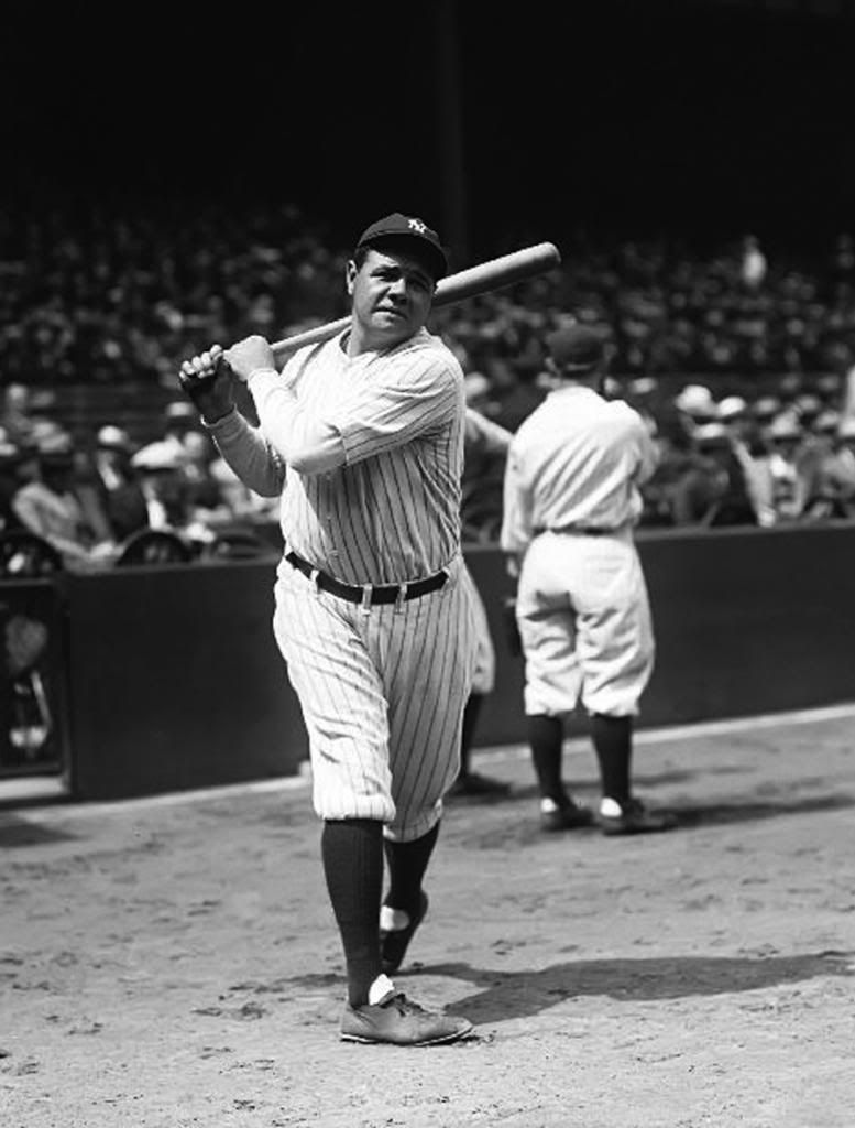 I think it's fair to say that they're the same image. But they're still some minor differences here and there. And on the other side of the spectrum are the illustrations that very much resemble certain photos, but have larger differences. The one that immediately comes to mind for me is the Hubbell from the same set (or even the one from the '34 issue): 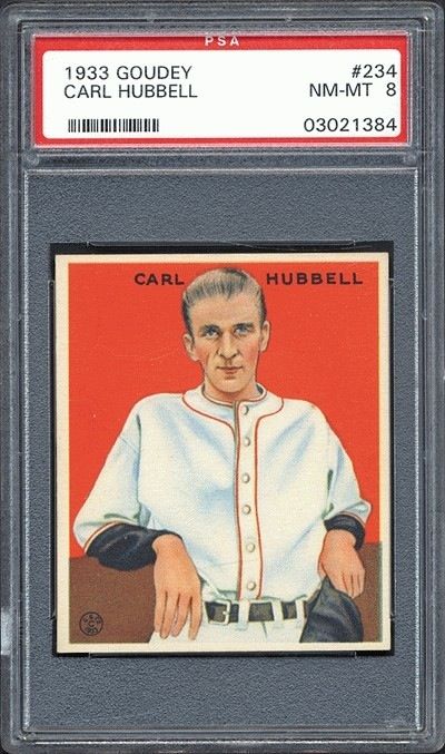 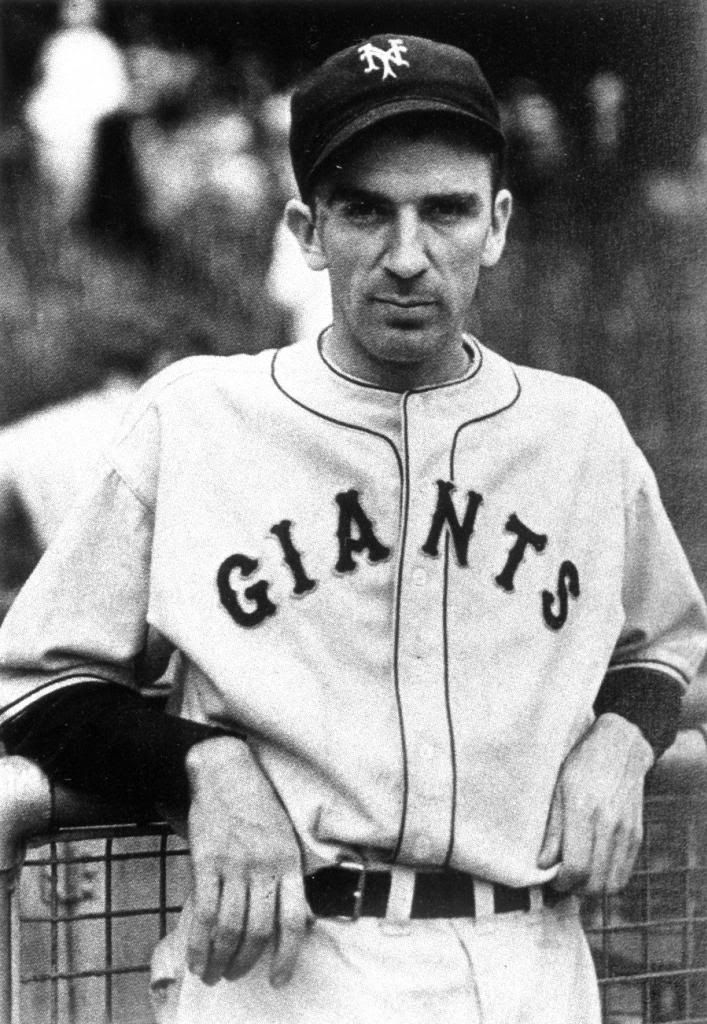 I don't think the comparison is as obvious between the two, but I believe that the illustration was done from this photo. Obviously, the jersey's different and he's not wearing but holding his hat in the card, but still, they're too many things that make me think that it was just a liberty taken by the artist. The gestures are pretty identical, especially in regard to his lean against the fence. Also, his right hand falls the same way in both images. His left hand, though hold the hat, still very much mimics the grip in the photo. The jersey, though without any lettering, has man of the same folds that are in the photo, and the collar/neck hole shape is exactly the same. The positioning of the belt buckle is the same. The faces (minus the hat) are incredibly similar. So, I can look at that photo and say that in my own opinion, it was used to make the Goudey card. But of course, I could be wrong, and it's possible that another photo could surface that looks more like the image on the card. But unless one is found, then I wouldn't think otherwise. The Elberfeld example that Runscott provided is an interesting one. In the one with Detroit jersey, they're a lot of similarities. But after seeing the shot of him with NY, I would definitely say that that one was what the artist had in hand. But what's to be said about the differences between his NY jersey in the studio photo and the one on the card? Obviously, a lot of t-206 artists took liberties in those jerseys, whether it came to collar folds or whatever was written across their chests. That was mostly done in order to be current with the correct teams the players were on, or just to make it obvious to the viewer who was on what team. There's going to be some liberties taken in all of these illustrated cards, and I guess the more obvious the liberty, the more distant said illustration gets from said card muddies. In my eyes, that Gehrig card is an example of that. I think the biggest liberty was taken in his face. The lighting that's in that face has gotta be made up, as there was no way that the brim of that hat he's wearing in the card would cover that entire face in shadow, and then produce that depicted light pattern in his jersey. With that in mind, I'm pretty darn sure that a photo depicting that exact lighting condition doesn't exist. And of course, I could be wrong, too! I guess what I'm trying to say is that we can't be 100% that any of these are from those exact photos. All we can do is use our eyes and make the most educated guess possible. Kinda like the autograph game. I guess to know for sure, we would have had to have seen the artist in the process of creating the illustration. And now please excuse me while my head explodes. Graig
__________________
Check out my baseball artwork: www.graigkreindler.com www.twitter.com/graigkreindler www.facebook.com/graigkreindler |
|
#14
|
||||
|
||||
|
Quote:
Here's a 1937 Goudey Wide Pen photo card that was created from the same photo used for the '33 and '34 , and like the Gehrig, probably came from the same photo shoot. 'GIANTS' is not on the jersey - not sure if the '37 Wide Pens were altered a little for the card, but I'm guessing it was removed from the photo. 
__________________
$co++ Forre$+ Last edited by Runscott; 12-18-2012 at 03:35 PM. |
|
#15
|
||||
|
||||
|
The fact that no one has been able to post a photo of the Gehrig image "from the same photo shoot" used for the Goudey card makes me agree with you Graig. Until one is shown, I would think that this would be considered the image. I also agree with you on the lighting of the face… no way that a photo from same shoot would have it. Drop the head down to fit on the card(like you did to get the hat in), it is almost identical. The subtle angle differences could easily have been done my artist. Although, there is an exact image of Hubble.. I get your point. The elberfield example given was completely different with little to no similarities(other than being the same person). I am not even convinced the two examples given are even from the same shoot.
Quote:
__________________
[I]"When you photograph people in colour you photograph their clothes. But when you photograph people in B&W, you photograph their souls." ~Ted Grant Www.weingartensvintage.com https://www.facebook.com/WeingartensVintage http://www.psacard.com/Articles/Arti...ben-weingarten ALWAYS BUYING BABE RUTH RED SOX TYPE 1 PHOTOGRAPHS--->To add to my collection Last edited by Forever Young; 12-18-2012 at 04:01 PM. |
|
#16
|
||||
|
||||
|
Hahaha! My hat tastes good.
And there you go - I stand corrected. I guess we can never be sure 100%. And man, sometimes that sucks. Thanks for pointing this out Scott.  Graig
__________________
Check out my baseball artwork: www.graigkreindler.com www.twitter.com/graigkreindler www.facebook.com/graigkreindler |
|
#17
|
||||
|
||||
|
Graig, it does suck. Given the fact that multiple photos, with slight variations, could have been taken at the same time as ANY photo actually used to produce a card, it's going to be tough to ever prove that any inexact ones were ever used. I do think it's cool the way Hubbell barely changed position, but the photographer had him move his hat, slightly tilt his head, and a few other slight variations. The fingers on his right hand are in almost the exact same position in both photos.
But the Gehrig certainly could be the right photo, and Ben thinks it is which is ultimately all that counts.
__________________
$co++ Forre$+ Last edited by Runscott; 12-18-2012 at 04:37 PM. |
|
#18
|
||||
|
||||
|
Quote:
__________________
[I]"When you photograph people in colour you photograph their clothes. But when you photograph people in B&W, you photograph their souls." ~Ted Grant Www.weingartensvintage.com https://www.facebook.com/WeingartensVintage http://www.psacard.com/Articles/Arti...ben-weingarten ALWAYS BUYING BABE RUTH RED SOX TYPE 1 PHOTOGRAPHS--->To add to my collection Last edited by Forever Young; 12-18-2012 at 05:05 PM. |
|
#19
|
||||
|
||||
|
.....
duplicate
__________________
$co++ Forre$+ Last edited by Runscott; 12-18-2012 at 05:12 PM. |
|
#20
|
||||
|
||||
|
Quote:
Thanks for posting this thread - very informative and I think it gave a lot of people some additional insight into the 'photo to card' process.
__________________
$co++ Forre$+ |
|
#21
|
||||
|
||||
|
Or.... the image simply doesn't exist nor has it ever which is a distinct possibility.
__________________
[I]"When you photograph people in colour you photograph their clothes. But when you photograph people in B&W, you photograph their souls." ~Ted Grant Www.weingartensvintage.com https://www.facebook.com/WeingartensVintage http://www.psacard.com/Articles/Arti...ben-weingarten ALWAYS BUYING BABE RUTH RED SOX TYPE 1 PHOTOGRAPHS--->To add to my collection Last edited by Forever Young; 12-18-2012 at 05:48 PM. |
|
#22
|
||||
|
||||
|
edited
Sorry, I get caught up in logic and this is about emotion. Congratulations once again on your find - it really is 'close enough', regardless.
__________________
$co++ Forre$+ Last edited by Runscott; 12-18-2012 at 06:09 PM. |
|
#23
|
||||
|
||||
|
Quote:

__________________
[I]"When you photograph people in colour you photograph their clothes. But when you photograph people in B&W, you photograph their souls." ~Ted Grant Www.weingartensvintage.com https://www.facebook.com/WeingartensVintage http://www.psacard.com/Articles/Arti...ben-weingarten ALWAYS BUYING BABE RUTH RED SOX TYPE 1 PHOTOGRAPHS--->To add to my collection Last edited by Forever Young; 12-18-2012 at 07:06 PM. |
|
#24
|
||||
|
||||
|
Actually.. I think you get caught up in emotion.. OVER... AND OVER.. AND OVER AGAIN. But thank you.. it is close enough for me and the majority so far because it is a logical explanation(on this card and image). Comparing the Gehrig to your images posted was not logical at all as it related to your argument. Graig actually supplied a better example. Your argument was that it was the same photo shoot yet you posted two images that were not the same photo shoot nor was your original photo close to the card IMO. That being said, you could be right but so could those who voted yes. Unless the artist documented this, we will never know unless a photo which is an exact match shows up. There could be one that is closer.. who knows.. but never an exact match IMO because of the light on face and different style hat. I also would think that the image would be published on such an important card. Again, I could be wrong. I appreciate differences of opinions(hence my poll), but I really do not know what your argument even is exactly Scott.
__________________
[I]"When you photograph people in colour you photograph their clothes. But when you photograph people in B&W, you photograph their souls." ~Ted Grant Www.weingartensvintage.com https://www.facebook.com/WeingartensVintage http://www.psacard.com/Articles/Arti...ben-weingarten ALWAYS BUYING BABE RUTH RED SOX TYPE 1 PHOTOGRAPHS--->To add to my collection Last edited by Forever Young; 12-18-2012 at 06:36 PM. |
|
#25
|
||||
|
||||
|
Quote:
For anyone else still reading - Ben is stuck on the lighting and the cap, not getting that if there is an 'exact match' photo, it would have had the same shadow and cap issue, and the artist STILL would have changed those items. These guys were not Graig Kindlers - you can tell as much by the crappy representation of Gehrig's face on that card. These artists didn't take a well-composed photo and try to improve on it by changing the player's physical orientation - at least we have no indication that they did, and it makes no sense, as composition was the photographer's job. This particular photo (Ben's) is very well-composed - no need to change anything from the forehead down, other than what made sense based on the move from b&w to color. The more I think through this, the more I am certain that Ben's photo was NOT used to create the Gehrig card. I was actually hoping it WAS the card, but after the last few posts, I could care less. There you go, Ben - a little emotion for you 
__________________
$co++ Forre$+ |
|
#26
|
||||
|
||||
|
One last thing before I exit this thread for good.
I considered not even posting that '37 Wide Pen - Ben was looking for pats on the back, not any evidence that he might be incorrect, and I have the utmost respect for Graig. It just seemed like it would be 'lying' to not show it, and I didn't think Graig would take it wrong, and he didn't (thanks). Graig - I completely understand your thoughts about artistic license. I have some other thoughts about how the color Goudeys were actually created, which is why I'm pretty adamant about the 'exact photo' thing. I'll share those thoughts by PM or start another thread after this topic cools down.
__________________
$co++ Forre$+ |
|
#27
|
||||
|
||||
|
Quote:
Really?? You were hoping that it was the image?? Just for me??? That is so nice of you and makes perfect sense to everyone reading I am sure.  The reason why you didn't comment on the paragragh above, is because you have nothing to say to defend it. Baloney?? Are you you saying you didn't do/say these things?? Youare a trouble maker and all over the place. Correct me if I am wrong but you have been kicked off here before correct? All over the place as you may be, you could be right as it relates to this photo. I just do not believe that you are.. that's all Scott. You ok?
__________________
[I]"When you photograph people in colour you photograph their clothes. But when you photograph people in B&W, you photograph their souls." ~Ted Grant Www.weingartensvintage.com https://www.facebook.com/WeingartensVintage http://www.psacard.com/Articles/Arti...ben-weingarten ALWAYS BUYING BABE RUTH RED SOX TYPE 1 PHOTOGRAPHS--->To add to my collection Last edited by Forever Young; 12-18-2012 at 08:10 PM. |
|
#28
|
||||
|
||||
|
Quote:
I guess you could always start a new dramatic thread titled "Baseball card art/photo:gehrig 34 goudey or not gehrig 34 goudey.that is the question PART 2". Oh RUNSCOTT......
__________________
[I]"When you photograph people in colour you photograph their clothes. But when you photograph people in B&W, you photograph their souls." ~Ted Grant Www.weingartensvintage.com https://www.facebook.com/WeingartensVintage http://www.psacard.com/Articles/Arti...ben-weingarten ALWAYS BUYING BABE RUTH RED SOX TYPE 1 PHOTOGRAPHS--->To add to my collection Last edited by Forever Young; 12-18-2012 at 08:08 PM. |
|
#29
|
||||
|
||||
|
Quote:

__________________
Cur |
|
#30
|
||||
|
||||
|
I thought you might like him.... As it turns out, this thread needed some comic releif!
But now the really important question... Is that the same Monkey as in your Avatar, or did the sculptor take some artistic liberties? Last edited by perezfan; 12-19-2012 at 10:25 PM. |
|
#31
|
||||
|
||||
|
Quote:
Are you sure you want to go there?  I vote close enough for government work... 
|
|
#32
|
||||
|
||||
|
Quote:

__________________
[I]"When you photograph people in colour you photograph their clothes. But when you photograph people in B&W, you photograph their souls." ~Ted Grant Www.weingartensvintage.com https://www.facebook.com/WeingartensVintage http://www.psacard.com/Articles/Arti...ben-weingarten ALWAYS BUYING BABE RUTH RED SOX TYPE 1 PHOTOGRAPHS--->To add to my collection |
 |
|
|
 Similar Threads
|
||||
| Thread | Thread Starter | Forum | Replies | Last Post |
| 1933 Goudey Baseball Cards: Ruth, Gehrig, Foxx, & Ott - Are these Legit or Fakes? | meatloaf | Net54baseball Vintage (WWII & Older) Baseball Cards & New Member Introductions | 12 | 12-29-2011 06:04 PM |
| 1934 Goudey Gehrig Raw Question???? | jg8422 | Net54baseball Vintage (WWII & Older) Baseball Cards & New Member Introductions | 8 | 07-20-2011 01:49 PM |
| WTB Gehrig -- 33 Goudey 5/6 | becollie | 1920 to 1949 Baseball cards- B/S/T | 0 | 06-28-2011 11:30 PM |
| Fake '33 Goudey Lou Gehrig card on eBay | iggyman | Net54baseball Vintage (WWII & Older) Baseball Cards & New Member Introductions | 26 | 04-19-2010 11:15 AM |
| Question about 1933 Goudey Lou Gehrig Cards | Archive | Net54baseball Vintage (WWII & Older) Baseball Cards & New Member Introductions | 3 | 12-01-2006 11:49 AM |