|
|
#151
|
||||
|
||||
|
Quote:
 . Edited to add this is recurring. I have two and have seen another. . Edited to add this is recurring. I have two and have seen another.
Last edited by Cliff Bowman; 11-28-2014 at 12:47 PM. Reason: Addition |
|
#152
|
||||
|
||||
|
Quote:
Nice Cliff....."obscured" is a kind descriptor in your example's case. |
|
#153
|
|||
|
|||
|
Good find, Saved. I have it updated.
Most ones I can see have the small white blob after Cisco. I also found another with the small white blob after Cisco but with 112 completely intact. There seem to be some with the white in the check squares somewhat misaligned, but I saw none that struck me as significant enough to note. Probably people will find more. Richard Happy holiday! |
|
#154
|
||||
|
||||
|
This is a current card on ebay...a little to pricey for me to add to my print variation collection but perhaps one that someone here would like to add. It appears that the overprint is of the same card. I haven't contacted the seller to ask any more about it.
http://www.ebay.com/itm/1953-Topps-2...item3f41c749c0
__________________
COLLECTING BROOKLYN DODGERS & SUPERBAS |
|
#155
|
||||
|
||||
|
Quote:
|
|
#156
|
||||
|
||||
|
Saw this first card end yesterday on ebay ....but could not find another example of this print defect anywhere. That is until today....already had a copy in a stack of some of my doubles. Had never seen this print variation before these two copies.
http://www.ebay.com/itm/1961-Topps-R...p2047675.l2557 |
|
#157
|
||||
|
||||
|
Next card in my stack of 61 Topps doubles was the 381 Wickersham card with a border break(similiar to the 73s) along the top border. Found another copy on ebay....http://www.ebay.com/itm/1961-Topps-B...item2a28d6f0d0
|
|
#158
|
|||
|
|||

|
|
#159
|
|||
|
|||

|
|
#160
|
||||
|
||||
|
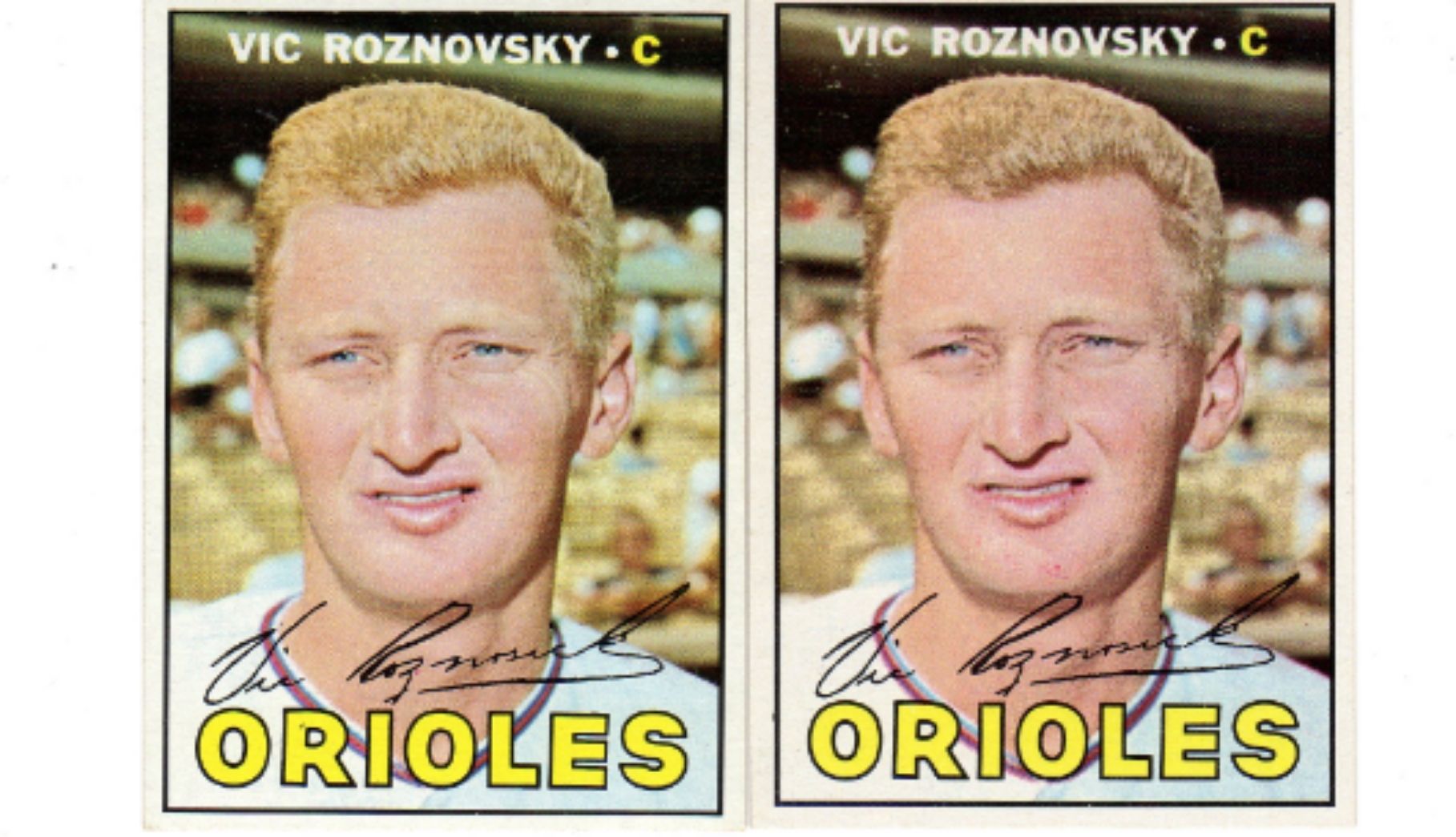
Noticed this 67 Roznovsky card today in some of my dupes....not sure if this is the same print variation noted on Richard's list or not. Anyone else have a similar copy of this card??
|
|
#161
|
|||
|
|||
|
That card also has zit/blemish versus no zit /blemish versions
|
|
#162
|
|||
|
|||
|
Saved,
the card I list in my variations page is one I have never seen. I have looked for a couple years but never seen anything that I think would qualify specifically as "red eye and cheek". many of these cards vary a fair bit on amount of red, but still I am stumped. Don't recall where I heard of the variation, but I believe Al or someone may have one... meanwhile, this card of yours is a new one on me. Richard |
|
#163
|
|||
|
|||
|
Zit on chin at right. Maybe looks more reddish too
Last edited by ALR-bishop; 12-07-2014 at 08:43 AM. |
|
#164
|
|||
|
|||
|
Sorry Al, only his forehead comes through...
Looking forward to the chin. Richard |
|
#165
|
||||
|
||||
|
Quote:
|
|
#166
|
|||
|
|||
|
For some reason Photobucket will not let me properly crop and size the Roz cards
|
|
#167
|
|||
|
|||
|
Saved,
You are correct, there are lots of small variations. No one has yet mentioned the light bluish circle in middle of hair above forehead, nor the short red/white lines at top of forehead at hairline. Both are fairly common, more so than the chin zits, I think. Al, thanks, now I can see the chin! richard |
|
#168
|
||||
|
||||
|
Noticed today that this 61 242 Hal Smith card has a limited, but recurring print mark near the upper right corner. I have seen many copies of this card, but until today, I had not noticed this.
|
|
#169
|
||||
|
||||
 . 
|
|
#170
|
|||
|
|||
|
Hello Everyone,
I found this color variation on this 1976 Brooks Robinson card. The blue banner and white print at the bottom of the card is unusual. I scrolled through the listings on eBay and didn't see anything like it. Thought it might be of interest here. Best regards, Joe |
|
#171
|
||||
|
||||
|
Quote:
|
|
#172
|
||||
|
||||
|
I agree that it appears that the yellow-less card is missing the yellow most likely due to it's omission during the printing process, but only on that card's bottom portion. To me it appears that the green border around BRobby's image is the same green on both cards (the border does not appear to be missing the yellow). In addition, on the yellow-less card, the green border does not appear to match the bottom banner(which is a greenish-blue due to missing the yellow?). Could be my bad eyesight though. Nice find either way Joe!
Last edited by savedfrommyspokes; 12-15-2014 at 01:13 PM. |
|
#173
|
|||
|
|||
|
Quote:
Does anybody have an idea of how that could happen? Thanks, Joe |
|
#174
|
||||
|
||||
|
Quote:
|
|
#175
|
|||
|
|||
|
Quote:
I did examine the card with a loupe, and I don't see any evidence of tampering. Under magnification I can see no trace of yellow color in the bottom banner at all. The white in the Orioles name is identical with the white in the border of the card. The gloss of the card is also consistent top to bottom. I don't see any evidence of a chemical alteration. Is there any way that I can test to see if the card has been altered? Best regards, Joe |
|
#176
|
||||
|
||||
|
Quote:
At high magnification the card will just be made up of blue, red, yellow, and black dots. Make sure the blue dots look exactly the same color/tint on bottom and top of card. Without any magnification you could compare the blue banner on your card to another card from the 76 set that has the blue border normally. This 76 Topps card has had the yellow removed. 2nd card is what it should look like. They are not the same card. |
|
#177
|
|||
|
|||
|
Tough to find Red cap variation
 TED Z . |
|
#178
|
|||
|
|||
|
I've been searching for another 1969 blue Mantle since 1987 when I acquired this one.
Does anyone here have a blue one, or have seen blue one ? 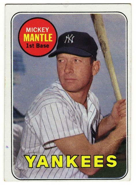 . .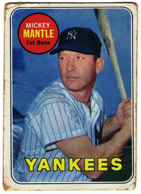 TED Z . |
|
#179
|
||||
|
||||
|
I have seen them with a blue tint but never as blue as yours Ted. That one is very nice looking.
|
|
#180
|
|||
|
|||
|
Quote:
On the printing side - A misfeed can cause one sheet to overlap another blocking a color. A piece of debris can get into the press. Scrap of paper, bit of cloth, plastic, pretty much anything. Good practices prevent a lot of that, but if the press operators are sloppy it happens. Paper jam, can cause either a foldover to block part of the sheet or a chunk of leftover to become debris within the press affecting the next sheet. A very bad jam just might damage the plate. I saw it once, but I've never seen a card that I felt was from something like that. It has to be a really bad jam, and the press has to be stopped to clear all the wreckage out and make sure it's ok to keep going. A missing portion of the plate should be obvious. The plate can be made wrong. An obstruction when It's exposed like what made the 90T Thomas NNOF. The ink to that portion of the plate can be blocked or shut off or run out. The water to that portion of the plate can be way overdone. Solvent can spill on the plate. It's usually more confined since it's usually just drips, but it IS a 70's Topps card........... On the non- printing side- If it sat in the sun with another card on top of it the yellow could fade in only the exposed area. You can usually rule this out if there's red in the same area as red is often the first to fade. Ben has done some really great work on fading and which colors from which years are worse than others. If he found the 76 yellow to be particularly bad it just might fade before the red. Steve B |
|
#181
|
|||
|
|||
|
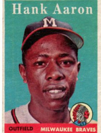
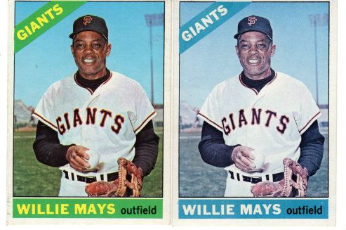
We have discussed the blue/green issue before. I have not seen multiple Mays but have seen multiple blue Aarons with differing levels of green. I think my Mays is faded from sun. I think on the many Aarons, many are sun or light faded, possibly some intentionally after some high dollar blue sales. It could be some of the Aarons are legit, but if so, we should probably be seeing some bluish 58 common cards around. Agree that Ben's experiments on fading have been very revealing
Last edited by ALR-bishop; 12-16-2014 at 09:52 AM. |
|
#182
|
||||
|
||||
|
In going through some 59's, I noticed this fairly frequently recurring print variaition on the 59 Hal Brown card....there is a print spot on the "r" in "brown".
|
|
#183
|
||||
|
||||
|
Flipping through some 71s, I found two more print variations...first, the 71 173 Garrido can be found with the position partially obliterated. Besides my copy, I found just this one other copy(pictured). Second, I noticed a "bouncing" red doughnut on the 71 #207 Foster card. This recurring print spot is "bouncing" as it seems to move right to left on the few cards I found it on (on my copy, that is not pictured, the doughnut is more to the left).
|
|
#184
|
||||
|
||||
|
I had started a thread about this card, but realized it would fit in nicely here, so I cut and pasted it:
If you look at 1972 Topps #209, Joe Rudi, some of his cards appear with varying lengths of a line (hair? crack in the printing plate?) emanating from the left of his name at bottom. (These are all ebay screen grabs.) In the first, there is just a bit of a line apparent. The second shows a much longer line, and the third features this anomaly crossing through Joe and eventually reaching the top white border. It's a little tough to see in the lo-res pic, but just follow the curving line from the bottom on up and you'll see what I mean. It is also worth noting that the first and third cards also feature what I would call an 'iron burn' on the front of the card. It's a triangular dark area and looks as if someone burnt the card while ironing it. It's most prominent in the third card, where the line intersects it below Rudi's elbow. rudi.jpg
__________________
All the cool kids love my YouTube Channel:
Elm's Adventures in Cardboard Land  https://www.youtube.com/@TheJollyElm Looking to trade? Here's my bucket: https://www.flickr.com/photos/152396...57685904801706 I was such a dangerous hitter I even got intentional walks during batting practice. Casey Stengel Spelling "Yastrzemski" correctly without needing to look it up since the 1980s. Overpaying yesterday is simply underpaying tomorrow.  |
|
#185
|
||||
|
||||
|
Quote:
Last edited by savedfrommyspokes; 12-17-2014 at 01:51 PM. |
|
#186
|
||||
|
||||
|
It's funny. I have no idea whether or not the line goes anywhere else on the Rudi sheet, but I looked through the few pics of 1972 Topps uncut sheets that I've downloaded over the years and found a very interesting tidbit.
Card #607 Frank Duffy is called the 'yellow letter' version (similar to #534 Jim Hickman), but the card really just has less green in it than the 'normal' version. It's not, by any means, devoid of green. It's just much, much lighter (in some cases, verging on being non-existent). Well, on the sheet shown here, the 'normal' version is at top and the 'yellow letter' version is three cards below it. Since all of the colors of the cards seem correct, maybe the balance of green to yellow on that card was due to the actual layout of the cards and wasn't due to a lack of yellow or cyan (blue) during the printing process? But, then again, perhaps something else was at play that caused the dearth of color? Either way, pretty cool. 1972duffy.jpg
__________________
All the cool kids love my YouTube Channel:
Elm's Adventures in Cardboard Land  https://www.youtube.com/@TheJollyElm Looking to trade? Here's my bucket: https://www.flickr.com/photos/152396...57685904801706 I was such a dangerous hitter I even got intentional walks during batting practice. Casey Stengel Spelling "Yastrzemski" correctly without needing to look it up since the 1980s. Overpaying yesterday is simply underpaying tomorrow.  Last edited by JollyElm; 10-06-2023 at 05:20 PM. |
|
#187
|
||||
|
||||
|
Never noticed the Duffy before...nice.
This 63 Topps #32 card has a unique "glowing" green spot near the left edge of the card...it is very green in hand, unlike the scan. Could not find another example though. |
|
#188
|
||||
|
||||
|
While flipping through some of my new arrivals, I found a copy of a 65 #596 card with a pink spot on the neck area. Found two other copies (PSA 7 on ebay) that have the pink spot on the neck.
|
|
#189
|
||||
|
||||
|
Hmmm...in 1965 Topps had to airbrush out a pink t-shirt that Landrum had on underneath his uniform, in 1966 they had to airbrush out a button in his pants. It's a good thing he didn't have a 1967 Topps card.
|
|
#190
|
||||
|
||||
|
Cliff, any ideas on why there is also pink above Don's right ear on his 65 pinkie??
Found two copies of this 69 Wert with a break in the black border of the yellow player name/position circle (right side). Had not seen this one before. Last edited by savedfrommyspokes; 12-30-2014 at 11:04 AM. |
|
#191
|
||||
|
||||
|
Quote:
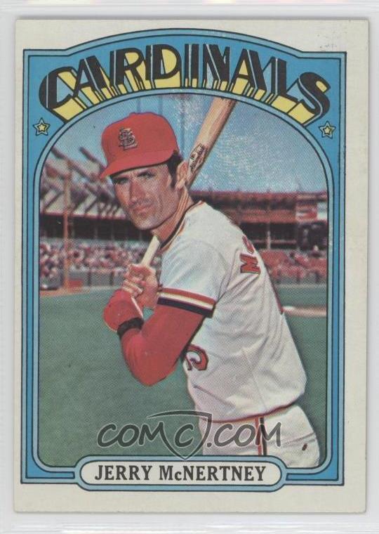 . .But I also noticed the sales information on COMC. Since Oct 1, there have been 11 sales of this card. Previous quarters ranged from 0-4 copies.  Interesting? I bought mine since my father was a crime scene analyst for 30+ years for the state of Florida before he retired last year. Just reminds me of the AFIS computer and latent prints.
__________________
-- PWCC: The Fish Stinks From the Head PSA: Regularly Get Cheated BGS: Can't detect trimming on modern SGC: Closed auto authentication business JSA: Approved same T206 Autos before SGC Oh, what a difference a year makes. |
|
#192
|
||||
|
||||
|
Quote:
|
|
#193
|
|||
|
|||
|
Hmm... I wonder if your dad could identify the culprit.
|
|
#194
|
||||
|
||||
|
Quote:
I was showing that because of that post a few months ago, it probably led to a buying spree of this variation of the card on comc. See, Net54 drives sales...
__________________
-- PWCC: The Fish Stinks From the Head PSA: Regularly Get Cheated BGS: Can't detect trimming on modern SGC: Closed auto authentication business JSA: Approved same T206 Autos before SGC Oh, what a difference a year makes. |
|
#195
|
||||
|
||||
|
He probably could have, but that would be against the rules (unless it was for training new hires?...). Sadly, he passed away this summer. And the print will only match something if an exemplar is in the national database. So hopefully it won't match anyone, or they would have been accused of a serious crime.
__________________
-- PWCC: The Fish Stinks From the Head PSA: Regularly Get Cheated BGS: Can't detect trimming on modern SGC: Closed auto authentication business JSA: Approved same T206 Autos before SGC Oh, what a difference a year makes. |
|
#196
|
||||
|
||||
|
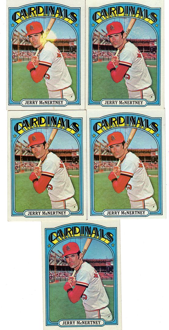
I have always figured it was Sy Berger's finger print........tough to tell if it matches the print on Ben's 61 McCovey.
|
|
#197
|
|||
|
|||
|
|
#198
|
||||
|
||||
|
Wow, Al that one with the big yellow print error is super cool.
|
|
#199
|
|||
|
|||
|
I'd bet it's not Sy Bergwer on the McNelty or McCovey cards. In my correspondence with him, he said that he did not get involved with the production of the cards. Now, Woody Gelman would be a possibility.
But in reality, it is probably an unknown printer, as Gelman was in the art department,not production effort. Cheers, Patrick |
|
#200
|
|||
|
|||
|
I bet both those guys would look at this thread and say all of us need to get a life. Baseball cards to them was just a token to sell gum
|
 |
|
|
 Similar Threads
|
||||
| Thread | Thread Starter | Forum | Replies | Last Post |
| 1966 Topps High # Print Variations | 4reals | Postwar Baseball Cards Forum (Pre-1980) | 9 | 04-27-2014 06:05 PM |
| Are these variations or print defects? | savedfrommyspokes | Postwar Baseball Cards Forum (Pre-1980) | 16 | 02-09-2013 11:52 AM |
| Well known print defects. Do variations exist without? | novakjr | Postwar Baseball Cards Forum (Pre-1980) | 9 | 01-28-2011 04:32 PM |
| Finally confirmed - d311 print variations exist! ("bluegrass" variations) | shammus | Net54baseball Vintage (WWII & Older) Baseball Cards & New Member Introductions | 8 | 09-03-2010 07:58 PM |
| Wanted: T206 Print Variations and Errors | Archive | Tobacco (T) cards, except T206 B/S/T | 1 | 01-04-2007 07:23 PM |