|
||||||
 |
|
|||||
|
||||||
|
|
|||||
|
|||||||
| View Poll Results: Which set was the worst set produced by Toops in the 1960's | |||
| 1960 |
|
12 | 10.91% |
| 1961 |
|
13 | 11.82% |
| 1962 |
|
5 | 4.55% |
| 1963 |
|
6 | 5.45% |
| 1964 |
|
16 | 14.55% |
| 1965 |
|
3 | 2.73% |
| 1966 |
|
3 | 2.73% |
| 1967 |
|
9 | 8.18% |
| 1968 |
|
35 | 31.82% |
| 1969 |
|
8 | 7.27% |
| Voters: 110. You may not vote on this poll | |||
 |
|
|
Thread Tools | Display Modes |
|
#1
 07-08-2015, 06:23 PM
|
||||
|
||||
|
In keeping up with the running tab of worst main issued Toops baseball set we will now move on to the 60's. Same rules apply as did for the 50's. Any discussion and comments are welcome. Two front runners appeared fairly quickly in the 50's thread. Let's see if any others are overwhelmingly or perhaps underwhelmingly top runners here.
There is a few more days left to vote in the 50's thread if you haven't voted already. I'll keep this one a bit shorter as the other thread died down after three or four days. So what year will it be to be the worst or ugliest or least desired set in the 60's. Let's get the voting started and find out. Drew
__________________
Drew 
|
|
#2
07-08-2015, 06:54 PM
|
||||
|
||||
|
I voted for 1964. Bland design and terrible backs.
__________________
Happy Collecting Ed
|
|
#5
07-08-2015, 07:54 PM
|
|||
|
|||
|
The 1960s are incredibly bland. Small photos and awkward horizontal design. With exception to Yaz, the rookie class is very weak.
|
|
#6
07-08-2015, 09:28 PM
|
||||
|
||||
|
I went with 1962. The wood grain borders just seem incredibly tacky to me, even for the sixties. The 1965 and 1966 sets were right on its heels, though. Those two designs just seemed very bland and uninspired.
__________________
Signed 1953 Topps set: 264/274 (96.35 %)
|
|
#7
07-08-2015, 10:17 PM
|
||||
|
||||
|
1960 or 1968! I went with 60, just dont like the little B&W photo or the multi colored name lettering. '68 was saved by the backs as I like the full stats.
|
|
#9
07-09-2015, 05:11 AM
|
||||
|
||||
|
Quote:
|
|
#10
07-09-2015, 05:13 AM
|
||||
|
||||
|
Quote:
|
|
#11
07-09-2015, 05:23 AM
|
|||
|
|||
|
I'm in the minority, I love the 68s. It's the only 60s cards i have in any real numbers and I have the whole set. A family friend gave me a handful when I was 7-8 and I was mesmerized. I don't like the 1960 horizontals.
|
|
#13
07-09-2015, 07:06 AM
|
|||
|
|||
|
65's are my personal choice. 68 is sentimental for me as the 1st set I collected as a kid so can't go there. Perhaps 69, although I completed it as a kid is the real choice.
__________________
Look for our show listings in the Net 54 Calendar section
|
|
#14
07-09-2015, 07:40 AM
|
||||
|
||||
|
Quote:

|
|
#15
07-09-2015, 08:04 AM
|
|||
|
|||
|
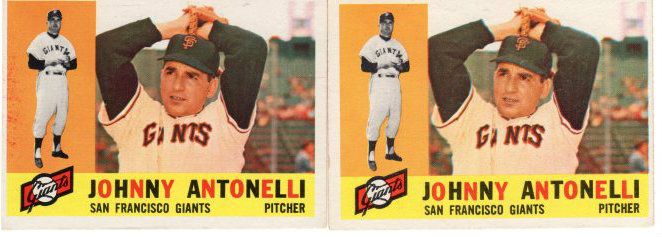
Jason---then the 1960 Antonelli with the uneven colored letters must sing to you
|
|
#16
07-09-2015, 08:54 AM
|
|||
|
|||
|
Quote:
I agree - I love the multi-color lettering on the 60s (I also love the 57s that have the colorful blue/red letters for name/team). At the same time, I agree that the 60 horizontal two-picture format can be distracting, and the number of players without caps bothers me (e.g., Maris, Koufax) To me though every set has some clunkers and some winners, which is why no matter which set through the 50s-70s, there are always cards I love in each
|
|
#17
07-09-2015, 10:23 AM
|
|||
|
|||
|
'61's for me. Muddy photography, boring design. Same with '57 and '69 Topps, muddy photography
Rich, '65's are your least favorite? After '53 Bowman and '67 Topps, that is my favorite design post war. While '68 is leading, no one set seems to stand out as the absolute worst. Wonder if you took out sentimental favorites ('68 and '70 iare not designs liked by most, but they are my sentimental favorites) what the vote would be?
|
|
#18
07-09-2015, 10:41 AM
|
|||
|
|||
|
1968, because nothing says baseball like burlap!
__________________
Member of OBC (Old Baseball Cards), the longest running on-line collecting club www.oldbaseball.com
|
|
#19
07-09-2015, 12:21 PM
|
||||
|
||||
|
The cramped style of 1960 with its two picture, horizontal format does it for me. Yuck times a million!! They were trying to put ten pounds of gum into a five pound bag.
__________________
All the cool kids love my YouTube Channel:
Elm's Adventures in Cardboard Land  https://www.youtube.com/@TheJollyElm Looking to trade? Here's my bucket: https://www.flickr.com/photos/152396...57685904801706 I was such a dangerous hitter I even got intentional walks during batting practice. Casey Stengel Spelling "Yastrzemski" correctly without needing to look it up since the 1980s. Overpaying yesterday is simply underpaying tomorrow. 
|
|
#20
07-09-2015, 12:26 PM
|
|||
|
|||
|
A vote for1966 here
__________________
Looking for a fast fun read about high school football? Get my book Way Out Wayne.
|
|
#21
07-09-2015, 12:39 PM
|
||||
|
||||
|
Quote:
|
|
#22
07-09-2015, 12:49 PM
|
||||
|
||||
|
For what it's worth, I think the 1960 Topps Mantle and Clemente are the two most attractive cards of those stars that Topps ever produced.
|
|
#23
07-09-2015, 05:51 PM
|
||||
|
||||
|
I went with the 1968 set, the burlap is too much for me.
1962 would probably be the next on my list, dark back, wood grain, and the lack of any card in the set to "wow" me.
__________________
Tiger collector Need: T204 Donovan and McIntyre Monster Number 519/520
|
|
#24
07-09-2015, 06:42 PM
|
||||
|
||||
|
I see the 68 set is the runaway winner in this vote but I voted for 67. As a kid I was a huge Nolan Ryan fan and always wanted his RC. That alone would keep me from viewing it as the worst, but I don't really mind the look either.
__________________
Successful transactions with peter spaeth, don's cards, vwtdi, wolf441, 111gecko, Clydewally, Jim, SPMIDD, MattyC, jmb, botn, E107collector, begsu1013, and a few others.
|
|
#25
07-09-2015, 08:10 PM
|
|||
|
|||
|
No, 1969 is clearly the worst! There are NO team cards in the set. All of the team names are in the same color (yellow) because of the expansion, there are many cap less player photos. The front design of the card is plain. The only good of it is that Mickey shows up for the final time and Reggie has his own rookie card. It is an easy set to complete, no high number problems at all.
Why doesn't the 1968 Topps set get more love? I love this set, enjoyed putting it together. This set holds a mystic to me for some reason. The backs are easy to read and they are horizontal, the last set to do this until 1973! Plus they give complete stats.
|
|
#27
07-11-2015, 09:29 AM
|
|||
|
|||
|
To me, it was a toss up between 1962, 1968, and 1969. 62's are notoriously difficult to find in great shape, but when you find them, they are gorgeous. There are at least 100 cards in the 1969 set (or more) that are just wretched. But, many of the cards are quite attractive. So, this leaves 1968. Nothing awful, but just bland. Burlap equals boring.
__________________
Actively bouncing aimlessly from set to set trying to accomplish something, but getting nowhere
|
|
#28
07-11-2015, 11:39 AM
|
||||
|
||||
|
I already voted ('68 for me), but all the comments got me thinking. What is your criteria for voting? For me, in order it is:
1. Design (layout, font, borders, ...) 2. Photography (all head shots, in action shots, crispness, ...) 3. Player inclusion (who are the rookies, last cards, ...) 4. Backs (readability, years of stats, ...) 5. Relevance to me ('77 was my first year collecting, I was born in '66, ...)
|
|
#29
07-11-2015, 01:33 PM
|
|||
|
|||
|
To me it was design, photography, and backs. I can't go with player inclusion, otherwise sets like the 1955 Topps set would be hammered because of all the stars missing. I actually don't hate the 1968's. If I compared them to some of the sets of the 80's, I'd take the 68's in a heartbeat. But, compared to the cards from 63-67 and the 60's, it was a no brainer for me.
__________________
Actively bouncing aimlessly from set to set trying to accomplish something, but getting nowhere
|
|
#30
07-11-2015, 02:50 PM
|
||||
|
||||
|
Please send all the ugly cards to me
__________________
[FONT="Lucida Sans Unicode"]CampyFan39
|
|
#31
07-11-2015, 03:04 PM
|
|||
|
|||
|
Chris is a contrarian collector
|
|
#33
07-12-2015, 07:25 PM
|
||||
|
||||
|
Quote:
Drew
__________________
Drew
|
|
#34
07-13-2015, 10:06 AM
|
|||
|
|||
|
I didn't vote - because they all sucked wasn't an option. Hard to pick the worst one amongst so many dreadful offerings (1960, 1962, and 1968 stand out a bit; but any other year could be described as dreadful and I'll buy off). The 1950s were Topps golden age. The 1970s were okay. The 1960s was a conmplete miss.
|
|
#35
07-13-2015, 10:23 AM
|
|||
|
|||
|
I feel like I just wasted 10 years of my like collecting those sets
|
|
#36
07-13-2015, 11:15 AM
|
|||
|
|||
|
Each set has its high points, with many of them having very cherished associations and memories from our childhood. All those sets have their share of disappointments, which somehow grow in number and irritation as the years go on.
Remember, at the beginning of the 60s, Topps was still refining its ability to produce color baseball cards without the need to adjust the photo. Then again, when they did their airbrush work in the mid-70s to edit or adjust a team change, sometimes it was some of the worst stuff they ever did. Plus, the attention to centering went to pot. Hmm, maybe too many of the print dept. guys were spaced out on pot. Think of it  , ,--Brian Powell
|
|
#37
07-13-2015, 12:14 PM
|
|||
|
|||
|
I can honestly say I have not seen a Topps design from the 1950s and 1960s that I truly hate. Even the 1969 cards have some charm. Today, no company has been able to capture the charm, creativity and originality of those early designs.
|
|
#38
07-13-2015, 12:24 PM
|
||||
|
||||
|
Quote:
__________________
Signed 1953 Topps set: 264/274 (96.35 %)
|
|
#40
07-13-2015, 03:39 PM
|
|||
|
|||
|
Quote:
|
|
#41
07-13-2015, 03:52 PM
|
|||
|
|||
|
Does anyone have any idea (or seen any numbers) as to how the Topps Heritage sets have fared against sales of their base set counterparts over recent years ?
I have all the Topps sets 48 to 2015, including all the Heritage sets, and I like my older sets best myself, but think if I was a kid again ( born 1950) and opening some of the new stuff back in the 60s, I would have been awed and thrilled.
|
|
|
|
 Similar Threads
|
||||
| Thread | Thread Starter | Forum | Replies | Last Post |
| Vote! Worst Topps produced set of the 50's | almostdone | Postwar Baseball Cards Forum (Pre-1980) | 60 | 12-27-2015 07:03 PM |
| What was the last year Topps produced their cards in series? | wilkiebaby11 | Postwar Baseball Cards Forum (Pre-1980) | 6 | 05-21-2015 02:38 PM |
| 2003 Topps Vintage Embossed ( 1961 #85 Gil Hodges ) One of Two Cards Produced | DinoPro | Ebay, Auction and other Venues Announcement- B/S/T | 0 | 03-08-2015 01:15 PM |
| My vote for worst slab design | Archive | Net54baseball Vintage (WWII & Older) Baseball Cards & New Member Introductions | 9 | 12-20-2005 10:39 PM |
| Vote for Worst Condition Card on EBAY | Archive | Net54baseball Vintage (WWII & Older) Baseball Cards & New Member Introductions | 25 | 04-15-2004 10:54 AM |


 Linear Mode

