|
||||||
 |
|
|||||
|
||||||
|
|
|||||
|
|
|
#1
 04-19-2022, 03:17 PM
|
|||
|
|||
|
Quote:
Butch,
__________________
Man proposes and God disposes. U.S. Grant, July 1, 1885 Completed: 1969 - 2000 Topps Baseball Sets and Traded Sets. Senators and Frank Howard fan. I collect Topps baseball variations -- I can quit anytime I want to.....I DON'T WANT TO. 
|
|
#3
05-09-2022, 10:07 AM
|
||||
|
||||
|
1961 Topps Norm Larker #130
Top of card can is found with missing blue ink (sky) due to a horizontal white bar. I believe later in the print run they attempted to disguise this by washing out the sky and making the top all white. Or it could just be less blue ink?  Sent from my iPhone using Tapatalk
__________________
COLLECTING BROOKLYN DODGERS & SUPERBAS
|
|
#4
05-09-2022, 01:23 PM
|
|||
|
|||
|
Good one Joe
Just bought this from fellow board member. Not sure if it has been posted before or not, The red line in bottom below glove is not common but not scarce either 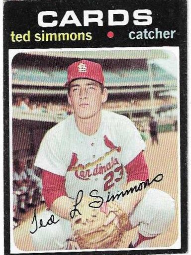
|
|
#5
05-10-2022, 12:47 PM
|
|||
|
|||
|
I consider different stocks to be a variation, and so this isn't a RPD for me, but I think many of you guys are doing RPD's and not doing stock variations. You pick if this counts
 I think every white back card of Alston has this frame gap in the top left, and all the cream back cards don't have the gap. The cream back is a little easier in series 1 but the white back/frame gap card isn't difficult at all. I'm pretty sure this is a clue to which stock was the initial run, I have most of series 1 with both backs but haven't finished hunting down all the RPD's with both backs and observed enough to know if they probably don't exist with a certain back. I do think Alston here implies that the two stocks were not done at the same time.
|
|
#6
05-10-2022, 12:51 PM
|
|||
|
|||
|
#197 Dick Selma can be found with this little mark at top from the printing sheet, if it is cut off center a little bit (not all cards with more space at top show it, actually very few of them do). I wouldn't technically consider this a recurring defect or a print variation, but it seems close enough to note and the kind of thing we like here. It was worth .50 to grab one and add a notation in my spreadsheet.
|
|
#7
05-10-2022, 01:45 PM
|
|||
|
|||
|
I generally pursue stock differences if recognized in the Standard Catalog or by PSA. But for 68 while I did the MB set I have not pursued the other back color differences in that set. I gave up on 1991 Topps a free pursuing different backs for awhile. I know there are many differences in many sets but at my age I am starting to wind down on the pursuit of variants. However I enjoy seeing all the stuff you and others post here
|
|
#8
05-10-2022, 01:30 PM
|
|||
|
|||
|
Quote:
Mike
|
|
#9
05-10-2022, 09:00 PM
|
|||
|
|||
|
Quote:
|
|
#10
05-31-2022, 01:23 PM
|
||||
|
||||
|
From the front, they look the same. But flip them over and youll see the difference
   Milt was double printed but based on the location of the flag this would have had to have occurred on the sheet with Jim Wynn #395 directly above and Dock Ellis #528T adjacent as seen in my poor drawing. I could not find any examples of the other two cards with print variations on back. Maybe your luck is better than mine?  Sent from my iPhone using Tapatalk
__________________
COLLECTING BROOKLYN DODGERS & SUPERBAS Last edited by 4reals; 05-31-2022 at 05:49 PM.
|
|
#11
05-31-2022, 02:06 PM
|
||||
|
||||
|
Joe W., that looks more like the tentacle of an octopus extending over the back of poor Milt May's card.
__________________
I blog at https://adventuresofabaseballcardcollector.blogspot.com
|
|
#13
06-01-2022, 02:06 PM
|
||||
|
||||
|
Bought a 71 set from the same seller Darren bought his WL Pirates team card from and found this 582 WL card.
To quote Darren directly from his post in the May PU thread "It's a true variation, as it is not sun faded or missing the yellow ink from the entire card, and looks identical to all of the other Pirates Team cards from that year (with obvious yellow usage throughout) with the exception of the color of the word "PIRATES."" This Cash card would carry the same description.
|
|
#14
06-01-2022, 02:20 PM
|
||||
|
||||
|
Unfortunately, the Pirates TC is more of a "yellow-lessing" version (faint yellow letters). With the Clemente card, the letters are as white as the Cash card, however, there appears to be a yellow print line of sorts on the lower, far right part of the card's image....almost like the yellow run did not make it across the entire card just along that edge of the image.
|
|
#15
06-01-2022, 03:23 PM
|
||||
|
||||
|
Been gone awhile, so it's good to see that Cash card. Great pick-up!
It's strange with these sorts of things, because although your eyes, scans, pics, photoshop level adjustments, etc., tell you it is, in fact, missing the yellow in the word "PIRATES," you (at least I) still search for a reason to conclude it is not an actual variation. Such is the depressing life of an E&V collector.
__________________
All the cool kids love my YouTube Channel:
Elm's Adventures in Cardboard Land https://www.youtube.com/@TheJollyElm Looking to trade? Here's my bucket: https://www.flickr.com/photos/152396...57685904801706 I was such a dangerous hitter I even got intentional walks during batting practice. Casey Stengel Spelling "Yastrzemski" correctly without needing to look it up since the 1980s. Overpaying yesterday is simply underpaying tomorrow. 
|
|
#16
06-02-2022, 07:53 AM
|
||||
|
||||
|
Quote:
I wonder if these WL cards are only seen on Pirate cards in this series?, on Pirate cards in other series also?, or other cards from other teams in this series? My last question is why have these WL Pirate cards not surfaced previously....was the source a hoarder?
|
|
#17
06-22-2022, 05:00 PM
|
|||
|
|||
|
Interesting printing error. Two distinct white lines top and bottom border far left. Another pair of white lines bottom border between the letters T & F.
|
|
#18
06-29-2022, 10:15 AM
|
||||
|
||||
|
78 Niekro - seems to be an uncorrected print defect. I looked through a couple hundred examples without a correction.
 Sent from my iPhone using Tapatalk
__________________
COLLECTING BROOKLYN DODGERS & SUPERBAS
|
|
#22
07-10-2022, 11:59 AM
|
|||
|
|||
|
I recall there are other 'fairly large blob of one color with scribble looking mark of another color in the center of it' cards in 1961 Topps. Haven't seen this one before and don't see another. Anyone know of another copy?
Now that I'm posting it I notice it appears the black border at top left is misshapen. Will have to see if that's on them all.
|
|
#23
07-12-2022, 12:11 PM
|
|||
|
|||
|
Just discovered an interesting print error (?) from one of those 80s Junk Era cards
does this have any value? Has anyone else seen this on Topps cards?
Does it consist of a new error, to be added to a (growing) list of errors from this 1987 Topps series?   Sent from my iPhone using Tapatalk
|
|
#24
07-12-2022, 01:21 PM
|
|||
|
|||
|
Buddy is currently available at a bargain price on ebay

|
|
#25
07-12-2022, 01:49 PM
|
|||
|
|||
|
Quote:
I assume thats a polite way of saying nice try, but no payday. Sent from my iPhone using Tapatalk
|
|
#27
07-12-2022, 05:36 PM
|
||||
|
||||
|
Quote:
|
|
#28
07-12-2022, 03:04 PM
|
|||
|
|||
|
Quote:
Beyond my pay grade but there may be a big pockets 1987 Buddy Bell collector out there. Never hurts to ask.
|
|
#29
07-12-2022, 06:46 PM
|
|||
|
|||
|
Quote:
 Sent from my iPhone using Tapatalk
|
|
#32
07-15-2022, 10:30 PM
|
|||
|
|||
|
Shout out to Cliff!
You are the MAN and thank you so much for putting me onto this card. I hope to somehow return the favor one day. Butch
__________________
Man proposes and God disposes. U.S. Grant, July 1, 1885 Completed: 1969 - 2000 Topps Baseball Sets and Traded Sets. Senators and Frank Howard fan. I collect Topps baseball variations -- I can quit anytime I want to.....I DON'T WANT TO.
|
|
#33
07-15-2022, 09:25 PM
|
|||
|
|||
|
Was replying to the 1970 ollie brown post a few earlier....I have about 30 or 40 different 1970 like this (2 white lines) in case anyone is collecting them/ is interested.
Sent from my SM-G996U using Tapatalk Last edited by ejstel; 07-15-2022 at 09:26 PM.
|
|
#34
08-11-2022, 03:36 PM
|
||||
|
||||
|
Break out your '53 BC Folks.
Being a single player collector and combing over the same cards gives you a wide array of what to expect. I found that Reds '53 Bowman color usually has a very small small red dot, very faint red line, or in this case (the only one I've ever seen) a complete bloody wound. No it's not a mark. I can't tell if it's a print defect or an actual injury red had that was caught and airbrushed very early on. To me it looks like the ladder and fits his skin too well for a print defect. I've been looking for over a year and headed to the national trying to find another example as one of my top priorities. Alas nothing came close. So I've given up looking for another and wondered if anybody on the board had one. Thanks Lucas  
__________________
My Red Schoendienst collection- https://imageevent.com/lucas00/redsc...enstcollection My Baseball Snapshot Photo collection- https://imageevent.com/lucas00/snapshotcollection Original Type 1/Press photos etc for sale- https://imageevent.com/lucas00/photosforsale
|
|
#35
08-15-2022, 04:11 PM
|
|||
|
|||
|
I picked up this nice 70T Tovar with a bullseye between the name and position.
__________________
Man proposes and God disposes. U.S. Grant, July 1, 1885 Completed: 1969 - 2000 Topps Baseball Sets and Traded Sets. Senators and Frank Howard fan. I collect Topps baseball variations -- I can quit anytime I want to.....I DON'T WANT TO.
|
|
#37
08-18-2022, 09:44 PM
|
|||
|
|||
|
Quote:
|
|
#38
08-21-2022, 05:31 PM
|
|||
|
|||
|
Just picked up some Gil Hodges rocking a little earring bling!
He will be removed from the tomb and will join all the rest of his friends in the binder. Another variation off the list. Cheers, Butch
__________________
Man proposes and God disposes. U.S. Grant, July 1, 1885 Completed: 1969 - 2000 Topps Baseball Sets and Traded Sets. Senators and Frank Howard fan. I collect Topps baseball variations -- I can quit anytime I want to.....I DON'T WANT TO.
|
|
#39
08-22-2022, 10:51 AM
|
|||
|
|||
|
Quote:
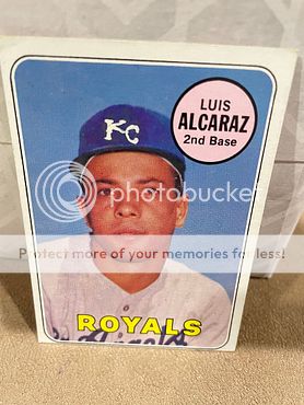
This may sound a little whack. I looked at a number of these cards and they all have that "O-esque" look about them. I am thinking that it may just be an unintended consequence of a bad attempt of covering up the "LA" on the hat. They all have that "O" look about them. The other circumstance that leads me to believe the above. The Omaha Royals started operations in 1969. My WAG here is that picture of Alcaraz would have been taken in 68. If that is the case, then no Omaha Royals team existed in 68. Cheers, Butch.
__________________
Man proposes and God disposes. U.S. Grant, July 1, 1885 Completed: 1969 - 2000 Topps Baseball Sets and Traded Sets. Senators and Frank Howard fan. I collect Topps baseball variations -- I can quit anytime I want to.....I DON'T WANT TO. Last edited by butchie_t; 08-22-2022 at 11:16 AM.
|
|
#40
08-23-2022, 10:58 AM
|
||||
|
||||
|
Partial black border missing on corner of 74 cl, partial border missing at top of 79 B. Lee, low black ink pass on 74 Stargell.
    Sent from my iPhone using Tapatalk
__________________
COLLECTING BROOKLYN DODGERS & SUPERBAS
|
|
#41
08-23-2022, 02:50 PM
|
|||
|
|||
|
A couple of his cards where it looks like he just drank some blood.
Position smears too.
__________________
Man proposes and God disposes. U.S. Grant, July 1, 1885 Completed: 1969 - 2000 Topps Baseball Sets and Traded Sets. Senators and Frank Howard fan. I collect Topps baseball variations -- I can quit anytime I want to.....I DON'T WANT TO.
|
|
#42
08-24-2022, 09:58 AM
|
|||
|
|||
|
Brent has /at least/ 4 variations. 3 don't look all that bad and 1 looks like a bad scab to the left side of his temple.
__________________
Man proposes and God disposes. U.S. Grant, July 1, 1885 Completed: 1969 - 2000 Topps Baseball Sets and Traded Sets. Senators and Frank Howard fan. I collect Topps baseball variations -- I can quit anytime I want to.....I DON'T WANT TO. Last edited by butchie_t; 08-25-2022 at 07:55 AM. Reason: Larry found more.
|
|
#43
08-24-2022, 01:16 PM
|
|||
|
|||
|
Picked this up for grins
|
|
#44
08-24-2022, 01:18 PM
|
|||
|
|||
|
Gotta be one of a kind. U da man.
 A classic Topps fix by the way.
__________________
Man proposes and God disposes. U.S. Grant, July 1, 1885 Completed: 1969 - 2000 Topps Baseball Sets and Traded Sets. Senators and Frank Howard fan. I collect Topps baseball variations -- I can quit anytime I want to.....I DON'T WANT TO. Last edited by butchie_t; 08-24-2022 at 01:19 PM.
|
|
#45
09-10-2022, 03:15 AM
|
|||
|
|||
|
Quote:
If I got that sorting through a lot I'd stop right there with 'my purpose has been served' Sent from my SM-G996U using Tapatalk
|
|
#46
08-25-2022, 07:32 AM
|
||||
|
||||
|
Quote:
My last three all have varying amounts of the red/white anomaly from the 2nd image scribbled in by someone at Topps. IMO, the most common variety is the first one, the one where the print anomaly is all white.
|
|
#47
08-25-2022, 07:47 AM
|
|||
|
|||
|
Larry,
Thanks for your additional info on Strom. So there are at least 6 (not 4 mentioned above). I'll add them to my library and be on the look out for them now. Frankly the one (now three) variations look like gunshot wounds to me. Not a great way to describe it though. Cheers, Butch
__________________
Man proposes and God disposes. U.S. Grant, July 1, 1885 Completed: 1969 - 2000 Topps Baseball Sets and Traded Sets. Senators and Frank Howard fan. I collect Topps baseball variations -- I can quit anytime I want to.....I DON'T WANT TO. Last edited by butchie_t; 08-25-2022 at 07:57 AM.
|
|
#49
09-07-2022, 12:00 AM
|
|||
|
|||
|
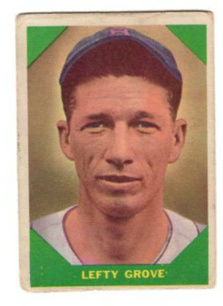
"Lefty" Grove comes with or without this mark in the left border. It's a green line with a small red line above it. Most Grove's are found off-center with a thicker left border, but even those not cut properly usually don't have the mark. I don't know the sheet layout but would guess this is probably a mark from the sheet, by a single slot, for part of production. I have only noticed this on the normal cream stock, not the tougher glossy version of the issue (card on the right is the glossy).
|
|
#50
09-07-2022, 07:06 AM
|
|||
|
|||
|
 |
|
|
 Similar Threads
|
||||
| Thread | Thread Starter | Forum | Replies | Last Post |
| 1966 Topps High # Print Variations | 4reals | Postwar Baseball Cards Forum (Pre-1980) | 9 | 04-27-2014 06:05 PM |
| Are these variations or print defects? | savedfrommyspokes | Postwar Baseball Cards Forum (Pre-1980) | 16 | 02-09-2013 11:52 AM |
| Well known print defects. Do variations exist without? | novakjr | Postwar Baseball Cards Forum (Pre-1980) | 9 | 01-28-2011 04:32 PM |
| Finally confirmed - d311 print variations exist! ("bluegrass" variations) | shammus | Net54baseball Vintage (WWII & Older) Baseball Cards & New Member Introductions | 8 | 09-03-2010 07:58 PM |
| Wanted: T206 Print Variations and Errors | Archive | Tobacco (T) cards, except T206 B/S/T | 1 | 01-04-2007 07:23 PM |


 Hybrid Mode
