|
||||||
 |
|
|||||
|
||||||
|
|
|||||
|
|
|
#1
 09-07-2022, 07:08 AM
|
|||
|
|||
|
Nice looking pack Al.
Very clean!
__________________
Man proposes and God disposes. U.S. Grant, July 1, 1885 Completed: 1969 - 2000 Topps Baseball Sets and Traded Sets. Senators and Frank Howard fan. I collect Topps baseball variations -- I can quit anytime I want to.....I DON'T WANT TO. 
|
|
#2
09-07-2022, 10:20 AM
|
|||
|
|||
|
The # 80 card cost more than the pack
 It is on the back of the Grove. Can also be found on the backs of Tinker and Collins. Grove seems to have it more than the other two, but still quite rare. They do not come up very often. Not likely issued at retail, unless maybe a few by mistake. They can be found as unissued proofs or cancelled/cut. There is no Pepper Martin card in the set It is on the back of the Grove. Can also be found on the backs of Tinker and Collins. Grove seems to have it more than the other two, but still quite rare. They do not come up very often. Not likely issued at retail, unless maybe a few by mistake. They can be found as unissued proofs or cancelled/cut. There is no Pepper Martin card in the set
Last edited by ALR-bishop; 09-07-2022 at 10:31 AM.
|
|
#3
09-19-2022, 08:23 PM
|
|||
|
|||
|
Butch- do you have the 1971 Nash and Northrup blobs? There are some graded out there. I saw some at the Chantilly show and picked up.
I had a 1969 Topps 50th stamp of the 1969 Arcia white letters (prob 1 of 1) - but I sold it  to buy more cards to buy more cards  Best, Ed Sent from my SM-G996U using Tapatalk
|
|
#4
09-20-2022, 05:32 AM
|
|||
|
|||
|
Quote:
I do have the Nash blob and I have 3 color phases of the Northrup blob. Nothing wrong with selling a card for more cards. Butch
__________________
Man proposes and God disposes. U.S. Grant, July 1, 1885 Completed: 1969 - 2000 Topps Baseball Sets and Traded Sets. Senators and Frank Howard fan. I collect Topps baseball variations -- I can quit anytime I want to.....I DON'T WANT TO.
|
|
#5
09-20-2022, 03:15 PM
|
|||
|
|||
|
I checked mine and it looks perfectly normal - was this left off the earlier posts for that reason, or was it that this wasn't a commonly known variation?
Last edited by deweyinthehall; 09-20-2022 at 03:15 PM.
|
|
#6
09-20-2022, 04:13 PM
|
|||
|
|||
|
Yes, that is the common card of Strom.
I think it was just not included in the initial postings.
__________________
Man proposes and God disposes. U.S. Grant, July 1, 1885 Completed: 1969 - 2000 Topps Baseball Sets and Traded Sets. Senators and Frank Howard fan. I collect Topps baseball variations -- I can quit anytime I want to.....I DON'T WANT TO.
|
|
#8
10-02-2022, 05:35 PM
|
|||
|
|||
|
Picked this up on ebay for low $...the seller had a few other similar cards avail with more popular players (unissued proofs) Seem real...not sure they are retiring from making fake Mark Wagner test proofs?
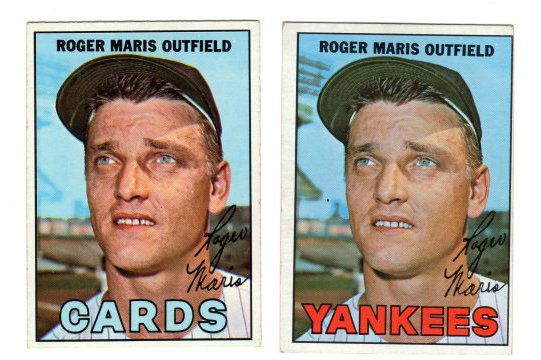
If anyone has any cool unissued photo proofs (like the 1967 Maris Yankees) pls share. I always had my eye on the 1977 Topps Proofs with unissued photos (I've seen them listed here or there) but could never part with the $. Best, Ed  Sent from my SM-G996U using Tapatalk
|
|
#9
10-02-2022, 05:58 PM
|
||||
|
||||
|
The 1982 Fleer Test cards are legit and not overly rare, I think the only pricey ones are a couple of Cal Ripkens.
__________________
interesting to some absolute garbage to others. - Error cards and variations are for morons, IMHO.
|
|
#10
10-02-2022, 08:39 PM
|
|||
|
|||
       The last are extension of these 
|
|
#12
10-03-2022, 04:21 PM
|
|||
|
|||
|
The Shaw border break can be found without the red registration issue so I guess you could get 3 versions
|
|
#14
10-12-2022, 07:47 AM
|
|||
|
|||
|
Shift is a neat one. There are several threads in here on how blue variants arise, like the 58 Aaron or the 66 Mays
|
|
#15
10-12-2022, 07:54 AM
|
||||
|
||||
|
Quote:
Below is my elusive white letter Hebner card, missing the yellow just like the bottom Baker card. My guess is that the missing yellow on both cards is due to the same source....too much sun light. My Hebner card came straight from my west facing window after sitting there for about a month or so.
|
|
#16
10-12-2022, 08:32 AM
|
|||
|
|||
|
Shoutout to Ed for the following.
69 Topps Ed Stroud Blue mark on his shoulder. Not sure if this is the one that Dingman documented or not. He mentioned a black mark so if someone has the black marked one, I would like to see it to compare with this one.
__________________
Man proposes and God disposes. U.S. Grant, July 1, 1885 Completed: 1969 - 2000 Topps Baseball Sets and Traded Sets. Senators and Frank Howard fan. I collect Topps baseball variations -- I can quit anytime I want to.....I DON'T WANT TO. Last edited by butchie_t; 10-12-2022 at 08:36 AM.
|
|
#17
10-12-2022, 09:49 AM
|
|||
|
|||
|
Hi I heard the yellow to white but not yellow to blue. I thought topps just didn't run the yellow (to make green) will check the other article mentioned in above reply.
So for the Ed Stroud Card that Butch just posted are we saying that if he left it in the sun that Senators and Stroud would turn white and the green circle would turn blue?...I haven't seen that happen...but open to learn more. Didn't someone post a blue team circle 1969 Hannah a few years ago? To prove the theory above, was the team name in white? Best, Ed Sent from my SM-G996U using Tapatalk
|
|
#18
10-12-2022, 10:21 AM
|
|||
|
|||
|
Sometime back some blue 58 Aarons turned up and sold for high dollars as missing color variants, but some of our printing slouths. Ben and Steve I think, demonstrated that blue turns to green after a lot of sun or light exposure.I think Ben posted results of some experiments he ran.
Here are my Mays and Aaron. Fortunately I got my Aaron after the market imploded on them. The amount of blue varies depending on exposure. Some Aarons are much bluer than mine. You can also see yellow goes white 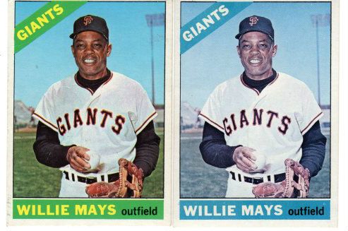 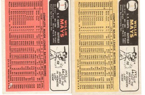 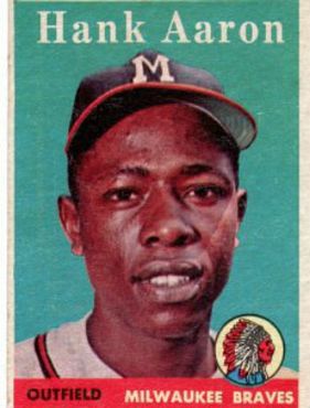
Last edited by ALR-bishop; 10-12-2022 at 10:23 AM.
|
|
#19
10-12-2022, 12:11 PM
|
|||
|
|||
|
Quote:
The Mays is a really strange one, having a different color back. I'd have to experiment a bit to see how to make that happen with chemicals, as I don't think it's fading.
|
|
#20
10-12-2022, 01:54 PM
|
||||
|
||||
|
Everyone needs to remember that 'savedfrommyspokes' Larry is the dream killer!!! When you've discovered an incredibly, historically new variation, he turns your life into a nightmare as he proves it to be nothing more than a fanciful daydream. And I should know, because like others, my head is a trophy mounted on his wall.
 (Great guy, though!! )
__________________
All the cool kids love my YouTube Channel:
Elm's Adventures in Cardboard Land https://www.youtube.com/@TheJollyElm Looking to trade? Here's my bucket: https://www.flickr.com/photos/152396...57685904801706 I was such a dangerous hitter I even got intentional walks during batting practice. Casey Stengel Spelling "Yastrzemski" correctly without needing to look it up since the 1980s. Overpaying yesterday is simply underpaying tomorrow. 
|
|
#21
10-13-2022, 06:00 AM
|
||||
|
||||
|
Quote:
As Darren's collectorisms list grows seemingly daily, I may have missed it, but I am quite sure there should be a term for this scenario if there is not already.
|
|
#22
10-12-2022, 10:23 AM
|
||||
|
||||
|
Quote:
Below are some examples (I have posted previously in this thread) of this same scenario where some clever person tried to create their own WL version of these cards that do have WL variations. They merely covered all but the top portions of each card (the reason the team name didn't turn yellow) which caused the upper parts of the green circles to turn blue and the yellow letters to turn white. On the Epstein card, you can still clearly see the green below the WLs of Epstein.
|
|
#23
10-12-2022, 10:38 AM
|
|||
|
|||
|
Ive made some blue vintage Topps cards from green cards a couple of ways. Exposure will do it easiest. I do not believe any of this type, even when people are paying hundreds of dollars for these variations, are legitimate. None of them left the printer this way, its damage. It looks cool sometimes though.
|
|
#24
10-12-2022, 09:56 PM
|
|||
|
|||
|
Yes agreed. Everything looks so dark on the Baker card (without any fades). In my heart of heart I feel the 1971 Topps crew smoked a few extra marlboro 100's on the back dock while the yellow ink ran out.
 Sent from my SM-G996U using Tapatalk
|
|
#25
10-12-2022, 10:14 PM
|
|||
|
|||
|
Quote:
|
|
#26
10-13-2022, 06:33 PM
|
|||
|
|||
|
Sharing the Topps color wheel of doom! Middle left is not a safe place to be.
*This image is a 1 of 1 nft variation with red and blue in white font I had bought the 2 bakers from the same seller (same blue tape) ..at least he (and I) went 1 for 2 in identifying print variations. Ed  Sent from my SM-G996U using Tapatalk
|
|
#27
10-25-2022, 02:34 PM
|
|||
|
|||
|
Hello Everyone,
I got this card in a lot of 1949 Bowmans the other day. First, I thought it was just a faded card, but then the gray strip at the top of the card and the ghost image of Pesky's hat at the center top, caught my eye. I guess that it is a missing color, gray slate variation wan-a-be. Any thoughts? Best regards, Joe Last edited by Northviewcats; 10-25-2022 at 02:35 PM.
|
|
#28
10-25-2022, 03:00 PM
|
|||
|
|||
|
The layers of colors are misaligned, hence the cap, the gray strip at top, and the misalignment in his jersey text. Gray/Slate fronts are totally missing a color to make them appear that way, and this card is an exemplar that shows why. Without the red layer, that's the background color
Last edited by G1911; 10-25-2022 at 03:00 PM.
|
|
#29
10-26-2022, 08:03 AM
|
|||
|
|||
|
Neat defect Joe
|
|
#30
10-26-2022, 10:24 AM
|
|||
|
|||
|
Quote:
I understand the misalignment defect that caused the gray strip and the ghost images with the Boston logo and the jersey text, but I am still not getting the error in color. All of the Pesky cards that I see on eBay or the other red background 1949 Bowmans that I have in my possession are a rich deep red color. (I am attaching a picture of the Pesky next to a Rosen card to show the difference in color.) My question is the difference in color have to do with natural sunlight fading, or is there another missing color in the Pesky card? In other words, are there two separate printing errors, poor alignment and missing color? I appreciate the board's expertise and patience. Best regards, Joe
|
|
#31
10-27-2022, 06:45 AM
|
|||
|
|||
|
Much older cards were sometimes done with multiple layers of similar colors, but that was pretty much out by the late 40's. Nearly everything you'll see postwar is just CMYK. None of those are missing, so it's down to if it's fading or not.
Yellow seems about right. Blue Seems a bit light Black/gray Shouldn't fade and looks about right Red is obviously light. Red can fade readily for a lot of the colorants, so fading wouldn't be a surprise. But here, we have an extra complication. (Don't we always? )Note how blue and red are in registration with each other. And how yellow and black are in registration with each other. That's a sign that a 2 color press was used. Pretty cool. Red and blue both being from the same pass and both being light makes me lean towards the sheet it was from being used for press setup. Adjusting the registration and ink levels. Probably an early pass, when the plate wasn't fully inked, and registration hadn't been fully adjusted. Of course, it's possible that red and blue fade more readily than yellow and black on 49 bowmans.
|
|
#32
11-22-2022, 10:36 AM
|
|||
|
|||
|
I cant figure out how to attach pictures here
But my 3 big finds are 1958 Mickey mantle with lots of text missing on back 1956 sandy Koufax with sand in the outfield 1955 ted Williams topps removed the dots in his signature
|
|
#33
11-22-2022, 10:53 AM
|
||||
|
||||
|
Quote:
You should be able to use the paper clip to add images to a post
|
|
#34
11-22-2022, 10:58 AM
|
|||
|
|||
|
The Mantle has relatives. I would like to see the Koufax. What color back ?
And + 1 on the welcome Last edited by ALR-bishop; 11-22-2022 at 11:06 AM.
|
|
#35
11-22-2022, 11:24 AM
|
|||
|
|||
|
I leave it to Cliff who put me onto the Mantle and related 1958 defective backs to elaborate but so far I have Mantle, Jensen, Drabowsky, Slaughter, Jolly and Virdon.
I see there a a few of the Koufax cards on ebay. Curse you for pointing it out Ted 1918 :-) Last edited by ALR-bishop; 11-22-2022 at 11:45 AM.
|
|
#36
11-22-2022, 07:45 PM
|
||||
|
||||
|
Jackie Jensen was above Mantle on the print sheet and is missing much of his stats, Jolly, Slaughter, Drabowsky, and Susce all fit together on the other combination, Susce is missing a foot.
__________________
interesting to some absolute garbage to others. - Error cards and variations are for morons, IMHO.
|
|
#37
12-06-2022, 06:25 AM
|
|||
|
|||
|
|
|
#38
12-06-2022, 06:37 AM
|
|||
|
|||
|
|
|
#40
12-28-2022, 07:28 AM
|
||||
|
||||
|
Recurring; here's a copy on COMC right now:
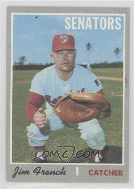 1970 Topps - [Base] #617 - Jim French Courtesy of COMC.com Nice find.
__________________
-- PWCC: The Fish Stinks From the Head PSA: Regularly Get Cheated BGS: Can't detect trimming on modern SGC: Closed auto authentication business JSA: Approved same T206 Autos before SGC Oh, what a difference a year makes.
|
|
#41
12-28-2022, 02:35 PM
|
||||
|
||||
|
Ok….we all know the 1967 Topps highs are really tuff but found another winner…….595 Rojas.
Here are two pictures. First one normal and second one print off set and blotched back in two different spots (large blotch has the snake skin or dots….which is in a few of the high numbers) Last edited by Elberson; 01-04-2023 at 01:38 PM.
|
|
#44
01-23-2023, 01:33 PM
|
|||
|
|||
|
and some are white, right?
So are the black lines only on the outside borders....and they are sloppy, like the original layouts were pencil or pen. I feel that where there are those bigger marks is where the pen/pencil came up and the next went down. Like when you are marking a 8 ft board with a 2 ft ruler? Sent from my SM-G996U using Tapatalk
|
|
#45
01-23-2023, 07:34 PM
|
||||
|
||||
|
I personally don't pay much attention to the endless variety of different printing anomalies that can be found on most cards, but if you enjoy those kinda things, here's something new I noticed on one of my graded 1973 Topps #174 Rich Gossage Rookies. I searched around a while and located another example relatively quickly on eBay (below), so it is recurring and assumedly pretty rare as far as these things go.
A spectral blue orb hovers right below the Goose's pitching hand... s-l1600.jpg
__________________
All the cool kids love my YouTube Channel:
Elm's Adventures in Cardboard Land https://www.youtube.com/@TheJollyElm Looking to trade? Here's my bucket: https://www.flickr.com/photos/152396...57685904801706 I was such a dangerous hitter I even got intentional walks during batting practice. Casey Stengel Spelling "Yastrzemski" correctly without needing to look it up since the 1980s. Overpaying yesterday is simply underpaying tomorrow.
|
|
#46
01-24-2023, 02:26 PM
|
|||
|
|||
|
Quote:
The entire process was essentially hand done. If the lines are at the top and bottom of the slits - groups of cards produced together, usually 3-4 rows of 11 if I remember them right. Then the dark line would be a gap between the large negative for the different slits. The negatives get placed on an opaque backing paper and the whole thing is called the mask. White lines would be where the mask blocked the overlappping area.
|
|
#47
01-25-2023, 02:04 PM
|
|||
|
|||
|
Can anyone educate me on what the black is at the top of the card?
Not to mention there are print dots down his right arm in the small photo and and one on his left arm as well.
__________________
Fr3d mcKi3
|
|
#48
01-25-2023, 02:27 PM
|
||||
|
||||
|
Quote:

__________________
My Red Schoendienst collection- https://imageevent.com/lucas00/redsc...enstcollection My Baseball Snapshot Photo collection- https://imageevent.com/lucas00/snapshotcollection Original Type 1/Press photos etc for sale- https://imageevent.com/lucas00/photosforsale
|
|
#50
02-26-2023, 04:45 PM
|
||||
|
||||
 1969 Topps #214 Checklist: Has a large black and white blotch fisheye over Special. Recurring? Only one that was for sale on COMC at the time. First 10 I looked at on eBay didn't have it.
__________________
-- PWCC: The Fish Stinks From the Head PSA: Regularly Get Cheated BGS: Can't detect trimming on modern SGC: Closed auto authentication business JSA: Approved same T206 Autos before SGC Oh, what a difference a year makes.
|
 |
|
|
 Similar Threads
|
||||
| Thread | Thread Starter | Forum | Replies | Last Post |
| 1966 Topps High # Print Variations | 4reals | Postwar Baseball Cards Forum (Pre-1980) | 9 | 04-27-2014 06:05 PM |
| Are these variations or print defects? | savedfrommyspokes | Postwar Baseball Cards Forum (Pre-1980) | 16 | 02-09-2013 11:52 AM |
| Well known print defects. Do variations exist without? | novakjr | Postwar Baseball Cards Forum (Pre-1980) | 9 | 01-28-2011 04:32 PM |
| Finally confirmed - d311 print variations exist! ("bluegrass" variations) | shammus | Net54baseball Vintage (WWII & Older) Baseball Cards & New Member Introductions | 8 | 09-03-2010 07:58 PM |
| Wanted: T206 Print Variations and Errors | Archive | Tobacco (T) cards, except T206 B/S/T | 1 | 01-04-2007 07:23 PM |


 Hybrid Mode
