|
||||||
 |
|
|||||
|
||||||
|
|
|||||
|
#1
 12-26-2011, 03:25 PM
|
||||
|
||||
|
Okay, I'm through sulking.
I mentioned a while back that I would be posting about Matty black cap variations (I was waiting to find another of the type on the left, and now I have). It should be no surprise that there are various versions of this card - it's one of the most common HOF'er cards. Here are two ends of the spectrum of what I've found in the 13+ that I've owned. The card on the right is what I normally looked for in this card - nice dark colors. The one on the left looks a bit different - there is at least one glaring item that, once you've become aware of it, you'll always look for it in this card. Guesses? 
__________________
$co++ Forre$+ Last edited by Runscott; 12-26-2011 at 03:26 PM. 
|
|
#2
12-26-2011, 03:37 PM
|
|||
|
|||
|
the green background is lower(in relationship to the glove) in the brownish
colored Matty.???? all the best, barry
|
|
#5
12-26-2011, 03:49 PM
|
||||
|
||||
|
Brown layer looks black!
__________________
T206 gallery Last edited by atx840; 12-26-2011 at 03:51 PM.
|
|
#6
12-26-2011, 03:58 PM
|
|||
|
|||
|
sorry wrong thread for this comment.
best, barry Last edited by ethicsprof; 12-26-2011 at 04:01 PM.
|
|
#10
12-26-2011, 04:17 PM
|
|||
|
|||
|
The one on the left has a couple of minor creases.
Just kidding, you can see more of the whites of his eyes in the one on the left.
|
|
#11
12-26-2011, 04:28 PM
|
|||
|
|||
|
SCott!!
YES...this is what i'm talking about......you are the man  glad to see you get us thinking glad to see you get us thinking card on left: 1)What's the blue line in the bottom lower right border?? by the name caption?? also- small uniform line missing ???or very light in the pant leg??might not be significant?? my guesses besides the obvious color difference(lighter uniform, sky) barry is right about the green back ground...chris and the rest...all great observations... TELL US SCOTT
|
|
#12
12-26-2011, 05:57 PM
|
||||
|
||||
|
This has been discussed before:
http://www.net54baseball.com/showthr...Dark+Cap+Matty There is a link to a Photobucket album with 13 different Dark Cap Matty's within the thread. Last edited by toppcat; 12-26-2011 at 05:58 PM.
|
|
#13
12-26-2011, 06:26 PM
|
||||
|
||||
|
Quote:
Everyone else - Great observations. The main one I thought would be pointed out is the green background level near his glove; however, the dark splotch in the upper-left of the blue background is an indication of the richer (and browner)-color version. In the past, I thought that that blue splotch was part of an overall heavier application of blue ink, but that doesn't account for the green height-level difference, or the 'brown vs black' difference. Almost looks like a heavier layer of black was applied in the left card, and in the right card - an additional brown layer on top of a light black layer. That heavy brown/light black could also account for the different look of the face. I will compare the backs/fronts of the 13 images I have, plus the 13 that Dave was nice enough to link us to, and see if I can find a front/back correlation.
__________________
$co++ Forre$+
|
|
#14
12-26-2011, 06:45 PM
|
||||
|
||||
|
One black, one brown
The blotch and the brown belt go together. Sample size 2. Yours and mine Last edited by frankbmd; 12-26-2011 at 06:57 PM. Reason: Additional comment
|
|
#15
12-26-2011, 06:57 PM
|
||||
|
||||
|
Some have a purple between the green and blue, like Dave's number 3 and more so on 11. The purple seems to be even more pronounced here - maybe it's just a scan thing though. The vertical border lines seem to be a bit off too.
Whatever, mo Mattys mo better
Last edited by Tsaiko; 12-26-2011 at 06:59 PM. Reason: Word
|
|
#16
12-26-2011, 07:10 PM
|
||||
|
||||
|
Quote:
__________________
$co++ Forre$+ Last edited by Runscott; 12-26-2011 at 07:17 PM.
|
|
#17
12-26-2011, 08:26 PM
|
||||
|
||||
|
scan both of the original cards with the same scanner. looks like the one on the left had the contrast adjusted a bit, its too white, while the one on the right looks normal. The captions on all T206 cards should be a brown color never black like the line around the image directly above caption (Ive never seen an authentic card with pure black caption)
wonder if some of the print variations were different series ie 150, 350, 460 etc. Im not an expert on which series this card is even found in, but that may have something to to with the color variations.
|
|
#18
12-26-2011, 08:42 PM
|
||||
|
||||
|
Quote:
The series thought is a good guess, but I only have 350 and 350/460 black caps, and the differences overlap both of those series. I'll admit I'm dumb in this area, but does the fact that the black cap was a superprint mean that it was printed in ALL series? Because I haven't found any 150 examples. I also noticed that there are some color similarities between the white cap and the black cap on the left. I honestly don't know what any of this might mean about printing order, etc., but thought perhaps someone might.
__________________
$co++ Forre$+
|
|
#19
12-27-2011, 06:06 AM
|
|||
|
|||
|
Here are the different Matty cards in my collection. They were scanned from the same scanner. Check out the subtle difference in the background coloring of these cards.
![[linked image]](http://i603.photobucket.com/albums/tt113/zanted86/amattyab350x50x.jpg) ![[linked image]](http://i603.photobucket.com/albums/tt113/zanted86/bmattyab350x50x.jpg) ![[linked image]](http://i603.photobucket.com/albums/tt113/zanted86/amatty1910coupon.jpg) ![[linked image]](http://i603.photobucket.com/albums/tt113/zanted86/bmatty1910coupon.jpg) ![[linked image]](http://i603.photobucket.com/albums/tt113/zanted86/amattysov460p460.jpg) ![[linked image]](http://i603.photobucket.com/albums/tt113/zanted86/bmattysov460p460.jpg) ![[linked image]](http://i603.photobucket.com/albums/tt113/zanted86/amattysov350x25.jpg) ![[linked image]](http://i603.photobucket.com/albums/tt113/zanted86/25xxmattysov350b.jpg) ![[linked image]](http://i603.photobucket.com/albums/tt113/zanted86/ap350mattydarkcap.jpg) ![[linked image]](http://i603.photobucket.com/albums/tt113/zanted86/bamattycy460darkcap.jpg) ![[linked image]](http://i603.photobucket.com/albums/tt113/zanted86/mattyepdgbk.jpg) Best regards, TED Z
|
|
#20
12-27-2011, 09:16 AM
|
||||
|
||||
|
Quote:
Last edited by toppcat; 12-27-2011 at 09:18 AM.
|
|
#21
12-27-2011, 09:36 AM
|
||||
|
||||
|
Hi guys,
You can find dozens of examples of cards with "changing" backgrounds.... From clouds, and sunsets to "Doves" that appear on some cards while not on other's... It's amazing what the volume of ink can do to a card... I wish I could post some scans, but I'm not at home at the moment. Be well Brian PS The Ritchey card is one of my favorites.... as well as the Matty above...I have over a dozen dark cap Matty's with different backs and some with the "Halo" effect and some without... I'll try to post some scans when I can...
|
|
#22
12-27-2011, 09:37 AM
|
||||
|
||||
|
Quote:
Overinking certainly isn't a design change, but there appears to be an intentional change in the amounts of ink used, and possibly a different color(s) introduced - I detailed this explanation in a previous post that you might not have read. It's obvious to me that there Matty was intentionally given two different looks. Within each look there are, of course, various amounts of ink used. I'm not going to get my feelings hurt because some people disagree with me This was simply something that interested me, so I'm discussing it. Just like a lot of T206 collectors focus almost entirely on stats and don't really notice the color variations in the cards, I am not so interested in stats and much moreso in the card anomalies and the lithographic process. Some collectors share this interest with me, so we're discussing it.
__________________
$co++ Forre$+
|
|
#23
12-27-2011, 09:40 AM
|
||||
|
||||
|
Quote:
By the way - this should not surprise anyone. There are several T206 cards where the design was changed only slightly - why? Given cards like the Chase (white vs black cap), Bender (trees/no trees), Mordecai Brown or Evers (jersey)...we could go on and on....it shouldn't be a surprise that at times the designers would take a far simpler route and get a new look by simply changing color distribution, especially with a superprint (tm) card like the black cap Matty that had a better chance of one design getting stale.
__________________
$co++ Forre$+ Last edited by Runscott; 12-27-2011 at 09:43 AM.
|
|
#24
12-27-2011, 10:04 AM
|
||||
|
||||
|
Hi Scott,
I've always thought the Ritchey "Dove" was an intentional change too, or perhaps it didn't show up as well on the first few printings, so they made it more prominent in the later print runs... I know many people believe it's a mere coincidence that the cloud appears to be a "Dove", the teams nickname, but not me... I only have access to my photobucket, so I can't post a lot of pictures, but here are a few: 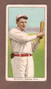 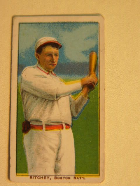 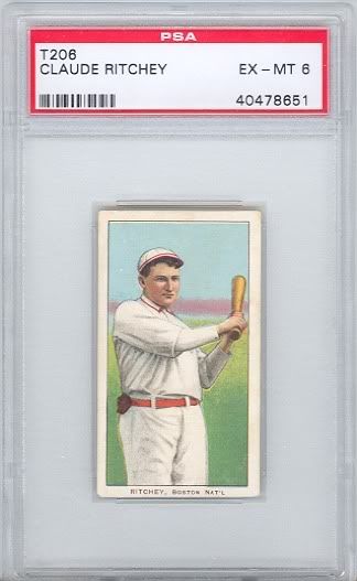  Be well Brian PS I will try to post more later Last edited by Brian Weisner; 12-27-2011 at 10:07 AM. Reason: added scans
|
|
#25
12-27-2011, 10:22 AM
|
||||
|
||||
|
Hi Scott,
I'm sorry to derail the thread with Ritchey pictures.... Here are all of the Matty scans in my photobucket: AB: 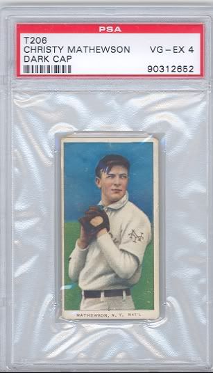 Sovereign 460: 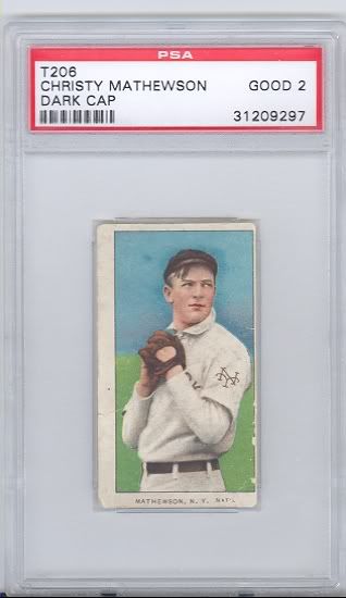 Cycle 350: 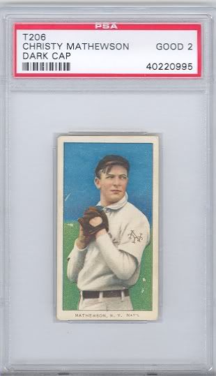 Carolina Brights 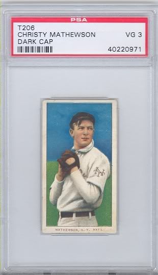 Piedmont 42 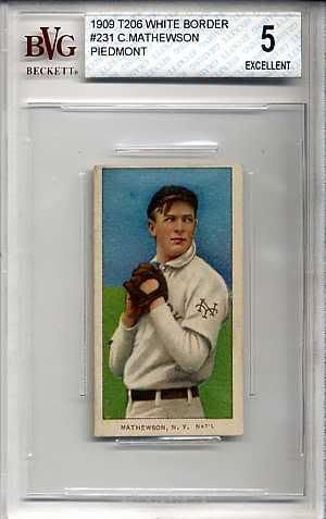 Be well Brian
|
|
#26
12-27-2011, 10:42 AM
|
||||
|
||||
|
The Ritchie proof has faint dove clouds.
 Quote:
__________________
T206 gallery Last edited by atx840; 12-27-2011 at 10:48 AM.
|
|
#27
12-27-2011, 10:57 AM
|
||||
|
||||
|
Brian, thanks for posting.
My intention, and I forgot to mention it - was to ask others to post cards that they saw as intentional variations, so definitely not a de-rail. I never noticed the Ritchie dove before, but I think this is similar to the Matty halo...but maybe not. Since the dove was in the proof, I would see a change as intentional if we found dark blue Ritchie cards without doves, but the 'without dove' cards are all light blue.
__________________
$co++ Forre$+
|
|
#28
12-27-2011, 11:12 AM
|
||||
|
||||
|
Quote:
|
|
#29
12-27-2011, 11:14 AM
|
||||
|
||||
|
Hi Scott,
I agree the Ritchey wasn't changed from it's original "proof", but I it appears that the printers weren't happy with the first run and increased the amount of ink to bring out the "Dove".... Check out the Owen Wilson card too... Nice Orange and Yellow versions.... Be well Brian PS I posted this on the old board sometime in 2005 or 2006... Then Tim and Jamie Hull produced a wonderful thread on it again in 2009....Check it out... Hi Chris, Nice McQuillians.... I don't have any in my Photobucket, but will post some when I get home....
|
|
#30
12-27-2011, 11:16 AM
|
|||
|
|||
|
I’m with Brian on this one cards can have all sorts of subtle differences. If you were to collect all these subtle differences you would have tens of thousands of cards and still be finding them. Still very cool though!
Chris posted some good ones of mine that show this I have some others I’ll dig up later. Ted, sweet Mattewson’s! BTW you may have missed me saying congrats on your pickup of a Magie card in the other thread. Congrats I know you were looking for one. Details what shape did you score nice one? My few Matthewson’s….  Cheers, John Last edited by wonkaticket; 12-27-2011 at 11:19 AM.
|
|
#31
12-27-2011, 11:33 AM
|
||||
|
||||
|
As I don't have the quantity of cards to show as some of the guys here, it does seem that that the colors are more "cloudy" the less sharp the print is. Just observing some of the various examples shown it looks as if the sharper the print the less color variations you see. I am sure this does not hold true 100% of the time but seems to be a pattern.
Beautiful cards John and Brian !! As always thanks for sharing !! Adam
|
|
#32
12-27-2011, 11:46 AM
|
||||
|
||||
|
Quote:
The older 13 cards that I had were collected for registration and condition, as I liked all versions of this card and wasn't looking for anything specific. These 2 new ones were collected as extreme examples of each type (but now I need a 'purple background' one as well), so they should yield the most information once in hand.
__________________
$co++ Forre$+
|
|
#33
12-27-2011, 11:48 AM
|
||||
|
||||
|
Quote:
__________________
$co++ Forre$+
|
|
#34
12-27-2011, 03:23 PM
|
|||
|
|||
|
Quote:
Hey Scott I think Frank (FKW) is on to something in his previous post here. The 7 cards of Matty that I show here were all printed by American Lithographic circa 1910. There are subtle differences, but nothing too significant. You may find that the Matty (dark cap) cards printed at the tail-end of the T206 press runs (circa Spring 1911) were printed with a different shades of inks. These would include Matty's with the following backs........ PIEDMONT 460 factory 42 SWEET CAPORAL 460 factory 42 NOTE....this Matty was not printed with the UZIT back or the AMERICAN BEAUTY 460 factory 42 back. TED Z
|
|
#35
12-27-2011, 03:46 PM
|
||||
|
||||
|
Quote:
__________________
$co++ Forre$+
|
|
#36
12-29-2011, 03:44 PM
|
||||
|
||||
|
The card arrived today, and there is a good reason that it looked like such an extreme example of the 'lower ink quantity' version - it was, as Frank suggested, a bad scan. The card did; however, yield some interesting facts.
First, Matty has a redder complexion than the dark card in the first post, which has a yellower complexion. Looping each and studying closely, the reason for this is obvious: The darker card has a layer of light-brown, while the lighter card has a layer of light-red - two very clearly different colors of ink. In addition, the lighter Matty does exhibit the bit of purple in the background, which is the result of light-red ink in that area - perhaps part of the same layer as the light-red highlights. The dark Matty does not have this, or it is more of the light-yellow-brown and simply doesn't do anything except add a bit of darkness. Regarding the green background - simple print registration issue. The lower green is from the green being printed lower, the higher green is the result of the opposite occurring - I just happened to pick up two extreme examples. Now I need to pick up more of these to confirm the yellow-brown vs light-red thing. Two examples really isn't enough. Scans will probably not illustrate this well, but I'll get some when I get home.
__________________
$co++ Forre$+
|
 |
| Thread Tools | |
| Display Modes | |
|
|
 Similar Threads
|
||||
| Thread | Thread Starter | Forum | Replies | Last Post |
| f/s: t206 speaker p/f...sold | chaddurbin | Tobacco (T) cards, except T206 B/S/T | 0 | 07-27-2011 01:52 PM |
| T206 Matty white cap FS FT low grade**Sold** | alaskapaul3 | Tobacco (T) cards, except T206 B/S/T | 0 | 04-21-2010 09:15 PM |
| T206 Mathewson price reduction | caramelcard | Tobacco (T) cards, except T206 B/S/T | 1 | 11-14-2009 08:21 PM |
| T206 White Cap Matty, Pied Fact 42, and a few SL for Sale | Archive | Tobacco (T) cards, except T206 B/S/T | 1 | 10-04-2008 05:17 PM |
| t206 Matty Black cap variation? | Archive | Net54baseball Vintage (WWII & Older) Baseball Cards & New Member Introductions | 0 | 03-31-2002 12:03 PM |


 Linear Mode

