Quote:
Originally Posted by jason.1969

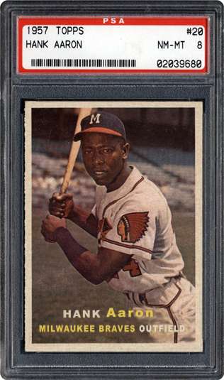
3. Really hate that the Hank Aaron photo is reversed. 1957 was THE year for the Hammer...MVP and World Championship...I realize Topps wouldn't have known this at the time the card went to press, but what a shame they got it wrong.
|
Agreed. See my #1
1. I love the 1957 set for some of the reasons mentioned. I never really thought about it this way, but it is the closest Topps set to 1953 Bowman Color, which I absolutely adore. Same kind of feel, just a little smaller. But, the set had a few problems. The missing players bother me, but there are enough cards from those players in other recent sets, so it doesn't continually gnaw at me when I look at it.
The 1957 Topps Hank Aaron, however, does. Hammerin' Hank had perhaps his finest year in 1957. Not only were his statistics great (118 runs scored, 198 hits, 44 home runs, 132 RBI, .322 AVG), but he helped the Braves to their only World Series win while in Milwaukee. It's his only MVP season, and he and the Braves beat Mantle and the Yankees for Milwaukee's only World Series win. So, you'd think that with Aaron's card being kind of important, that somebody in quality control at Topps would have caught that Hank, one of the finest right handed hitters to ever play the game, was suddenly batting lefty if you believed his card.
So, today, I decided to take to Photoshop to correct this. It doesn't look like a lot of work went into fixing it, but it took a good teal of tinkering with. Obviously, I couldn't just flip the card, because the text would have been wrong, too. So, I had to use the clone stamp tool to sample the background, and get rid of the text. I flipped the picture, then recreated the text. It's just a simple Arial typface that I used. It's not a perfect recreation of the textNow, I just need to get the proper printer, and learn which current, readily available card stock would be appropriate to print these cards on. I'd love to be able to print some of these up, and give them to collectors who would like them.
So, on the left, my version of the corrected 1957 Topps Hank Aaron, and a 1953 Bowman Style 1957 Topps Hank Aaron. In the immortal lyrics of Berlin, "No More Words

I will have to think about the other two sets. I'll finish my answer tonight.