|
||||||
 |
|
|||||
|
||||||
|
|
|||||
|
#11
 02-15-2018, 10:28 AM
|
|||
|
|||
|
Here are the 4 Topps 1960 cards I mentioned in post 985. In each case the gray back is on top and white back on bottom
--On Grunwald 427, there is dot to right of his cap in insert on white back 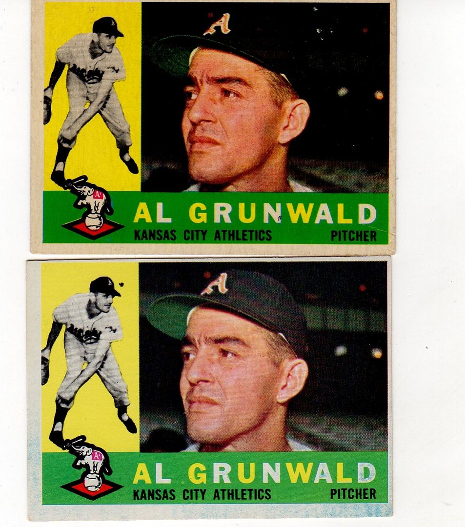 --On Rodgers, 431, the white mark just above the logo in lower left is bigger in gray back version 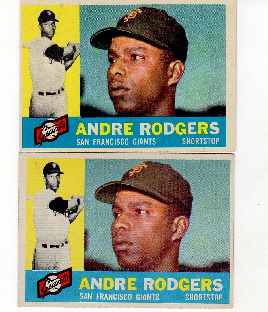 --On Jones, 410, there is minor white area above the logo on gray back and a red area in the ball within the logo on white back 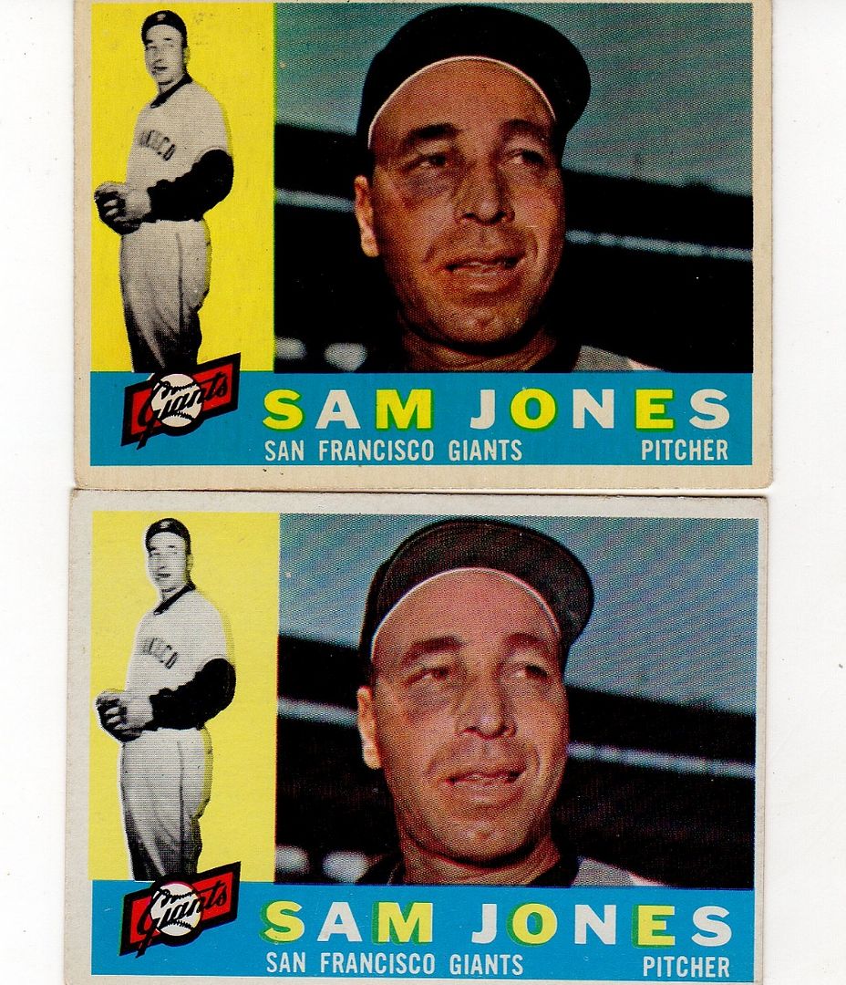 --On Williams, 414, there is a line/mark at end of his truncated arm in insert on gray back. Looks blueish to me in hand 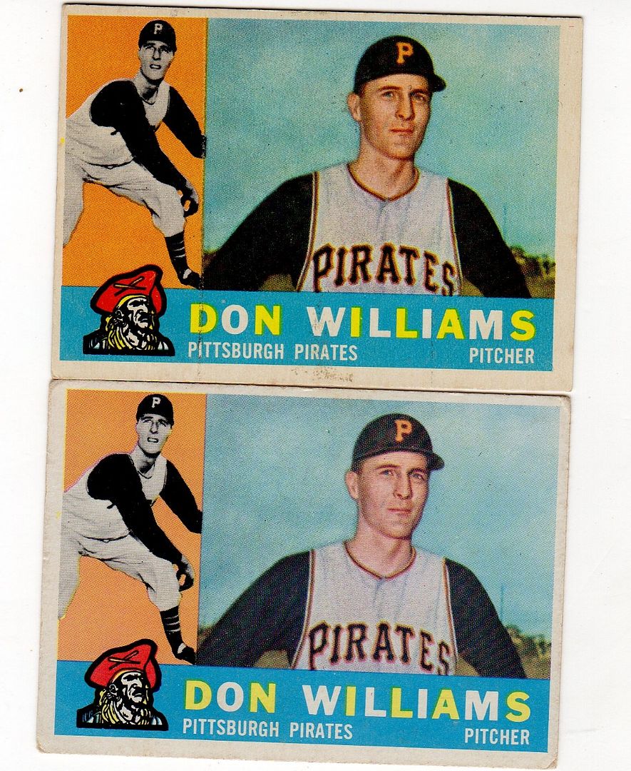 I have not looked at the backs of all the cards in the series to see if there are differences beyond the stock differences. And would not be surprised if I missed other front differences 
|
|
|
 Similar Threads
|
||||
| Thread | Thread Starter | Forum | Replies | Last Post |
| 1966 Topps High # Print Variations | 4reals | Postwar Baseball Cards Forum (Pre-1980) | 9 | 04-27-2014 07:05 PM |
| Are these variations or print defects? | savedfrommyspokes | Postwar Baseball Cards Forum (Pre-1980) | 16 | 02-09-2013 12:52 PM |
| Well known print defects. Do variations exist without? | novakjr | Postwar Baseball Cards Forum (Pre-1980) | 9 | 01-28-2011 05:32 PM |
| Finally confirmed - d311 print variations exist! ("bluegrass" variations) | shammus | Net54baseball Vintage (WWII & Older) Baseball Cards & New Member Introductions | 8 | 09-03-2010 08:58 PM |
| Wanted: T206 Print Variations and Errors | Archive | Tobacco (T) cards, except T206 B/S/T | 1 | 01-04-2007 08:23 PM |


 Threaded Mode