|
|
|
|
#1
|
|||
|
|||
|
I didn't explain that very well.
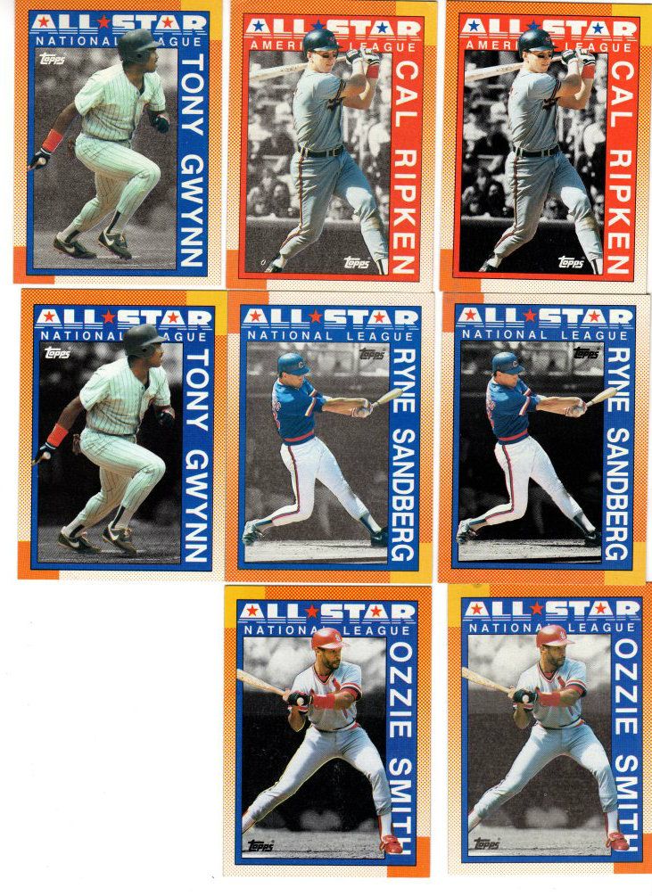
The group of 90T related to the Thomas are from something causing the plate to be made incorrectly. The plates are made from a set of large negatives called the mask. It's usually a bunch of negatives taped to an opaque paper or plastic sheet. The plate is exposed much like a photograph would be, then developed. If something like a hunk of tape or strip of paper was between the mask and the plate that part wouldn't get exposed and that portion of that color wouldn't print. I think the 90T and the Seaver/Clemens were both caused that way. The 90T is the most extreme example I've seen. Very sloppy work by the platemaker. Other cards missing areas of color may be similar, but it's just one way of having missing color in an area. Incorrect original Incorrect mask Bad plate Solvent/water drips Debris in the press. Too much wetting of the plate Underinking Damaged/stained paper stock Misfeed of a sheet Partial print of the sheet - Impression cylinder not engaged for the whole rotation Sheet not fed through at all I think that's it, there could be others I missed. And some of those have related errors. Debris in the press can sometimes wrap around the plate, get inked and print what looks like faded solid color. If there's too little water instead of too little the entire plate can get inked to varying degrees and will also print a light solid layer. All are pretty cool, but the only one I'd call a variation is the incorrectly made plate. Steve B |
|
#2
|
|||
|
|||
 
Last edited by ALR-bishop; 07-31-2014 at 09:29 AM. |
|
#3
|
|||
|
|||
|
1959 Don Zimmer #287. From what I've tracked, about 90% of printing has unbroken "O", 9.5% has broken "O", and 0.5% has a partially broken "O".
Unbroken "O" in Dodgers.   Partially broken "O" in Dodgers.   Broken "O" in Dodgers.  
|
|
#4
|
|||
|
|||
|
Good one Brad. Has Don ever looked better than on that card

|
|
#5
|
||||
|
||||
|
Steve, thanks for the explanation, your reasoning makes sense to me. Do you think the other 90's from that sheet will ever be recognized like the Thomas?
Here's a Podres variant...some can be found with a section of pink in the top border where there should be orange. On ebay the pinks are about 20:1. Not too hard to find. 
__________________
COLLECTING BROOKLYN DODGERS & SUPERBAS |
|
#6
|
|||
|
|||
|
I think the other 90's related to the Thomas should be recognized. Each is just as tough if not tougher because commons don't get much attention. (Took me more than 2 years to find an 88T Canseco to finish the set and he's not exactly a common)
But I don't think it will happen anytime soon. The Thomas was an obvious error on a really popular card and was in guides early on. The first time I saw one the seller wasn't sure of it and to me it looked like a print error. So the others would have been treated the same way if they'd been noticed. And for better or worse, pricing and acceptance revolved around Beckett and they always downplayed print errors. Obviously neither they or the standard catalog could list every difference, especially once the huge production of the late 80's began. And even now there are dealers that put minor print errors out there as "variations" often with what I'll politely call "imaginative pricing". If a major price guide began listing actual small differences to an audience with no understanding of the technical aspects that sort of thing would only be worse. Especially for stuff in the questionable category. I have a couple 1991T partial wrong backs. Player cards with the underlying pink that's not a player card background but a manager background. Are they ones where they were printed on a sheet intended to be a different sheet? Like one printed with the pink from say the A sheet then finished with the blue and front from the C sheet? Or was the pink back plate made wrong. Eventually I'll compare the sheet layouts and see if any normal sheet matches up. If it does, they're probably the first, and "just" print errors - uncommon but errors. If none of the normal layouts match they're likely actual major variations that escaped notice for years. Steve B |
|
#7
|
||||
|
||||
|
Broken borders in upper left corner, one with a single break and one with a double. The double is somewhat tough to find.

__________________
COLLECTING BROOKLYN DODGERS & SUPERBAS |
 |
| Thread Tools | |
| Display Modes | |
|
|
 Similar Threads
|
||||
| Thread | Thread Starter | Forum | Replies | Last Post |
| 1966 Topps High # Print Variations | 4reals | Postwar Baseball Cards Forum (Pre-1980) | 9 | 04-27-2014 06:05 PM |
| Are these variations or print defects? | savedfrommyspokes | Postwar Baseball Cards Forum (Pre-1980) | 16 | 02-09-2013 11:52 AM |
| Well known print defects. Do variations exist without? | novakjr | Postwar Baseball Cards Forum (Pre-1980) | 9 | 01-28-2011 04:32 PM |
| Finally confirmed - d311 print variations exist! ("bluegrass" variations) | shammus | Net54baseball Vintage (WWII & Older) Baseball Cards & New Member Introductions | 8 | 09-03-2010 07:58 PM |
| Wanted: T206 Print Variations and Errors | Archive | Tobacco (T) cards, except T206 B/S/T | 1 | 01-04-2007 07:23 PM |