|
||||||
 |
|
|||||
|
||||||
|
|
|||||
|
#1302
 05-26-2025, 06:43 AM
|
||||
|
||||
|
Thank you so much for all of the super kind words, everybody!! I really appreciate all of you taking the time the make them.
Hope you're all having a nice Memorial Day weekend. I'm doing my best to get some work done while the kids are home, but since it's going to be pretty nice out here in Brooklyn, I imagine it's going to be a losing effort on my part. So I guess the main objective seems to be to not beat myself up over it! Anywho, I thought I'd post a painting I finished a little while back, one with subject matter that I guess is a bit less common to see on the boards: 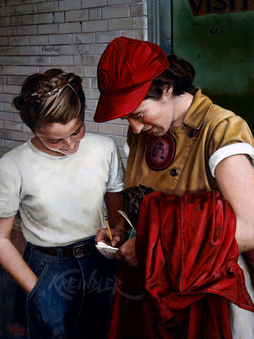 Dorothy Kamenshek, 1947, 24" x 18" I've always had a fascination with the AAGPBL, and like so many of us, it was sparked by Penny Marshall's A League of Their Own. For those who don't know, the depicted subject matter, "Kammie", was pretty much the face of the Rockford Peaches. She was a seven-time All-Star and a two-time batting champion. I believe she is still the all-time leader in hits and total bases for the league, too. In other words, she kicked @$$. The main issue I had with this painting was all in its beginning stages--just finding the imagery to work off of to make it happen was the biggest challenge. The AAGPBL, though obviously popular in the midwest, wasn't as well documented visually as their male counterparts. Finding un-posed shots, be it during a game or during practice, is still to this day no easy feat. I luckily have a few friends in the space who mainly collect stuff from those leagues (as well as other women's teams), and they were more than willing to share some of their pieces with me. This candid snapshot of her was probably my favorite of the entire batch. I've always loved the motif of ballplayers with children, and when you add the fact that here it's a young girl getting the autograph, it makes it even more powerful (in my eyes). And then that red of her hat and the AAGPBL jacket draped over her arm--it's a winning combination. They're outside of the visiting team's dressing room at Beyer Stadium in Rockford, and if you look closely, you can even catch some graffiti on the gray bricks. 1947 wasn't necessarily a great year for Rockford, as they finished in 6th place, but they bounced back to win the League Championship for three straight years from '48 to '50. As always, if y'all have any questions, comments are critiques, fire away!! Thanks for reading and enjoy yourselves today! Graig
__________________
Check out my baseball artwork: www.graigkreindler.com www.twitter.com/graigkreindler www.facebook.com/graigkreindler Last edited by GKreindler; 05-26-2025 at 06:44 AM. 
|
|
#1303
05-26-2025, 07:21 AM
|
|||
|
|||
|
Breathtaking spectacular as always!!!

|
|
#1304
05-26-2025, 07:59 AM
|
||||
|
||||
|
A graphite autograph - interesting
__________________
RAUCOUS SPORTS CARD FORUM MEMBER AND MONSTER FATHER. GOOD FOR THE HOBBY AND THE FORUM WITH A VAULT IN AN UNDISCLOSED LOCATION FILLED WITH WORTHLESS NON-FUNGIBLES 274/1000 Monster Number
|
|
#1305
05-26-2025, 09:29 AM
|
|||
|
|||
|
Quote:
As a collector of women in baseball items and the father of three girls, this image quite literally captures the very essence of why I collect what I do. Have to admit that I teared up a bit seeing this. Indescribably wonderful.
|
|
#1306
06-29-2025, 02:50 PM
|
||||
|
||||
|
Thanks so much for the kind words, everybody!! I really appreciate them as always, especially for the women's baseball stuff. It's subject matter that I enjoy tackling, whether it's from the AAGPBL or other teams that sported women in the early 1900s.
I figured I'd show a few more of these badasses: 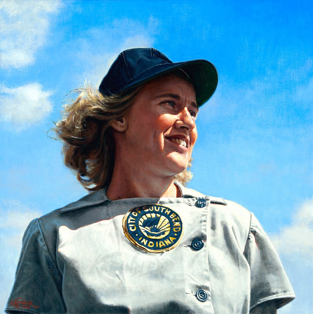 Jean Faut, 1949, 18" x 18" 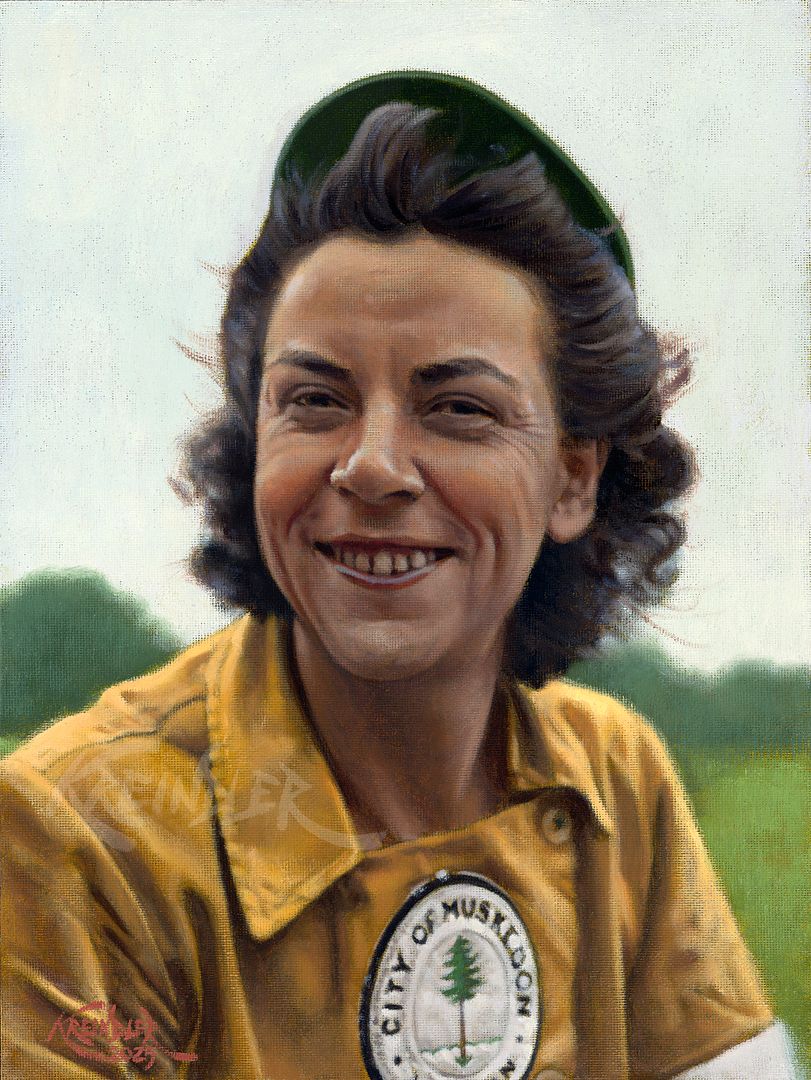 Dorothy Maguire Chapman, 1946, 9" x 12" The Jean Faut image was an absolute blast to paint, especially since the original photography was of such high quality. Plus, it had that great angle from below of her looking into the distance, giving it a heroic feel. For those unfamiliar with Jean, she was one of the greatest pitchers in the history of the league. Some of her more impressive stats are pitching four no-hitters (two of which were perfect games), winning two pitching Triple Crowns; winning two Player of the Year awards; winning twenty games three times; winning two championships; and is the league's all-time leader in ERA. And believe me, there are a lot more. This painting ended up going to Jean's son. Dorothy Maguire Chapman was no slouch either, as she was an all-star catcher on two championship teams (1943 Racine Belles, 1944 Milwaukee Chicks). Known for being tough as nails, part of her story inspired a scene in A League of Their Own, but less so anything play-related. The scene where Betty Spaghetti receives a telegram bringing news of her husband's death was partially based on Dorothy's experience--she had received a phone call before a game, informing her of the death of her husband Tom in Italy. Unlike Betty Spaghetti, she actually DID play that day. Oddly enough, he was discovered to be alive months later after a dog-tag mix-up. Like the Faut painting, this was commissioned by the ballplayer's family. The images of both players came from a large scrapbook at the Louis Pettus Archives at Winthrop University. They have a bunch of great images in their archives that I've licensed recently in the hopes of making future paintings of these great ballplayers. Anywho, hope y'all enjoy these!! Any comments, critiques, questions and rotten tomatos are always welcome. Oh!! And the Satchel Paige giclée officially goes live and becomes available for purchase on Monday, July 7th! If you'd like to be added to the mailing list for more updates, fill in your info here. Thanks, as always!! Graig
__________________
Check out my baseball artwork: www.graigkreindler.com www.twitter.com/graigkreindler www.facebook.com/graigkreindler
|
|
#1308
07-01-2025, 10:10 AM
|
||||
|
||||
|
I wish that I could claim this one as my own, but it belongs to a good friend who recently had it commissioned by Graig Kreindler. It is amazing how Graig is able to keep outdoing himself.
|
|
#1309
07-03-2025, 07:01 AM
|
|||
|
|||
|
Quote:
|
|
#1311
07-03-2025, 11:54 AM
|
||||
|
||||
|
Quote:
|
|
#1312
07-03-2025, 07:27 PM
|
||||
|
||||
|
Maaaannn, thank you so much for all of those kind words, everybody!! I really do appreciate every single one of them.
Hopefully you're all getting ready for a fun and safe holiday weekend. Here's one I just got back from the photographers today: 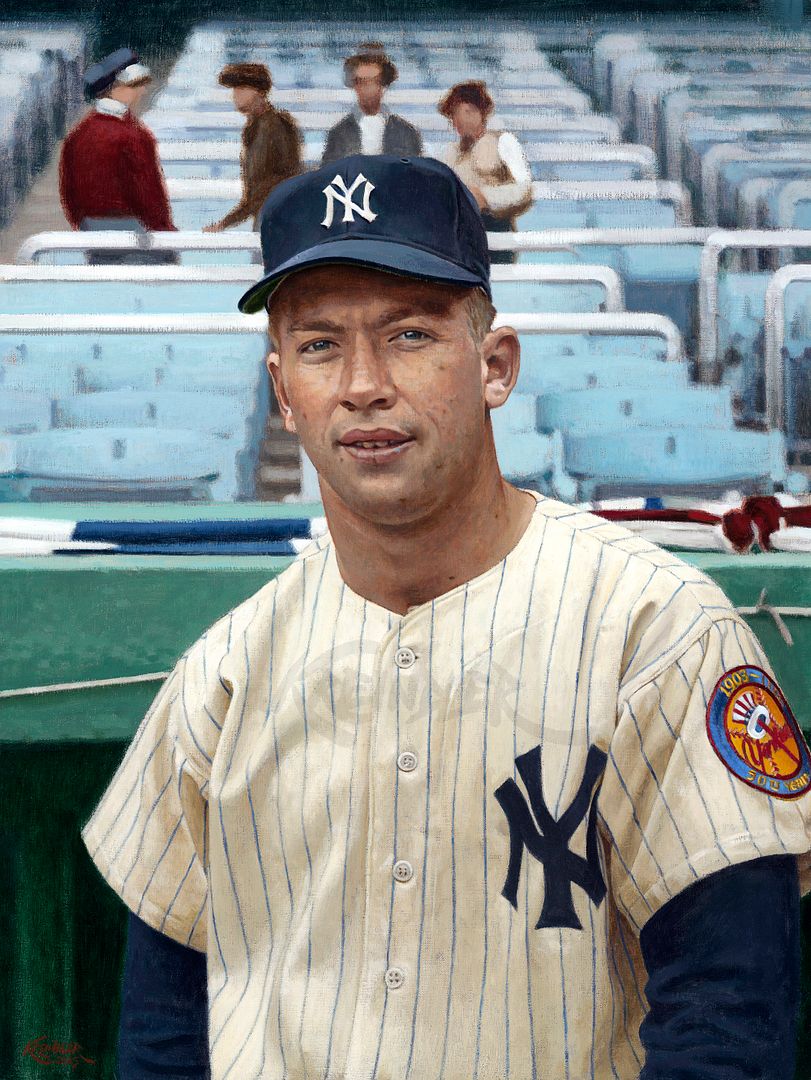 Mickey Mantle, April 18, 1952, 18" x 24" Though I was never able to figure out who the photographer was, this shot was always super intriguing to me. Sure, it's a young Mickey and who doesn't love that, but there's a cool narrative to it. At least in my head there is. I just feel like he's caught at a really interesting time in his life. It's Opening Day in New York, and Mickey is still fresh off of the injury that almost ended his career before it really began. The event in the World Series months prior was initially diagnosed as a torn muscle, but later identified as torn ligaments and cartilage--a torn ACL and MCL, and meniscus. Despite how serious the injury was, he wouldn't have surgery until 1953. Woof. So as a result, he had a very slow start in March. His dad, the center of his world, was weeks away from dying. Mickey also had a new bride in Merlyn, married less than four months before the opening of the season. On the field, he was battling Bob Cerv, Jackie Jensen, and a little later, Irv Noren for regular centerfield duties, the position that had been vacated by the great DiMaggio that prior December. He was not yet a god. Hell, far from it. Probably still just a scared kid at this point. The day the photograph was taken, the Yankees raised their third consecutive championship banner. Joe DiMaggio gave his glove and newly retired #5 jersey to Rowan Spraker of the Hall of Fame. Gil McDougald was given his Rookie of the Year award. Yogi his MVP award. Allie Reynolds the Page One prize. Phil Rizzuto an award for his play in the '51 WS. But still, here's the kid with the weight of the world on his shoulders, and all the ability to make himself into what Stengel bragged about him to be. I guess for me, knowing all of that stuff makes the portrait seem extra special. Annnyyywwwhhhhoooo, sorry for being all cerebral and reflective. Hope y'all dig the painting. And as usual, feel free to reach out with any comments, critiques, or questions! Thanks for reading! Graig
__________________
Check out my baseball artwork: www.graigkreindler.com www.twitter.com/graigkreindler www.facebook.com/graigkreindler Last edited by GKreindler; 07-03-2025 at 07:27 PM.
|
|
#1313
07-03-2025, 08:07 PM
|
|||
|
|||
|
Lord have mercy Man!! The backstory is amazing...sets the tone perfectly and its all captured effortlessly in your brushstrokes. Why are the paintings so more captivating than the photos they are based on?
|
|
#1314
07-03-2025, 09:32 PM
|
||||
|
||||
|
I really appreciate that, Michael. Thank you. Even if I dont necessarily agree, I am super thankful for your sentiments!! 😬
__________________
Check out my baseball artwork: www.graigkreindler.com www.twitter.com/graigkreindler www.facebook.com/graigkreindler
|
|
#1315
07-06-2025, 05:51 AM
|
||||
|
||||
|
Quote:
You're being modest. I agree with Michael. .
__________________
Leon Luckey www.luckeycards.com
|
|
#1316
07-07-2025, 05:30 PM
|
||||
|
||||
|
Dagnabbit, Leon. Thank you, guys.
Also, might be worth mentioning that giclées of the aforementioned Satchel Paige painting are officially on sale as of this morning. 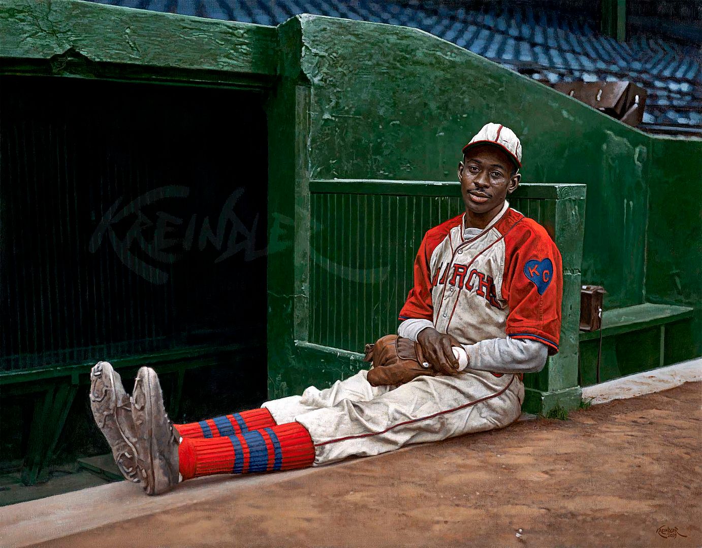 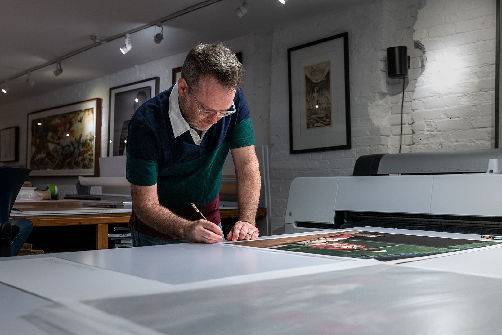 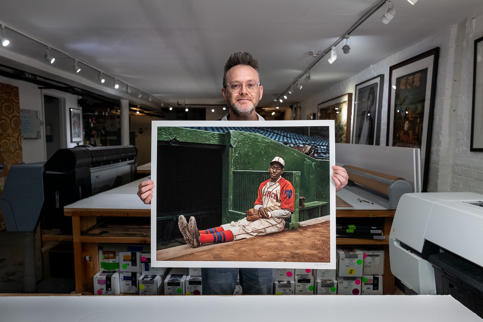 The Main Attraction is a signed and numbered time-limited edition of giclée prints which will be available for one week, starting at 8:00 AM ET on Monday, July 7th and ending at 7:59 AM ET on Monday, July 14th. The edition is limited by the number of prints sold during that period and never reprinted. In other words, after next Monday, it's gone forever. It's printed on Hahnemühle Museum Etching 350 gsm paper, which is really high quality stuff. The company actually dates back to 1584. And "yes", you read that right. Anywho, I figured I'd post the link here since I know a lot of folks have been interested in prints of my work, which I'm finally hoping to be able to offer, even if it's only on a limited basis. https://store.graigkreindler.com/pro...raction-giclee Note that a portion of the proceeds go to benefit both the Satchel Paige estate and the Negro Leagues Baseball Museum. Really, thanks again for all of the kind words, everybody. Graig
__________________
Check out my baseball artwork: www.graigkreindler.com www.twitter.com/graigkreindler www.facebook.com/graigkreindler Last edited by GKreindler; 07-07-2025 at 05:32 PM.
|
|
#1317
07-11-2025, 07:51 AM
|
||||
|
||||
|
Hey all,
Brooklyn Editions, the folks I've teamed up with the Paige giclée, put together a little behind the scenes video of their process, which I thought might be cool to share: Pay no attention to my gut hanging out in some these shots. Hope everyone is keeping cool! G
__________________
Check out my baseball artwork: www.graigkreindler.com www.twitter.com/graigkreindler www.facebook.com/graigkreindler
|
|
#1318
07-11-2025, 11:41 AM
|
||||
|
||||
|
sweet stuff my friend.... sweet stuff... love the subject matter as well...
__________________
Al Jurgela Looking for: 1910 Punch (Plank) 50 Hage's Dairy (Minoso) All Oscar Charleston Cards Rare Soccer cards Rare Boxing cards
|
|
#1319
07-11-2025, 11:45 AM
|
||||
|
||||
|
Makes me smile every day...
__________________
Al Jurgela Looking for: 1910 Punch (Plank) 50 Hage's Dairy (Minoso) All Oscar Charleston Cards Rare Soccer cards Rare Boxing cards
|
|
#1320
07-11-2025, 11:46 AM
|
||||
|
||||
|
to me one of the most important Negro League photos in existence...
__________________
Al Jurgela Looking for: 1910 Punch (Plank) 50 Hage's Dairy (Minoso) All Oscar Charleston Cards Rare Soccer cards Rare Boxing cards
|
|
#1321
07-13-2025, 11:53 AM
|
||||
|
||||
|
Thanks so much, Al!! Im honored to be on your wall and in your collection
or something like that.
__________________
Check out my baseball artwork: www.graigkreindler.com www.twitter.com/graigkreindler www.facebook.com/graigkreindler
|
|
#1322
07-13-2025, 05:44 PM
|
|||
|
|||
|
Quote:
__________________
T206 HOF Set (74/74) T206 OMSL SET (3/48) https://www.flickr.com/photos/197085...77720322768299
|
|
#1323
07-13-2025, 06:58 PM
|
|||
|
|||
|
Quote:
__________________
BST h2oya311, Jobu, Shoeless Moe, Bumpus Jones, Frankish, Shoeless Moe again, Maddux31, Billycards, sycks22, ballparks, VintageBen (for a friend), vpina87, JimmyC, scmavl, BigFanNY, Bliggity, bluespruce, powell_am
|
|
#1324
07-14-2025, 12:10 PM
|
||||
|
||||
|
Here are a few write ups on the team:
https://wordsabovereplacement.com/le...in-excellence/ https://sabr.org/journal/article/twi...ara-leopardos/ https://www.seamheads.com/NegroLgs/t...23.5&teamID=SC Also, Ryan has bios on a lot of the Santa Clara players on this net54 thread: https://www.net54baseball.com/showthread.php?t=346254
__________________
Al Jurgela Looking for: 1910 Punch (Plank) 50 Hage's Dairy (Minoso) All Oscar Charleston Cards Rare Soccer cards Rare Boxing cards
|
|
#1325
07-18-2025, 04:49 AM
|
||||
|
||||
|
The moment last night when I noticed a 2025 acquired Graig Kreindler painting in an 11 year old post. Just another case of someone getting "The Kreindler Goosebumps" and loving every moment of it.
 thanks Graig for sharing your talent w/ the world. ----------------------------- Quote:
Last edited by tjisonline; 07-18-2025 at 04:52 AM.
|
|
#1326
07-21-2025, 10:49 AM
|
|||
|
|||
|
Quote:
__________________
To all my friends here, kindly please consider gifting yourself, your wife, your girlfriend or significant others a copy of my wife's book, "The Source Light Healing". My deepest gratitude for any and all support. https://store.bookbaby.com/book/the-...-light-healing Legacy Board Member Since 2009. Hundreds of successful transactions here on Network 54. Buy/Sell/Trade with Confidence.
|
|
#1327
08-24-2025, 01:57 PM
|
||||
|
||||
|
Thank you for all of the kind words, everybody!! So very much appreciated.
Here's one I finished recently that should be arriving in my client's hands tomorrow (Monday): 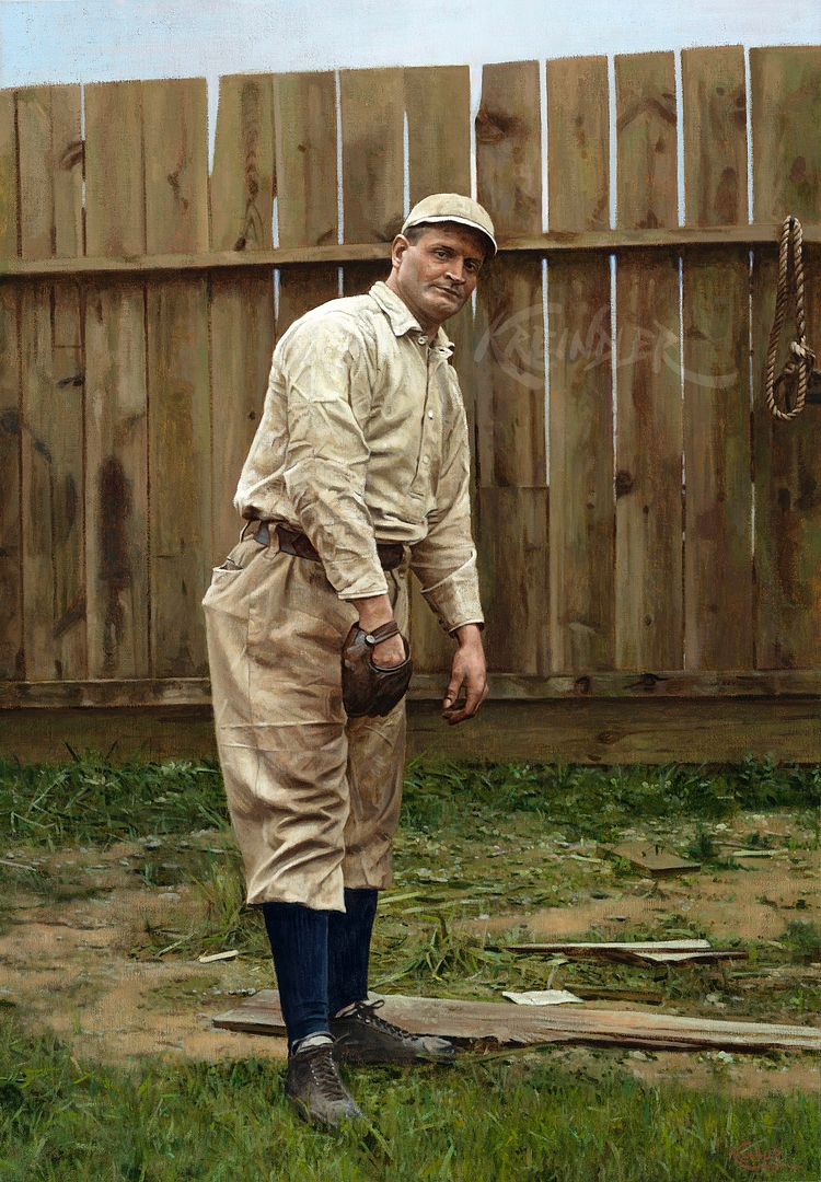 Rube Waddell, (ca) 1904, 32" x 22" I'm super glad to have this out of the studio, as it had been sitting here for quite some time. It was actually really close to completion, but because of an influx of larger canvases, somehow this one ended up getting hidden behind a few, and I lost track of it. Woof. Anywho, it was an enjoyable one to paint, though pretty complicated. Rube himself wasn't too bad, though there were a few spots in his uniform that proved to be a bit complicated, what with all of the wrinkles and what-not. And then the fence with all of the knots! And the ground with the grass, wooden planks and dirt!!! Oh, my. Just a ton of different textures and eye-candy. But in the end, I think the painting is successful and am hoping the client agrees. For what it's worth, I have *NO* idea where the original photograph was taken. It doesn't seem like a big league ballpark considering the fence and condition of the ground, but I'm of course not 100% on that. Also, I'm not 100% on the year either, as it's a general guess from the jersey and belt style (check out those long sleeves withOUT the button attachments). His face also seems to be a bit on the younger side, I think? But certainly, if anybody has any information they're willing to share, I'd love to hear about it! Also, I thought I'd share a few shots of some other stuff I've been working on as of late, all of which are in varying states of completion: 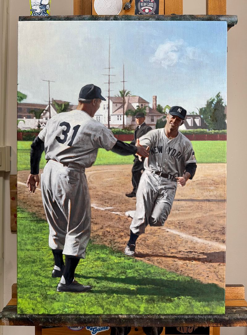   The painting of Mantle is after his MONSTER home run during spring training of '51, against the Trojans at Bovard Field in southern California. It's *almost" there. Super close. Same can be said with the Earle Combs piece and the larger Ruth painting behind it (the other Ruth behind THAT needs more help). And the Warren cabinet of George Wright! Another one that's getting there. So incredibly honored to be so busy though, not matter how stressed out I might be. Also also, here's an interview I did with PJ Kinsella and the good folks at REA a few months back: https://collectrea.com/stories/post/...raig-kreindler If any of y'all have comments, critiques or questions, fire away! Hope ya dig it all. Thanks for reading, Graig
__________________
Check out my baseball artwork: www.graigkreindler.com www.twitter.com/graigkreindler www.facebook.com/graigkreindler
|
|
#1328
08-24-2025, 04:25 PM
|
||||
|
||||
|
Quote:
|
|
#1329
08-24-2025, 04:41 PM
|
||||
|
||||
|
I don't mean to be the one to tell you this Craig...but, I think you are getting better!!
Who wudda thunk it? Simply AMAZIN'
__________________
. "A life is not important except in the impact it has on others lives" - Jackie Robinson If you have a chance to make life better for others and fail to do so, you are wasting your time on this earth.- Roberto Clemente
|
|
#1332
08-24-2025, 09:24 PM
|
||||
|
||||
|
Terrific hyper-real painting, Graig. Looks like some kid tagged the fence back in 1904.
__________________
David McDonald Greetings and Love to One and All Anything is possible if you don't know what you're talking about.
|
|
#1333
08-29-2025, 07:57 PM
|
||||
|
||||
|
Thanks so much for all of those super kind words, everybody!!! I really appreciate the good vibes.
Definitely hoping the client likes the painting (lord knows hes waited long enough). Yall rule. Graig
__________________
Check out my baseball artwork: www.graigkreindler.com www.twitter.com/graigkreindler www.facebook.com/graigkreindler
|
|
#1334
08-29-2025, 07:58 PM
|
||||
|
||||
|
Incredible talent Greg
Geoff Bedine Premier Card Collectors Since 1977 Sent from my iPhone using Tapatalk
__________________
Geoff Spending my lunch money on Baseball Cards It all just goes back into the PC https://www.ebay.com/str/premiercardcollectors Over 7500 successful transactions. Curating an unfocused collection for nearly 50 years. T206, 19th Century, Pre-War, HOFers, Jewish Athletes Member of SABR - Dead Ball Era/Baseball Card Research/19th Century
|
|
#1335
08-29-2025, 09:30 PM
|
|||
|
|||
|
Honest to God question.....how can paintings look better and more realistic than pictures?
. Every single time!!
|
|
#1336
08-30-2025, 06:56 AM
|
||||
|
||||
|
That Waddell is sick. Just incredible work.
__________________
http://www.flickr.com/photos/calvindog/sets
|
|
#1337
08-31-2025, 08:57 PM
|
||||
|
||||
|
Thank you so much for that, guys. I really appreciate the kind words. I still havent heard from the fella who commissioned Rube, but I do hope his reaction is similar to the ones youve been giving me!! 😬
Michael, Im really happy you feel that way!!! The goal is always to get better and better, but I still keep climbing the ladder, hoping Im gonna reach the peak and then I realize Im still at base camp. Kinda Sisyphusian, I guess is that even a word?!? Now, if I can only get Mr. Wonderful and two other folks to invest $13,000,000 into these things. Hah!
__________________
Check out my baseball artwork: www.graigkreindler.com www.twitter.com/graigkreindler www.facebook.com/graigkreindler
|
|
#1338
09-16-2025, 05:38 AM
|
||||
|
||||
|
Hey all!
Hope the end of the summer has been treating y'all well. My kids are fully back in school, so I'm still adjusting to the new schedule and figuring out when I can paint, when I can go to the gym, and when I just sit on the couch and zone out for five minutes. Things remain as busy as ever in the studio (thankfully), as I do my best to make a dent in the ol' backlog. Here's one of the latest efforts: 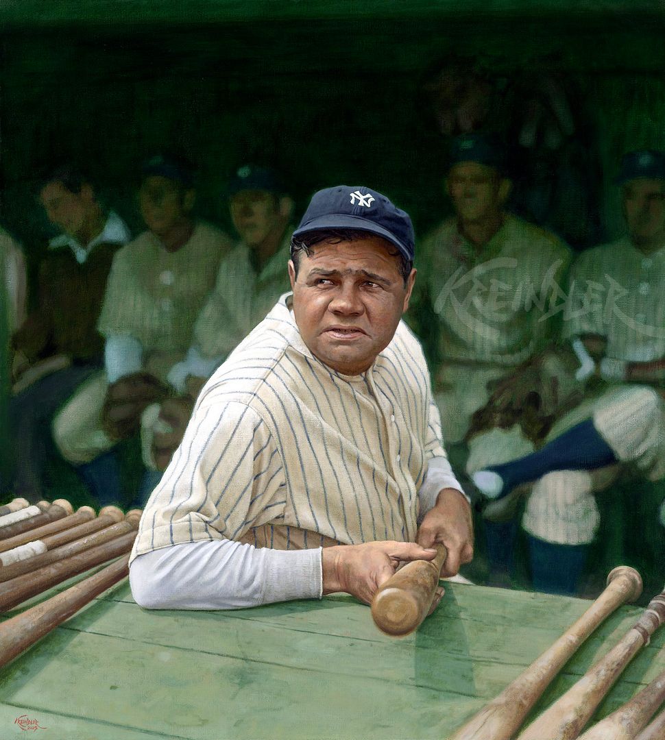 Babe Ruth, 1929, 40" x 36" I've gotta be upfront here--I've *never* liked the '33 Goudey #181. I know it's iconic, and as a playing-days Babe, it's always been extra desirable. Heck, it's one of my earliest vintage card memories from those reprint books. Buuuuuuutttttt, I've just always hated the image. To me, he looks old, fat and tired. Very Jabba-esque. I guess the brown hat didn't help things, but I was already pretty down on it to begin with. For whatever reason, when the original negative for the source image was discovered/offered up, I did a complete 180. Granted, I do still think he looks old and tired, but finally seeing him in context with everything else in the image helped a TON. I love seeing how there's hazy sunlight shining on him, something that's not even super evident until you notice the shadow of the bat on the rack. And then being able to see his teammates in the dugout, coupled with the way he's holding the bat, it just makes for something extra three-dimensional. All of the aforementioned stuff proved to be a bit of a challenge to paint. The tendency (for me) is to try and push the values and temperature differences a little bit when I'm dealing with direct sunlight. But with this kind of sun, those differences had to be a lot more subtle. So there's less of a value separation, and fewer hard edges. The changes in temperature (especially in the face and the bat rack) are still there, but the jump between the warms and cools are less drastic. But with all that said, I think that Ruth and his cohorts really turn in space. And now I feel like I can look at that Goudey with less disgust.  If any of y'all have comments, critiques or questions, fire away! Hope ya dig it. And as always, thanks for reading, Graig
__________________
Check out my baseball artwork: www.graigkreindler.com www.twitter.com/graigkreindler www.facebook.com/graigkreindler
|
|
#1340
09-16-2025, 06:01 AM
|
||||
|
||||
|
I feel like i can reach through the computer screen and take the bat Babe is offering into my hands. I love the teammates in the background almost fading into the shadow of his greatness.
__________________
Collection is Varied and Ever Changing, T207, T206 oddbacks, and vintage (1957-66) buybacks are current priorities Successful transaction(s) with npa589, Andrew T206, Chesbro41, premiercardcollectors, dougscats, kzoo
|
|
#1341
09-16-2025, 06:02 AM
|
||||
|
||||
|
Graig, as always, your paintings look so very, very realistic!
__________________
Seeking very scarce/rare cards for my Sam Rice master collection, e.g., E210 York Caramel Type 2 (upgrade), 1931 W502, W504 (upgrade), W572 sepia, W573, 1922 Haffner's Bread, 1922 Keating Candy, 1922 Witmor Candy Type 2 (vertical back), 1926 Sports Co. of Am. with ad & blank backs. Also 1917 Merchants Bakery & Weil Baking cards of WaJo. Also E222 A.W.H. Caramel cards of Revelle & Ryan.
|
|
#1342
09-16-2025, 08:44 AM
|
|||
|
|||
|
Graig,
I have to admit, I've always had the same opinion of that card. I think that a lot of people have a mental image of Ruth as old, fat, lazy and tired. Instead, his playing career, right up until the last couple of years, demonstrates that he was strong and fast, and known as being pretty athletic. I think that images like that card have not helped his overall image for modern generations. Your painting does bring to life that photo in a different way. He still looks old and tired, but not as bad as the card made him appear. Really neat to see your take on the image! kevin
|
|
#1343
09-16-2025, 09:54 AM
|
|||
|
|||
|
Quote:
Have you ever gone off the script, so to speak, by just adding your own touches to the original? For example, I have done acrylic paintings of a few vintage cards from my own collection - those I consider to be iconic - but with a bit of a twist to them. The result can be fun. Here's one I did in July on a 20" X 16" canvas. I detailed his face by using the artwork involved in the #149 card, which is supposed to be a blowup of the original photo used on card #144. Last edited by robw1959; 09-16-2025 at 10:00 AM.
|
|
#1344
09-16-2025, 10:52 AM
|
||||
|
||||
|
Being that Robert Redford has just passed away, is there any way we might get a closer look at the painting with him in his "The Natural" uniform that is partially obscured behind other paintings in this photo?
Brian Quote:
|
|
#1345
09-16-2025, 01:18 PM
|
||||
|
||||
|
Beautiful work, Graig! I, too, have never been a fan of the Goudey dugout Babe. But this painting is fantastic.
Quote:
|
|
#1347
09-18-2025, 06:43 PM
|
||||
|
||||
|
Saw one of your earlier works at the REA offices today. It was Teddy Ballgame coming home after a homer. Stunning work in person. I love your color studies skills. See it up close was fantastic.
Anyway, just wanted to mention it. Andy .
__________________
I'm always looking for t206's with purple numbers stamped on the back like the one in my avatar. The Great T206 Back Stamp Project: Click Here My Online Trading Site: Click Here Member of OBC (Old Baseball Cards), the longest running on-line collecting club www.oldbaseball.com My Humble (Outdated) Blog: Click Here
|
|
#1348
09-22-2025, 08:53 AM
|
||||
|
||||
|
Thank you so much for all of those wonderfully kind words, everybody!! You're all being super kind.
A super cool rendition, Rob! I actually *do* like seeing those little personal touches in paintings, but for whatever reason, I just can't bring myself to do them. I think I'm just so anal about keeping everything historically accurate that I'd never want to change anything that's clearly there, ya know? In the beginning of my career, I did do a few paintings that had the client placed into them, which at the time, I was somewhat okay doing. Now, I look back at those paintings and it's ALL I see. Ugh, and I really don't like it. But again, that's just me! Brian, here's the Redford piece you mentioned: 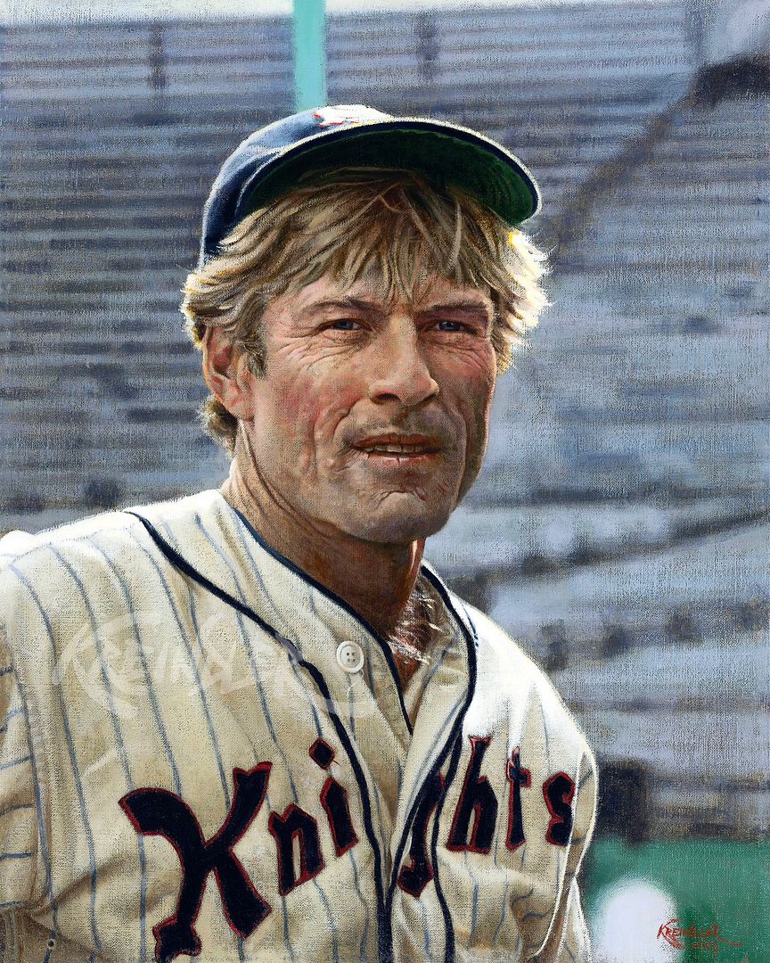 Roy Hobbs, 1939 (Robert Redford, 1983), 20" x 16" The client who commissioned it actually came by the studio the other day to see it in person (it'll ship out in a few weeks), and he was sad about Robert's passing. But, I do know that hes going to be using the painting in some sort of 50th anniversary celebration of the movie, so I'm curious to see what he has in mind. The image itself I thought was pretty cool. Aside from Redford being handsome, I just love that back-lighting, especially as it illuminates Robert's strawberry blonde hair. It's also pretty cool to have the War Memorial Stadium stands in the background. Overall, it was just a fun one! Andrew! Cool that you saw that one. I had forgotten that it was there until I went into the room last winter--it was a nice surprise. It's interesting seeing it now though, as there are things that I would have handled differently, had the painting still been in my possession. I guess that's not a bad thing though, as it shows that I'm growing. Or something. I think. Graig
__________________
Check out my baseball artwork: www.graigkreindler.com www.twitter.com/graigkreindler www.facebook.com/graigkreindler
|
|
#1349
09-25-2025, 04:46 PM
|
||||
|
||||
|
Hey all,
Thought Id share another one I got back from the photographers recently: 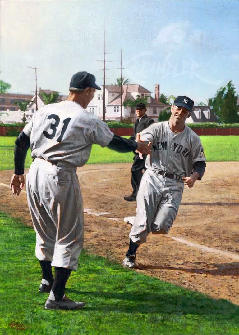 Mickey Mantle, March 26, 1951, 20 x 28 Ive been a fan of this image for such a long time. Well, the photograph its based on, I mean. The quality of light is exactly the kind of thing that I get off on, and adding to that, a smiling Mickey Mantle about to enter his rookie seasonI just think its super special. The story behind this particular game has been eloquently described in Jane Leavys book The Last Boy: Mickey Mantle and the End of Americas Childhood. For those who havent read that one, its VERY much worth the effort, especially since we think we know everything there is to know about the man. Jane certainly proved me wrong when I first read it all those years ago. Anywho, you can read a bit about the game here: https://thegloryofbaseball.blogspot....ickey.html?m=1 And believe me, this chapter is so incredible in Janes book. The whole notion that this game was, according to Justin Dedeaux (the USC batboy who was sitting with Mantle that day), "the day the whole world opened up" is the chef's kiss. Painting the image proved to be a bit of a challenge, as it was tough to find much information on Bovard Field in terms of color, but my guesses are all based on pertinent research. Admittedly, the one Im a bit iffy on is the outfield wall. In a color photograph from the mid-70s, that same wall was that deep maroon color associated with USC. And since that color has been synonymous with the college since time began, I thought it wouldnt have been a stretch to say that it could have been that color in 1951. The newspapers of the day made no mention of it, but if I ever find out that my guess was incorrect, the painting is going to a client who lives close by andll let me fix it. 😊 But man, that sun light! And those late afternoon shadows!! All of that reflected light!!! And the palm trees!!!! Everything a painter could want. Hope yall dig it, and as usual, feel free to reach out with questions, comments and critiques. Thanks for reading!! Graig
__________________
Check out my baseball artwork: www.graigkreindler.com www.twitter.com/graigkreindler www.facebook.com/graigkreindler
|
|
#1350
09-28-2025, 03:22 PM
|
||||
|
||||
|
Great arwork and thanks for sharing the story, Graig.
Someday you might be working on it again... Quote:
__________________
Leon Luckey www.luckeycards.com
|
 |
| Thread Tools | |
| Display Modes | |
|
|
 Similar Threads
|
||||
| Thread | Thread Starter | Forum | Replies | Last Post |
| 68 Topps 3D Easel | Archive | Postwar Baseball Cards Forum (Pre-1980) | 1 | 04-22-2008 02:17 PM |


 Linear Mode

