|
||||||
 |
|
|||||
|
||||||
|
|
|||||
|
|
|
#1
 08-14-2024, 05:59 AM
|
|||
|
|||
|
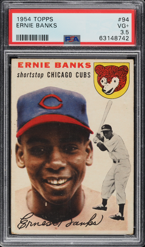
Interesting thread. I always used to prefer sharp corners over centering until I ran into this set. No matter how centered the card is, they always look off center T to B because of the way they were printed. I prefer strong centering L to R, with a wide enough space above the name

|
|
#2
08-15-2024, 12:57 PM
|
||||
|
||||
|
Quote:
Yeah, its a nightmare set for centering purists. Im not in my normal card collecting life, but have discovered over the years that if the centering affects how design elements (like name, secondary image on 54 Topps) are positioned in relation to the edge of the card, I quickly become a centering freak. Another example of this for me is the team lettering on 1963 Topps. With the colored full-bleed bottom border, 63s can sometimes be o/c and not really look it - but I absolutely hate it when the team name shows little or no color beneath it and looks like it was almost cut off at the bottom of the card. I recently got rid of an otherwise very clean 63 Mantle due to this problem. I digress. 54 especially after you see uncut sheets is really just odd. The names for a lot are pushed to the top by virtue of the design and there is just not much room for error when its also badly OC. Same with the black and white action player image, many of which on the cards were designed to encroach into the border as almost a little gimmick. Im a Cubs fan and the Banks RC was a must for me and my team set endeavors, but I am NOT a fan in general of the 1954 Topps layout. Sent from my iPad using Tapatalk
__________________
Postwar stars & HOF'ers. Cubs of all eras. Currently working on 1956, '63 and '72 Topps complete sets.
|
|
#4
08-20-2024, 08:17 AM
|
||||
|
||||
|
Quote:
Very nice. Cant do much better than that up top, and you have nice s-s centering as well. I was actually looking for a card like that in the 3, 3.5 range - but figured I had better pounce on the 4 I found with it when I did. I had looked in Cleveland for 3+ hours and not found one that nice. Sent from my iPad using Tapatalk
__________________
Postwar stars & HOF'ers. Cubs of all eras. Currently working on 1956, '63 and '72 Topps complete sets.
|
 |
|
|
 Similar Threads
|
||||
| Thread | Thread Starter | Forum | Replies | Last Post |
| 1954 topps #128 Hank Henry Aaron HOF RC no creases decent centering SGC A nice card | Republicaninmass | 1950 to 1959 Baseball cards- B/S/T | 24 | 12-05-2021 08:32 AM |
| top-bottom centering on 1954 Topps | darwinbulldog | Postwar Baseball Cards Forum (Pre-1980) | 4 | 02-17-2020 07:58 AM |
| WTB 1954 Topps Banks | Peter_Spaeth | 1950 to 1959 Baseball cards- B/S/T | 0 | 02-17-2016 02:17 PM |
| FS 1954 Topps Kaline RC $200 50/50 centering | jjcollects | 1950 to 1959 Baseball cards- B/S/T | 1 | 08-17-2013 01:36 PM |
| 1954 Topps Al Kaline PSA 5 1954 Topps Ernie Banks PSA 3 MC | Sean1125 | Ebay, Auction and other Venues Announcement- B/S/T | 0 | 05-18-2013 11:00 AM |


 Hybrid Mode
