|
||||||
 |
|
|||||
|
||||||
|
|
|||||
|
#501
 02-21-2016, 02:19 PM
|
||||
|
||||
|
Quote:

|
|
#502
02-21-2016, 02:29 PM
|
||||
|
||||
|
Quote:
Guess those bidding on the card I posted think it is something special based on what they are bidding on the card for. No harm in trying to bump it up I guess?? 
__________________
52 Topps cards. https://www.flickr.com/photos/144160280@N05/ http://www.net54baseball.com/album.php?albumid=922
|
|
#503
03-01-2016, 01:07 PM
|
|||
|
|||
|
1928 Harrington's with and without the apostrophe. Also the backs can be different by an extra offer
|
|
#505
03-02-2016, 09:42 AM
|
|||
|
|||
|
looks like it sat in the sun and is faded
|
|
#506
03-02-2016, 10:28 AM
|
|||
|
|||
|
Finally we have a real variation man in this thread
 ....welcome
|
|
#507
03-03-2016, 01:19 PM
|
|||
|
|||
|
thanks I do many variations and the miscut, faded, etc. are not variations. those are factory errors and mainly worthless. example of a true variation is the 1967 bolin white streak. a miscut card of a 1968 johnny bench rookie card showing half his face is worth zero unless you use it as a conversation piece showing on how bad quality control was back then.
|
|
#508
03-03-2016, 02:51 PM
|
|||
|
|||
|
What is your personal definition of a "true variation " ?
Do you think the Bolin was an intentionally corrected error or an unintended recurring print defect, and in either event how could one tell....or does it matter ?
|
|
#509
03-03-2016, 06:40 PM
|
||||
|
||||
|
Quote:
|
|
#510
03-04-2016, 08:35 AM
|
|||
|
|||
|
The 1967 cards I agree that they are "printing flaws" but they we corrected. I do not recognize such errors as miscuts, print dots or faded. if the printing company made a correction, then I believe it is a variation - 1969 white letters - 1966 purple tree Heffner. this could be argued all day long.
|
|
#511
03-04-2016, 12:30 PM
|
|||
|
|||
|
If they were intentionally corrected it would be a "true variation". Examples would be the 1959 Spahn DOBs or traded/optioned cards....no doubts.
But agree with Cliff the 67s could well be unintentional print defects that simply occurred in some runs but we're not detected. There are thousands of such defects, including in my mind the 58 Herrer and 57 Bakep. There is no way to tell if such cards were early run errors that were intentionally corrected, or just a temporary undetected defect in the printing process. I think the no name Thomas may also have been a temporary unintentional recurring print defect. On most such cards, you simply can not tell if a recurring print defect was intentionally corrected. The hobby recognizes some but not others. For myself, a true variation is a card that the manufacturer clearly changed intentionally, or a card that differs from it's counterparts because an intentional change was made in the printing process itself....the 62 greenies and double print differences such as occurred in the 52 Mantle, Robinson and Thompson are examples of the latter. But that's just me and many may disagree. If you read this entire thread you can see this debate played over and over. There is not recognized hobby standard, so to each their own. Many in here , myself included, collect variants ( cards that differ from their common counterpart) whether they are "true variations"or not. Look forward to you contributions to the thread
|
|
#512
03-04-2016, 01:10 PM
|
||||
|
||||
|
Quote:
|
|
#513
03-12-2016, 09:59 AM
|
|||
|
|||
|
I know everyone is aware of the green bleed on the back of some, but here is a frontal version difference. The left version has a short blue line to the left of Podres' head and a black mark of some kind in the upper right margin. There is also a border break at the top.
|
|
#514
03-15-2016, 06:11 PM
|
||||
|
||||
|
I had not come across this recurring print variation until today....Del has a dark blue line extending from the "M" on his cap across the bill of his cap to his forehead. Found one copy on ebay in addition to my copy.
Last edited by savedfrommyspokes; 03-15-2016 at 06:25 PM.
|
|
#515
03-16-2016, 11:18 AM
|
|||
|
|||
|
Picked some of these up after seeing them on a web site devoted to the 1959 set. Apologize for dark scans...having scanner issues. All are recurring
The Grammas may be a real variation, since the blob appears to have been airbrushed before being eliminated. The Hall has a couple of errant yellow dots. The Finnigan has a black dot on his chin that looks like it is part of the auto but is not and is not present on most cards. It would be clear on a better scan. 198 Davenport...bad back scan, has distinct line extending through back # into bio below. Bessent has a blue line through the 2nd S in his name. Burton 231 (dark scan) has a red tail at the top right of bio box on back. Wise has a red mark under cartoon on back. The Senators card ( dark scan) has a divot out of the W in Washington, a dot above the players to right of Senators and some dark marks right of the logo. These three things are recurring and occur together. On Burdette the L in his name has a tail and on Throneberry there is printers mark, which differs in dimensions, in lower right front border 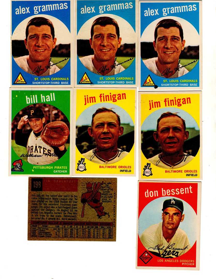 
|
|
#516
03-16-2016, 12:06 PM
|
||||
|
||||
|
Nice P/Us.....the back of the 181 Porterfield card has the extension of the line found on back of the 198 Davenport card.
Cliff posted a pic here: http://www.net54baseball.com/showthread.php?t=171784
|
|
#517
03-16-2016, 01:16 PM
|
|||
|
|||
|
There is some possibility the Finnigan is a variation. The dot on his chin may have been an errant dot for the i in Finnigan that was removed due to it's location on his face...maybe not
Davie has print defects in bottom of Tiger logo. Yellow outside the cat and on right red inside 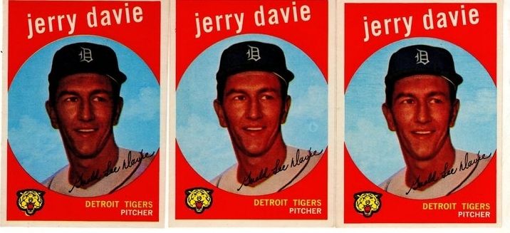
Last edited by ALR-bishop; 03-16-2016 at 01:33 PM.
|
|
#518
03-16-2016, 01:41 PM
|
|||
|
|||
|
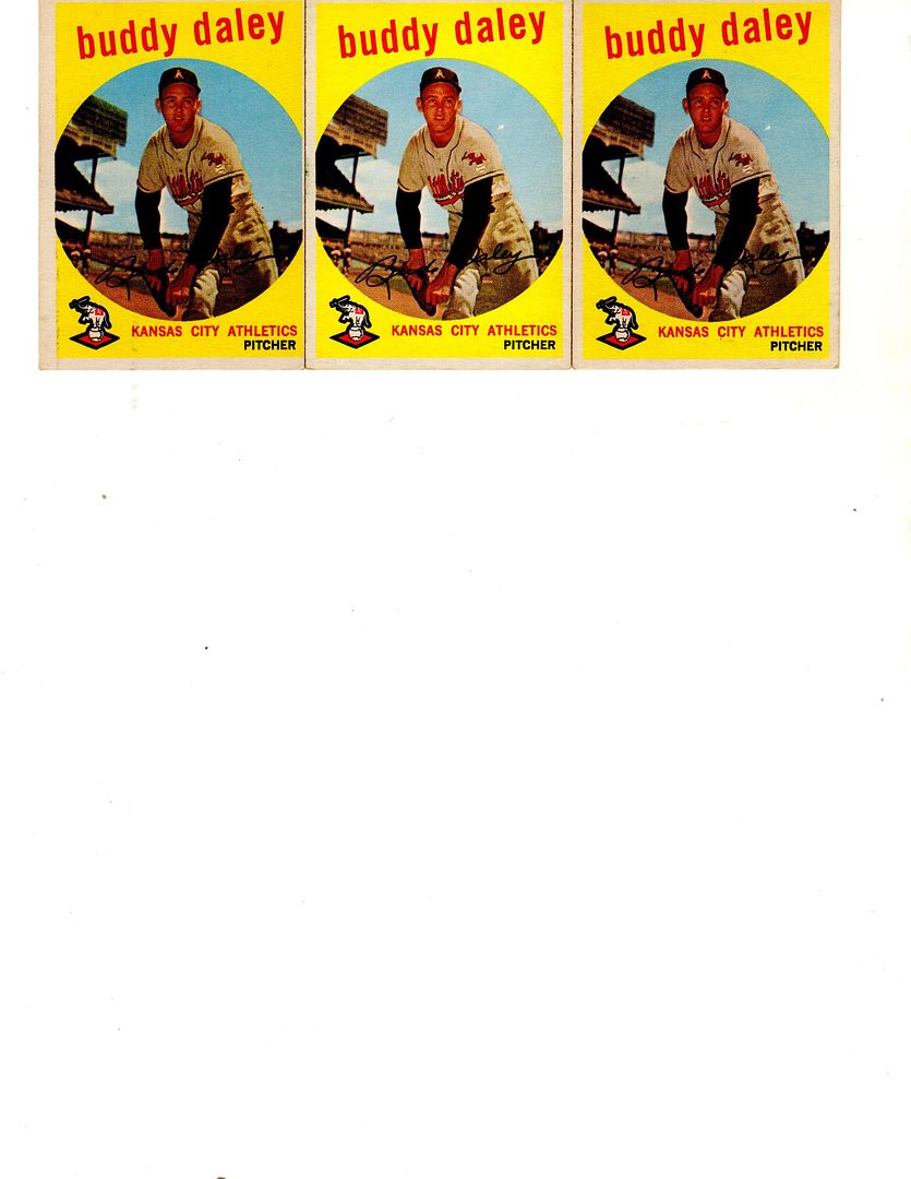
On Daley the card without the white dot is a WB, but the white dot appears on both white and gray back cards
|
|
#519
03-20-2016, 03:13 PM
|
|||
|
|||
|
Junk Wax Variation from sheet A* not A*B. The bold back seems to be the same as the cards used in Desert Shield and Desert Storm and also part of the bold back set. These were out of wax packs.
Last edited by rgpete; 03-20-2016 at 03:50 PM.
|
|
#520
03-21-2016, 12:26 PM
|
||||
|
||||
|
I have not seen the two white lines that cross the "I", "N" and top left corner of the "D" in the team's name previously discussed. Out of about 120 copies between ebay and COMC, I found 4 copies which have the white lines across the team name.
|
|
#522
03-21-2016, 05:17 PM
|
|||
|
|||
|
Ted--In 1982 Topps had its Blackless and apparently in 1949 Bowman had it's Yellowless
|
|
#523
03-21-2016, 07:57 PM
|
|||
|
|||
|
Quote:
Hey Al The color printing errors of the early Bowman's are all over the place. Here are some more examples.  TED Z .
|
|
#525
03-24-2016, 02:21 PM
|
||||
|
||||
|
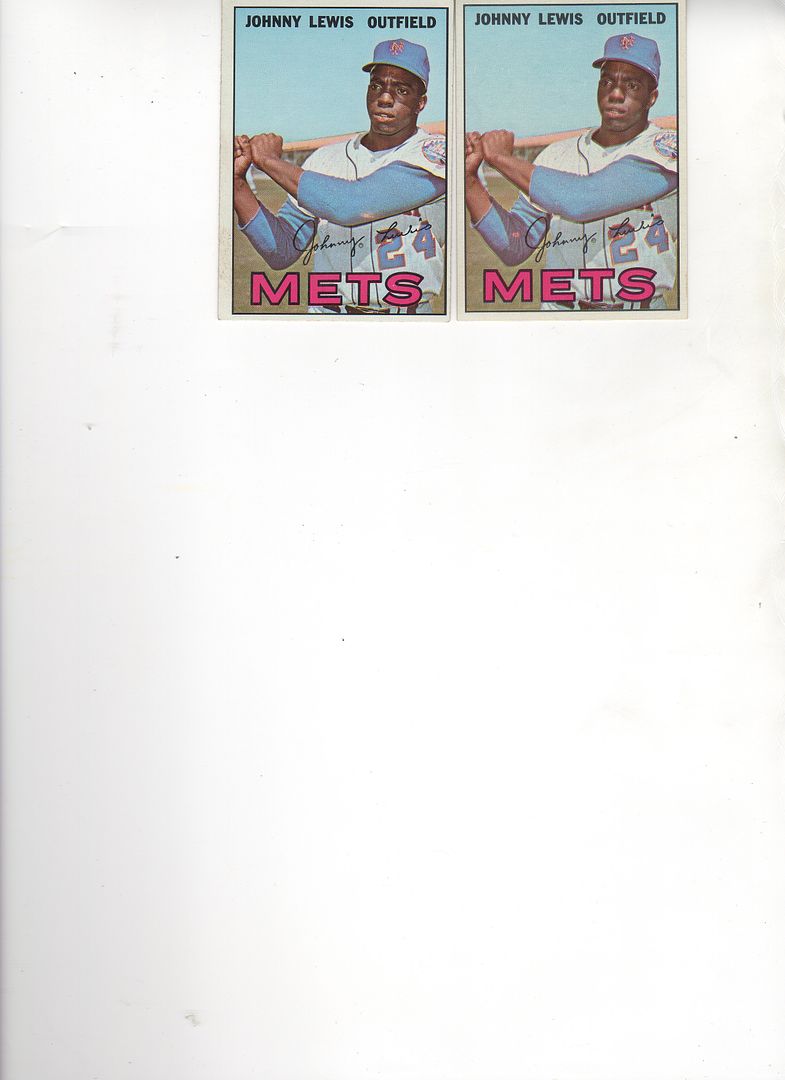
While there are other print variations noted for this card, I had not seen the recurring white spot above the "O" in Johnny before today. The white spot's size does vary from card to card also.
|
|
#526
03-24-2016, 09:40 PM
|
|||
|
|||
|
what are the other Lewis variants for 67 ?
|
|
#527
03-25-2016, 07:18 AM
|
||||
|
||||
|
Richard D's variation list notes these other two variations for the 67 #91 card: 1)Light pink stain / mark on left elbow, 2)Gap in horizontal line under H on stats reverse
|
|
#528
03-25-2016, 09:21 AM
|
|||
|
|||
|
Do you know if there is a version of the card without the gap ?
Last edited by ALR-bishop; 03-25-2016 at 09:21 AM.
|
|
#529
03-25-2016, 05:31 PM
|
||||
|
||||
|
I do have both...the one pictured above in the original post about this card has the "filled in" line. You can see where the gap has been unevenly filled in.
|
|
#531
03-28-2016, 11:38 AM
|
|||
|
|||
|
Larry---finally found a Lewis with no gap, but they are definitely in the minority
Tom---you need to get a hobby...no...wait....never mind
|
|
#533
03-29-2016, 02:12 PM
|
|||
|
|||
|
Hi All:
While this is not a PRINT variation, it is a variation none the less. Luzinski Penn Emblem Patch with and without pinstripes on his left shoulder. Without seems to be the harder to find Anyone else have this or other variations in the Penn Emblems? Fred
|
|
#534
03-30-2016, 12:15 PM
|
|||
|
|||
|
I don't collect them but that is an interesting find, Fred
|
|
#535
03-30-2016, 05:50 PM
|
||||
|
||||
|
I have a complete 1962 green tint set for trade, and I noticed that my Murphy has a weird white line floating in the sky. It's not an after-market defect, as it's actually part of the printing of the card. So I did some searching through ebay completed auctions and I found another one (card on the left) with this same anomaly. It's not in the exact same position (just a hair further to the right), but it is the exact same line. These are the only two I have seen.
__________________
All the cool kids love my YouTube Channel:
Elm's Adventures in Cardboard Land  https://www.youtube.com/@TheJollyElm Looking to trade? Here's my bucket: https://www.flickr.com/photos/152396...57685904801706 I was such a dangerous hitter I even got intentional walks during batting practice. Casey Stengel Spelling "Yastrzemski" correctly without needing to look it up since the 1980s. Overpaying yesterday is simply underpaying tomorrow. 
|
|
#536
03-31-2016, 02:28 PM
|
|||
|
|||
|
Pink can be on either arm...both together ?
|
|
#537
04-02-2016, 09:18 PM
|
||||
|
||||
|
Good ole Teddy comes with and without those two red spots/slashes above "RED" and below "SOX" at the border.
1957tedwilliams.jpg
__________________
All the cool kids love my YouTube Channel:
Elm's Adventures in Cardboard Land https://www.youtube.com/@TheJollyElm Looking to trade? Here's my bucket: https://www.flickr.com/photos/152396...57685904801706 I was such a dangerous hitter I even got intentional walks during batting practice. Casey Stengel Spelling "Yastrzemski" correctly without needing to look it up since the 1980s. Overpaying yesterday is simply underpaying tomorrow.
|
|
#538
04-03-2016, 03:41 PM
|
|||
|
|||
|
I was putting away some recent purchases today and noticed what seems to be some sort of airbrush job on this card. I am being lazy and using ebay scans, but my pair of cards have a similar difference.
__________________
Looking for: Unique Steve Garvey items, select Dodgers Postcards & Team Issue photos
|
|
#539
04-03-2016, 04:25 PM
|
|||
|
|||
|
Very noticeable difference Curt. Looks like a shadow was removed
Interesting on Williams Darren. Not hard to find the red dot ones....just a little expensive :-) Last edited by ALR-bishop; 04-03-2016 at 04:28 PM.
|
|
#540
04-03-2016, 07:32 PM
|
||||
|
||||
|
Most every card Post Cereal card cut from a box has at least one if not multiple variations. These variations mainly with involve the cropping of the image (these two copies of this card are also cropped different), but also with variances with the color/brightness of either the background or players image (as in this case). Most of these variances are due to what original product type the card appeared on.
|
|
#541
04-06-2016, 01:14 PM
|
||||
|
||||
|
I had not noticed until today that the black left border of this card comes either "straight" or "slightly indented" at top and middle. After a very quick look through available copies, it appears that approximately 9 of 10 have the straight edge. Here are two copies of the "slightly indented" left border.
|
|
#542
04-06-2016, 06:32 PM
|
|||
|
|||
|
Larry-- you simply have to start noticing these things sooner
|
|
#543
04-07-2016, 05:37 AM
|
||||
|
||||
|
Quote:
|
|
#545
04-08-2016, 10:38 AM
|
|||
|
|||
|
Tom-- I finished out my 1960 set in gray and white back. My gray back is white and the white back is blue. Do you know if that difference always corresponds with the different backs ?
|
|
#546
04-08-2016, 12:48 PM
|
||||
|
||||
|
These two copies of Cal's 58 Topps card both have what appears to be a small cursive style "L" just to the left of his cap bill.
|
|
#547
04-08-2016, 07:46 PM
|
|||
|
|||
|
The comment is correct. For all 3 years of Post Cereal, the front of the box colors dictated the print. So depending on what cereal box they were on the shades and croppings could be different. This also occurred in the Football set and the 2 Jello sets.
|
|
#548
04-08-2016, 08:01 PM
|
||||
|
||||
|
This isn't exactly scientific or anything, but if you look on COMC it seems all of the Wagner cards that are missing the blue are grey backs.
__________________
All the cool kids love my YouTube Channel:
Elm's Adventures in Cardboard Land https://www.youtube.com/@TheJollyElm Looking to trade? Here's my bucket: https://www.flickr.com/photos/152396...57685904801706 I was such a dangerous hitter I even got intentional walks during batting practice. Casey Stengel Spelling "Yastrzemski" correctly without needing to look it up since the 1980s. Overpaying yesterday is simply underpaying tomorrow.
|
|
#550
04-10-2016, 05:24 PM
|
||||
|
||||
|
Some 1965 AL ERA Leaders cards have that weird black and red mark running across the bottom
1965eraleadervar.jpg
__________________
All the cool kids love my YouTube Channel:
Elm's Adventures in Cardboard Land https://www.youtube.com/@TheJollyElm Looking to trade? Here's my bucket: https://www.flickr.com/photos/152396...57685904801706 I was such a dangerous hitter I even got intentional walks during batting practice. Casey Stengel Spelling "Yastrzemski" correctly without needing to look it up since the 1980s. Overpaying yesterday is simply underpaying tomorrow.
|
 |
|
|
 Similar Threads
|
||||
| Thread | Thread Starter | Forum | Replies | Last Post |
| 1966 Topps High # Print Variations | 4reals | Postwar Baseball Cards Forum (Pre-1980) | 9 | 04-27-2014 06:05 PM |
| Are these variations or print defects? | savedfrommyspokes | Postwar Baseball Cards Forum (Pre-1980) | 16 | 02-09-2013 11:52 AM |
| Well known print defects. Do variations exist without? | novakjr | Postwar Baseball Cards Forum (Pre-1980) | 9 | 01-28-2011 04:32 PM |
| Finally confirmed - d311 print variations exist! ("bluegrass" variations) | shammus | Net54baseball Vintage (WWII & Older) Baseball Cards & New Member Introductions | 8 | 09-03-2010 07:58 PM |
| Wanted: T206 Print Variations and Errors | Archive | Tobacco (T) cards, except T206 B/S/T | 1 | 01-04-2007 07:23 PM |


 Linear Mode

