|
||||||
 |
|
|||||
|
||||||
|
|
|||||
|
#152
 05-18-2010, 03:39 PM
|
||||
|
||||
|
Graig,
How long does it take you to just draw the photos out. Last edited by yanks12025; 05-18-2010 at 03:41 PM. 
|
|
#153
05-18-2010, 04:33 PM
|
||||
|
||||
|
Brian, thank you SO much. You're always welcome in!
Brock, it really varies with the sizes and complexities and all. The smaller portrait shots are only a few hours, but as we get larger and larger, they can take up to a week to get just right. And that can even be with gridding it all off. It's actually my least favorite part of the process, as I just want to get to the painting!
__________________
Check out my baseball artwork: www.graigkreindler.com www.twitter.com/graigkreindler www.facebook.com/graigkreindler
|
|
#154
05-18-2010, 04:37 PM
|
||||
|
||||
|
Graig,
I figured your answer would be something like that. Though I do agree with terjung, you see things in a different way than the rest of us. Or perhaps it's just that you can put to words why people feel they way they do about specific works of paintings. I think most of us don't specifically identify light/shade as the reason we like a painting. Most just say it looks realistic or use some other adjective without identfying that the control of light is the reason it looks the way it does. Again, great stuff buddy. Ben, Cut Graig some slack, after all he is a painter, not a writer. Perhaps he could loathe you....Is that better? Mark
__________________
My signed 1934 Goudey set(in progress). https://flic.kr/s/aHsjFuyogy Other interests/sets/collectibles. https://www.flickr.com/photos/96571220@N08/albums My for sale or trade photobucket album https://flic.kr/s/aHsk7c1SRL
|
|
#155
05-18-2010, 09:48 PM
|
||||
|
||||
|
I'm still waiting to hear why that little guy in the upper-right is leaning at a 45 degree angle. I keep reading and reading (and there's no explanation)
 Graig, please clarify and try to put more effort into your replies. Just kidding of course... this is the greatest thread in the whole forum, IMO and you can add me to the list of awe-struck admirers. Thanks so much for your incredibly insightful responses and for sharing your amazingly beautiful work!
|
|
#156
05-18-2010, 11:12 PM
|
||||
|
||||
|
Quote:

__________________
David McDonald Greetings and Love to One and All Anything is possible if you don't know what you're talking about. Last edited by Kawika; 05-28-2010 at 09:14 PM. Reason: spelling
|
|
#157
05-18-2010, 11:51 PM
|
||||
|
||||
 The word 'succinct' is not in my vocabulary!! I'm pretty sure that the guy in the right hand corner is pulling at some sort of barrier, perhaps a rope or something. I know it's hard to tell in the scan I provided, but that crowd in the foreground is actually being held back by a similar rope. For some reason, I haven't been able to upload anything to Photobucket for a few days, so I can't show a detail right now. Once I figure it out, I'll post a bigger shot. Though, I do like that banner, David - who knew that Bobby Jones was a pimp?! And Mark, that's kind of what it comes down to. It's weird that I see the world in the way that I do. Well, maybe not weird, but you know what I mean. I just can't not dissect every bit of information I have in front of me. And I know that most of it comes from going to art school and all, especially considering the teachers I had there. But yeah, it just seems like I'm always drawn to the way light falls on things. And that doesn't have to be bright light or anything, but just the concept of it in general. I guess that's why I paint the way I paint. Someone like Ron Stark might paint the way he paints for a completely different reason, and the same goes for Purdom, Neiman and the like. And by no means is that a bad thing, it's just that different things inspire us to create what we do. I think that's really the true meaning of the word 'style' when it comes to painting. It's not necessarily what school of rules you follow, it's what inspires you to get up and paint in the first place. Alright, I'm really shutting up now. Succinct! Succinct! Succinct!!
__________________
Check out my baseball artwork: www.graigkreindler.com www.twitter.com/graigkreindler www.facebook.com/graigkreindler
|
|
#159
05-19-2010, 12:08 AM
|
||||
|
||||
|
Hey Andrew! I will be at the National this year, though I won't have a booth. I plan on going for the majority of it to look around. And of course, hang out with some good people.
But yeah, I wasn't able to do much for inventory this year, as I've been super backed up with commissions. But, we are shooting for next year, I think. The only event happening in the near future (that I'm aware of) is a talk I'll be giving at the Norman Rockwell Museum in Stockbridge, MA over July 4th weekend.
__________________
Check out my baseball artwork: www.graigkreindler.com www.twitter.com/graigkreindler www.facebook.com/graigkreindler
|
|
#160
05-20-2010, 12:26 PM
|
||||
|
||||
|
Thats too bad. I was looking forward to seeing your work at the National up close. Well I guess thats something I have to look forward to at the next National which will be in Chicago I believe. Since that is my hometown I will make sure I make that one!!
Keep up the great work!! You do amazing stuff!
|
|
#161
05-20-2010, 12:37 PM
|
||||
|
||||
|
Thanks for the compliments, Andrew! I'm sorry we're not setting up shop there this year, as I really enjoyed the experience in Cleveland. I might actually have a painting or two to drop off with clients at the show though, so you're most likely welcome to see those if they make the trip to Baltimore.
And really, if next years show is in Chicago, I couldn't see us not being there. Out of all of the cities they've had it in, Chi-town has to have one of the richest art cultures, something that my agent can't say 'no' to. He's definitely been to hundreds of art expos and conventions there over the years, and he's had nothing but wonderful things to say about it.
__________________
Check out my baseball artwork: www.graigkreindler.com www.twitter.com/graigkreindler www.facebook.com/graigkreindler
|
|
#162
06-26-2010, 01:36 PM
|
||||
|
||||
|
Graig, how about an update!
Also, by any chance, will you be 1) attending the National (Baltimore, in August) and 2) bringing any pieces w/u to the National? Rob 
|
|
#163
06-26-2010, 07:42 PM
|
||||
|
||||
|
Quote:
|
|
#164
06-28-2010, 04:14 PM
|
||||
|
||||
|
Hey Rob,
Thanks for the shout-out! I just got these two back from the photographer. The first image is of Bob Feller after pitching a one-hitter against the Red Sox on July 31, 1946. That one measures 28" x 30". The second image should be pretty familiar, I hope. It measures at 22" x 28". 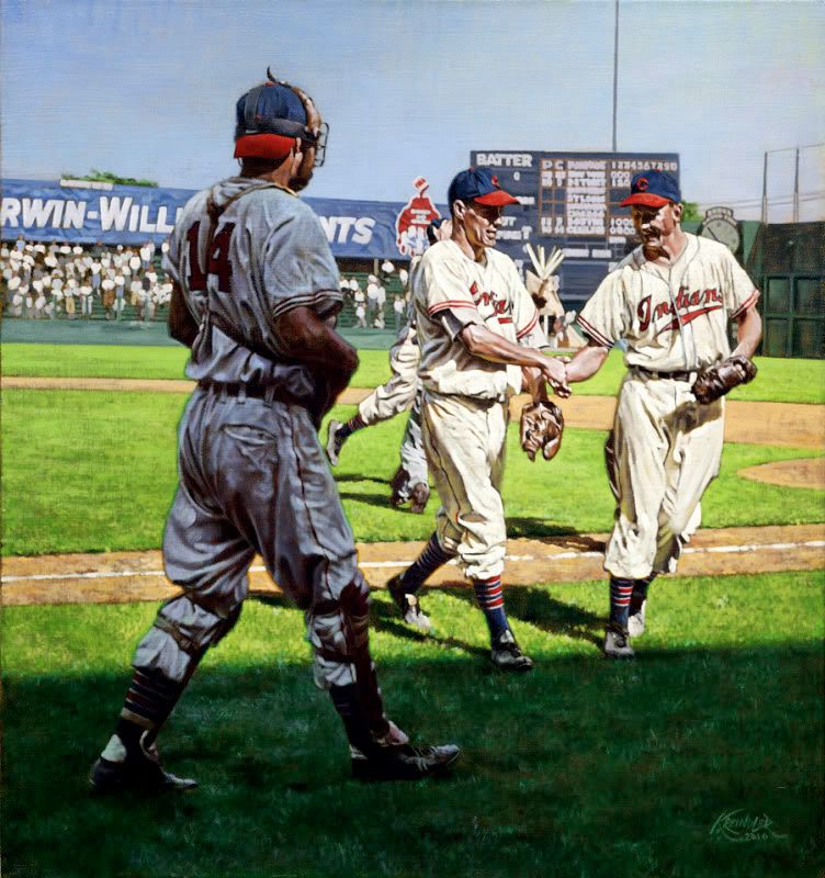  I have another painting that should be coming back soon too, as well as a few works in progress. Aside from starting some of the commissions for board members, I have these going on - and as usual, please excuse the poor photography:  Jackie stealing home against the Phillies, July 2, 1950. It's got a long ways to go, but it's starting to get there! It's a nice size at 24" x 32", and if some of you remember, was in progress at the National last year.  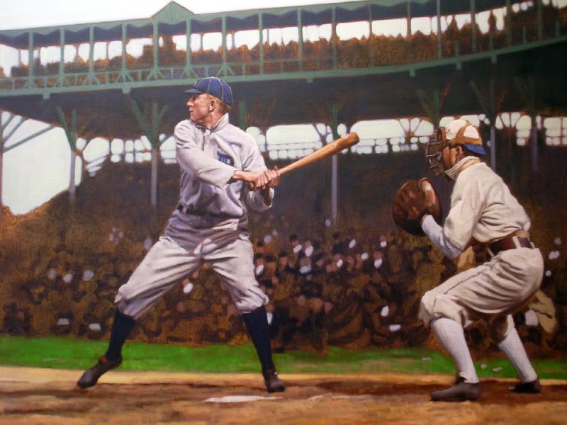 Ty Cobb batting against the White Sox on Opening Day, April 14, 1908 in Chicago's South Side Grounds. Cobb went 3-5 with a homer, but the Sox ended up with the victory. This bad boy's going to worked on a lot this week, and at 40" x 62", is quite the undertaking. 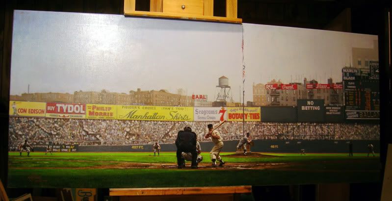 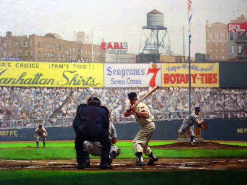 At 30" x 70", this is Mickey Mantle during a mid September game of his rookie year. Facing Feller and the Indians on that September 16 contest, the Yanks came up on top and took over first place for good. Regarding the National, I won't be there exhibiting this year unfortunately. However, I do know that Dean has plans to work something out for the Chicago version next year, which I think will be another wonderful opportunity. Man, I just had so much fun last year. Though, I will actually be in attendance at the National on Friday, Saturday, and Sunday, but only as a spectator. I'm really hoping that I can purchase some nice photos for future paintings and basically look around a lot (I feel like I didn't really get the chance last year). I know that I already have plans to meet up with some of you again, so I'm super stoked!!! I may bring a painting or two down there, but I don't even know if it would make it past the hotel doors. I guess it all depends on what I can fit into the car, and what people actually want to see. I guess if you're dying to see something in person, let me know and we'll see if I can work it out. This weekend, if you guys are in the Massachusetts area, I'll be giving a talk at the Norman Rockwell Museum in Stockbridge on Saturday. It's their annual celebration of the National game and they've been kind enough to give me some time to make a fool of myself. So, if you want to come on by, bring some tomatoes! Hope y'all dig it! Graig
__________________
Check out my baseball artwork: www.graigkreindler.com www.twitter.com/graigkreindler www.facebook.com/graigkreindler
|
|
#167
06-28-2010, 06:42 PM
|
||||
|
||||
|
Thanks, guys.
And David, if I'm not human, why couldn't I have been made taller??
__________________
Check out my baseball artwork: www.graigkreindler.com www.twitter.com/graigkreindler www.facebook.com/graigkreindler
|
|
#169
06-28-2010, 08:57 PM
|
||||
|
||||
|
of the three is you again?
PS - very nice work, Graig, as usual.
__________________
www.thetriple-l.com
|
|
#170
06-28-2010, 10:07 PM
|
||||
|
||||
|
Graig,
What is it with you? Can't you just tip your cap and say thank you?  Quote:
__________________
[I]"When you photograph people in colour you photograph their clothes. But when you photograph people in B&W, you photograph their souls." ~Ted Grant Www.weingartensvintage.com https://www.facebook.com/WeingartensVintage http://www.psacard.com/Articles/Arti...ben-weingarten ALWAYS BUYING BABE RUTH RED SOX TYPE 1 PHOTOGRAPHS--->To add to my collection
|
|
#171
06-29-2010, 12:05 AM
|
||||
|
||||
|
__________________
Check out my baseball artwork: www.graigkreindler.com www.twitter.com/graigkreindler www.facebook.com/graigkreindler
|
|
#172
07-02-2010, 11:07 AM
|
||||
|
||||
|
Hey all,
Just wanted to wish y'all a happy 4th, as I'll be in Stockbridge, MA for the Norman Rockwell thing. If any of you happen to be in the area on Saturday and want to check it out, you can get more info here: http://www.nrm.org/2010/06/play-ball...ican-festival/ I'll be going on at around 2 PM, I think. Either way, everyone stay safe this weekend! Graig
__________________
Check out my baseball artwork: www.graigkreindler.com www.twitter.com/graigkreindler www.facebook.com/graigkreindler
|
|
#174
07-14-2010, 09:02 PM
|
||||
|
||||
|
Hey guys!!
Check out this cool baseball art article from MLB.com, which I'm lucky enough to be featured in. http://www.mlb.com/news/article.jsp?...=.jsp&c_id=mlb What's interesting is that under the first gallery, my work comes right after Rockwell's in the pecking order. Whoa. Now that's humbling. Also, jut got this guy back from the photographers - my father's birthday present. Always the Mantle fan, I figured it was the perfect image for him. 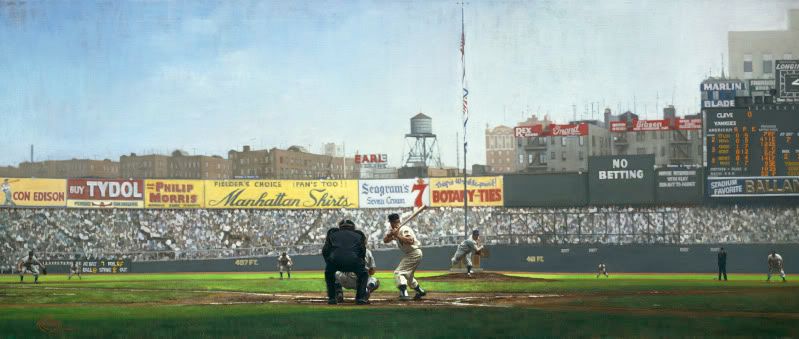 Thanks for looking! Graig
__________________
Check out my baseball artwork: www.graigkreindler.com www.twitter.com/graigkreindler www.facebook.com/graigkreindler
|
|
#176
07-15-2010, 11:12 AM
|
||||
|
||||
|
Thanks for the compliments, Magic1313!
I don't have a book of my work yet, though I know my agent has been in talks with various publishers in the hopes that we can get something going at some point. In the end, I might just need to keep painting to get as many images done as possible. Though, when I get anymore information, you guys will definitely be some of the first to know!
__________________
Check out my baseball artwork: www.graigkreindler.com www.twitter.com/graigkreindler www.facebook.com/graigkreindler
|
|
#177
07-15-2010, 12:21 PM
|
||||
|
||||
|
Graig - congrats on your inclusion in the slideshow!
I've included a screenshot for everyone else. Can't say that I'm surprised, though! P.S. - would love to see the look on your father's face when he opens that one - truly one of your best, Graig. Just awesome!
|
|
#178
07-18-2010, 08:27 AM
|
||||
|
||||
|
Quote:
|
|
#179
07-18-2010, 04:37 PM
|
||||
|
||||
|
Oh, Jimmy...
And thanks so much for posting that screen-cap, Jacksons!
__________________
Check out my baseball artwork: www.graigkreindler.com www.twitter.com/graigkreindler www.facebook.com/graigkreindler
|
|
#180
08-03-2010, 08:28 PM
|
||||
|
||||
|
Hey all,
Just wanted to let you know that I'll be at the National on Friday, Saturday and Sunday, if anyone wants to meet up. I'm bringing down two works in progress, one of which is for a client - Ben (ForeverYoung). The paintings will probably spend most of their time in the hotel, but if anyone wants me to show 'em, let me know. Either way, I'm sure we'll all be hanging out a bit down there, so it would be wonderful to meet some other Net54ers. PM me if you want to get in touch... Graig
__________________
Check out my baseball artwork: www.graigkreindler.com www.twitter.com/graigkreindler www.facebook.com/graigkreindler
|
|
#181
08-26-2010, 05:04 PM
|
||||
|
||||
|
Hey all,
Here's the latest! 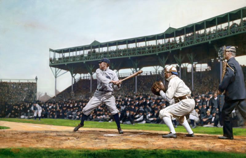 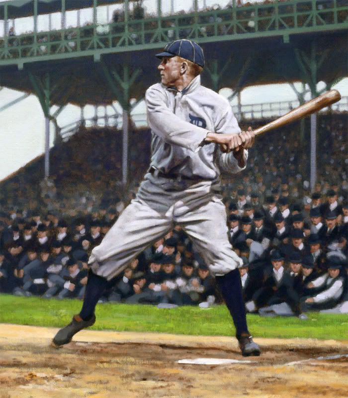 The painting illustrates Ty Cobb on April 14, 1908 - Opening Day. The Tigers were in Chicago that hazy and oddly warm afternoon, and though they lost to the locals 15-8, Cobb went 3-5 - one of his hits being a homer (the depicted) into the right field bleachers, which was certainly a rarity at the South Side Park. Obviously a good start for the Georgian, he was on his way to making the $800 promised to him by owner Frank Navin if he hit over .300 for the season. That was, of course, to complement his 'outlandish' $4000 salary. At 40" x 62", this guy was a commission, and now that I'm officially moved into my new apartment and unpacked (for the most part), I can get going on some of the other commissions from you board members - I'm sure you know who you are. Anyways, hope you dig it. As always, any comments are welcome! Thanks, Graig
__________________
Check out my baseball artwork: www.graigkreindler.com www.twitter.com/graigkreindler www.facebook.com/graigkreindler
|
|
#185
08-27-2010, 02:48 PM
|
||||
|
||||
|
Oh, Sean.
Thanks for the compliments, guys. Cobb really did seem to have a great swing. I found it interesting how his hands were so together in this image, unlike a lot of other shots we see of him, with his hands so far apart. I guess it makes sense that he hit the ball over the rightfield fence. And man, that crowd was a b*tch. There was a lot going on there and since it was so crowded, it was a little hard to create the depth of field I was looking for. Having the stands in there definitely helped a bit, as the structure right behind Cobb's head ends up being much cooler in temperature than what's above the heads of the catcher and umpire. The former really sits back the way it should, as when objects go back in space, they tend to get a little cooler in temperature and for the most part, lighter. But anyways, that structure was absolutely crucial for this painting to have any sort of dimension whatsoever.
__________________
Check out my baseball artwork: www.graigkreindler.com www.twitter.com/graigkreindler www.facebook.com/graigkreindler Last edited by GKreindler; 08-27-2010 at 02:53 PM.
|
|
#186
09-08-2010, 12:21 AM
|
||||
|
||||
|
Hey all,
Hope everyone had a wonderful Labor Day weekend. I took the time to take a break from commission stuff and work on some smaller portraits for the inventory, as well as to get the juices flowing in the new apartment. Or something. These are only a few hours in each, so none of them are done. The 9" x 12" Gehrig is probably the closest to completion, though I need to get more work on the mezzanine level, as well as soften some edges and some minor details (buttons!). Apparently, this one is already spoken for. The second is a seldom-seen Conlon shot of DiMaggio. I believe it's from '36 or '37, judging from his face. The light captured in the photograph seems a little big flat and devoid of punch, so I'm trying to exaggerate that a bit. Obviously, this 9" x 12"s not there yet, either. The least finished is the 11" x 14" of Home Run Baker. I've always adored the image it came from and I finally thought I'd give it a shot. The man looks like a friggin' ghost. I hope I can pull it off in the end. Anywho, questions, comments and crits are always welcomed! And as usual, excuse the sh*tty photography - one day, I'll get that right. Thanks for checking back! Graig 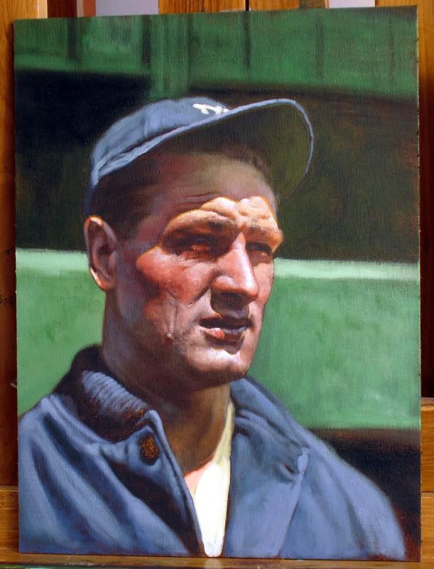 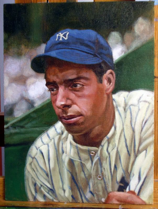 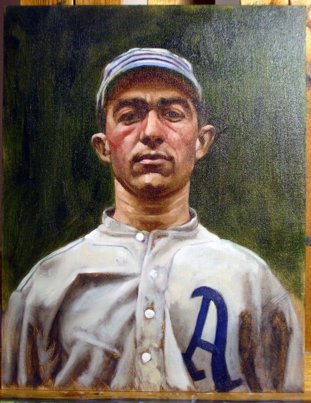
__________________
Check out my baseball artwork: www.graigkreindler.com www.twitter.com/graigkreindler www.facebook.com/graigkreindler Last edited by GKreindler; 09-08-2010 at 12:22 AM.
|
|
#187
09-08-2010, 12:29 AM
|
||||
|
||||
|
I don't think hr baker looks like a ghost at all! You are HORRIBLE!!! BOOOOOOOOO!!!!
Quote:
__________________
[I]"When you photograph people in colour you photograph their clothes. But when you photograph people in B&W, you photograph their souls." ~Ted Grant Www.weingartensvintage.com https://www.facebook.com/WeingartensVintage http://www.psacard.com/Articles/Arti...ben-weingarten ALWAYS BUYING BABE RUTH RED SOX TYPE 1 PHOTOGRAPHS--->To add to my collection Last edited by Forever Young; 09-08-2010 at 12:37 AM.
|
|
#189
09-08-2010, 12:53 AM
|
||||
|
||||
|
I prefer Leon Wolf. His attention to details is far more precise, and he doesn't come on Boards fishing for prospective buyers.
DanC P.S Did you give Baker, Shoeless Joe's ears?
__________________
An ignorant person is one who doesn't know what you have just found out---Will Rogers
|
|
#190
09-08-2010, 08:30 AM
|
||||
|
||||
|
Quote:
But we all get to like what we like when it come to art.
|
|
#193
09-08-2010, 11:26 PM
|
||||
|
||||
|
What a horrible joke to play on all these fine net54 goers. You should be ashamed of yourself. I am glad that you have embraced the Graig though.
Quote:
__________________
[I]"When you photograph people in colour you photograph their clothes. But when you photograph people in B&W, you photograph their souls." ~Ted Grant Www.weingartensvintage.com https://www.facebook.com/WeingartensVintage http://www.psacard.com/Articles/Arti...ben-weingarten ALWAYS BUYING BABE RUTH RED SOX TYPE 1 PHOTOGRAPHS--->To add to my collection
|
|
#195
09-10-2010, 01:19 AM
|
||||
|
||||
|
__________________
Check out my baseball artwork: www.graigkreindler.com www.twitter.com/graigkreindler www.facebook.com/graigkreindler
|
|
#196
10-01-2010, 01:16 PM
|
||||
|
||||
|
Hey guys,
Here are completed shots of the Gehrig and Baker paintings. Additionally, I don't remember if I posted the Foxx or not, as I just had it photographed. They also need some touching up in Photoshop to make sure the colors are where they need to be. Either way, hope y'all dig 'em! 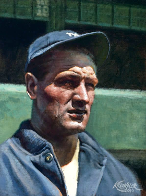 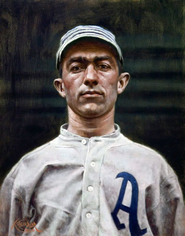 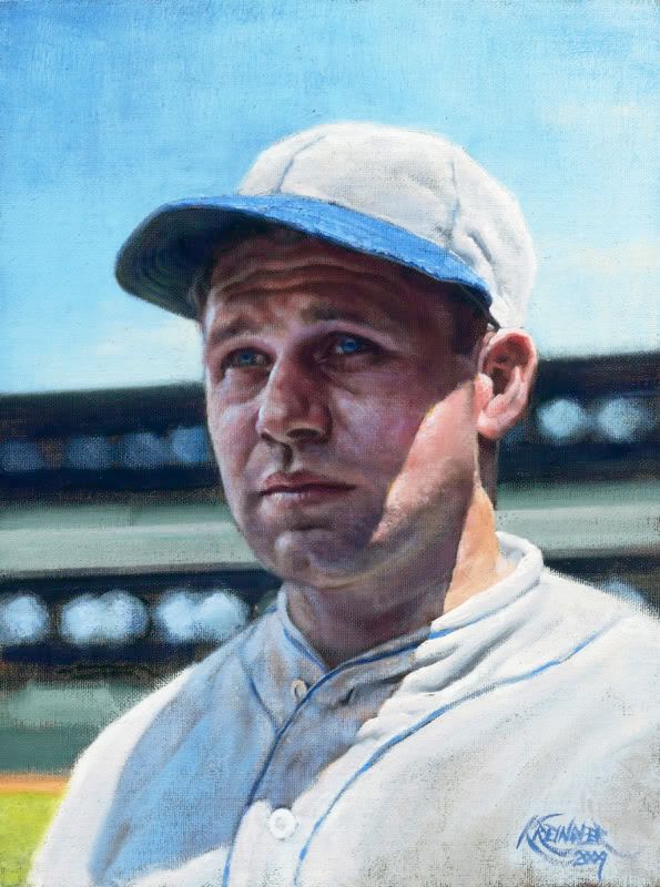 Graig
__________________
Check out my baseball artwork: www.graigkreindler.com www.twitter.com/graigkreindler www.facebook.com/graigkreindler
|
|
#199
10-06-2010, 11:16 PM
|
||||
|
||||
|
Thanks so much, Dan and Mark!
I'm pretty fond of that Baker image - I think that stare is absolutely striking. I would even say it's on par with the Conlon Mathewson image. Haunting! Graig
__________________
Check out my baseball artwork: www.graigkreindler.com www.twitter.com/graigkreindler www.facebook.com/graigkreindler
|
|
#200
10-06-2010, 11:47 PM
|
||||
|
||||
|
Haunting is right. That Baker belongs on the wall of a mansion in a Scooby Doo cartoon. I saw it in person and I think his eyes may have shifted. Good work Graig but don't go gettin' a swelled head or I'll start hurling more tomatos.
|
 |
|
|
 Similar Threads
|
||||
| Thread | Thread Starter | Forum | Replies | Last Post |
| 68 Topps 3D Easel | Archive | Postwar Baseball Cards Forum (Pre-1980) | 1 | 04-22-2008 03:17 PM |


 Linear Mode

