|
||||||
 |
|
|||||
|
||||||
|
|
|||||
|
|
|
#1
 03-16-2013, 07:48 PM
|
|||
|
|||
|
Neat story, Randy. We were Braves fans and I got three Aarons in the first game I ever got. Thanks, Dad!
Still have all the cards from my original game but don't have that particular game board. Hope this picture brings back some good memories for you. 
|
|
#3
03-16-2013, 08:30 PM
|
||||
|
||||
|
Great card Paul, here's mine, from the same sheet

|
|
#4
03-16-2013, 08:49 PM
|
|||
|
|||
|
Six Eddie Brinkman 1968 cards in chronological order:
1. Regular Brinkman, gold back, white letters, Jan-Feb 1968 2. O pee chee Brinkman, brown back, white letters, Jan-Feb 1968 3. Topps Milton Bradley Brinkman, yellow back, yellow letters, Apr 1968 The card is a beauty, looks flawless 4. Topps Milton Bradley Brinkman, yellow back, yellow letters, Apr 1968 Eddie was great with autographs before his untimely death in 2008. Had a smile as wide as the Mississippi when he signed this. 5. Topps Milton Bradley Brinkman/Winston Hill miscut, yellow back, yellow letters, Apr 1968. One of my favorite MB cards. I call it the "missing link". 6. Topps Venezuelan Brinkman, brown mustard back, yellow letters, ? in 1968. Note also the yellow letters! Between Jan/Feb 1968 and the production of the MB cards in April, Topps corrected a huge mistake they made with the white letter Brinkman and Cox. Unlike all the other 1968 Washington Senators cards, those were the only two that did not have yellow letters. In the first series, the Ed Stroud #31 and Senators rookies #96 are always found with the proper yellow letters. They continued to get it right with the Venezuelan issue. I am not an expert on that series but I assume they were produced around mid Spring. In 1968 there were 10 different color schemes for the position/team circle on the front. The Giants also had the green circle/yellow letter scheme. Perhaps the same person who didn't tint in the Cox and Brinkman in series 1 decided to reprise his error in the 5th series with the #400 McCormick card. I have looked a long time for 1968 Senators and Giants cards with white letters and haven't found any. I noticed the yellow letters on the Cox/Brinkman cards in the first MB game I got. It always bothered me that they were different from the regular 68s in my collection. That would be a pretty good clinical definition of obsessive compulsive disorder.
|
|
#5
03-17-2013, 08:32 AM
|
|||
|
|||
|
Really a neat item Carlton.
And you certainly do have a disorder, but it is one shared by several folks around these parts 
|
|
#6
03-17-2013, 09:21 AM
|
||||
|
||||
|
Speaking of 1968 Topps, any ideas on why Topps did not include a team card for all of the teams for this year? Leaving out two popular teams from the north east area, and one popular team from the mid west does not make a lot of sense as these two areas were (are) two of the stronger regional areas of collectors. I can understand why the Astros were not included as there were apparently licensing issues with the team name (and logo). But why were the others excluded?
Last edited by savedfrommyspokes; 03-17-2013 at 09:21 AM.
|
|
#7
03-17-2013, 09:46 AM
|
||||
|
||||
|
Quote:
|
|
#8
03-17-2013, 11:45 AM
|
|||
|
|||
|
The lack of yellow tint in these two circles has bothered me since 1970.
I tell my patients the difference between obsessive compulsive personality and disorder is that the latter affects relationships and might include too much spending. So yes, Al, most people on this board and diehard variation collectors could use 20 mg of paroxetine.
|
|
#9
03-19-2013, 12:19 AM
|
||||
|
||||
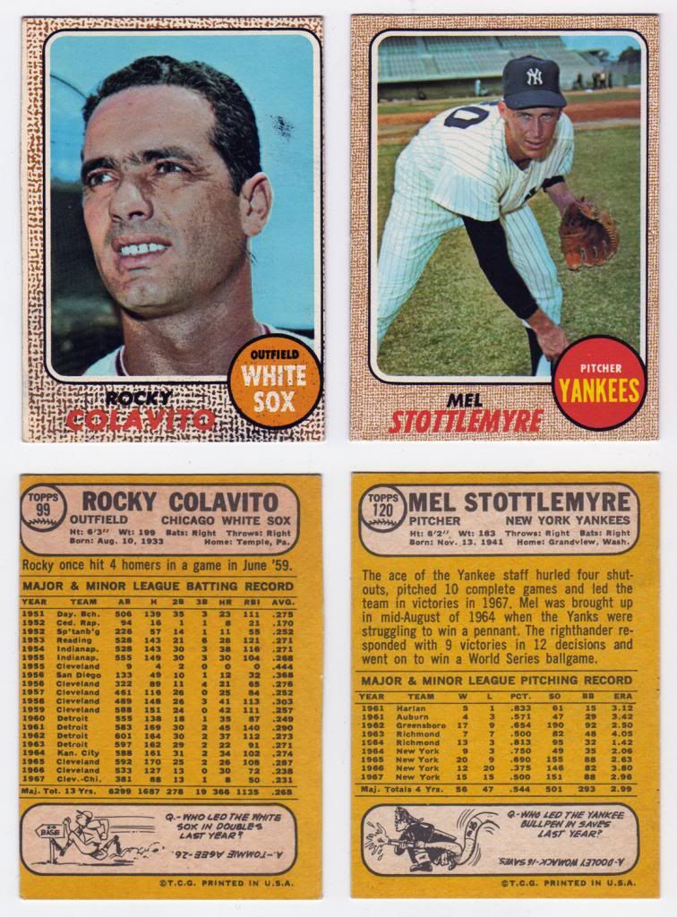 My scan comes across very dark orangey, but in person both of these cards jump out for their yellowness as compared to the other cards on the page. The Colavito has the same miscut as the example in this thread. I believe these both may be Milton Bradley cards, but I am brand new to this game. Carlton and Al, what do you guys think? After further thought, the scan really hides the true color features, so I added this new scan. For the sake of comparison, here are the same 2 cards bookending a non-Milton Bradley Seaver card: 
__________________
All the cool kids love my YouTube Channel:
Elm's Adventures in Cardboard Land https://www.youtube.com/@TheJollyElm Looking to trade? Here's my bucket: https://www.flickr.com/photos/152396...57685904801706 I was such a dangerous hitter I even got intentional walks during batting practice. Casey Stengel Spelling "Yastrzemski" correctly without needing to look it up since the 1980s. Overpaying yesterday is simply underpaying tomorrow. 
|
|
#10
03-16-2013, 08:34 PM
|
||||
|
||||
|
Quote:
|
 |
|
|
 Similar Threads
|
||||
| Thread | Thread Starter | Forum | Replies | Last Post |
| WTB WTT for 1968 Topps Baseball | RayBShotz | 1950 to 1959 Baseball cards- B/S/T | 3 | 04-08-2011 02:57 AM |
| Question about the design of 1958 Topps | Gary Dunaier | Postwar Baseball Cards Forum (Pre-1980) | 2 | 03-12-2011 03:06 PM |
| WTB 1968 Topps Baseball | Archive | 1950 to 1959 Baseball cards- B/S/T | 2 | 10-24-2008 07:15 AM |
| Baseball Card Design | Archive | Net54baseball Vintage (WWII & Older) Baseball Cards & New Member Introductions | 0 | 08-19-2008 07:45 PM |
| 1968 Topps 3-D Baseball | Archive | Postwar Baseball Cards Forum (Pre-1980) | 60 | 08-11-2008 10:17 AM |


 Hybrid Mode
