|
||||||
 |
|
|||||
|
||||||
|
|
|||||
|
|
|
#1
 07-17-2014, 03:50 PM
|
|||
|
|||
|
Quote:

|
|
#2
07-17-2014, 06:17 PM
|
|||
|
|||
|
Thanks for that info Rich, I had not realized that. In your view how can it be distinguished from other 61s with the green in the baseball on the back ? Or other front and back print defects that are recurring and even more prominent ? I kind of understood Bob Lemke's SCD criteria before he retired. Does Beckett have some known criteria or is it ad hoc depending on who is recommending it or their persistence ?
By the way I have no interested in trying to get anything recognized myself, this is just curiosity Last edited by ALR-bishop; 07-17-2014 at 06:22 PM.
|
|
#3
07-18-2014, 09:58 AM
|
||||
|
||||
|
I found this 58 Korcheck card....I was not able to locate another copy, so this "variation" must be "extremely rare"( LOL).
Notice the yellow line above the black box(does not appear on other copies of this card), and then the word "Catcher" in the black box has a small bit of yellow on the bottom while it looks like a red marker was used to color the upper part of the word "catcher" all while the red appears to overlap (more obviously on this card than on other copies) the black print. Looks like a case of the sheet shifting during part of the printing process when either the red or yellow were supposed to print, as evidenced by the extra yellow on the top of the "W" in the Sentors logo. But what I do not understand is why the yellow line above the black box exists without any offsetting print errors on the upper edge and why the red overlapping the black print is so obvious(as this is not obvious on other copies). .
|
|
#4
07-18-2014, 10:51 AM
|
|||
|
|||
|
Cool. There was another one similar to it on ebay
http://rover.ebay.com/rover/0/e11400...xe=exe,ext=ext Last edited by ALR-bishop; 07-18-2014 at 10:53 AM.
|
|
#5
07-18-2014, 10:58 AM
|
||||
|
||||
|
Looks like the ebay Korcheck slipped in the opposite direction during printing.
|
|
#6
07-18-2014, 10:59 AM
|
||||
|
||||
|
Quote:
I have noticed that darker red blob showing in the black over the around the player position on some 58's I have. Last edited by bnorth; 07-18-2014 at 11:16 AM.
|
|
#7
07-22-2014, 11:56 PM
|
||||
|
||||
|
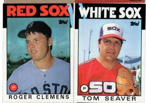
I know everyone is aware of the 86 Topps Clemens blue streak variation and the Seaver blue streak variation from the same year but I just saw this card end on ebay tonight. It sold for $15 at auction. As a Dodgers collector I had no interest in it but thought I'd share its existence for those of you who might want to track one down. From a previous thread I know the layout of these cards on the sheet was discussed and based on those findings I think it would be safe to assume there is a fourth card floating around out there that has a similar blue streak.

__________________
COLLECTING BROOKLYN DODGERS & SUPERBAS
|
|
#8
07-23-2014, 06:40 AM
|
|||
|
|||
|
There was some speculation that the Puhl card might have a simialr defect
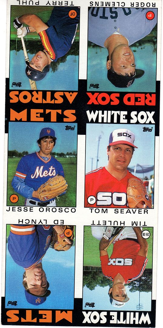  There is blue on this one....among other issues 
|
|
#9
06-06-2019, 03:06 AM
|
||||
|
||||
|
1952 Topps Campanella
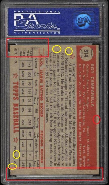 Missing the R in "Major" League Batting Record plus some of the line above. Spotted by the guys on blowout.
__________________
-- PWCC: The Fish Stinks From the Head PSA: Regularly Get Cheated BGS: Can't detect trimming on modern SGC: Closed auto authentication business JSA: Approved same T206 Autos before SGC Oh, what a difference a year makes.
|
|
#10
06-06-2019, 07:26 AM
|
|||
|
|||
|
The Campanella variant was included in the Huggins and Scott Super set a few years back. The checklist is in post 6
https://r.search.yahoo.com/_ylt=Awr9...2ULPJ6hPHVjo0- Getting 2 of that card and the two Mantles, Thompsons and Robinsons was expensive 
Last edited by ALR-bishop; 06-06-2019 at 07:26 AM.
|
|
#11
06-07-2019, 12:42 PM
|
|||
|
|||
|
Here are a couple rare variations I picked up recently. If I was bidding against one of you for the Papai, Apologize.
On the Papai (#245), there is a blue slash along the bottom of the leftmost version. FYI, these are both the "no copyright" versions. On the Frisch (#229), there is a little blue dash in the lower right margin of the right example. This is the common version so the left example, without the blue dash, is the variation and very rare, I am told. FYI, these are both the "copyright" versions. I will soon also have another example showing a variation in the the sixth series of this set, so stayed tuned!
|
|
#12
06-07-2019, 01:17 PM
|
|||
|
|||
|
If it was the graded Papai auction on ebay I followed it and in the end was glad I stayed on the sideline

|
|
#13
06-09-2019, 02:42 PM
|
|||
|
|||
|
I was informed about a variation in the sixth (of seven) series of the 1950 Bowman Baseball set. Everyone is familiar with the last two series having been issued initially without the copyright at the bottom and then this was corrected in both sets. The bottom of these two scans shows the no copyright version. The middle version of the Hamner and top of the Stringer shows what is likely the first correction with the copyright being added. The middle version of Stringer and top of Hamner shows the probable second editing as they moved the name and logo up to avoid the collision that had resulted. I have purchased all 36 variations of this set and am awaiting their arrival. I checked fairly thoroughly and found that this situation does NOT exist in the last series at all as all 36 have the name and logo properly positioned.
|
|
#15
03-10-2020, 10:40 AM
|
|||
|
|||
|
Ok, richtree, you get a pass on the Metzger but if you have the Comstock yellow name you have to put up a better scan
|
|
#16
03-10-2020, 11:48 AM
|
|||
|
|||
|
These newly-discovered variations keep on coming. Some guy listed the no dots version for a ton of money so I searched and found the one on eBay that does NOT have dots in his last name. There are several and possibly some on COMC as well. At least this is not a scarce one.
|
|
#17
03-10-2020, 01:30 PM
|
|||
|
|||
|
Good one Tom
|
|
#18
03-11-2020, 11:04 PM
|
||||
|
||||
|
Quote:
__________________
interesting to some absolute garbage to others. - Error cards and variations are for morons, IMHO. Last edited by Cliff Bowman; 03-11-2020 at 11:08 PM. Reason: Added scan
|
|
#19
03-18-2020, 06:49 PM
|
|||
|
|||
|
Partial missing Ink
|
|
#20
03-18-2020, 08:18 PM
|
||||
|
||||
|
Quote:
__________________
interesting to some absolute garbage to others. - Error cards and variations are for morons, IMHO. Last edited by Cliff Bowman; 03-18-2020 at 08:25 PM. Reason: Grammar
|
|
#21
04-16-2020, 08:07 AM
|
||||
|
||||
|
Recurring blue streak in the grass on the right side.
 1950 Bowman - [Base] #117 - Bill Rigney Courtesy of COMC.com
__________________
-- PWCC: The Fish Stinks From the Head PSA: Regularly Get Cheated BGS: Can't detect trimming on modern SGC: Closed auto authentication business JSA: Approved same T206 Autos before SGC Oh, what a difference a year makes.
|
|
#22
12-24-2022, 02:53 PM
|
||||
|
||||
|
1972 Topps #92 AL ERA Leaders with Palmer, Blue, and Wood.
Variation 1: Blue line through yellow border next to Jim Palmer. 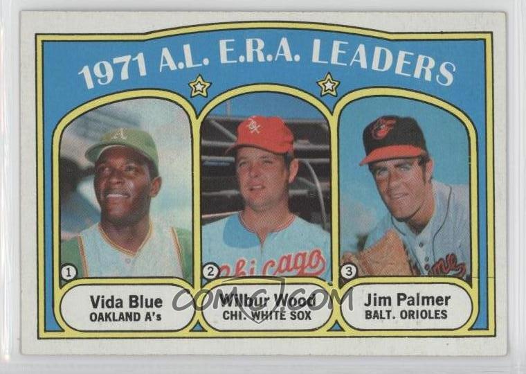 Variation 2: Blue line extends into the yellow above Palmer's name. 
__________________
-- PWCC: The Fish Stinks From the Head PSA: Regularly Get Cheated BGS: Can't detect trimming on modern SGC: Closed auto authentication business JSA: Approved same T206 Autos before SGC Oh, what a difference a year makes.
|
|
#23
12-25-2022, 05:01 PM
|
|||
|
|||
|
Good one John
|
 |
|
|
 Similar Threads
|
||||
| Thread | Thread Starter | Forum | Replies | Last Post |
| 1966 Topps High # Print Variations | 4reals | Postwar Baseball Cards Forum (Pre-1980) | 9 | 04-27-2014 06:05 PM |
| Are these variations or print defects? | savedfrommyspokes | Postwar Baseball Cards Forum (Pre-1980) | 16 | 02-09-2013 11:52 AM |
| Well known print defects. Do variations exist without? | novakjr | Postwar Baseball Cards Forum (Pre-1980) | 9 | 01-28-2011 04:32 PM |
| Finally confirmed - d311 print variations exist! ("bluegrass" variations) | shammus | Net54baseball Vintage (WWII & Older) Baseball Cards & New Member Introductions | 8 | 09-03-2010 07:58 PM |
| Wanted: T206 Print Variations and Errors | Archive | Tobacco (T) cards, except T206 B/S/T | 1 | 01-04-2007 07:23 PM |


 Hybrid Mode
