|
||||||
 |
|
|||||
|
||||||
|
|
|||||
|
#1751
 03-13-2021, 10:00 AM
|
||||
|
||||
|
Just now found out about this one, COMC has it listed. The 1973 OPC #453 Checklist can be found with and without the Topps logo in the baseball, I don't know which is the error and which is the corrected, the earlier checklists don't have the logo but the later #588 checklist has it. So this makes the fourth known variation on the 1965 through 1985 OPC baseball sets that I am aware of, the shifted copyright line on the 1969 #66 Merv Rettenmund Rookies card, the two different color team names on two 1971 Pirates, #27 Gene Clines Rookies and #144 Jackie Hernandez, and now this 1973 checklist.
__________________
interesting to some absolute garbage to others. - Error cards and variations are for morons, IMHO. Last edited by Cliff Bowman; 03-13-2021 at 11:26 AM. Reason: Added info 
|
|
#1752
03-13-2021, 04:08 PM
|
||||
|
||||
|
Nice find Cliff, I had not noticed that variation on this card before. What is weird is that on the #453 card w/o the "topps" brand name in the ball, you can see where the seams of the ball are partially missing due to the OPC guys removing the "topps" name from the checklist. I am thinking that the corrected version of this card is the one w/o "topps" on it and the original is the one with "topps" on it. My guess on the 588 card is that the OPC guys simply missed removing "topps" altogether on that card after remembering to remove it on the #54, #264 and #338 checklist cards. On the #54 card, my copy is missing part of the upper seam where the Topps logo appeared.
Another more subtle OPC variation I learned about recently is a difference in the grey on the back of the 1965 OPCs. While I would assume it is due to a difference in the card stock that was used, some cards have much darker grey backs while most have lighter grey backs. I heard from a collector who is trying to collect both colored backs for his set. He mentioned that cards 1-109 appear to be printed on these different stocks, while cards 110-283 appear to have been printed on the same stock. In my set, the lighter grey backs are far more prevalent.
|
|
#1754
03-15-2021, 07:56 PM
|
||||
|
||||
|
Quote:
|
|
#1755
03-19-2021, 06:27 AM
|
||||
|
||||
.jpg?id=817cb172-01b2-4190-a8a3-06d4e77b27cc&size=original) 1969 Topps - [Base] #412 - Checklist - 5th Series (Mickey Mantle) Courtesy of COMC.com Not sure if this one is known yet, red line recurring print defect between the A and L in BASEBALL at top. Looks like it might be related to this print issue, with a small line at the bottom of the card as well. .jpg?id=e591338a-96c5-4e7c-ac66-59e453fb2d6e&size=original) 1969 Topps - [Base] #412 - Checklist - 5th Series (Mickey Mantle) Courtesy of COMC.com
__________________
-- PWCC: The Fish Stinks From the Head PSA: Regularly Get Cheated BGS: Can't detect trimming on modern SGC: Closed auto authentication business JSA: Approved same T206 Autos before SGC Oh, what a difference a year makes. Last edited by swarmee; 03-19-2021 at 06:28 AM.
|
|
#1756
03-29-2021, 11:17 AM
|
|||
|
|||
|
Here are the 1955 Topps pairs of cards that I have showing logo croppings. If anyone knows of others, I would love to seek them out as well.
#14 Finigan #26 Groat #29 Wehmeier #30 Power #31 Spahn #50 Robinson #70 Rosen #80 Grim
|
|
#1757
03-29-2021, 07:31 PM
|
||||
|
||||
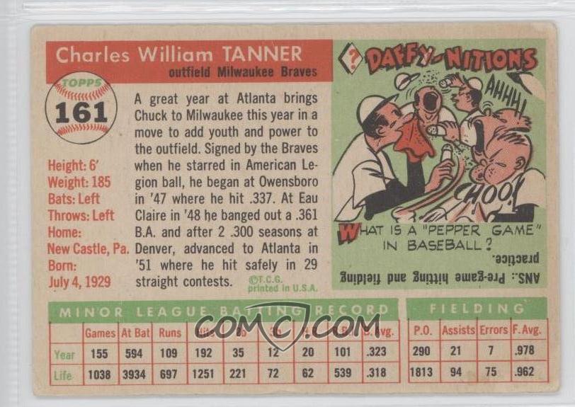 Partially filled in 'Y' in "Daffy-nition" on back of 1955 Topps #161 Chuck Tanner
__________________
-- PWCC: The Fish Stinks From the Head PSA: Regularly Get Cheated BGS: Can't detect trimming on modern SGC: Closed auto authentication business JSA: Approved same T206 Autos before SGC Oh, what a difference a year makes.
|
|
#1758
03-31-2021, 03:13 PM
|
||||
|
||||
|
Quote:
Awesome! Sent from my iPhone using Tapatalk
__________________
COLLECTING BROOKLYN DODGERS & SUPERBAS
|
|
#1760
03-31-2021, 05:08 PM
|
||||
|
||||
|
Nice; those are called "blobs" on some cards.
__________________
-- PWCC: The Fish Stinks From the Head PSA: Regularly Get Cheated BGS: Can't detect trimming on modern SGC: Closed auto authentication business JSA: Approved same T206 Autos before SGC Oh, what a difference a year makes.
|
|
#1761
03-31-2021, 07:52 PM
|
|||
|
|||
|
Wonder what he was thinking ?
|
|
#1762
04-05-2021, 10:46 AM
|
||||
|
||||
|
Similar to the recurring missing number on back of the 1969 485 Perry card, here his teammate is missing a letter of his last name in a recurring fashion.
|
|
#1763
04-05-2021, 10:55 AM
|
|||
|
|||
|
|
#1764
04-05-2021, 04:16 PM
|
||||
|
||||
|
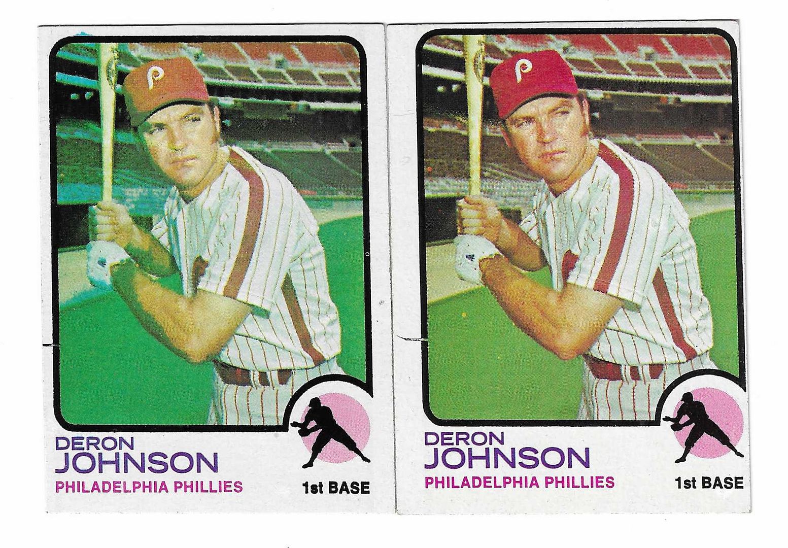
Man, that 1973 Deron Johnson has a lot of recurring variations going on with it:
1) Left border gap 2) Black streak extending from border gap 3) Yellow smudge line across face 4) Blue bleed from top border (though much less pronounced than the Nolan Ryan) 5) Yellow dot below batting glove 6) Blue streaks on arm 7) This copy has a paintball splat (or lizard facing down) on his cap: 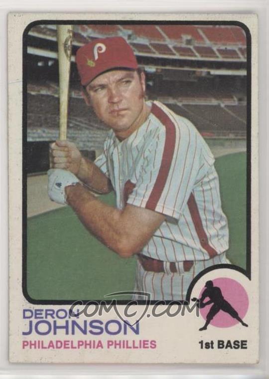 8) Blue lines eye level on left border And then, you've got to marvel at his sideburns. You know he never played for Steinbrenner...
__________________
-- PWCC: The Fish Stinks From the Head PSA: Regularly Get Cheated BGS: Can't detect trimming on modern SGC: Closed auto authentication business JSA: Approved same T206 Autos before SGC Oh, what a difference a year makes. Last edited by swarmee; 04-05-2021 at 04:21 PM.
|
|
#1765
04-23-2021, 03:19 PM
|
||||
|
||||
|
Dont know if this has been covered before but the word league is misspelled on the back of the 52 Campy. Does a correct variation exist?
Sent from my iPhone using Tapatalk
__________________
COLLECTING BROOKLYN DODGERS & SUPERBAS
|
|
#1766
04-23-2021, 03:34 PM
|
|||
|
|||
|
Not as far as I know, but there is a back variant of the card. It is listed in the H&S super set. I would post one but it would be 214 days premature in the 52 Gallery thread
https://r.search.yahoo.com/_ylt=AwrE...fyYbEWXalG85c- Last edited by ALR-bishop; 04-23-2021 at 03:42 PM.
|
|
#1767
04-25-2021, 08:29 AM
|
||||
|
||||
.jpg?id=86ffb5f0-8dac-4991-a38f-5538714ad75b&size=original) 1958 Topps - [Base] #101.2 - Bobby Richardson (yellow name) [SGC*80*EX/NM*6] Courtesy of COMC.com In this yellow name variation, there is another variation where the top of the 'h' in Richardson is white. Recurring print defect, as seen also in this copy. .jpg?id=075c44b8-0100-408d-80ea-a400f8b658a5&size=original) 1958 Topps - [Base] #101.2 - Bobby Richardson (yellow name) Courtesy of COMC.com
__________________
-- PWCC: The Fish Stinks From the Head PSA: Regularly Get Cheated BGS: Can't detect trimming on modern SGC: Closed auto authentication business JSA: Approved same T206 Autos before SGC Oh, what a difference a year makes.
|
|
#1768
04-26-2021, 10:14 AM
|
|||
|
|||
|
Looks like on some versions the bottom of the h is impacted
|
|
#1769
04-28-2021, 08:39 AM
|
||||
|
||||
|
I didn't read this entire thread, but I did do a search for Morgan and didn't see any hits for a 1966 Topps printing variation so if it is posted already I apologize.
I was looking through my 66 set in my binder last night when I saw something on my Morgan card below the S in Astros...I took it out to see if I could scrape it off and saw that it was actually red print. I looked through ebay and found the exact print error on only one other listing. I searched google images and saw another like this. here is the one on ebay https://www.ebay.com/itm/19379652802...MAAOSwNTpf1DJH Here is mine and a graded one I found in google images
__________________
Looking for Nebraska Indians memorabilia, photos and postcards Last edited by slidekellyslide; 04-28-2021 at 08:42 AM.
|
|
#1770
04-28-2021, 10:31 AM
|
|||
|
|||
|
Good one Dan. Scarce, recurring and a major player in a neat set
|
|
#1771
04-28-2021, 11:35 AM
|
||||
|
||||
|
Quote:
__________________
Looking for Nebraska Indians memorabilia, photos and postcards
|
|
#1772
05-08-2021, 05:36 PM
|
||||
|
||||
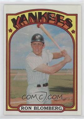 1972 Topps - [Base] #203 - Ron Blomberg Courtesy of COMC.com White loop in first E of YANKEES. Recurring print defect.
__________________
-- PWCC: The Fish Stinks From the Head PSA: Regularly Get Cheated BGS: Can't detect trimming on modern SGC: Closed auto authentication business JSA: Approved same T206 Autos before SGC Oh, what a difference a year makes.
|
|
#1773
05-08-2021, 07:03 PM
|
||||
|
||||
|
.
Sent from my iPhone using Tapatalk
__________________
. || || \/ If you want a deal, you might not get a card. If you want a card, you might not get a deal. Last edited by CardPadre; 05-08-2021 at 07:04 PM. Reason: Ooops, was this baseball only? Sorry, disregard.
|
|
#1774
05-09-2021, 11:51 AM
|
|||
|
|||
|
I found these print errors at a card show last Saturday. The dealer had MANY 1953 Bowman Color cards for sale.
#19 Dark has a gold and a green dot on the NY logo in the bottom example. There are MANY of these on eBay as well as the correct version. #34 Coan has yellowish dash over the letter on the cap in the top version. I saw one of these on eBay so it is not a one-off. #103 Ennis has a yellow dot on the cap in the middle one and a green raindrop over his left eye in the lowest one. I have seen MANY of the yellow dot versions on eBay. #124 Dressen has a red spot on the bill of his cap in the lower example. I am not sure how many of these are out there.
|
|
#1775
05-21-2021, 04:42 PM
|
||||
|
||||
|
This is deja vu all over again, as I think maybe this has already been posted before? It seemed quite familiar to me when I 'discovered' it.
There's a definitive black line/hair hitting Carl's hat on a good number of these cards. Seems to me it probably wasn't corrected, so to speak, but the print sheet had the card in two different positions, one with the black line and one without, and (based on a quick look at COMC) the cards were seemingly printed in equal numbers... 1971mortonhair.jpg
__________________
All the cool kids love my YouTube Channel:
Elm's Adventures in Cardboard Land  https://www.youtube.com/@TheJollyElm Looking to trade? Here's my bucket: https://www.flickr.com/photos/152396...57685904801706 I was such a dangerous hitter I even got intentional walks during batting practice. Casey Stengel Spelling "Yastrzemski" correctly without needing to look it up since the 1980s. Overpaying yesterday is simply underpaying tomorrow. 
|
|
#1776
05-29-2021, 08:16 PM
|
|||
|
|||
|
Not sure if this is considered a print variation or just a card that missed a certain step of the process. But I found this checklist with Checklist in red today in a random notebook at my LCS. They had the regular one right next to it. As I said, not sure if it's a print variation or it just missed a step in the process of being made.

__________________
Anyone on Twitter? Here's my new handle @et_cardcollectr Also just created a Youtube channel: https://www.youtube.com/results?sear...t_cardcollectr
|
|
#1777
05-29-2021, 09:10 PM
|
||||
|
||||
|
Most non-1st series checklists from 1961-72 Topps' sets have some sort of minor variation as they were typically printed in two different series. This "variation" has been documented for years.
|
|
#1778
06-16-2021, 03:48 PM
|
||||
|
||||
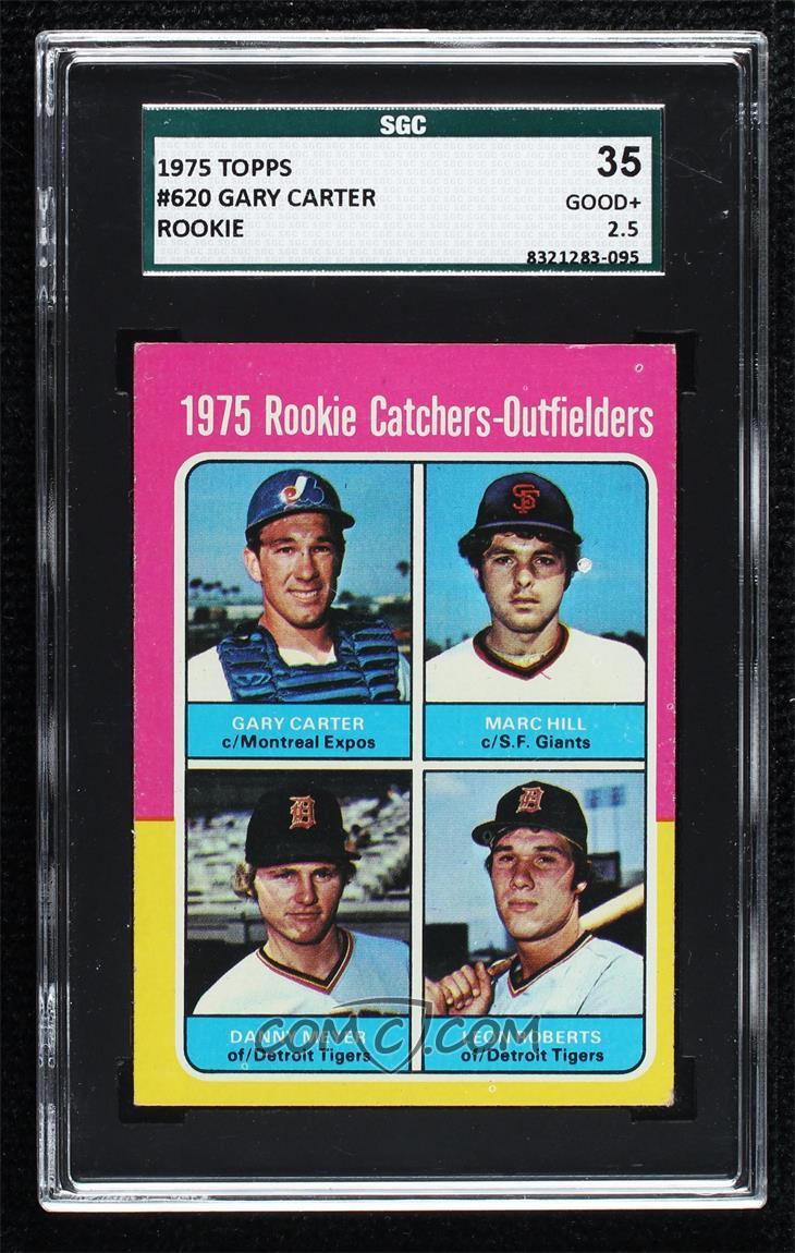 HOF RC Recurring print defect: magenta line extending from collar of Marc Hill. This one also seems to have a white blob next to ear, but it may just be an artifact of the photograph/scan. The card I spotted on Blowout which led me to this one only had the magenta line: 
__________________
-- PWCC: The Fish Stinks From the Head PSA: Regularly Get Cheated BGS: Can't detect trimming on modern SGC: Closed auto authentication business JSA: Approved same T206 Autos before SGC Oh, what a difference a year makes.
|
|
#1779
07-31-2021, 02:47 PM
|
|||
|
|||
|
To all who may be referencing my variations lists at https://sites.google.com/site/richarddingmancards/home
this is to let you know that Google has informed me that they are updating their formats and as of perhaps sometime in September the old format will no longer work. I tried to see whether my pages will transfer into the new format, and they won't. I do not know how to make them work and am no longer interested in keeping these pages up to date like I used to do. If anyone is capable of, and interested in, taking over these lists, moving them or whatever to keep them current, please lmk, you are welcome to do it. I hope someone will, as otherwise they will be gone sometime in September according to Google. Best to all, Richard Dingman
|
|
#1780
07-31-2021, 04:40 PM
|
|||
|
|||
|
Quote:
I wish I knew more about computers to help you out. Your website is a fantastic source of material. I go to it at least once every few days. Been doing that for years. I have taken your list of the 1960's variations and copied into an excel file. I then copied each year's listing into a separate tab. Still have to clean them up but at least I'll have what is currently known. Mike .
|
|
#1781
07-31-2021, 04:45 PM
|
|||
|
|||

|
|
#1782
08-02-2021, 02:26 PM
|
||||
|
||||
|
Not sure if this has been shown already, but the "V" just to the right of Gerry's hat appears to be recurring. As I do not recall seeing this font used on 70 Topps cards, I don't believe this is caused by a wet sheet transfer.
|
|
#1783
08-02-2021, 06:01 PM
|
||||
|
||||
|
Quote:
__________________
interesting to some absolute garbage to others. - Error cards and variations are for morons, IMHO.
|
|
#1784
08-02-2021, 07:58 PM
|
||||
|
||||
|
Quote:
|
|
#1785
08-02-2021, 08:28 PM
|
|||
|
|||
|
Quote:
|
|
#1786
08-02-2021, 08:38 PM
|
||||
|
||||
|
Quote:
__________________
interesting to some absolute garbage to others. - Error cards and variations are for morons, IMHO.
|
|
#1787
08-03-2021, 07:30 AM
|
||||
|
||||
|
Quote:
Thank you Cliff for the image, I now know I don't have a copy of that Brandon card, but will begin the search. Last edited by savedfrommyspokes; 08-03-2021 at 07:31 AM.
|
|
#1788
08-03-2021, 11:47 AM
|
|||
|
|||
|
Quote:
EDIT: I found the site... great another place to spend my money at. I did not see any of the variations though. I just searched on Arrigo but got no variation hits. Cheers, Last edited by butchie_t; 08-03-2021 at 12:01 PM.
|
|
#1789
08-03-2021, 12:41 PM
|
||||
|
||||
|
Quote:
__________________
interesting to some absolute garbage to others. - Error cards and variations are for morons, IMHO.
|
|
#1790
08-03-2021, 01:28 PM
|
||||
|
||||
|
Sometimes, one variation will yield another and another, etc...
In this case the 1969 #47 Popovich has several well known factory induced front variations. Also known is a version of this card where some stats on the back are obscured. However, what I did not realize is that there appears to be at least 3 versions of the back with light print to completely obscured print....the backs with the obscured print appear to occur only on the emblem visible on front version. And yes, on the bottom left Popovich card, the obscured print on the back extends onto the top edge Woody Fryman card obscuring some print on that card also.
|
|
#1791
08-03-2021, 02:46 PM
|
|||
|
|||
|
Quote:
Thanks, I only saw one and that is all I needed to see. It is on its way to my binder now. Thanks!!!
|
|
#1792
08-03-2021, 02:59 PM
|
|||
|
|||
|
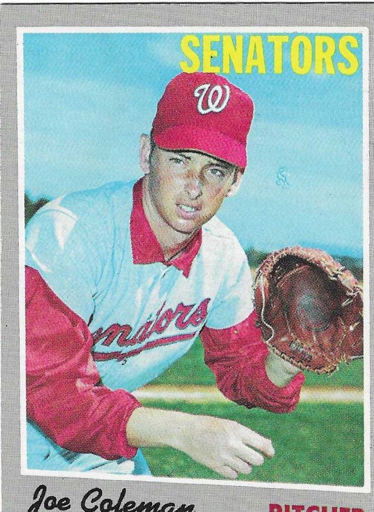
I think I have one of the Colemans too. Does is look like a scripted Egyptian symbol ?
|
|
#1793
08-03-2021, 03:18 PM
|
||||
|
||||
|
Quote:
__________________
interesting to some absolute garbage to others. - Error cards and variations are for morons, IMHO. Last edited by Cliff Bowman; 08-03-2021 at 03:49 PM. Reason: Addition
|
|
#1794
08-03-2021, 03:49 PM
|
||||
|
||||
|
Quote:
__________________
-- PWCC: The Fish Stinks From the Head PSA: Regularly Get Cheated BGS: Can't detect trimming on modern SGC: Closed auto authentication business JSA: Approved same T206 Autos before SGC Oh, what a difference a year makes.
|
|
#1795
08-05-2021, 08:03 PM
|
||||
|
||||
 See the line through the LEAGUE BATTING? I thought it was writing, but it seems to be a recurring print defect in various depths and lengths.
__________________
-- PWCC: The Fish Stinks From the Head PSA: Regularly Get Cheated BGS: Can't detect trimming on modern SGC: Closed auto authentication business JSA: Approved same T206 Autos before SGC Oh, what a difference a year makes.
|
|
#1797
08-06-2021, 09:23 PM
|
|||
|
|||
|
Will do so early next week.
|
|
#1799
08-09-2021, 12:59 PM
|
|||
|
|||
|
Butch---not sure if this is what Cliff was referring to but it is recurring
|
|
#1800
08-09-2021, 01:35 PM
|
|||
|
|||
|
Quote:
Cheers, 
|
 |
|
|
 Similar Threads
|
||||
| Thread | Thread Starter | Forum | Replies | Last Post |
| 1966 Topps High # Print Variations | 4reals | Postwar Baseball Cards Forum (Pre-1980) | 9 | 04-27-2014 06:05 PM |
| Are these variations or print defects? | savedfrommyspokes | Postwar Baseball Cards Forum (Pre-1980) | 16 | 02-09-2013 11:52 AM |
| Well known print defects. Do variations exist without? | novakjr | Postwar Baseball Cards Forum (Pre-1980) | 9 | 01-28-2011 04:32 PM |
| Finally confirmed - d311 print variations exist! ("bluegrass" variations) | shammus | Net54baseball Vintage (WWII & Older) Baseball Cards & New Member Introductions | 8 | 09-03-2010 07:58 PM |
| Wanted: T206 Print Variations and Errors | Archive | Tobacco (T) cards, except T206 B/S/T | 1 | 01-04-2007 07:23 PM |


 Linear Mode

