|
||||||
 |
|
|||||
|
||||||
|
|
|||||
|
#1
 09-24-2020, 06:20 PM
|
|||
|
|||
|
Are these documented print variations, or just flukes? I have seen several representations of each of these, (Sans detail on Jackie's hat, and no color on John's left hand). Just wondering if these are on par with Aberson and Peterson variations. There was obviously 2nd printing of all the cards hence the other variations and the correction of the Hermanski error, but I have never seen these called out.

|
|
#2
09-24-2020, 06:38 PM
|
|||
|
|||
|
Wouldnt the yellow strip by the left side of Jackies card vs the absence of it be a variation?
|
|
#3
09-24-2020, 06:42 PM
|
|||
|
|||
|
A few different variations on the Musial also
Last edited by Gobucsmagic74; 09-24-2020 at 06:47 PM.
|
|
#5
09-24-2020, 07:12 PM
|
|||
|
|||
|
Quote:
Jackie's portrait is slightly shifted to the RIGHT, resulting in that skinny yellow sliver along his right shoulder. Ditto for the Wagner card. The Yellow ink was one of the 1st colors printed on these cards (in the 4-color process). I've seen this effect on a number of these 1949 LEAF BB cards. This is not a variation, but simply a printing anomaly. TED Z T206 Reference . Last edited by tedzan; 09-24-2020 at 07:24 PM. Reason: Corrected typo.
|
|
#7
09-24-2020, 09:06 PM
|
|||
|
|||
|
Quote:
|
|
#8
09-25-2020, 05:57 AM
|
|||
|
|||
|
Brian
The differences you're pointing to are simply printing variants. The LEAF cards are replete with such color differences. Here are some examples in my set...... 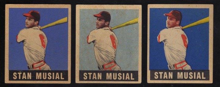  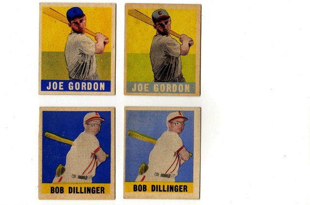 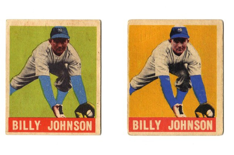 And then, there is BLUE or no BLUE. 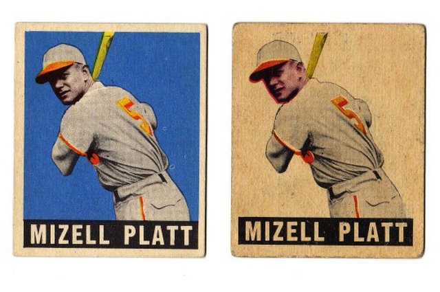 TED Z T206 Reference .
|
|
#9
09-25-2020, 10:20 AM
|
|||
|
|||
|
Hopefully this link works
https://1drv.ms/x/s!AnK7duip0UvBxzpc...UZplq?e=YXqAtT I made an excel spreadsheet with pictures of as many different 49 Leaf cards as I could find, and organized them by things like lines where bats or portraits meet the border, shading on hats, Bright magenta instead of red etc. They land in 5-6 distinct categories, perhaps more. There are lots of small differences, and some transitional types where for example the hat is cut down away from the border on one color but not the other. I don't think the spreadsheet is anywhere near complete.
|
|
#11
09-25-2020, 11:00 AM
|
|||
|
|||
|
Quote:
I agree there are a TON of print variations, especially in regards to ink colors and plate order (typically black ink will always go down first). When a color block changes, like on the Aberson sleeves, that is a physical change to the blue plate. There had to be an actual replacement of that plate in order for the color block to change (short to long, long to short). I'm sure that there are more in the set than just the Robinson, Musial, and Wagner, but there are distinct plate changes as color block have changed or been removed. Or like that awesome Platt that you posted, some plates were totally missed! I guess my over arching question is should there be a designation for the difference like there is for Aberson and Peterson. Peterson is probably the closest to the Jackie/Stan change as part or all of the black plate detail was removed. I'm fascinated by the prints, process and variations, being that I am a designer and do a ton of screenprinting. I mostly wanted to see if others thought that maybe the variations (outside of Hermaski) warranted a full designation, while the other changes don't?
|
|
#12
09-25-2020, 01:51 PM
|
||||
|
||||
|
Brian,
I love this thread you started. If you look at the Post-war section, then you'll see that a few threads were started on this subject. It's very interesting, for sure. I say YES, some of these print variations that we see should be given special designations. For example:  This is the most commonly found Jackie.  Now this one is the BLUE CAP variant. The black color is missing from his cap. This example is more difficult to find than the one above it, but it's not rare or anything like that. I also want to point out that the magenta found on his face is usually stronger for this BLUE CAP variant. Again, this is a very interesting subject that very few collectors pay attention to. I think if you (or anyone) has the time to just sit around examining thousands of these cards, then a book could be written about it! Oh, and by the way, I do have a Jackie, but it's the BORING one that I posted first. It's not a variant either. I would love to own the BLUE CAP variant someday.
__________________
Successful transactions on Net54: Peter_Spaeth, rustywilly, esehombre, scooter729, NiceDocter, Mishu2nite, wolf441, jdeptula, mckinneyj and more!
|
|
#14
09-25-2020, 04:43 PM
|
||||
|
||||
|
Brian,
What you have is the BLUE CAP variant. And like I mentioned in my earlier post, the magenta is much stronger on this variant. I don't own any of the examples that I posted above. I do have a PSA 4, but mine is the same variant as the SGC 6. I would like to own the BLUE CAP variant someday, but at the moment they are too damn expensive! I am hoping prices will come down in the future, but they might go the other way!  I'm going to take a wild guess here, but the BLUE CAP variant could have been a first printing. Afterwards, Leaf Gum Co. decided to make changes to the printing plates, colors, etc. I also think that certain variants should be priced higher than the others. For example, the BLUE CAP variant is harder to find, so it should be worth more. However, most collectors just care about one thing: the grade! 
__________________
Successful transactions on Net54: Peter_Spaeth, rustywilly, esehombre, scooter729, NiceDocter, Mishu2nite, wolf441, jdeptula, mckinneyj and more!
|
|
#15
09-25-2020, 06:12 PM
|
|||
|
|||
|
Quote:
You could say LEAF's printers were sort of "sloppy". And, if we were to "nit-pick" on all the possible permutations due to color printing anomalies, we would have numerous variations. Illustrated here are the 98 subjects in the 1949 LEAF set. And, there are three additional (legitimate) variation cards [Aberson, Hermansk(i), and Peterson]. This gallery of cards in the set is from my 8-page article in Old Cardboard Magazine (Issue # 9). Check-it-out if you are interested in being more informed on this LEAF set. Note.... Card # is on the left. On the Right is the COPYRIGHT date (1948 or 1949). All 98 of these cards were issued in 1949. 1st Series in the Spring, and 2nd Series (SP) in the Summer.   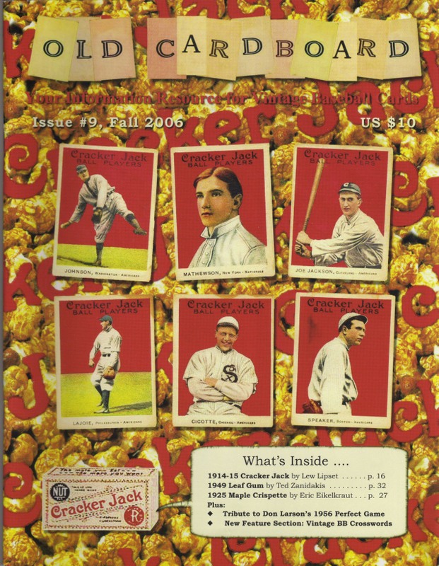 TED Z T206 Reference .
|
|
#16
09-25-2020, 10:34 PM
|
|||
|
|||
|
If you have Excel desktop, the spreadsheet I linked to has lots of these on it.
I really wish there was a way of sharing it that works easily. It won't email because it's a big file, and now Live won't open it. So downloading or opening with a desktop application is the only way.
|
|
#17
09-26-2020, 05:26 AM
|
||||
|
||||
|
Quote:
|
|
#18
09-26-2020, 07:52 AM
|
|||
|
|||
|
Quote:
Hi rats60 I really appreciate your kind words. PSA has perpetuated the "1948" myth since the early 1990's. In the mid-1990's, they were informed that this BB card set was strictly issued in 1949. But, they ignored this information. Thanks again, TED Z T206 Reference .
|
|
#19
09-26-2020, 12:30 PM
|
||||
|
||||
|
Quote:
 Now here is the corrected version below:  The yellow bars have been removed in the corrected version of this card. The image hasn't been shifted at all. Some black was added to his cap in order to give it a better shaded look. Furthermore, the magenta on his face was reduced.
__________________
Successful transactions on Net54: Peter_Spaeth, rustywilly, esehombre, scooter729, NiceDocter, Mishu2nite, wolf441, jdeptula, mckinneyj and more!
|
|
#20
09-26-2020, 10:01 PM
|
|||
|
|||
|
The reduced magenta was just going back to using red instead. There's a whole separate print run where they used the actual magenta - Yes, the very pink ones.
The ones with the extra bars come both normal and with bright pink. 
|
|
#21
09-27-2020, 11:51 AM
|
||||
|
||||
|
Quote:
__________________
Successful transactions on Net54: Peter_Spaeth, rustywilly, esehombre, scooter729, NiceDocter, Mishu2nite, wolf441, jdeptula, mckinneyj and more!
|
|
#22
09-28-2020, 08:57 AM
|
|||
|
|||
|
Well, that was supposed to have an image... The IMG link is there, and it showed in preview....
Onedrive is apaprently mostly hopeless for sharing images. Anyway, here's the image from my spreadsheet. I don't own any of these, but collected images from online. Some of the spreadsheet images are my cards, but mostly commons. L to right shaded hat no bars at the sides Plain hat red/blue/yellow/black bars at the sides. Plain hat Magenta/blue/yellow/black bars at the sides. I can see I'll have to do some cropping to get it bigger.
|
|
#23
09-28-2020, 09:14 AM
|
|||
|
|||
|
Ok, still small cropped, we'll do it the hard way.
shaded hat no bars Unshaded hat regular red bars at sides Unshaded hat bright pink bars at sides A bit of pixelation here and there, wiht the images sourced from Ebay and auction houses and here the sizes and quality are variable. In the spreadsheet I resized most for consistency. The Jackie is one of the tougher ones to spot the bright pink. I used the image I chose because the card is a bit out of register and has a random spot , both showing the pink more clearly. On cards with red backgrounds or name boxes it's much easer.
|
|
#24
09-28-2020, 09:58 AM
|
|||
|
|||
|
The color variations is so amazing as in NO QC for using ink colors that were remotely similar in many cases. I could be totally off base but I feel like the Jackie with the hat details came first and was changed after. I guess it is not unheard of that details would be added in by creating a new plate, but it is usually the other way around. I would make the same argument for Stan Musial, that the plate was corrected to let more red come through, and have less black printed. You can basically see the line that was masked to allow this to happen.
Thanks for all the great info, it has made going through my set and doubles that much more enjoyable.
|
|
#25
09-28-2020, 01:21 PM
|
|||
|
|||
|
Each color has its own plate.
removing stuff from a plate is easy, adding it to an existing plate is hard. (well, not hard if all you want is a line or to strengthen a small letter, you can just scratch that in. But adding shading is a new plate situation. The colors would have been mixed by hand to get a particular shade that would reproduce the colors better. Black is pretty much always the same, but for one press run at least, they used the Magenta straight instead of mixing it to red. Cyan was probably also used unmixed at one point. And yellow, but that's usually the first color printed, so it's the hardest to tell. They were all on the same sheet as far as I know, so there should be differences on every card. I haven't counted, but I think I found maybe 1/4 of the different ones. At least three different main groups, plus some intermediate ones.
|
|
#26
09-28-2020, 01:44 PM
|
|||
|
|||
|
Quote:
Steve This is true....here is an old photo (circa 1981) of an uncut sheet of 1st series cards. Along with a diagram of the card #'s on their backs.   TED Z T206 Reference .
|
|
#27
09-28-2020, 01:44 PM
|
||||
|
||||
|
I feel like I've run into a wall here:
 The face color on the above four cards are all different. On top of that, we're trying to look at the bars/no bars + shaded cap/no shaded cap. This is getting tough! How would you guys break the above cards down?
__________________
Successful transactions on Net54: Peter_Spaeth, rustywilly, esehombre, scooter729, NiceDocter, Mishu2nite, wolf441, jdeptula, mckinneyj and more!
|
|
#29
09-28-2020, 01:52 PM
|
|||
|
|||
|
Quote:
The difference in face color speaks to the Print Variations that Ted references earlier in the thread.
|
|
#30
09-29-2020, 09:04 AM
|
|||
|
|||
|
Quote:
2 and 4 are the same.
|
|
#31
09-29-2020, 05:20 PM
|
||||
|
||||
|
Quote:
__________________
Successful transactions on Net54: Peter_Spaeth, rustywilly, esehombre, scooter729, NiceDocter, Mishu2nite, wolf441, jdeptula, mckinneyj and more!
|
|
#32
09-30-2020, 08:41 AM
|
|||
|
|||
|
Quote:
Long stuff follows, short version is there are just so many variables It's not really possible to say for sure. There are lots of things that can affect color like that. If the plate is dampened slightly less it will retain more ink. On most presses the inking level can be adjusted. There are a few things that can be done to stretch the available ink if for instance you have an hour left in the day, or you're on the last few hundred sheets but getting low on ink. All the ones I can think of would change the color slightly. Humidity and temperature can affect how the paper absorbs the ink, how the ink goes on the plate etc. If the shop is consistent, it's not much different. But whoever did the printing for Leaf obviously wasn't into consistency.. Stuff like inking levels can indicate different press operators, some may run heavier than others. Typically you'd print one color on a particular day, for high production it would be over multiple days, and maybe multiple shifts. The place I was at each operator typically used one particular press, but it's possible their plant assigned operators to certain jobs if it was a multi day thing, or that someone was out sick or hurt, and another operator took over. I think a lot of what Leafs printers did was out of economy. Over thousands of impressions, heavy inking uses more ink and cuts into the bottom line a little. Getting rid of the side bars uses less ink. Inking less heavily and maybe adding a touch of white ink to the yellow uses less, (white and black may have also been cheaper as the pigments are less expensive. ) In some ways not having the side bars looks a little better, and adding the hat shading makes it better still. And uses way less ink than the sidebars. (And very very little on the non-Portraits. )
|
 |
| Thread Tools | |
| Display Modes | |
|
|
 Similar Threads
|
||||
| Thread | Thread Starter | Forum | Replies | Last Post |
| 67 Carew rookie print variation | rsdill2 | Postwar Baseball Cards Forum (Pre-1980) | 4 | 04-14-2016 06:45 PM |
| Stargell Print Variation? | savedfrommyspokes | Modern Baseball Cards Forum (1980-Present) | 0 | 12-20-2014 02:03 PM |
| 1974 Topps #599 Large Print variation | Archive | 1950 to 1959 Baseball cards- B/S/T | 0 | 06-23-2008 10:08 AM |
| I think I found a rare Obak print variation | Archive | Net54baseball Vintage (WWII & Older) Baseball Cards & New Member Introductions | 12 | 09-14-2007 02:09 PM |
| Cool print variation | Archive | Net54baseball Vintage (WWII & Older) Baseball Cards & New Member Introductions | 5 | 08-08-2007 09:36 AM |


 Linear Mode

