|
|
#701
|
||||
|
||||
|
Got this awesome 73 Topps Al Kaline Band Aid card in the mail today thanks to a great forum member.

|
|
#702
|
||||
|
||||
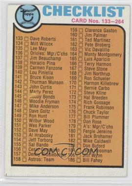
 1973 Topps #264 - Checklist Courtesy of COMC.com Bobby at #145 scratched out. Multiple cards on COMC show this flaw.
__________________
-- PWCC: The Fish Stinks From the Head PSA: Regularly Get Cheated BGS: Can't detect trimming on modern SGC: Closed auto authentication business JSA: Approved same T206 Autos before SGC Oh, what a difference a year makes. |
|
#703
|
|||
|
|||
|
Good one John. I know there are at least two version of every CL in every 1960s sets, I think mostly because they are all DPs. Most differences are minor. Not sure if that holds true for all the 70s sets, but have several
|
|
#704
|
||||
|
||||
|
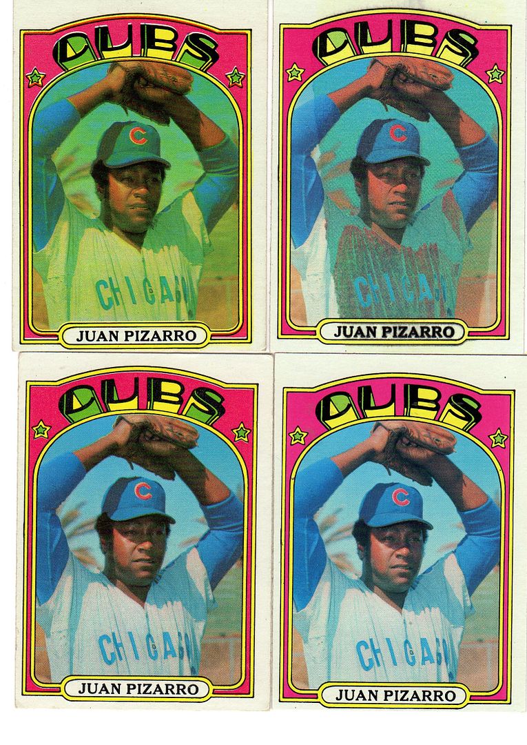
At first glance, it appears that some kid at some point neatly colored in this jersey a green color. However, the only thing I can not figure out is how they were able to color the jersey and not color over the facsimile autograph? Looking closely at the card, the facsimile auto is clearly on top of the green and not the other way around.
Any ideas? |
|
#705
|
|||
|
|||
|
Something similar from 1972 ?

|
|
#706
|
||||
|
||||
|
Quote:

__________________
All the cool kids love my YouTube Channel:
Elm's Adventures in Cardboard Land  https://www.youtube.com/@TheJollyElm Looking to trade? Here's my bucket: https://www.flickr.com/photos/152396...57685904801706 I was such a dangerous hitter I even got intentional walks during batting practice. Casey Stengel Spelling "Yastrzemski" correctly without needing to look it up since the 1980s. Overpaying yesterday is simply underpaying tomorrow.  |
|
#707
|
||||
|
||||
|
Al, this "coloring" is mostly limited to the jersey, similar to the limited coloring on just the glove of this 70 Lockwood card.
As Darren points out, the coloring goes over into the white border area. It also goes over the "Pirates" on the jersey on the front. The lack of uniformity in the color makes me skeptical, even though the facsimile auto appears to be over the greenish-grey color. |
|
#708
|
|||
|
|||
|
I noticed a right angle line at the top right in this card. I checked COMC an many eBay and they all have it. Has anyone seen this withOUT this line? It only occurs on the non-greenie.
|
|
#709
|
||||
|
||||
|
That line up there is one of the tells showing that this is the 'normal' version of the card and not a green tint. (If you look closely, a similar area appears in the top left area, too.) It seems that Topps used a lot of scotch tape (that's what it looks like to me) when laying out the sets that year and many, many of the cards show pieces of it here and there. Almost none of the GT cards have these tape problems. Just a few. And no cards have the same piece(s) of tape appearing in both the regular and GT versions.
__________________
All the cool kids love my YouTube Channel:
Elm's Adventures in Cardboard Land  https://www.youtube.com/@TheJollyElm Looking to trade? Here's my bucket: https://www.flickr.com/photos/152396...57685904801706 I was such a dangerous hitter I even got intentional walks during batting practice. Casey Stengel Spelling "Yastrzemski" correctly without needing to look it up since the 1980s. Overpaying yesterday is simply underpaying tomorrow.  Last edited by JollyElm; 12-10-2016 at 04:59 PM. |
|
#710
|
||||
|
||||
|
__________________
All the cool kids love my YouTube Channel:
Elm's Adventures in Cardboard Land  https://www.youtube.com/@TheJollyElm Looking to trade? Here's my bucket: https://www.flickr.com/photos/152396...57685904801706 I was such a dangerous hitter I even got intentional walks during batting practice. Casey Stengel Spelling "Yastrzemski" correctly without needing to look it up since the 1980s. Overpaying yesterday is simply underpaying tomorrow.  |
|
#711
|
|||
|
|||
|
Great stuff Darren
|
|
#712
|
|||
|
|||
|
Quote:
The color separation negatives were scotch taped to the mask, a big sheet of opaque paper, to make what was essentially a huge negative used to make the plates. Sloppy work let the tape show on the image. It's also on a lot of 81 Fleer. Steve B |
|
#713
|
||||
|
||||
|
Perhaps the most egregious display of a wayward piece of tape is found on the Babe Ruth Special card #142, right above the red book. They didn't exactly try to hide it...
s-l1600-12.jpg
__________________
All the cool kids love my YouTube Channel:
Elm's Adventures in Cardboard Land  https://www.youtube.com/@TheJollyElm Looking to trade? Here's my bucket: https://www.flickr.com/photos/152396...57685904801706 I was such a dangerous hitter I even got intentional walks during batting practice. Casey Stengel Spelling "Yastrzemski" correctly without needing to look it up since the 1980s. Overpaying yesterday is simply underpaying tomorrow.  |
|
#714
|
|||
|
|||
|
Quote:
|
|
#715
|
|||
|
|||
|
Here is a closeup of three Coogans showing different hiccups.
|
|
#716
|
||||
|
||||
|
Quote:
Not sure what happened to the Campos with a large section of the top border missing though?
__________________
52 Topps cards. https://www.flickr.com/photos/144160280@N05/ http://www.net54baseball.com/album.php?albumid=922 |
|
#717
|
||||
|
||||
|
Speaking of border breaks, here is a limited but recurring (right) border break that I have not noticed before.
|
|
#718
|
|||
|
|||
|
Are my eyes deceiving me or do the Spahn cards with the blue mark have his face darker than the ones that do not? Any reason for this, if so? The three cards on the right vertically all have blue dashes while the ones on the left do not. The three birthdate versions are present with 1931 at top, obscured 1931 in the middle, and the correct 1921 at the bottom.
More mysteries. |
|
#719
|
||||
|
||||
|
1975 Hostess #48 Carl Yastrzemski "outfield" and "infield" variations. The "infield" version is much more difficult to find, but I don't think it is as rare as the corrected cards of Doug Rader and Burt Hooton.
|
|
#720
|
|||
|
|||
|
This smudge on his left cheek is recurring and there are a few of these on COMC (two for sure) and eBay (at least one-my eyes aren't too great).
Last edited by Sliphorn; 12-14-2016 at 05:59 PM. |
|
#721
|
||||
|
||||
|
Similar to the 57 "Bakep", these Buhl cards have some of the same characteristics as the Bakep card....some bleeding of the red into the ball and a letter in the name partially obscured(Bob's middle initial "R"). As with the Bakep, there appears to be varying degrees of red in the ball and the amount of the "R." that is obscured.
|
|
#722
|
|||
|
|||
|
Here is a new twist on this card. Notice that there is a white shadow around his ear on one version. There are a few of these on eBay and COMC and I just bought three to prove the variation. It should be easy to find.
|
|
#723
|
||||
|
||||
|
I noticed this 61 Grba card with varying degrees of missing border along the right edge. My first thought was what does the card to the right look like, no luck though, the Grba card is on the sheet's right edge.
|
|
#724
|
|||
|
|||
|
How about these?
|
|
#725
|
||||
|
||||
|
They look like they're missing a black color pass.
__________________
-- PWCC: The Fish Stinks From the Head PSA: Regularly Get Cheated BGS: Can't detect trimming on modern SGC: Closed auto authentication business JSA: Approved same T206 Autos before SGC Oh, what a difference a year makes. |
|
#726
|
||||
|
||||
|
Very nice Tom...blackless and nearly blackless. |
|
#727
|
|||
|
|||
|
How about these overprints?
|
|
#728
|
|||
|
|||
|
Second attempt
|
|
#729
|
||||
|
||||
|
There is a pretty cool 1959 Topps Venezuelan currently on eBay, it's a Gene Green missing all of the green ink on the back of the card.
|
|
#730
|
|||
|
|||
|
I have the one in the scan with the normal one and found this one on COMC, proving it is not a one off.
|
|
#731
|
|||
|
|||
|
On this card, you will notice at the left of the off-focus version that most of the phrase "GET YOUR INITIAL FREE!" is present. On the back of the cards (both are ON focus) that phrase exists at the top. I did not scan the back but can, if needed. I am curious about this card. Was the card double-printed with one version turned over so the phrase is next to the obverse of the other? Has anyone obtained an uncut sheet of 1958 Topps Football cards?
|
|
#732
|
||||
|
||||
|
Here's an odd pair of variations. 1970 card #401, Giants Rookies, comes in the 'regular' version (not shown), plus (top) with a black 'pinhole' beside the 'G' in 'Giants' and (bottom) a UFO buzzing above the baseball in Harrell's hand
1970giantsvariations.jpg
__________________
All the cool kids love my YouTube Channel:
Elm's Adventures in Cardboard Land  https://www.youtube.com/@TheJollyElm Looking to trade? Here's my bucket: https://www.flickr.com/photos/152396...57685904801706 I was such a dangerous hitter I even got intentional walks during batting practice. Casey Stengel Spelling "Yastrzemski" correctly without needing to look it up since the 1980s. Overpaying yesterday is simply underpaying tomorrow.  |
|
#733
|
||||
|
||||
|
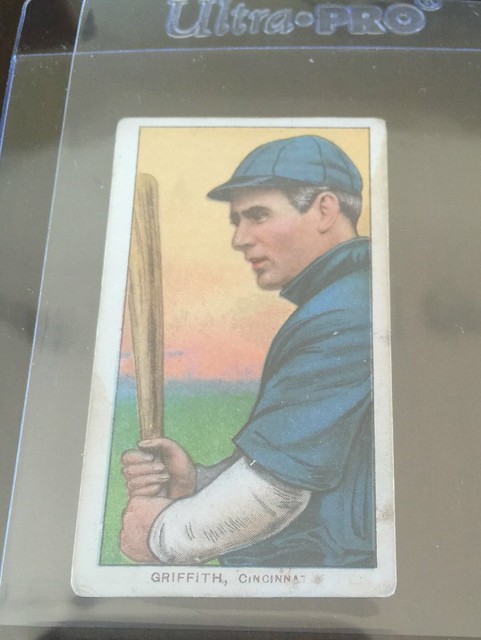
Here's one of my favorites! Griffith missing the ti. I think I've seen only 4-5 of these.
 Griffith Missing "ti" version by Paul Herbener, on Flickr Griffith Missing "ti" version by Paul Herbener, on Flickr
__________________
https://www.flickr.com/photos/137748538@N02/albums Successful transactions with Sycks22, Vintageloz, jim, zachclose21, shamus, Chris Counts, YankeeFan Snapolit1 and many more. |
|
#734
|
|||
|
|||
|
Notice in the left version that the bat has gray in it. This is recurring and some are on COMC and eBay currently.
|
|
#735
|
|||
|
|||
|
Can anyone explain this one?
|
|
#736
|
||||
|
||||
|
That is an awesome print offset. They are from when the press is getting set up and not properly adjusted yet. Most left out the back door and very few with a print offset that big left the factory in a pack.
Those are among my favorite cards to collect. 
|
|
#737
|
|||
|
|||
|
I would love to see other examples like this.
|
|
#738
|
||||
|
||||
|
Here are a few of mine with different amounts of print offset.
|
|
#739
|
||||
|
||||
|
Here is a missing print (on back) on a known variation...2 for the price of 1:
|
|
#740
|
||||
|
||||
|
Came across this card, it appears to be "yellow-less"....my expectation/experience would be for the red to fade before the yellow and since I am not seeing any fading on the red, I feel this "yellow-less" state of this card is due to factory print issues versus post factory fading.
The copy on the right's red is fairly close to the red on the left's copy, so if there was fading involved, the red on the left copy should appear much more faded than the right copy. Anyone else seen another "yellow-less" 58 Topps card? |
|
#741
|
|||
|
|||
|
Neat card. Here in Cairns no one has seen anything like it. They want to know if Bobby plays cricket
|
|
#742
|
||||
|
||||
|
Quote:
That card looks faded from the picture. If you want to know for sure send it to me with return postage and I will tell you for sure. |
|
#743
|
||||
|
||||
|
Quote:
I will put this 58 card with the same color scheme in a (south facing) window tomorrow and see what happens with it.....here is the before pic. I am curious to see if the yellow and/or red fades first . Any ideas on how long it might take to show signs of fading? |
|
#744
|
||||
|
||||
|
Quote:
PM or email me and I can give you all the info you want.  EDIT: If you find the blue front 1958 Aaron threads there is one that I show pictures of the background turning from green to blue. I added them to this post. Last edited by bnorth; 03-04-2017 at 08:13 PM. |
|
#745
|
||||
|
||||
|
Here is one I have not noticed before....the bottom border on this 71 Bench card has a recurring but limited print defect....always tougher to spot on HOFer's cards.
|
|
#746
|
|||
|
|||
|
Have been on a fairly long cruise...128 days...since 1-5. Most passengers are retired like we are and even older age wise ( one guy is 102). On several occasions at dinner people will ask if I play golf or have a hobby. When I say I colllect baseball cards they say "oh"....and that the end of that conversation. ( although one guy did say he used to have a Mantle card but did not remember which one)
|
|
#747
|
|||
|
|||
|
Not sure if th this one applies to this section or not but an interesting card non the less . At bottom of card it says Section I . Sorry the picture is not that great ,
Brett |
|
#748
|
||||
|
||||
|
Quote:
|
|
#749
|
||||
|
||||
|
Quote:
Enjoy!
__________________
52 Topps cards. https://www.flickr.com/photos/144160280@N05/ http://www.net54baseball.com/album.php?albumid=922 |
|
#750
|
|||
|
|||
|
Notice on this pair of cards that, more than a different color uniform jersey, the "9" in "19" is farther into the margin on the right most version. Also, the person at the bottom is more to the right in this version and the vegetation is different above him.
Also, the closeup of his hands on the ball image clearly shows his knuckles closer to the side margin in the lower one. Last edited by Sliphorn; 04-04-2017 at 05:12 PM. |
 |
|
|
 Similar Threads
|
||||
| Thread | Thread Starter | Forum | Replies | Last Post |
| 1966 Topps High # Print Variations | 4reals | Postwar Baseball Cards Forum (Pre-1980) | 9 | 04-27-2014 06:05 PM |
| Are these variations or print defects? | savedfrommyspokes | Postwar Baseball Cards Forum (Pre-1980) | 16 | 02-09-2013 11:52 AM |
| Well known print defects. Do variations exist without? | novakjr | Postwar Baseball Cards Forum (Pre-1980) | 9 | 01-28-2011 04:32 PM |
| Finally confirmed - d311 print variations exist! ("bluegrass" variations) | shammus | Net54baseball Vintage (WWII & Older) Baseball Cards & New Member Introductions | 8 | 09-03-2010 07:58 PM |
| Wanted: T206 Print Variations and Errors | Archive | Tobacco (T) cards, except T206 B/S/T | 1 | 01-04-2007 07:23 PM |