|
||||||
 |
|
|||||
|
||||||
|
|
|||||
|
#1
 06-19-2015, 10:41 PM
|
||||
|
||||
|
Our resident Brooks Robinson psychopath
 , Mark, contacted me about the errors and variations I have for trade. It dawned on me that I am unaware of any 'legitimate' variations involving Brooksie. If one of his regular cards had a variation, there's no doubt it would've been discovered by now, so how do I scratch this insatiable itch?? Why, start investigating checklists that he appeared on. And boom!!! I found one. (This will turn out to be very embarrassing if someone has already stumbled across it, but I'm assuming no one has.) I started with 1967, because that year has so many checklist variations that it was a natural place to begin. , Mark, contacted me about the errors and variations I have for trade. It dawned on me that I am unaware of any 'legitimate' variations involving Brooksie. If one of his regular cards had a variation, there's no doubt it would've been discovered by now, so how do I scratch this insatiable itch?? Why, start investigating checklists that he appeared on. And boom!!! I found one. (This will turn out to be very embarrassing if someone has already stumbled across it, but I'm assuming no one has.) I started with 1967, because that year has so many checklist variations that it was a natural place to begin.1967 Topps checklist #531 comes with two distinctly different croppings of his photo. The first one, which I've decided to call Mr. Chin, features his chin shadow coming in contact with the top of the black bounding box. This version includes a larger amount of dark shadowing beneath his chin and up the side of his face. The second version, Mr. Cheeky, portrays him with more of a svelte appearance as the people at Topps cropped out a good amount of his face, making him appear much thinner. It's most obvious in the section of his cheek below his left ear. This gif makes it easy to see both versions...  Neither version seems to be much rarer than the other. Cool stuff!!
__________________
All the cool kids love my YouTube Channel:
Elm's Adventures in Cardboard Land  https://www.youtube.com/@TheJollyElm Looking to trade? Here's my bucket: https://www.flickr.com/photos/152396...57685904801706 I was such a dangerous hitter I even got intentional walks during batting practice. Casey Stengel Spelling "Yastrzemski" correctly without needing to look it up since the 1980s. Overpaying yesterday is simply underpaying tomorrow.  Last edited by JollyElm; 06-19-2015 at 10:47 PM. 
|
|
#2
06-19-2015, 11:28 PM
|
||||
|
||||
|
Awesome! Aside from the black below his chin I think the biggest difference can be seen on his cheek next to his right ear.
Sent from my iPhone using Tapatalk
__________________
COLLECTING BROOKLYN DODGERS & SUPERBAS
|
|
#3
06-20-2015, 01:02 AM
|
||||
|
||||
|
Quote:
__________________
All the cool kids love my YouTube Channel:
Elm's Adventures in Cardboard Land https://www.youtube.com/@TheJollyElm Looking to trade? Here's my bucket: https://www.flickr.com/photos/152396...57685904801706 I was such a dangerous hitter I even got intentional walks during batting practice. Casey Stengel Spelling "Yastrzemski" correctly without needing to look it up since the 1980s. Overpaying yesterday is simply underpaying tomorrow.
|
|
#5
06-20-2015, 08:19 AM
|
|||
|
|||
|
I think I have found variations for most if not all checklists from all the 1960s sets. The majority are just cropping difference but since they result in intentional changes/set ups in the printing process they tend to fit my personal definition of a variation. I think similar differences exist on many/most checklist from the early 70s sets as well
Last edited by ALR-bishop; 06-20-2015 at 02:13 PM.
|
|
#6
06-20-2015, 10:05 AM
|
||||
|
||||
|
Quote:
|
|
#7
06-20-2015, 11:49 AM
|
||||
|
||||
|
Quote:
So...what took you so long to find one?!? I wrote you "hours" ago! All kidding aside thanks so much for taking your time to look for an error/variation of Brooks. I, for one, have never noticed the difference in the 1967 Checklist #531. Now I need to locate and see which of the two checklist variation that I have and which one I need to pick up. You just gave me something to add the search. I agree with you cool stuff!
|
|
#8
06-20-2015, 07:43 PM
|
||||
|
||||
|
And here's another one
1967 Topps Checklist #361  The most obvious difference between the two versions is the dark connection between his left ear and his hat/helmet combo (emphasized via the blue arrow). It appears or disappears depending on which card you have. The other telltale signs are a more rounded/smooth helmet compared to a more jagged look and the appearance of a very noticeable, small, dark spot on top of the black box directly beneath his chin. Also, there is a marked difference between the two versions of the shadowing of his entire chin region. Lastly, the dark shadow on the far edge of his left ear comes and goes.
__________________
All the cool kids love my YouTube Channel:
Elm's Adventures in Cardboard Land https://www.youtube.com/@TheJollyElm Looking to trade? Here's my bucket: https://www.flickr.com/photos/152396...57685904801706 I was such a dangerous hitter I even got intentional walks during batting practice. Casey Stengel Spelling "Yastrzemski" correctly without needing to look it up since the 1980s. Overpaying yesterday is simply underpaying tomorrow.
|
|
#9
06-20-2015, 08:15 PM
|
||||
|
||||
|
Let's keep the train a-rollin'
1967 Topps Checklist #278  Version one is Ole Pointy Hat as the top right part of Kaat's hat forms a squared corner. His left earlobe appears to be of the rounded, 'free' persuasion. The shadowing/hat slopes down and smoothly connects with his right ear. Version two is Doctor Roundness as the top right portion of his hat curves naturally. His left earlobe looks to be the 'attached' variety and the shadowing/hat is cropped differently above his right ear.
__________________
All the cool kids love my YouTube Channel:
Elm's Adventures in Cardboard Land https://www.youtube.com/@TheJollyElm Looking to trade? Here's my bucket: https://www.flickr.com/photos/152396...57685904801706 I was such a dangerous hitter I even got intentional walks during batting practice. Casey Stengel Spelling "Yastrzemski" correctly without needing to look it up since the 1980s. Overpaying yesterday is simply underpaying tomorrow.
|
|
#10
06-21-2015, 04:10 AM
|
|||
|
|||
|
Remember they were usually issued in both the previous series packd and then in the packs of that specific series.
So there are probably subtle (or not so subtle differences) in almost every checklist from about 1961-73 Rich
__________________
Look for our show listings in the Net 54 Calendar section
|
|
#11
06-21-2015, 06:58 AM
|
|||
|
|||
|
I agree Rich and think I now have two of every checklist for those years. There are back differences as well
Last edited by ALR-bishop; 06-21-2015 at 06:58 AM.
|
|
#12
06-21-2015, 05:05 PM
|
||||
|
||||
|
I am not aware of any variations on the 1973 checklists. If anyone has any please show a scan.
|
|
#14
06-22-2015, 01:30 AM
|
||||
|
||||
|
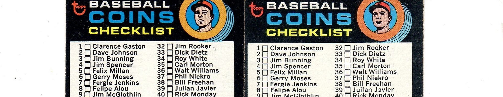
Here's one from 1971 that I discovered a number of years ago. It's the Coins Checklist, #161.
Although you rarely see it listed as such anywhere, many people knew this card came in two versions because the card number on back was either positioned 'high' or 'low' (two noticeably different placements) and the fronts were slightly dissimilar (explained below). But when I studied these cards, it soon became very apparent that there were, in fact, three total variations: 1. Beneath the coins graphic, a solid black line is present. It 'completes' the white box. 2. In that same area, the black line is not present and the blue from the coins forms a straight edge across the gap. 3. The black line is not present and the blue from the coins is cropped differently, forming three distinct curved edges.  For those of you keeping score, the straight blue edge version has the card number in the 'high' position. The other two both have it 'low.' None of these cards seem to be any rarer than their counterparts. And to Mark, Brooks Robinson appears listed on the back of this card, so it may fit into your ultimate Brooksie checklist.
__________________
All the cool kids love my YouTube Channel:
Elm's Adventures in Cardboard Land https://www.youtube.com/@TheJollyElm Looking to trade? Here's my bucket: https://www.flickr.com/photos/152396...57685904801706 I was such a dangerous hitter I even got intentional walks during batting practice. Casey Stengel Spelling "Yastrzemski" correctly without needing to look it up since the 1980s. Overpaying yesterday is simply underpaying tomorrow. Last edited by JollyElm; 06-23-2015 at 12:15 AM.
|
|
#15
06-22-2015, 11:58 AM
|
|||
|
|||
|
Good one Darren
|
|
#16
06-22-2015, 02:59 PM
|
|||
|
|||
|
Cliff---I do not have variants for the 73 CLs either. I know there has been some lively debate here about whether 73 or 74 was the first year Topps started releasing their sets at one time rather than in series. While I do think 74 was the first year they did it nationwide, I think the entire 73 set was released in some places at one time and so the way they formatted the CLs in in the printing process in 73 was likely different from what it had been in the 60s and early 70s. At least that is what I think

|
|
#17
06-23-2015, 05:44 PM
|
||||
|
||||
|
Quote:
")
|
|
#18
06-24-2015, 07:44 PM
|
||||
|
||||
|
I decided to check out the other Brooksie checklist I know of, 1969 #504, and I found there is a variation there. It is so frickin' subtle that it almost doesn't even count, but there is a slight difference in the cropping of the image.
 The easiest way to see it is by focusing on the edge of his hat brim at far right. On some/most versions of this card it touches the black, circular border. On a smaller number of these cards it falls short of reaching the border. If you concentrate on the image I created here, you can see how the picture is shifted very slightly upward and to the right. Look at the dark shadow on his jersey to the right of his chin and the upper left and right portions of his hat (as well as the top of the Orioles logo). The spacing in these areas changes between the two versions.
__________________
All the cool kids love my YouTube Channel:
Elm's Adventures in Cardboard Land https://www.youtube.com/@TheJollyElm Looking to trade? Here's my bucket: https://www.flickr.com/photos/152396...57685904801706 I was such a dangerous hitter I even got intentional walks during batting practice. Casey Stengel Spelling "Yastrzemski" correctly without needing to look it up since the 1980s. Overpaying yesterday is simply underpaying tomorrow.
|
|
#19
06-26-2015, 03:54 PM
|
|||
|
|||
|
Darren---I think there may be 4 different fronts, the three you posted and one where the blue is even at the white but does not extend into it...or not as far
Last edited by ALR-bishop; 06-26-2015 at 04:02 PM.
|
|
#20
06-26-2015, 05:18 PM
|
||||
|
||||
|
Quote:
I've examined that difference before, but to me it's just a printing anomaly with regard to the registration of the color plates. The cyan/blue isn't perfectly aligned, but Topps didn't make any purposeful changes to the printing plates like the other versions, which show true differences.
__________________
All the cool kids love my YouTube Channel:
Elm's Adventures in Cardboard Land https://www.youtube.com/@TheJollyElm Looking to trade? Here's my bucket: https://www.flickr.com/photos/152396...57685904801706 I was such a dangerous hitter I even got intentional walks during batting practice. Casey Stengel Spelling "Yastrzemski" correctly without needing to look it up since the 1980s. Overpaying yesterday is simply underpaying tomorrow.
|
|
#21
06-27-2015, 08:05 AM
|
|||
|
|||
|
Darren, you are a card. I am sure Topps worked very hard to get all of these versions just so.
|
|
#22
06-28-2015, 01:47 PM
|
|||
|
|||
|
As you look through the cropping pictures go back and forth, notice the height of the checklist boxes relative to the card numbers. All part of the cropping differences.
I have never seen a variation in the first series 1972 CL, card #4. I suspect it is because it was part of a 132 card series. The first series did include the 2nd series checklist but the 1st CL was not double printed. Ditto for the 1973 BB set of 660--five series of 132. The decision by Topps to not double print the first series or show a preview CL of the next series was followed shortly by a shift to a full release of cards vs series by series. Whether or not that started in 1974 or 1973 has been oft debated here.
|
|
#23
06-28-2015, 03:38 PM
|
|||
|
|||
|
Thanks for chipping in Carlton
|
|
#24
06-28-2015, 04:41 PM
|
||||
|
||||
|
Quote:
That's very interesting about the '72 CL, and seems to make perfect sense. The layout of that particular checklist is so basic, with hardly anything going on except a straight list of names (no copyright appearing, etc.), that it would be pretty easy to spot a variation if one did exist.
__________________
All the cool kids love my YouTube Channel:
Elm's Adventures in Cardboard Land https://www.youtube.com/@TheJollyElm Looking to trade? Here's my bucket: https://www.flickr.com/photos/152396...57685904801706 I was such a dangerous hitter I even got intentional walks during batting practice. Casey Stengel Spelling "Yastrzemski" correctly without needing to look it up since the 1980s. Overpaying yesterday is simply underpaying tomorrow.
|
|
#25
06-28-2015, 05:33 PM
|
||||
|
||||
|
The 1970 Topps #9 checklist card is most likely single printed also as it seems to command a premium over other 70 Topps checklist cards.
|
|
#27
06-28-2015, 07:13 PM
|
||||
|
||||
|
Ironically Carlton, I do not see any premiums for the 72 #4 checklist card....I do see premiums for all of the 73, 74 and 75 checklists(as they were all single printed).
With most of the 73 checklists typically carrying premiums (over the DP checklists from previous issues), this would further help to establish the fact that the 73 set was printed in single printing as the subsequent future sets were (although some collectors contend that the 73's were still distributed by series in some places).
|
|
#28
06-28-2015, 07:36 PM
|
|||
|
|||
|
All 73 CLs came in series of 132 so all were SPs.
The 73s were definitely sold by series. I have tons of the first 3 series and had to order a couple of 4th and 5th series from Larry Fritsch in early 1974 to fill out two sets.
|
|
#29
06-28-2015, 08:25 PM
|
||||
|
||||
|
1970 Topps checklist #9 is a bit of a puzzle, as there are two distinct versions, but it's more complex than that. I usually refer to the separate variations as: top of bat reaches the white border and; top of bat ends short of the white border. This could usually be explained as a simple registration problem regarding the colors mixed to make the brown bat or, more likely, the layer of red. However, that certainly doesn't fully explain it and I call your attention to the portion of the card I've highlighted in this gif.
 If you look between the batter's elbow and his midsection, you'll see a black line there. In the one version, it's at the lowest point of the batter graphic and appears to 'close' the yellow box. But in the other version, this line is significantly higher up (and on a bit of a downward slant) and no longer connected to the very bottom of the batter. Since both the batter and this line are part of the black printing plate, the layout had to have been changed at some point, making this a true variation. To play devil's advocate, I will say there's a tiny possibility that this line is actually part of the red/magenta plate, so it's movement would fit in with the obvious shift of that color. However, under strong magnification, I see nothing but a black/grey line there, so I'm not sure that's a reasonable counter-argument.
__________________
All the cool kids love my YouTube Channel:
Elm's Adventures in Cardboard Land https://www.youtube.com/@TheJollyElm Looking to trade? Here's my bucket: https://www.flickr.com/photos/152396...57685904801706 I was such a dangerous hitter I even got intentional walks during batting practice. Casey Stengel Spelling "Yastrzemski" correctly without needing to look it up since the 1980s. Overpaying yesterday is simply underpaying tomorrow.
|
|
#30
06-28-2015, 08:57 PM
|
|||
|
|||
|
Tough call without the card or another like it in hand, but to me it looks like registration. Red high, or maybe black a bit low.
But I do think there may be a subtle variation there anyway. One of the ones I refer to as the "invisible" variations - where a difference in one color is hidden behind another color. It's not really unusual for Topps, but they can be hard to spot unless there's a registration problem or some other printing issue. There's also a little something I see that may or may not confirm them as different, it's almost impossible to see clearly in the scans. I'll let you look for it for a while before telling you what I think I see. (Yeah, I can be slightly cruel like that) Steve B Quote:
|
|
#31
06-28-2015, 10:44 PM
|
||||
|
||||
|
Well, that was a waste of time!! My theory of the line being red (which I myself discounted based on all the scans I have) is actually frickin' right on. Here are the two separate versions of this card with both showing obviously red lines...
70Checklist.jpg Oh well. But there is a difference in the dot patterns inside the bat between the two versions, so that maaaaaay be something??
__________________
All the cool kids love my YouTube Channel:
Elm's Adventures in Cardboard Land https://www.youtube.com/@TheJollyElm Looking to trade? Here's my bucket: https://www.flickr.com/photos/152396...57685904801706 I was such a dangerous hitter I even got intentional walks during batting practice. Casey Stengel Spelling "Yastrzemski" correctly without needing to look it up since the 1980s. Overpaying yesterday is simply underpaying tomorrow. Last edited by JollyElm; 06-29-2015 at 12:33 AM.
|
|
#32
06-29-2015, 08:41 AM
|
||||
|
||||
|
While the 70 #9 checklist does appear twice on this uncut sheet(and may indeed have very subtle variations),it is a single print, as is the Joe Rudi card and all of the other non-checklist cards on this series 1/2 sheet, as they all appear only on this sheet(similar to the 63 cropping variations). In other words, all of the cards on the first sheet, except the 2nd series checklist, are single prints. The 2nd series checklist is the exception on these two sheets, as it appears on both of these different sheets, the series 1/2 sheet and the series 2/3, thus making it a double print. So if one were to split hairs, there would likely be 4 "unique" versions of this 2nd series checklist (as there are at least 4 different slight variations with the 68 Yaz checklist) as it appears twice on two different sheets.
Sorry for the crap images, they were the best that could be located.
|
 |
|
|
 Similar Threads
|
||||
| Thread | Thread Starter | Forum | Replies | Last Post |
| 1967 Topps Baseball #500 Marichal variation | variation-man | 1950 to 1959 Baseball cards- B/S/T | 3 | 08-20-2014 07:47 PM |
| 1967 Phillies Rookies Variation | Gr8Beldini | Postwar Baseball Cards Forum (Pre-1980) | 2 | 10-03-2013 03:16 PM |
| New Minor 1967 Variation | JollyElm | Postwar Baseball Cards Forum (Pre-1980) | 3 | 08-22-2013 02:11 PM |
| 1967 Master Reference File of Packard Bell's 1967 sponsorship of the L.A. Dodgers | Archive | Net54baseball Sports (Primarily) Vintage Memorabilia Forum incl. Game Used | 0 | 05-25-2008 04:46 PM |
| 1967 Master Reference File of Packard Bell's 1967 sponsorship of the L.A. Dodgers | Archive | Baseball Memorabilia B/S/T | 0 | 05-25-2008 04:44 PM |


 Linear Mode

