|
||||||
 |
|
|||||
|
||||||
|
|
|||||
|
#1
 09-03-2021, 09:15 PM
|
||||
|
||||
|
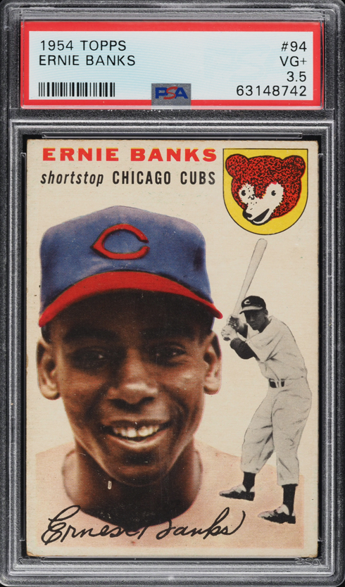
I would love to hear opinions on this and of course there is no right answer. Topps decided to screw with everyone in their production of this card. Even the PSA 10s Ive seen on social media dont look quite right. Its one of the great mysteries of the hobby in my opinion.
For me, I want to see the left-right border matched in width near the bottom of the card where there is a border. For the top-down centering, I think the answer is that the bottom border matches the width of the side borders and the top border just doesnt exist. I think a match between the border defined by top of his name and the bottom border isnt the design intent but appears to be PSAs definition. Lets have a deep dive on this one! Sent from my iPhone using Tapatalk 
|
|
#2
09-03-2021, 09:18 PM
|
||||
|
||||
|
Heres my lovely example (if I can get my link to work!)
https://flic.kr/p/2kABWwG Sent from my iPhone using Tapatalk Last edited by IgnatiusJReilly; 09-04-2021 at 08:47 AM.
|
|
#3
09-03-2021, 09:33 PM
|
||||
|
||||
|
I prefer a little room above the name.
__________________
Four phrases I have coined that sum up today's hobby: No consequences. Stuff trumps all. The flip is the commoodity. Animal Farm grading.
|
|
#4
09-03-2021, 09:39 PM
|
||||
|
||||
|
Just to be clear, my 7MC example is not my definition of ideal centering but its the card I have!
Sent from my iPhone using Tapatalk
|
|
#5
09-03-2021, 09:40 PM
|
||||
|
||||
|
Quote:
Sent from my SM-G981U using Tapatalk
|
|
#6
09-03-2021, 09:44 PM
|
||||
|
||||
|
Here is one I like.
__________________
Four phrases I have coined that sum up today's hobby: No consequences. Stuff trumps all. The flip is the commoodity. Animal Farm grading.
|
|
#7
09-03-2021, 10:30 PM
|
||||
|
||||
|
Great topic Matthew!
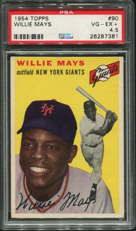
The L/R centering is pretty straightforward, but the Top/Bottom centering is kind of a 'know it when you see it' sort of thing. Should have a bit of space above the name, I agree. The Kaline for me is my favorite '54 for centering in my PC, and I think it nails the Top/Bottom centering for my money. The Spahn is only shown as an example of centering that is just a wee bit too far weighted to the top for my eye.
__________________
| Private collector, always looking to buy great cards from the good folks on Net54. | WTB: N162 Cap Anson (any Grade) | '15 Cracker Jack WaJo (PSA 2-4) | '33 DeLong Gehrig (PSA 4-6) | '33 Goudey Ruth #'s 53/144/149 (PSA 4-5). T-206 Monster: 520/520 (PSA 5.02 average)
|
|
#8
09-03-2021, 10:41 PM
|
||||
|
||||
|
...
__________________
Four phrases I have coined that sum up today's hobby: No consequences. Stuff trumps all. The flip is the commoodity. Animal Farm grading.
|
|
#9
09-03-2021, 10:55 PM
|
||||
|
||||
|
Here is mine I looked for a long time until I could find one that didnt break the bank and had a bit of room above the name. That was more important to me than the left right centering.
__________________
1971 Pirates Ticket Quest: 101 of 153 regular season stubs (66%), 14 of 14 1971 ALCS, NLCS , and World Series stubs (100%) If you have any 1971 Pirate regular season game stubs (home or away games) please let me know what have! 1971 Pirates Game used bats Collection 18/18 (100%) 1971 WS Full Tickets 5/7 need games 1 and 4
|
|
#10
09-03-2021, 11:02 PM
|
||||
|
||||
|
A lot of the Ernies have that lettering right on the top edge for some reason. I found a similar one to you and agree on a card with white background left to right is less noticeable.
__________________
Four phrases I have coined that sum up today's hobby: No consequences. Stuff trumps all. The flip is the commoodity. Animal Farm grading. Last edited by Peter_Spaeth; 09-03-2021 at 11:05 PM.
|
|
#11
09-03-2021, 11:06 PM
|
||||
|
||||
|
Beautiful card Peter!
__________________
1971 Pirates Ticket Quest: 101 of 153 regular season stubs (66%), 14 of 14 1971 ALCS, NLCS , and World Series stubs (100%) If you have any 1971 Pirate regular season game stubs (home or away games) please let me know what have! 1971 Pirates Game used bats Collection 18/18 (100%) 1971 WS Full Tickets 5/7 need games 1 and 4
|
|
#12
09-04-2021, 07:40 PM
|
|||
|
|||
|
Mine has a very little bit of space above the name
I can’t remember when or how I obtained this. Confident it was sometime in the 1980s. This was part of my first PSA submission. Last edited by IndyDave; 09-04-2021 at 07:40 PM.
|
|
#13
09-04-2021, 07:56 PM
|
||||
|
||||
|
Quote:
|
|
#14
09-05-2021, 12:15 AM
|
||||
|
||||
|
Quote:
Thats one of the things that make this such a tough card. You have his action image in the border and his name right at the top of the card. It really is an odd card. Sent from my iPhone using Tapatalk
|
|
#15
09-05-2021, 09:01 AM
|
|||
|
|||
|
I picked this one up last year and from what I can see is as close to perfect centering as one can expect. I use the 3 borders (excluding the top) as my drivers. The b/w action image is clearly meant to encroach into the border as part of the original design intent.
 Sent from my iPhone using Tapatalk
__________________
T206 Set (105/518) T206 HOF Set (74/74) T206 OMSL (4/48) T206 Backs (27/35) https://www.flickr.com/photos/197085...77720322768299
|
|
#16
09-05-2021, 09:22 AM
|
||||
|
||||
|
Quote:
I remember when you posted this one! In my opinion, this example has nearly ideal centering. Beautiful card! Sent from my iPhone using Tapatalk
|
|
#17
09-05-2021, 10:02 AM
|
||||
|
||||
|
Here is mine---the way i like them
|
|
#18
09-05-2021, 12:04 PM
|
||||
|
||||
|
Mine.
 Sent from my SM-G981U using Tapatalk
|
|
#19
09-05-2021, 12:46 PM
|
|||
|
|||
|
Quote:
|
|
#20
09-05-2021, 05:30 PM
|
|||
|
|||
|
Quote:
|
|
#21
09-06-2021, 08:15 AM
|
|||
|
|||
|
Quote:
For the black and white image, you want to see some white space between his rear end and the edge of the card, if it's touching or even close to the edge it's off center. See this overgraded SGC example in HA, you'd never see this in a new PSA holder in a 5. https://sports.ha.com/itm/baseball/1...umbnail-071515 I can't attach mine as I scanned it high resolution, tried compressing it to a zip and it's still too large.
|
|
#22
09-09-2021, 09:46 AM
|
||||
|
||||
|
Quote:
__________________
Postwar stars & HOF'ers. Cubs of all eras. Currently working on 1956, '63 and '72 Topps complete sets. Last edited by jchcollins; 09-09-2021 at 09:48 AM.
|
|
#24
09-09-2021, 09:57 PM
|
||||
|
||||
|
The thread just keeps getting more interesting, especially on the topic of the Banks RC.
The L/R centering on the card is of course famously tough, but I'd never really noticed how the playing image encroaches into the right border until it was mentioned above. It's really easy to lose your bearings on the white background '54's. Someone else on this thread is about to get my spare PSA 6 Banks, which is 50/50 centered left to right. I wasn't really sure why I was ok downgrading the L/R centering on this recent 7 pickup, but I'm looking at it with new eyes now from the comments above. This one's getting re-holdered as we speak. Great discussion! And a couple of great Mays cards above! -- one of my favorite Mays issues.
__________________
| Private collector, always looking to buy great cards from the good folks on Net54. | WTB: N162 Cap Anson (any Grade) | '15 Cracker Jack WaJo (PSA 2-4) | '33 DeLong Gehrig (PSA 4-6) | '33 Goudey Ruth #'s 53/144/149 (PSA 4-5). T-206 Monster: 520/520 (PSA 5.02 average)
|
|
#25
09-09-2021, 10:37 PM
|
||||
|
||||
|
Quote:
Awesome card! I think there is no right answer for the 54 Banks. I think whatever you think looks great is the right answer for you, and whatever the grading companies think be damned. That said, I would love to know how they determine the centering scale for this card. Sent from my iPhone using Tapatalk
|
|
#26
09-09-2021, 11:27 PM
|
|||
|
|||
|
To me it looks like almost every Banks Rookie no matter which way it is centered has the very top of the letters of BANKS cut off.... you can notice especially on the S. The only one Ive seen on here that doesnt qualify for that is the giant one that Stan posted above. Its more of a printing problem then a centering issue for this..... what say the rest of you? I dont see this on other random Topps 1954s but I havent checked intensively yet.....
|
|
#27
09-10-2021, 06:04 AM
|
|||
|
|||
|
Quote:
|
|
#28
10-11-2021, 01:34 PM
|
||||
|
||||
|
I have some new entrants to consider!
I recently received this one from ZiggerZagger:  1954_Banks_1 by boosandpearl, on Flickr 1954_Banks_1 by boosandpearl, on Flickrand bought this one off ebay 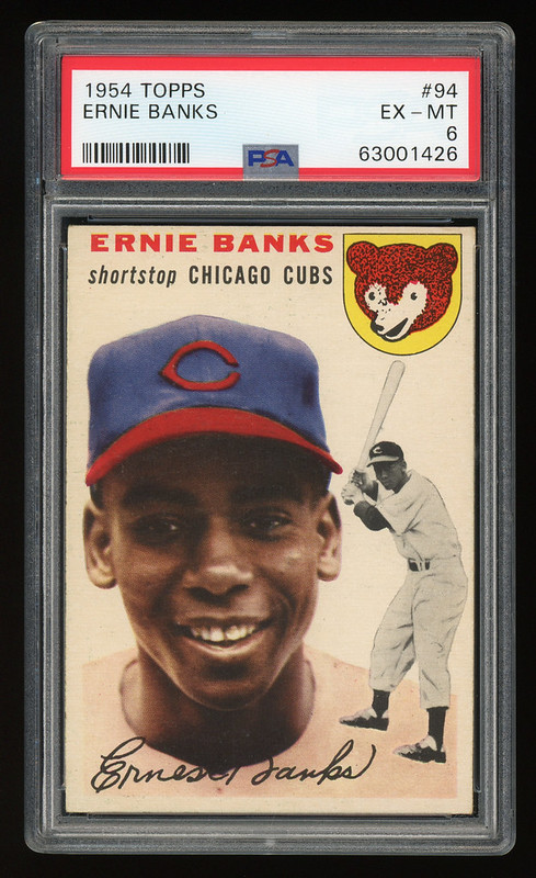 1954_Banks2_1 by boosandpearl, on Flickr 1954_Banks2_1 by boosandpearl, on FlickrI think both have strong centering, with the more recent one being a bit better. I plan to only keep one and would love to hear thoughts from the seasoned vets on the board.
|
|
#29
10-11-2021, 07:53 PM
|
|||
|
|||
|
There are a few ways to ensure a properly centered Banks IMO.
1) Check the bottom boarder, this should align with the right and left boarders. 2) The cubs logo should be an equal distance from the right boarder as the bottom right boarder. This ensures a 90 degree straight cut card. 3) Top/Bottom centering- The bottom boarder should be equal to the space above Ernies name. Also, the cubs logo should have an equal amount of boarder on the top and the right side, another check for a properly cut card. Another consideration is that the right edge of the cubs logo should be parallel to the right boarder. 4) Ernie Banks name is often cut off at the top of the card, this is a result of poor printing, not reflective of the card being miscut or off center. In general since its a common printing issue most folks ignore it. 5) The black and white image shouldnt be factored into the centering as its a secondary image layered on top of the primary image and was done so purposefully to overlap the primary boarder. A centered card will have the rear of Banks near the right boarder and there will be some white space, however, less boarder than the primary image. My attached card is shifted to the left probably 60/40ish but looks good top to bottom. The left/right off centering is consistent from top to bottom based on the width of the boarder between the cubs logo and right boarder being the same as that at the bottom boarder. You really cant go wrong with any Banks rookie but they sure look extra amazing centered!
|
|
#30
10-11-2021, 08:37 PM
|
||||
|
||||
|
My humble 4. Centering is always my priority and I believe I did well with this one but had not considered all of the factors brought forth in this thread.
 Sent from my SM-G960U using Tapatalk
__________________
Please PM if you are interested in Buy / Sell / Trade My eBay Store; https://www.ebay.com/str/thelumbercompanysportscards My HOF Collection; http://www.psacard.com/PSASetRegistr...t.aspx?s=77755 Last edited by scotgreb; 10-12-2021 at 02:57 PM.
|
|
#31
08-07-2024, 02:25 PM
|
||||
|
||||
|
Sorry to resurrect an old thread, but I recently picked up a copy of this card that I consider to be ideally centered, and given that it was so difficult to find - this of course sparked interest. I can tell you from searching for hours on end at the National a few weeks ago, finding a nice one with room above his name at all on the top is a very tall order indeed.
That said - the “print cutoff” thing on the name - where like part of the E and S seems missing at the top - not just the bad centering / cut - does anyone have more insight into how / why this happened? I have noticed that almost all of the time you find a decently centered card with room above his name at the top, the print problem like that is there. Many examples where the card is OC or almost miscut at the top - and the print problem will not be there, the E and the B and the S will be fully formed. Wonder why this is…
__________________
Postwar stars & HOF'ers. Cubs of all eras. Currently working on 1956, '63 and '72 Topps complete sets. Last edited by jchcollins; 08-08-2024 at 07:42 AM.
|
|
#32
08-07-2024, 02:28 PM
|
||||
|
||||
|
By the way, here is the card I finally settled on. I would much rather have the slightly noticeable print problem than the near miscut problem
  Sent from my iPhone using Tapatalk
__________________
Postwar stars & HOF'ers. Cubs of all eras. Currently working on 1956, '63 and '72 Topps complete sets.
|
|
#33
08-12-2024, 10:44 PM
|
|||
|
|||
|
Here is my copy. Just back from SGC today.
Picked up this lovely (gah) copy for $100. Cost $15 and about 2-1/2 weeks to have it graded. Absolutely not in the best shape. But no crease. Just the coffee cup stain on the left side. 
__________________
Anyone on Twitter? Here's my new handle @et_cardcollectr Also just created a Youtube channel: https://www.youtube.com/results?sear...t_cardcollectr
|
|
#34
08-13-2024, 09:53 AM
|
||||
|
||||
|
Quote:
Not at all bad for $100 raw. Most even trainwreck poor copies get $300 or so. And not a ton but you do have some room at the top above his name. Thanks for sharing Sent from my iPad using Tapatalk
__________________
Postwar stars & HOF'ers. Cubs of all eras. Currently working on 1956, '63 and '72 Topps complete sets. Last edited by jchcollins; 08-13-2024 at 09:57 AM.
|
|
#35
08-14-2024, 05:59 AM
|
|||
|
|||
|
Interesting thread. I always used to prefer sharp corners over centering until I ran into this set. No matter how centered the card is, they always look off center T to B because of the way they were printed. I prefer strong centering L to R, with a wide enough space above the name
|
|
#36
08-15-2024, 12:57 PM
|
||||
|
||||
|
Quote:
Yeah, its a nightmare set for centering purists. Im not in my normal card collecting life, but have discovered over the years that if the centering affects how design elements (like name, secondary image on 54 Topps) are positioned in relation to the edge of the card, I quickly become a centering freak. Another example of this for me is the team lettering on 1963 Topps. With the colored full-bleed bottom border, 63s can sometimes be o/c and not really look it - but I absolutely hate it when the team name shows little or no color beneath it and looks like it was almost cut off at the bottom of the card. I recently got rid of an otherwise very clean 63 Mantle due to this problem. I digress. 54 especially after you see uncut sheets is really just odd. The names for a lot are pushed to the top by virtue of the design and there is just not much room for error when its also badly OC. Same with the black and white action player image, many of which on the cards were designed to encroach into the border as almost a little gimmick. Im a Cubs fan and the Banks RC was a must for me and my team set endeavors, but I am NOT a fan in general of the 1954 Topps layout. Sent from my iPad using Tapatalk
__________________
Postwar stars & HOF'ers. Cubs of all eras. Currently working on 1956, '63 and '72 Topps complete sets.
|
|
#38
08-20-2024, 08:17 AM
|
||||
|
||||
|
Quote:
Very nice. Cant do much better than that up top, and you have nice s-s centering as well. I was actually looking for a card like that in the 3, 3.5 range - but figured I had better pounce on the 4 I found with it when I did. I had looked in Cleveland for 3+ hours and not found one that nice. Sent from my iPad using Tapatalk
__________________
Postwar stars & HOF'ers. Cubs of all eras. Currently working on 1956, '63 and '72 Topps complete sets.
|
 |
| Thread Tools | |
| Display Modes | |
|
|
 Similar Threads
|
||||
| Thread | Thread Starter | Forum | Replies | Last Post |
| 1954 topps #128 Hank Henry Aaron HOF RC no creases decent centering SGC A nice card | Republicaninmass | 1950 to 1959 Baseball cards- B/S/T | 24 | 12-05-2021 08:32 AM |
| top-bottom centering on 1954 Topps | darwinbulldog | Postwar Baseball Cards Forum (Pre-1980) | 4 | 02-17-2020 07:58 AM |
| WTB 1954 Topps Banks | Peter_Spaeth | 1950 to 1959 Baseball cards- B/S/T | 0 | 02-17-2016 02:17 PM |
| FS 1954 Topps Kaline RC $200 50/50 centering | jjcollects | 1950 to 1959 Baseball cards- B/S/T | 1 | 08-17-2013 01:36 PM |
| 1954 Topps Al Kaline PSA 5 1954 Topps Ernie Banks PSA 3 MC | Sean1125 | Ebay, Auction and other Venues Announcement- B/S/T | 0 | 05-18-2013 11:00 AM |


 Linear Mode

