|
||||||
 |
|
|||||
|
||||||
|
|
|||||
|
|
|
#1
 03-15-2013, 10:05 PM
|
||||
|
||||
|
Quote:
__________________
All the cool kids love my YouTube Channel:
Elm's Adventures in Cardboard Land  https://www.youtube.com/@TheJollyElm Looking to trade? Here's my bucket: https://www.flickr.com/photos/152396...57685904801706 I was such a dangerous hitter I even got intentional walks during batting practice. Casey Stengel Spelling "Yastrzemski" correctly without needing to look it up since the 1980s. Overpaying yesterday is simply underpaying tomorrow.  
|
|
#2
03-16-2013, 08:24 AM
|
|||
|
|||
|
Darren-- I think Bob Lemke would agree and believe Carlton above does too. I have them in both my regular 68 set and my MB set, but they all 4 have MB backs. If you have them, compare the backs to other backs from that series. They will be dull yellow versus yellow/orange. You could view the whole MB set as variations of the regular 68 set. Sort of like the 82 Topps Blackless set, which I also have, is listed separately in SCD, even though they are all just misprints from the regular 82 set. Carlton might not agree with that though :-) The MB set was an intentional separate print run. The Blackless were a printing mistake
I am also a long time variant collector Last edited by ALR-bishop; 03-16-2013 at 09:34 AM.
|
|
#3
03-16-2013, 11:15 AM
|
|||
|
|||
|
I hope these four pictures will explain some differences. Very little has been written about these obscure and rare Milton Bradley cards. The lack of info to date stems from three things: rarity; lack of cataloging; and limited info about 1968 backs in the regular sets. To be fair, the colors are subtle and the shadings are very similar. The simplistic and inaccurate response is to say, "well they all look a little yellow."
In the bottom scan, the Dick Lines cards come from the 68 4th series. In 1968 Topps used two types of stock, the typical light gold used in series 1-7, seen on the left, and also a sunflower color seen on the right, only in series 4-6. This lighter sunflower color is closer to the yellow stock used in the MB cards, but still darker and more orange/gold than yellow to the naked eye. I have boxes of 68s and in those 4-6 series it is a 50/50 split between stock backs. Like the 1956 Topps white/gray backs, there is no different value for scarcity. In the fourth picture, look closely at the two ovals containing the bio above and the cartoon below. The sunflower stock oval on the right has a white bleached background. The standard golden Lines card has the dingy gray cardboard color seen in all 7 series. The card on the right is not an MB but on ebay some of these cards have been sold as "yellow backs". Incorrect. The first set of photos compares a Merritt MB with the Lines sunflower stock card. Notice that the MB has the usual gray oval background, not the bleached white. The second back photo shows two Merritt MBs flanking a regular Merritt. The picture doesn't show it well, but all three cartoons have the gray color, not the bleached white. The MBs are of slightly different shadings, but clearly are both more yellow and not gold. The third front scan shows the same MBs flanking the regular. Note that the colors are a little more vivid. This isn't the distinguishing mark, but if you have a better condition MB (good luck finding in EX or above, most were handled roughly by 10 year olds in a game) the color strike is much deeper. You can only appreciate this in person, and scans don't really convey that. At your next show look at the graded Cox/Brinkmans and you will see a deeper, sharper picture than the regular card of comparable grade. The only cards in the first two series that have a yellow back are the 77 MBs, 44 from the first series and 33 from the second. Another place that shows some pretty clear pictures of Cox and Brinkman cards is the Huggins and Scott website. They have sold several Win a Card games over the years and the closeup pictures are good. Same goes for their current auction, which has a full 77 baseball card set up for sale in April. You can't tell MBs from the front, other than the Cox/Brinkman with the yellow team letters or an off-centered card with a football/hot rod white border, but on a good scan you might appreciate the richness of the picture. To answer Al's question, I don't think that the MB cards are part of the 1968 Topps master set, because you couldn't get them in a wax pack or vending set, only in a rare game. You could get variations like the #10 Lonborg/Lonberg or a #400 WL McCormick like any other card in a pack or vending. I wouldn't consider the 1967 Maris Yankees card part of a 67 master set for that reason; it was a proof card and not issued in the set. The Topps MBs are not proof cards, just an obscure and poorly appreciated set in its own right.
|
|
#4
03-16-2013, 11:45 AM
|
|||
|
|||
|
I was only kidding a little about the variation theme. Unlike the MBs, the 1982 Topps Blackless cards made their way into the hobby via packs.
But some check listed Topps issues did enter the market directly rather than packs. Most recently was the 2012 Topps Heritage Update, but there were numerous send away for a card or set of cards in the 80s. The only things I can think of pre 1980 were the 1973 Reprints of 1953 cards and possibly the 1971 Greatest Moments set. Some people say they came in packs but I am not aware of anyone coming up with a pack or wrapper so far ( there is one empty box I have seen at auction). Plus some variations may exist as a function of the appearance of cards only in factory sets. As usual Carlton, a great tutorial on MBs specifically and the 68 set in general I do agree on the 1967 Maris proof, but if you pursue "master" sets you have to have one  [IMG] 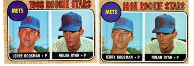 [/IMG] [/IMG][IMG] 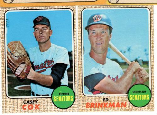 [/IMG] [/IMG][IMG] 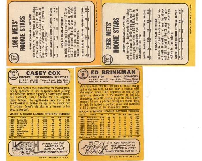 [/IMG] [/IMG][IMG] 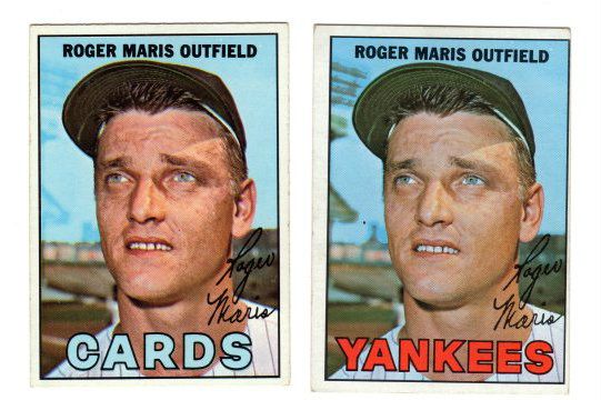 [/IMG] [/IMG]
Last edited by ALR-bishop; 03-16-2013 at 12:12 PM.
|
|
#5
03-16-2013, 12:13 PM
|
|||
|
|||
|
Then to be consistent a master set of 68s should include all 77 MB baseball cards or none at all.
Awesome 67 Maris. 71 Topps finest one of the neatest sets ever. Do you have any pics of the 1973 reprint set?
|
|
#6
03-16-2013, 12:17 PM
|
||||
|
||||
|
Carlton, here is an example of the JRobby from the 73 53 reprint set
|
|
#7
03-16-2013, 01:45 PM
|
|||
|
|||
|
Quoting from Bert Randolph Sugar's work, 2nd edition (1977):
"No. 107 issued with "course" (sic) or "fine" 'cloth' background on front. No. 179 issued with or without sentence at end of biography: "Bill was used sparingly but still" No. 258 issued with '1968 Rookie Stars' printed in orange or red. No. 278 issued with copyright printed on left or right side. No. 454 issued with two cropping forms of picture of Frank Robinson. No. 518 issued with No.539 listed as American League or Major League Rookies. No scarcities." I think my wife might have tossed my first edition  I can't find it. I know the second was heavily corrected between 1975 and 1977. I can't find it. I know the second was heavily corrected between 1975 and 1977.The managing editor of this edition? The brilliant Keith Olbermann. This book was a quantum leap forward for the hobby. Still, here is what they got right and didn't (IMHO): Fluffed on the 400 White Team Letters McCormick. Ditto for 49 YTL Brinkman and 66 YTL Cox. Missed on #10 Lonborg/Lonberg on back. Probably got it right on the Stoneman card #179. I have been looking for that one since the late 1970s and have never seen one. If anyone has a card without that last line I would love to see (or buy) it. I am still not sold on the red/orange rookies after years of scrutiny. All seven 1968 checklists have cropping changes. The 67 Kaat is subtle but it's there. The Kaat with a little more room between the cap and inset has a difference on the back. That card has the "T.C.G." end under the box for 109 Campaneris. The Kaat with the lesser room between the cap and inset has the "T.C.G." end just before that box. All Topps checklists between 1961 and 1972 had two variations. Not so in 1973 because they did not print a "preview" checklist enticing kids to buy the next series.
|
|
#8
03-16-2013, 12:48 PM
|
|||
|
|||
|
The 1973 set may have been a joke at a Topps function. I say that because 3 of the 8 cards in the set incorrectly identify the player pictured:
[IMG] 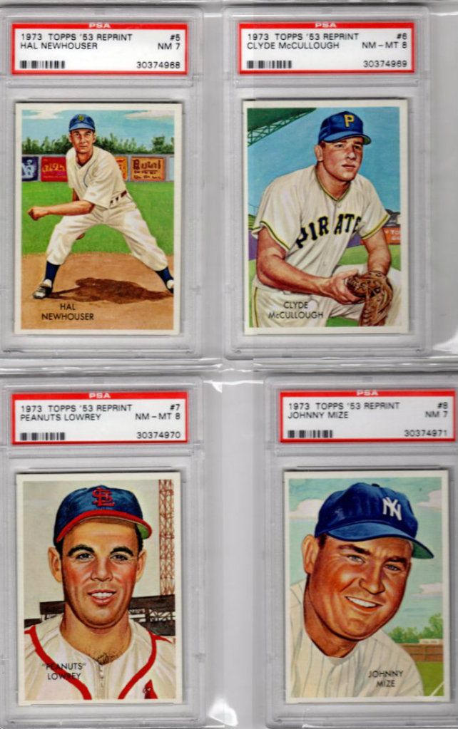 [/IMG] [/IMG][IMG] 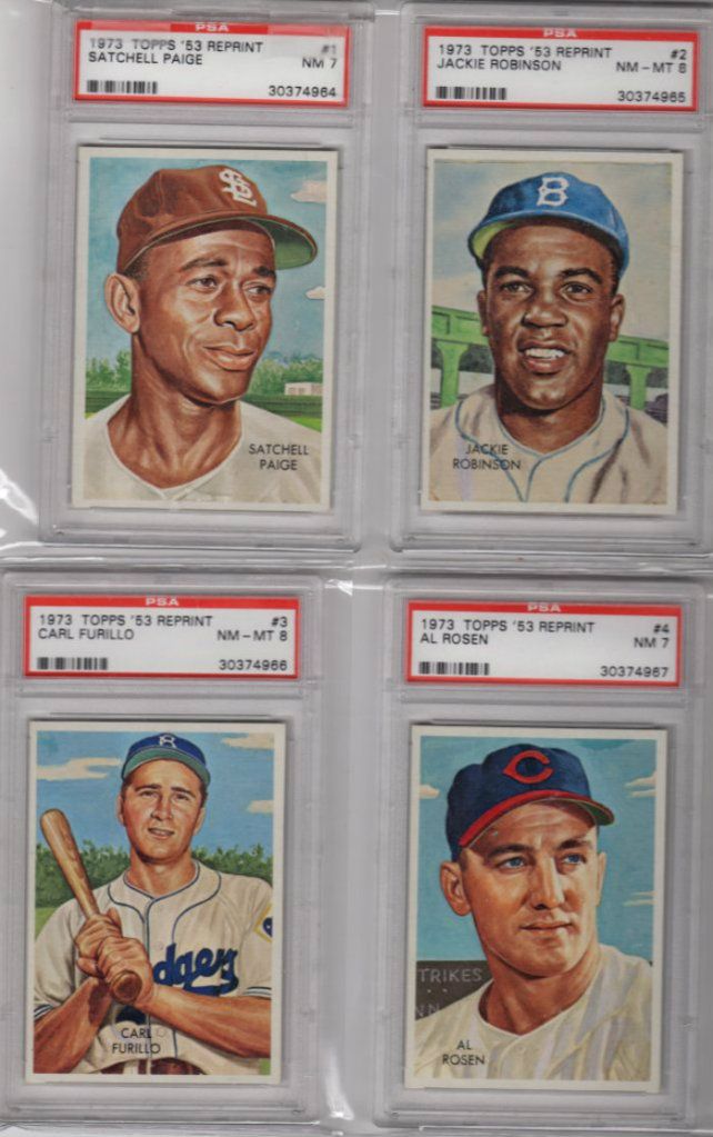 [/IMG] [/IMG][IMG] 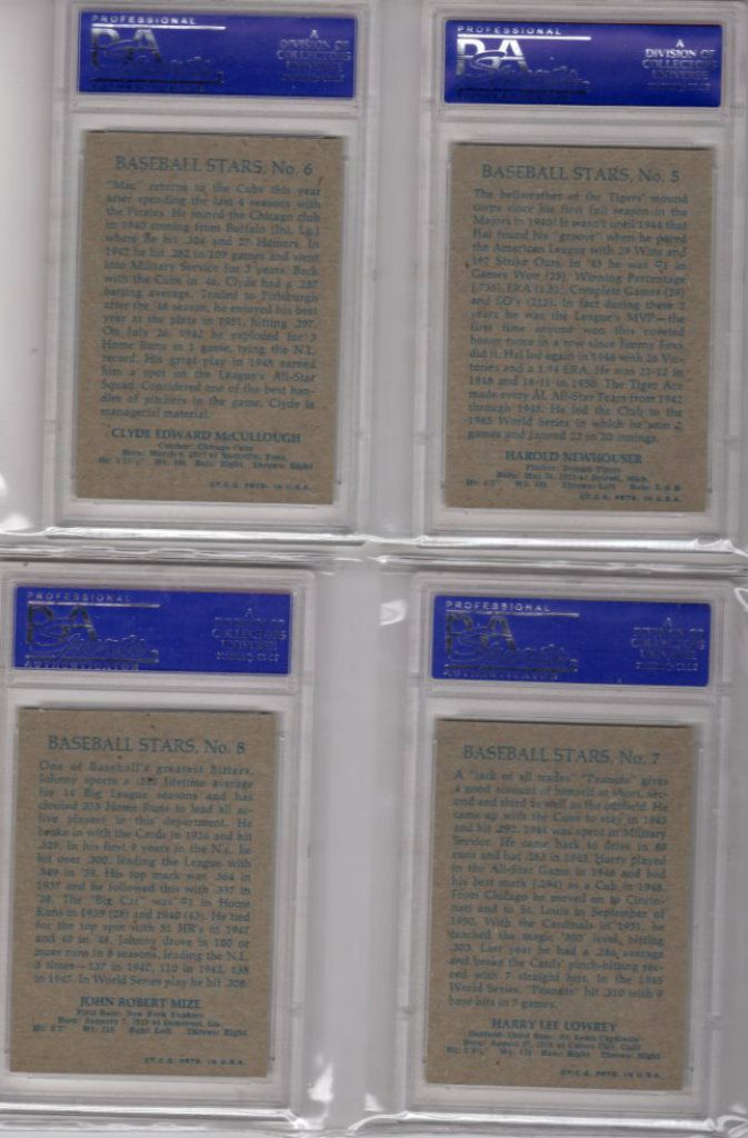 [/IMG] [/IMG]
|
|
#9
03-16-2013, 05:10 PM
|
||||
|
||||
|
Quote:
Beckett is not the best source for accurate information along these lines. I have cataloged over 500 mistakes, errors, omissions, and duplication etc. from their last alphabetical checklist, and that was ONLY Cardinals. Most of these mistakes still exist in their online database. Anybody with a common name such as Jack Taylor (or John), or Craig Wilson, are almost guaranteed to be combined with everybody who had that name. I used to inform them of these mistakes years ago, but quit because they corrected very few of the errors. As a side note, I discovered the 1968 Topps Mike McCormick variation in 1986 and was given credit from Ralph Nozaki in his Baseball Hobby News column.
|
|
#10
03-16-2013, 05:32 PM
|
|||
|
|||
|
And to think we knew you when Randy :-). Neat hobby story.
Agree on Beckett and already miss Bob Lemke at SCD. As for MBs, Carlton is The Man Last edited by ALR-bishop; 03-16-2013 at 05:35 PM.
|
|
#11
03-16-2013, 08:12 PM
|
||||
|
||||
|
Quote:

|
|
#12
03-16-2013, 06:00 PM
|
||||
|
||||
|
Quote:
__________________
All the cool kids love my YouTube Channel:
Elm's Adventures in Cardboard Land https://www.youtube.com/@TheJollyElm Looking to trade? Here's my bucket: https://www.flickr.com/photos/152396...57685904801706 I was such a dangerous hitter I even got intentional walks during batting practice. Casey Stengel Spelling "Yastrzemski" correctly without needing to look it up since the 1980s. Overpaying yesterday is simply underpaying tomorrow.
|
|
#13
03-16-2013, 08:12 PM
|
||||
|
||||
|
Quote:
|
|
#14
03-16-2013, 08:48 PM
|
|||
|
|||
|
Neat story, Randy. We were Braves fans and I got three Aarons in the first game I ever got. Thanks, Dad!
Still have all the cards from my original game but don't have that particular game board. Hope this picture brings back some good memories for you.
|
|
#16
03-16-2013, 09:30 PM
|
||||
|
||||
|
Great card Paul, here's mine, from the same sheet
|
|
#17
03-16-2013, 09:49 PM
|
|||
|
|||
|
Six Eddie Brinkman 1968 cards in chronological order:
1. Regular Brinkman, gold back, white letters, Jan-Feb 1968 2. O pee chee Brinkman, brown back, white letters, Jan-Feb 1968 3. Topps Milton Bradley Brinkman, yellow back, yellow letters, Apr 1968 The card is a beauty, looks flawless 4. Topps Milton Bradley Brinkman, yellow back, yellow letters, Apr 1968 Eddie was great with autographs before his untimely death in 2008. Had a smile as wide as the Mississippi when he signed this. 5. Topps Milton Bradley Brinkman/Winston Hill miscut, yellow back, yellow letters, Apr 1968. One of my favorite MB cards. I call it the "missing link". 6. Topps Venezuelan Brinkman, brown mustard back, yellow letters, ? in 1968. Note also the yellow letters! Between Jan/Feb 1968 and the production of the MB cards in April, Topps corrected a huge mistake they made with the white letter Brinkman and Cox. Unlike all the other 1968 Washington Senators cards, those were the only two that did not have yellow letters. In the first series, the Ed Stroud #31 and Senators rookies #96 are always found with the proper yellow letters. They continued to get it right with the Venezuelan issue. I am not an expert on that series but I assume they were produced around mid Spring. In 1968 there were 10 different color schemes for the position/team circle on the front. The Giants also had the green circle/yellow letter scheme. Perhaps the same person who didn't tint in the Cox and Brinkman in series 1 decided to reprise his error in the 5th series with the #400 McCormick card. I have looked a long time for 1968 Senators and Giants cards with white letters and haven't found any. I noticed the yellow letters on the Cox/Brinkman cards in the first MB game I got. It always bothered me that they were different from the regular 68s in my collection. That would be a pretty good clinical definition of obsessive compulsive disorder.
|
|
#18
03-16-2013, 09:34 PM
|
||||
|
||||
|
Quote:
|
 |
|
|
 Similar Threads
|
||||
| Thread | Thread Starter | Forum | Replies | Last Post |
| WTB WTT for 1968 Topps Baseball | RayBShotz | 1950 to 1959 Baseball cards- B/S/T | 3 | 04-08-2011 03:57 AM |
| Question about the design of 1958 Topps | Gary Dunaier | Postwar Baseball Cards Forum (Pre-1980) | 2 | 03-12-2011 04:06 PM |
| WTB 1968 Topps Baseball | Archive | 1950 to 1959 Baseball cards- B/S/T | 2 | 10-24-2008 08:15 AM |
| Baseball Card Design | Archive | Net54baseball Vintage (WWII & Older) Baseball Cards & New Member Introductions | 0 | 08-19-2008 08:45 PM |
| 1968 Topps 3-D Baseball | Archive | Postwar Baseball Cards Forum (Pre-1980) | 60 | 08-11-2008 11:17 AM |


 Hybrid Mode
