|
||||||
 |
|
|||||
|
||||||
|
|
|||||
|
|
|
#1
 03-17-2013, 09:46 AM
|
||||
|
||||
|
Quote:


|
|
#2
03-17-2013, 11:45 AM
|
|||
|
|||
|
The lack of yellow tint in these two circles has bothered me since 1970.
I tell my patients the difference between obsessive compulsive personality and disorder is that the latter affects relationships and might include too much spending. So yes, Al, most people on this board and diehard variation collectors could use 20 mg of paroxetine.
|
|
#3
03-19-2013, 12:19 AM
|
||||
|
||||
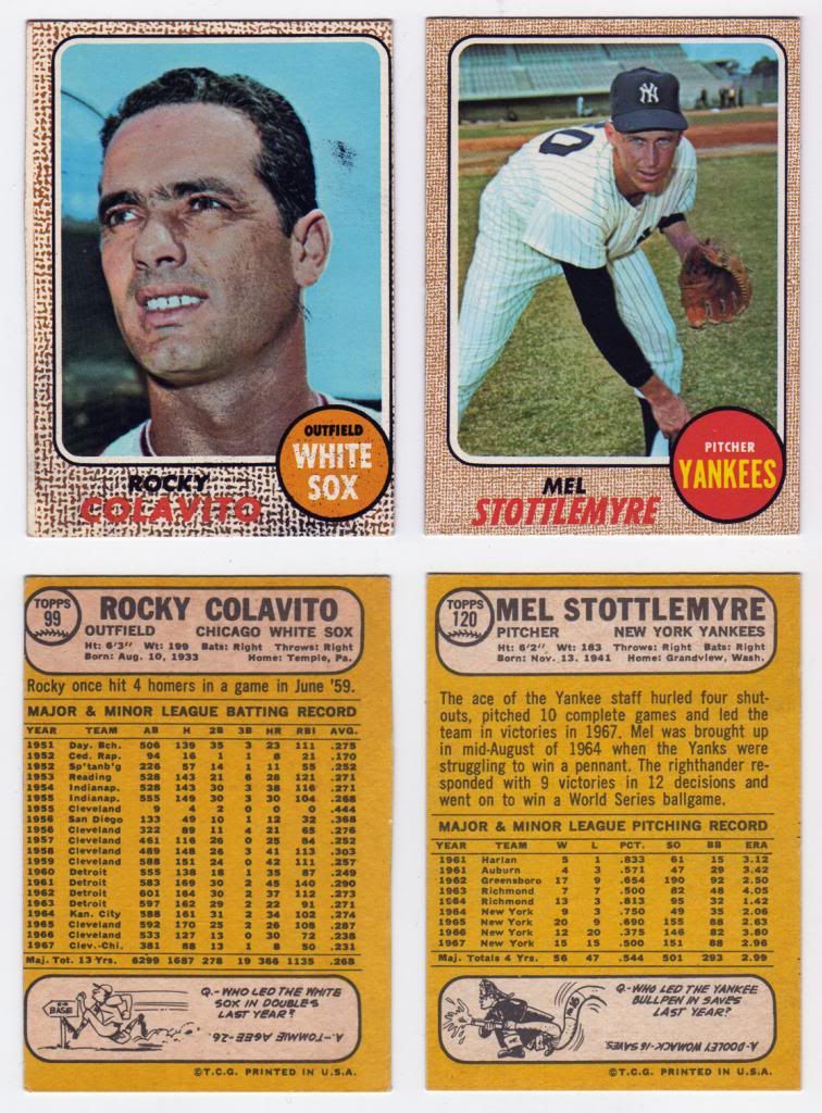 My scan comes across very dark orangey, but in person both of these cards jump out for their yellowness as compared to the other cards on the page. The Colavito has the same miscut as the example in this thread. I believe these both may be Milton Bradley cards, but I am brand new to this game. Carlton and Al, what do you guys think? After further thought, the scan really hides the true color features, so I added this new scan. For the sake of comparison, here are the same 2 cards bookending a non-Milton Bradley Seaver card: 
__________________
All the cool kids love my YouTube Channel:
Elm's Adventures in Cardboard Land  https://www.youtube.com/@TheJollyElm Looking to trade? Here's my bucket: https://www.flickr.com/photos/152396...57685904801706 I was such a dangerous hitter I even got intentional walks during batting practice. Casey Stengel Spelling "Yastrzemski" correctly without needing to look it up since the 1980s. Overpaying yesterday is simply underpaying tomorrow. 
|
|
#4
03-19-2013, 05:04 AM
|
|||
|
|||
|
Above average condition MBs, very nice. This set is horrible for centering, like the Colavito. If that Stottlemyre is a 6 then it is a really nice card. It would stand as the second best one graded to date (PSA: 3 5s, one 6, one 7; Beckett one 6). Considering it passed through the hands of an 8 year old...
|
|
#5
03-20-2013, 09:45 PM
|
|||
|
|||
|
Strange card from my 1968 Topps Milton Bradley autograph collection. However, I do not know if the autograph is original or autopenned.
Definite MB, look at the white border at the bottom. The back is yellow and definitely an MB. The color looks washed out. I have a few other MBs that look like this. Saw this in a shop in the 90s and snatched it immediately. It has not been exposed to the sun. Welcome any and all comments!
|
|
#6
03-21-2013, 10:25 AM
|
||||
|
||||
|
Carlton, IMO (and w/o card in hand), it appears to not be signed by Gibson himself. Very neat card though.
|
 |
|
|
 Similar Threads
|
||||
| Thread | Thread Starter | Forum | Replies | Last Post |
| WTB WTT for 1968 Topps Baseball | RayBShotz | 1950 to 1959 Baseball cards- B/S/T | 3 | 04-08-2011 02:57 AM |
| Question about the design of 1958 Topps | Gary Dunaier | Postwar Baseball Cards Forum (Pre-1980) | 2 | 03-12-2011 03:06 PM |
| WTB 1968 Topps Baseball | Archive | 1950 to 1959 Baseball cards- B/S/T | 2 | 10-24-2008 07:15 AM |
| Baseball Card Design | Archive | Net54baseball Vintage (WWII & Older) Baseball Cards & New Member Introductions | 0 | 08-19-2008 07:45 PM |
| 1968 Topps 3-D Baseball | Archive | Postwar Baseball Cards Forum (Pre-1980) | 60 | 08-11-2008 10:17 AM |


 Hybrid Mode
