|
||||||
 |
|
|||||
|
||||||
|
|
|||||
|
|
|
#1
 09-10-2013, 01:43 PM
|
|||
|
|||
|
My personal pick

|
|
#2
09-10-2013, 01:56 PM
|
||||
|
||||
|
1969 Topps nuff said.
|
|
#4
09-10-2013, 02:12 PM
|
||||
|
||||
|
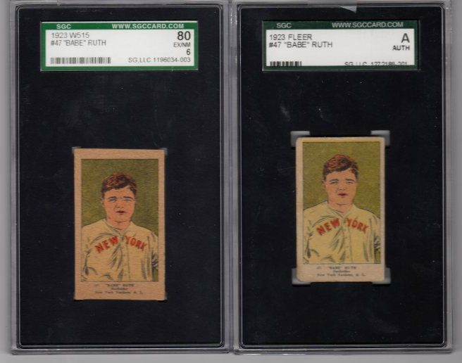
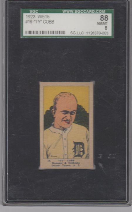
Al, I have to agree. If we're talking pre-war or vintage, the W515 gets my vote. Too bad, because there's some really great players available in it.
Of course, even that looks beautiful compared to some of the uninspired stuff that came out in the early 90s. Obnoxious, loud colors were all over the place. Thankfully, I'd stopped collecting by then.
__________________
Building these sets: T206, 1953 Bowman Color, 1975 Topps. Great transactions with: piedmont150, Cardboard Junkie, z28jd, t206blogcom, tinkertoeverstochance, trobba, Texxxx, marcdelpercio, t206hound, zachs, tolstoi, IronHorse 2130, AndyG09, BBT206, jtschantz, lug-nut, leaflover, Abravefan11, mpemulis, btcarfagno, BlueSky, and Frankbmd.
|
|
#5
09-10-2013, 03:17 PM
|
|||
|
|||
|
I think for pre-war the strip card sets W515, W551, etc. are pretty bad. They look like they were drawn by a child -- the likeness is questionable on some of them. Top that off with the fact that many are blank back and were actually cut by children.
Worst set of all time, though, has to be the yellow 1990 Score. Oh wait, the 1981 Fleer was pretty awful with the out-of-focus photographs.
|
|
#6
09-10-2013, 03:45 PM
|
||||
|
||||
|
1962 Topps are not very attractive for postwar and not a fan of Ramly T204 cards from 1909
__________________
Favorite MLB quote. " I knew we could find a place to hide you". Lee Smith talking about my catching abilities at Cubs Fantasy camp. Last edited by kmac32; 09-10-2013 at 03:48 PM.
|
|
#8
09-10-2013, 11:12 PM
|
||||
|
||||
|
Quote:
__________________
T206-520/524 T205-209/221 T207-68/200 T213-2 -65/185 E90-1 102/120 Topps 1954,1959,1964 Bowman 1954 complete Deals competed with: jb217676, marcdelpercio, dog*dirt, srs1a, KennyCole, ullmandds, RCMcKenzie, edhans, dboneesq, mybuddyinc, nineunder71, uke, T206kid, & more Last edited by deadballfreaK; 09-10-2013 at 11:20 PM.
|
|
#9
09-10-2013, 08:52 PM
|
||||
|
||||
|
Quote:
__________________
T206-520/524 T205-209/221 T207-68/200 T213-2 -65/185 E90-1 102/120 Topps 1954,1959,1964 Bowman 1954 complete Deals competed with: jb217676, marcdelpercio, dog*dirt, srs1a, KennyCole, ullmandds, RCMcKenzie, edhans, dboneesq, mybuddyinc, nineunder71, uke, T206kid, & more
|
|
#11
09-10-2013, 10:33 PM
|
||||
|
||||
|
As promised, here are scans of my set, and then cards that I have multiples. As can be seen, this issue comes with a lot of color and design variations (eat your heart out T206 freak lovers!).
I especially like the squiggly background lines variations on the Veach and Cadore...it makes these players seem incredibly psychotic. And the Griffith card always reminded me of Malcolm McDowell in A Clockwork Orange. Although I concede that the W9316 set is at or near the top of the ugly list, I still can't resist them. I must have absolutely no taste. Brian Last edited by brianp-beme; 09-10-2013 at 11:56 PM. Reason: Gettin' my Mics straight
|
|
#12
09-10-2013, 10:44 PM
|
|||
|
|||
|
Those are some fugly cards!
 Talk about lipstick on a pig.
|
|
#13
09-10-2013, 11:13 PM
|
|||
|
|||
|
Quote:
|
|
#14
09-10-2013, 11:55 PM
|
||||
|
||||
|
David, in an alternate world it would be Malcolm McClaren, but I guess in this world it will have to be Malcolm McDowell. Thanks for pointing out my otherworldliness.
Brian Last edited by brianp-beme; 09-11-2013 at 07:56 AM.
|
 |
|
|
 Similar Threads
|
||||
| Thread | Thread Starter | Forum | Replies | Last Post |
| Ugliest Postwar Baseball Cards of All Time | Gr8Beldini | Postwar Baseball Cards Forum (Pre-1980) | 12 | 12-14-2012 07:48 PM |
| Ugliest Card Ever | paul | Net54baseball Vintage (WWII & Older) Baseball Cards & New Member Introductions | 55 | 03-22-2011 08:00 AM |
| What is the UGLIEST... | mintacular | Net54baseball Vintage (WWII & Older) Baseball Cards & New Member Introductions | 3 | 03-23-2010 07:24 AM |
| The Ugliest Pre-War Set | Archive | Net54baseball Vintage (WWII & Older) Baseball Cards & New Member Introductions | 22 | 06-02-2007 02:15 PM |
| Ugliest set ever | Archive | Net54baseball Vintage (WWII & Older) Baseball Cards & New Member Introductions | 19 | 06-22-2003 11:51 PM |


 Hybrid Mode
