|
||||||
 |
|
|||||
|
||||||
|
|
|||||
|
#1
 03-08-2014, 11:14 AM
|
||||
|
||||
|
They can be quite striking, especially in portraits, but I understand they are not generally regarded as 'errors' and just interesting phenomenon. Am I right that they rarely bring much or any premium, even for a popular mid-grade card?

|
|
#3
03-08-2014, 12:49 PM
|
||||
|
||||
|
The McGraw/orange portrait gets a nice boost over his red background. Seems to be 3-4x the price depending on grade.
__________________
Please check out my books on baseball history. They include the bio of star second baseman Dots Miller. A book featuring 20 Moonlight Graham players who got into just one game. Another with 13 players who were with the Pittsburgh Pirates during the regular season, but never played a game. There's also one about 27 baseball families, as well as a day-by-day look at the worst team in Pittsburgh Pirates history. All five can be found here: https://www.amazon.com/stores/John-D...hor/B0DH87Q2DS
|
|
#4
03-09-2014, 06:15 PM
|
|||
|
|||
|
Quote:
what are you basing that off of? kevin
|
|
#5
03-09-2014, 06:19 PM
|
||||
|
||||
|
WTF r u gys talking about? True...radical color differences in T206 command a large premium. Kevins "Orange" cobb is definitely "oranger" than the normal red...but is not "orange" enough to command a large premium...in my opinion.
|
|
#6
03-09-2014, 07:46 PM
|
||||
|
||||
|
Quote:
__________________
Please check out my books on baseball history. They include the bio of star second baseman Dots Miller. A book featuring 20 Moonlight Graham players who got into just one game. Another with 13 players who were with the Pittsburgh Pirates during the regular season, but never played a game. There's also one about 27 baseball families, as well as a day-by-day look at the worst team in Pittsburgh Pirates history. All five can be found here: https://www.amazon.com/stores/John-D...hor/B0DH87Q2DS
|
|
#10
03-09-2014, 08:29 PM
|
||||
|
||||
|
An SGC 60 Eddie Collins--in a nice purple--just went for about $800 in last night's Leon auction--or about twice the normal....Seems about right?
|
|
#12
03-09-2014, 08:57 PM
|
||||
|
||||
|
I was wondering if anyone else has ever felt like Brown Hindu's almost look a bit "lighter" than the other ones? Maybe it is just my imagination, or I am seeing things, or am just completely insane, but in some cases I feel like I have noticed a difference.
I have not handled enough examples to really know, but I would like to know if anyone else has noticed this? I think what I am saying might not really apply to the original purpose of the thread, and any premium is coming from the front/ back combination itself and not necessarily a difference in the colors, but maybe someone has some information? Thank you. Derek
|
|
#13
03-09-2014, 10:07 PM
|
||||
|
||||
|
Paul, I suggest you provide a red apple Cobb so we all can compare and judge for ourselves.
Brian Quote:
|
|
#14
03-09-2014, 10:13 PM
|
||||
|
||||
|
Anyone who has bought/sold these knows that the premiums are all over the board, and really depend on whether or not there are two interested buyers when one is offered. I've seen Willis portraits that had odd but ugly faded purple backgrounds go for 2-3X normal price, and I've seen beautiful orange backgrounds (that should have been red) go for just a small fraction above the normal-background version. Like the others, the orange Cobb is also all over the board - when I was looking for one, and forum members knew it, the premium went way up
 . Now it isn't so high. Go figure. . Now it isn't so high. Go figure.
__________________
$co++ Forre$+
|
|
#15
03-09-2014, 10:27 PM
|
|||
|
|||
|
Quote:
 Paul
|
|
#16
03-09-2014, 10:56 PM
|
||||
|
||||
|
Quote:
|
|
#17
03-09-2014, 11:59 PM
|
||||
|
||||
|
Quote:
The Waddell card seems to have it a bit as well. The blue seems so light. I had a Sovereign 350 at one point and the blue was very dark and rich, almost like a royal blue. So I am not crazy, per se. Thank you Sir. Derek
|
|
#18
03-09-2014, 11:59 PM
|
||||
|
||||
|
PS
But, why ? ...
|
|
#19
03-10-2014, 03:54 AM
|
||||
|
||||
|
Quote:
scan0015.jpg scan0022.jpg I can't expain why, however. Last edited by Sean; 03-10-2014 at 04:17 AM.
|
|
#20
03-10-2014, 05:40 AM
|
|||
|
|||
|
Quote:
kevin
|
|
#22
03-10-2014, 06:38 AM
|
|||
|
|||
|
Quote:
Every other red background Hindu I had was orange(Chance, Merkle, McGraw).
|
|
#23
03-10-2014, 10:20 AM
|
||||
|
||||
|
Velly ineresting. I currently have two Merkle portraits on my website (and ebay) - the brown Hindu is orange and the other is red (good comparison, since I used the same scanner for both).
http://www.belltownvintagecards.com/...0101032902.htm http://www.belltownvintagecards.com/...0101032901.htm
__________________
$co++ Forre$+
|
|
#24
03-10-2014, 10:33 AM
|
|||
|
|||
|
Quote:
 
|
|
#26
03-10-2014, 12:20 PM
|
|||
|
|||
|
Scott......you called ?
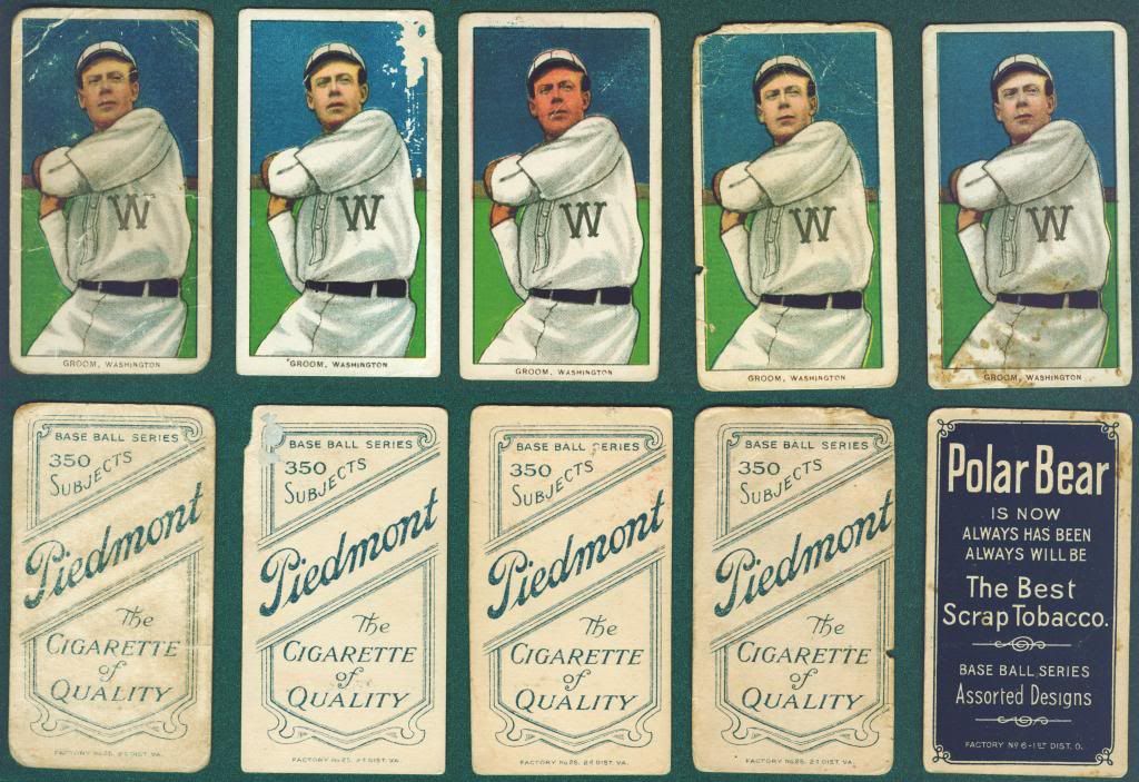
Currently, in my collection are following color errors. I had more, but traded them away. These I'll keep for a while. The only brown HINDU with a front color printing flaw that I have is Bridwell. I cannot think of how we can connect front printing flaws with any particular T206 back. Since, the fronts were printed first. The various T-brand backs were printed later, as the orders for T206's arrived to ALC from the various tobacco factory's. Thought you may like my ORANGE Cobb (with the "snow flake" effect for this wintry season) 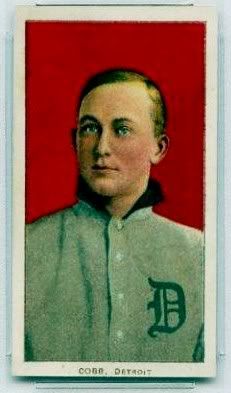 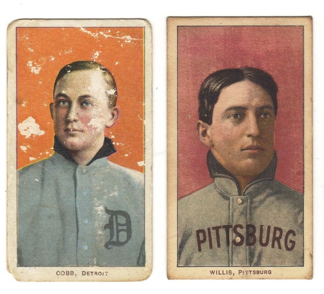 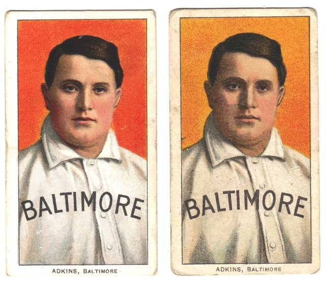 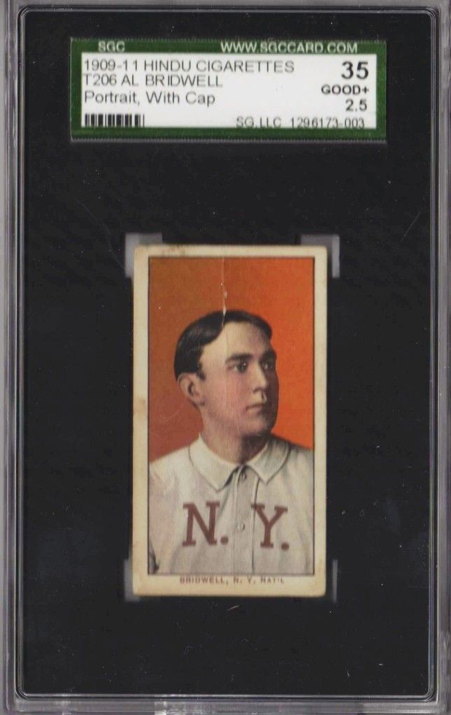    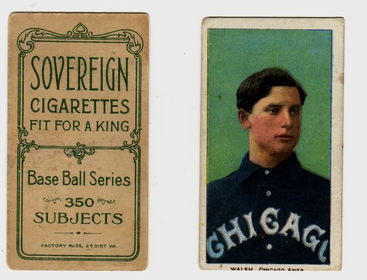 And, my favorite color error card....Lundgren without BLUE ink 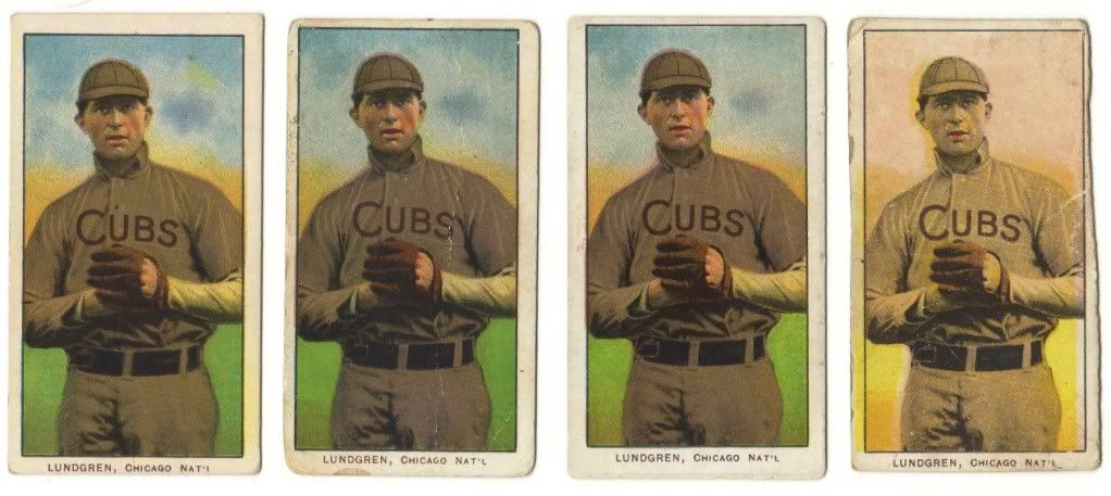 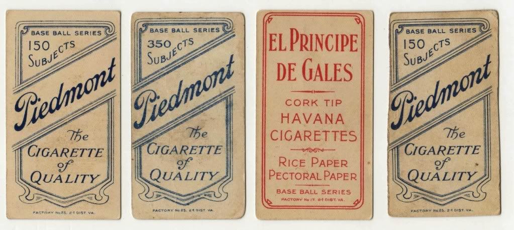 Furthermore, check-out the UZIT backs....some are deep BLUE, others are lighter BLUE....similar to the PIEDMONT 460/42 backs 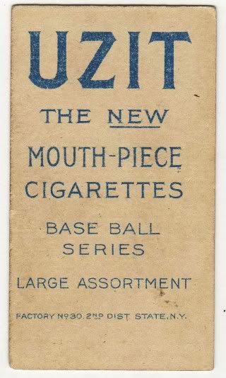 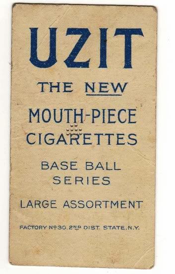 TED Z __________________________________________________ _________________________________ LOOKING for this T206 guy to complete my EXCLUSIVE 12 red HINDU sub-set (12 subjects) SHECKARD (glove) .
|
|
#28
03-10-2014, 12:54 PM
|
||||
|
||||
|
The Hindu is the much lighter one.
I traded the Sovereign before I got the Hindu, so I never had the chance to compare them side by the side, but the difference is very distinct as I remember it. Thoughts?
|
|
#29
03-10-2014, 06:02 PM
|
|||
|
|||
|
Some of these are just the colors not being printed with enough ink, others are not.
some places, like the uzit backs, you are seeing the cardboard color come through and its affecting your eyes abilitiy to judge the color as the same shade. some of the card board can probably even be see through the ink to some extent, much like paint on a wall, until you put the second coat on. kevin Last edited by thehoodedcoder; 03-10-2014 at 06:02 PM.
|
|
#31
03-10-2014, 09:32 PM
|
||||
|
||||
|
Still have to return to original question: are these cards getting anything more than a tiny premium? Should they?
|
|
#32
03-10-2014, 09:46 PM
|
||||
|
||||
|
Quote:
I don't think the question of "should" can be answered. People can collect what they want and pay whatever price makes them happy. Personally, I think it's crazy.
__________________
Tackling the Monster T206 = 213/524 HOFs = 13/76 SLers = 33/48 Horizontals = 6/6 ALWAYS looking for T206 with back damage.
|
|
#34
03-11-2014, 02:54 PM
|
|||
|
|||
|
Quote:
Last edited by CMIZ5290; 03-11-2014 at 03:02 PM.
|
|
#35
03-11-2014, 04:22 PM
|
||||
|
||||
|
Quote:
__________________
$co++ Forre$+
|
|
#36
03-11-2014, 09:02 PM
|
|||
|
|||
|
Some cards posted here are either faded from the sun, or have been altered (either intentionally or unintentionally) with chemicals. they command no premium. cards with "mild" color variations command little to some premium (orange backgrounds, etc). cards which are clearly missing color passes, command big premiums.
|
|
#37
03-12-2014, 08:38 AM
|
||||
|
||||
|
Quote:
 ...every card has some variance, but the card in the center is clearly darker. So much so that my wife can spot it from across the room (I know this because when she saw it sitting out she asked why it looked different and if it meant we could retire if I sold it ") ). ).
__________________
https://www.flickr.com/photos/bn2cardz/albums
|
|
#38
03-12-2014, 10:59 AM
|
|||
|
|||
|
Quote:
There may be slight differences, if the printer mixed multiple batches of ink, but to think they vary that much....I don't think so. There are ink weight formulas to produce specific colors and a printer would use that to make sure they are not vastly different. Kevin
|
|
#39
03-12-2014, 12:08 PM
|
||||
|
||||
|
Quote:
There was a thread I started about it when I first bought it. This is from that thread and shows closeups of the dot pattern: Quote:
Link to that orig thread: http://www.net54baseball.com/newrepl...reply&p=969213
__________________
https://www.flickr.com/photos/bn2cardz/albums
|
|
#40
03-12-2014, 03:26 PM
|
|||
|
|||
|
Quote:
|
|
#42
03-12-2014, 07:10 PM
|
|||
|
|||
|
All my cards that I have on display here in Post #26 are errors due to printing flaws at American Lithographic.
My opinion regarding any premium to be paid on such cards is a very subjective matter. Personally, I will not pay a premium....all the T206 color errors that I have acquired, I have paid very liitle for. TED Z
|
|
#44
03-12-2014, 08:44 PM
|
|||
|
|||
|
Quote:
A chemical that changes the color might only affect one of the colors. That would depend on the chemistry of the chemical and the pigment. Other chemicals could affect the carrier, usually some sort of oil or grease with lithography inks. Some oils like linseed oil eventually harden, others don't. Modern environmentally friendly inks are often based on vegetable oil and can be smudged or removed in normal handling if your skin isn't especially dry. Sports illustrated used inks like that for a while. I'm not really up on the exact pigments for most colors, but know a little about a few of them. Most black ink is colored with carbon, either carbonblack or lampblack. (A fine distinction of the process used to get the carbon pigment. And usually one that doesn't matter. ) Carbon won't fade, and isn't affected by most chemicals. Reds are sometimes done with Cochineal. And while it makes a nice bright red dye that resists fading from soap, it will fade with exposure to light. Many other colors don't fade. That's why I bought a small lot of cards with no bright red, but a known history of light exposure of around 40 years. Unfortunately a few other cards from the same batch have been slabbed as missing colors. The good look I've had at mine is to me inconclusive. One shows gloss where the bright red should be, the other doesn't. On both, none of the other colors have faded much if at all. The borders on T206 fronts won't be affected by light. Backs exposed to light might be affected a bit, but I don't have any examples. The good news is that the cardstock is probably not particularly acidic. A lot of lithography stock is coated on one or both sides. The fronts of T206s are coated stock. Probably a clay based glaze. The coating makes the inks appear a bit brighter and helps them adhere better to the surface without getting into the paper itself. The backs are uncoated. So stock that's more porous than usual will absorb more ink. I should also make clear that the ink is very thick, and won't bleed through. The depth it penetrates porous uncoated stock is very small. Maybe a layer or two of fibers. Many T206s under a lot of magnification will show a bit of fine cracking to the glaze coating on the front. And, over three years the exact cardstock and inks may have changed. As Kevin pointed out the press operators have formulas they follow. But they don't always follow them as precisely as they should. Other things during printing can also change how a color looks. The amount of ink put onto the plate can be changed, as can the amount of water. So a color can be overinked or underinked, making it darker or lghter. Or printed drier leading to small areas being filled like the drame lines on Piedmonts, or printed wet, which can prevent some areas from printing at all. Dry prints are pretty common on T206 backs, wet prints aren't common at all. I can't recall seeing one, but there's probably a few. Steve B
|
|
#45
03-12-2014, 09:00 PM
|
|||
|
|||
|
Kevin- you just have to keep an eye out for cards that are not legitimate errors from the factory. they are often "psychedelic" and swirly, and have a kaleidoscope of colors. i don't want to call out any specific ones from this thread, but one or two caught my eye that seem like they were either faded, or touched with chemicals (be it glue, or something else unintentional).
Here's a link i found on the subject: http://t206museum.com/page/periodical_43.html
|
|
#46
03-13-2014, 04:52 PM
|
|||
|
|||
|
Quote:
it also appears that what you see is really in your card's edge image is the blush color and a light magenta color, not a double strike of the same color. why would anyone print the same color down two times? take two cards that appear different and explode out the dot patterns and colors to show what distinct colors were laid down on the card some where in the middle of the card. I say middle of the card because the edges more commonly show more staining and wear, than the middle, particularly from hand oil, dust and dirt etc. if there is an extra dot color on one card vs the other then you are not correct. pick a plain Jane red background card. that would probably be the easiest to do. I'm not home or I would do it. Kevin
|
|
#47
03-13-2014, 05:32 PM
|
||||
|
||||
|
Quote:
This card was not factory cut as can seen by the curved edge that is evenly worn. I have looked at this card enough to know that it has nothing to do with dot patterns not lining up. The face is way too pink for that explanation to make sense. Also that is the reason the comment points out that the dots are the same shape but offset. The dots should look different if they were from different colors. Anyways I am not really going to argue it anymore. My point is that most cards look faded, but even cards that look darker than the norm will not bring any extra money.
__________________
https://www.flickr.com/photos/bn2cardz/albums
|
|
#48
03-13-2014, 06:47 PM
|
|||
|
|||
|
Quote:
the quantities and variances of multiple ads on the back no where equates to the variances of color on the front. say for instance 5000 of one card in existence. how many variations of the color red background do you think you could distinctly see? the answer would be some where in the order of an entire color palate full of them. its not quite the same thing as saying they were run through as test sheets for that color pass and then some how made it into a production distribution. lets also not forget the images that were posted here where there are multiple different saturations within the same ad backed card. that is a perfect example of it. even if they did go through two times, you basically are saying I am correct. it would be the same color ink, just that you are covering more of the cardboard, possibly due to print registration being ever so slightly off as the sheet goes through the press a second time. that is all completely different than saying, the printer laid down one red pass and in one instance it was this color red and then remixed the next batch of ink and continued to lay down just one pass of red and it was a totally different color. kevin Last edited by thehoodedcoder; 03-13-2014 at 06:50 PM.
|
|
#49
03-13-2014, 07:02 PM
|
||||
|
||||
|
There's not an abundance of tobacco cards that are "faded by the sun." Makes no sense. And red cards don't fade to orange.
Cards that have had the color changed by a chemical are usually pretty obvious. Just use common sense if you're buying them. If they look fishy, severely stained, etc, then I'd stay away. Certain cards (like Abstein for example) just have a wide amount of red/orange tones and are completely legit. Rob Last edited by caramelcard; 03-13-2014 at 07:02 PM.
|
|
#50
03-14-2014, 06:34 AM
|
|||
|
|||
|
Quote:
I totally agree with Rob's three points here. As a grown-up, I've been collecting Sportscards of all varieties since 1977.....and, T206's for the past 34 years. I have yet to see a "faded" T206 due to sun exposure. Furthermore, the few T206's that I have seen that appear to have been tampered with (chemically, or otherwise) are quite easy to detect. TED Z
|
 |
|
|
 Similar Threads
|
||||
| Thread | Thread Starter | Forum | Replies | Last Post |
| Legendary Lot 72: 1909-1920s "E"-Caramel Cards and "W"-Strip Cards "Grab-Bag" | x2drich2000 | Pre-WWII cards (E, D, M, etc..) B/S/T | 3 | 09-02-2013 10:07 AM |
| Finally confirmed - d311 print variations exist! ("bluegrass" variations) | shammus | Net54baseball Vintage (WWII & Older) Baseball Cards & New Member Introductions | 8 | 09-03-2010 07:58 PM |
| Looking for E90-3 Color "variations" | Archive | Pre-WWII cards (E, D, M, etc..) B/S/T | 0 | 03-26-2009 08:19 PM |
| We all hate "What is it worth?" but...what is highest T206 reverse error card has gone for | Archive | Net54baseball Vintage (WWII & Older) Baseball Cards & New Member Introductions | 0 | 06-02-2008 01:31 PM |
| Observation - Variations within 1887 N172 "0" numbered cards | Archive | Net54baseball Vintage (WWII & Older) Baseball Cards & New Member Introductions | 1 | 08-09-2003 07:44 PM |


 This Kling I got off the BST also seems to have some color variation similar to that Tinker. blueish gray on left orangeish on the right.


 Linear Mode

