|
|
#51
|
||||
|
||||
|
I thought that was going to be in the next step: "Selection of Subject -When selecting the subject for your painting, strong consideration should be given to popular deceased players from New York. If none of the popular dead Yankees can be settled upon, any obscure player may be suitable, provided he is depicted wearing pinstripes."
__________________
Ebay Store and Weekly Auctions Web Store with better selection and discounts Polite corrections for unidentified and misidentified photos appreciated. Rude corrections also appreciated, but less so. Last edited by thecatspajamas; 06-05-2014 at 07:38 AM. |
|
#52
|
||||
|
||||
|
Graig,
I'm digging the process steps. VERY cool! |
|
#53
|
||||
|
||||
|
Love seeing the process. Keep 'em coming. May not want to show too much of your secrets though cuz a bunch of us might start doing our own paintings. Can't be that hard can it....?
lol Rob M. |
|
#54
|
||||
|
||||
|
Hey guys,
So, here's the deal: I'm still waiting for my contact to come through with the image that John requested. I went to LA last weekend, and was expecting it to be waiting for me when I got home. Of course, that wasn't the case, and I was told it would be here 'any day now.' It's possible that 'any day' might mean 'never' considering his track record, so I figured I'd ask you fellas in a last ditch effort to get this thing moving. Did any of you win the below image from one of Henry Yee's auctions? It's one of the amazing Marvin Newman slides he was auctioning off, so it would have been bought in the past year (though I don't remember exactly which one, unfortunately). 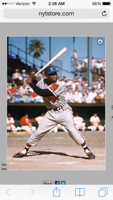 I really hate to be the one who let the image out of the bag, especially since I was hoping that once we had it, John could talk about why it attracted him. However, at this point, I just don't know whether I'll be able to get it any other way. If you do have it and are willing to help out, please drop me a PM or an email (gkreindler@gmail.com). I'm happy to pay you for both your time and trouble. I just really want to get this thing as soon as I can so I can start. Also, if need be, your identity can be kept secret if that is at all a concern. Thanks, everyone. Graig
__________________
Check out my baseball artwork: www.graigkreindler.com www.twitter.com/graigkreindler www.facebook.com/graigkreindler |
|
#55
|
||||
|
||||
|
Graig,
I wish I could help out but unfortunately I can't. I hope the wheels loosen up a bit to get this moving because that it a beautiful shot of Hammerin' Hank in full stride. Good luck, Drew
__________________
Drew |
|
#56
|
||||
|
||||
|
Hey everyone,
I FINALLY have an update to the progress of this raffle painting. My contact with John Rogers never came through on Newman image unfortunately, so we had to finally give up on that one and look elsewhere. John was really into the idea of the Hy Peskin shot that was in his first post of this thread, so we looked high and low for that one as well. While he didn't find the exact shot anywhere (Peskin's website doesn't even seem to offer the thing anymore), he did find one from the same shoot that was probably taken a second before or after. 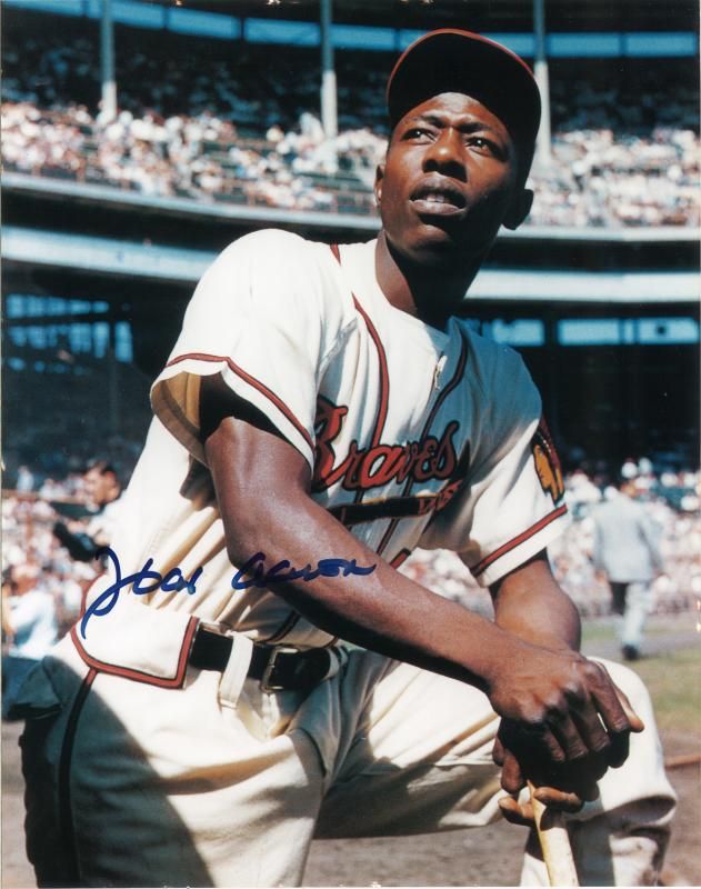 I'm going to be doing it a little larger than what we originally offered in the raffle - so, now we're at 16" x 24". The extra few inches on top with frame the image much better, in my eyes. Unfortunately that means that the 18" x 24" that I had already constructed has to be used for something else. So right now, my hope is to buy stretcher bars for it tomorrow (as I didn't have any extra 24" ones handy), construct the supports, prime and prepare it, and then perhaps have the drawing done by Wednesday, right before the National. I'll keep posting updates here for those of you who are interested. Graig
__________________
Check out my baseball artwork: www.graigkreindler.com www.twitter.com/graigkreindler www.facebook.com/graigkreindler |
|
#57
|
||||
|
||||
|
Couldn't have picked a better image myself. Awesome choice!
__________________
Looking for Toronto baseball items. Please contact me at chris@pacmedia.ca |
|
#58
|
||||
|
||||
|
My favorite is the one with him jumping near the fence.
|
|
#59
|
||||
|
||||
|
Same here.... by a landslide. And that could have made a killer 16" X 24" painting, by isolating as necessary on the leaping Aaron.
The Peskin pose chosen is pretty majestic as well. I like Aaron's face a bit better than the similar image (which was posted at the beginning of the thread). Last edited by perezfan; 07-28-2014 at 08:15 PM. |
|
#60
|
||||
|
||||
|
John,
Great choice. Graig, I will be looking forward to your magic show. Keep up the great work.
__________________
Norm Cash message to his pitchers, the day after one of his evenings on the town. "If you can hold em till the seventh, I'll be ready" |
|
#61
|
||||
|
||||
|
Looking forward to seeing this image come to life if Kreindler-color!
Last edited by whitehse; 07-29-2014 at 09:43 AM. |
|
#62
|
||||
|
||||
|
Hey everyone,
Thanks for tuning back into this thread. Now that we have the image all worked out and I can actually put something down on canvas, I'll be updating it a LOT more regularly until the piece is in John's hands. And certainly, I really appreciate you all chiming in and sharing your thoughts. First off, I definitely agree about the quality of the Aaron jumping image - it really is pretty bad@SS. I think that one would make one heck of a cool painting, especially at the 16" x 20" size (or thereabouts). However, I'm definitely loving this Peskin shot as much, too. I guess I'm just at peace with the fact that I know I'll do the other one at some point as well. Anywho, onto the canvas at hand. The drawing is officially on the darn thing. 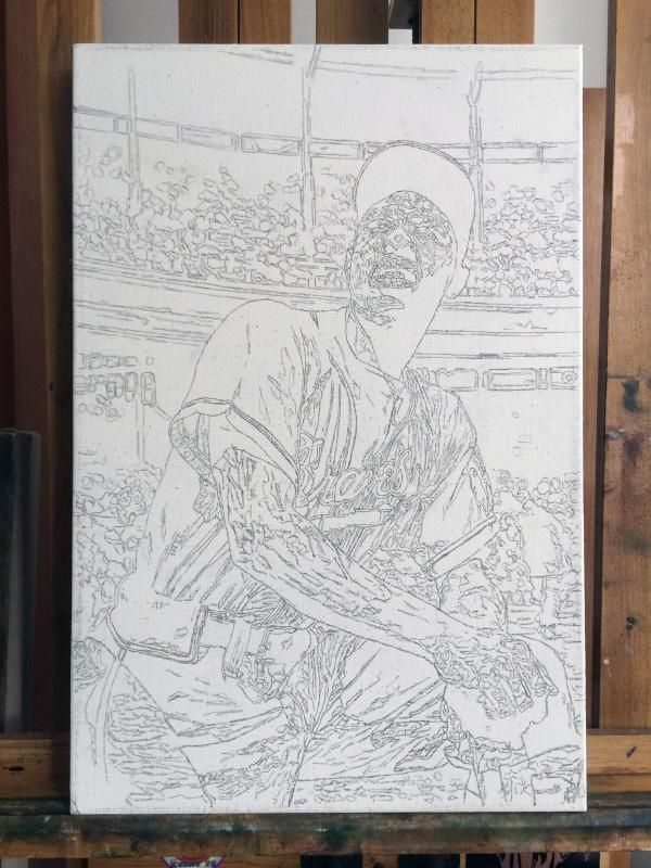 They're a few people off the boards who have asked me about the squiggly lines and what they represent, so I thought I'd address it here for those of you who may be curious. For the most part, having an underdrawing done for a painting acts as a road map for most artists, whether it's for something as simple as gesture lines, or if it's meticulous to the point of creating a full-on black and white guide that will later be glazed over with transparent color. By no means does everyone use them, and I don't want to say whether I think it's 'wrong' to do so, but for me, it works. For me, rather than just doing an outline of things for a skeleton, I prefer to get a bit more involved. All of the those squiggles that you see are changes in value, color, and/or temperature. Sometimes those changes are subtle, sometimes they're major, but the most important thing for me is that they're there. It's kind of a way of thinking about the drawing as being sculptural moreso than a bunch of lines that I'm filling in with color. Though, I guess you could say that it still looks rather paint-by-numberish. Whoops. Anywho, now that it's all drawn in, I can start with some color. The drawing was spray fixed with a Krylon product called Workable Fixatif, which will create a clear acrylic-based barrier between the drawing and the paint that'll go on top of it. With that, I put a warmish oil wash over the painting to create a colored-ground to work off of. For me, the ground is meant to do two things. One, to get rid of the stark white of the canvas as soon as possible. Traditionally, when creating a ground one would usually do so with a medium value so that when colors are placed on top of it, they can observed closer to their real value. For example, on a completely white surface, a small spec of paint in a medium value would look much darker than it actually is. The second thing the ground does for me is create certain atmospheric effects that can't be attained in any other way. Since all oil paint has a bit of translucency to it, whatever's underneath a typical stroke of mine will show through and effect it in some way. That's the sort of thing that will create richness, nuance, and a lot of headaches - all parts of the process.  After the National, I plan on jumping back into the thing and starting to put down some actual color. But man, I'm THRILLED that I have something to show before heading out to Cleveland. I hope y'all dig my thoughts along with the progress shots, even if it can sometimes sound flowery or long-winded. Regardless, as per usual, any thoughts, comments, or critiques are ALWAYS appreciated. Thanks for reading! Graig
__________________
Check out my baseball artwork: www.graigkreindler.com www.twitter.com/graigkreindler www.facebook.com/graigkreindler |
|
#63
|
||||
|
||||
|
Quote:
|
|
#64
|
||||
|
||||
|
I was going to make some smart comment about that being a paint-by-number from hell, but you kind of beat me to that one
 So I guess I'll just go back to staring at it and trying to envision it through your eyes. So far it's just giving me a headache, but if I cross my eyes just right, I swear I can almost see the 3-D image. It's a spaceship, right...? 
__________________
Ebay Store and Weekly Auctions Web Store with better selection and discounts Polite corrections for unidentified and misidentified photos appreciated. Rude corrections also appreciated, but less so. |
|
#65
|
||||
|
||||
|
I paint in much the same process. It's always nice to learn something ( I have never heard of or tried Workable Fixatif to seal the pencil lead so it doesn't show or smear with the oil/medium. I have used hair spray before, or very light varnish.
I will check it out. Love your work. John Last edited by nebboy; 07-30-2014 at 04:26 PM. |
|
#66
|
||||
|
||||
|
Who knew Hank had all those tatts?

__________________
RAUCOUS SPORTS CARD FORUM MEMBER AND MONSTER FATHER. GOOD FOR THE HOBBY AND THE FORUM WITH A VAULT IN AN UNDISCLOSED LOCATION FILLED WITH WORTHLESS NON-FUNGIBLES 274/1000 Monster Number |
|
#67
|
||||
|
||||
|
Graig,
It's already a beauty to me, to finally see it.
__________________
Norm Cash message to his pitchers, the day after one of his evenings on the town. "If you can hold em till the seventh, I'll be ready" |
|
#68
|
||||
|
||||
|
Hey all,
Thanks for all of the kind words and support throughout this project. So, I'm back from the National, and that means back to the easel. I've been working on this all day, so here's the progress thus far: 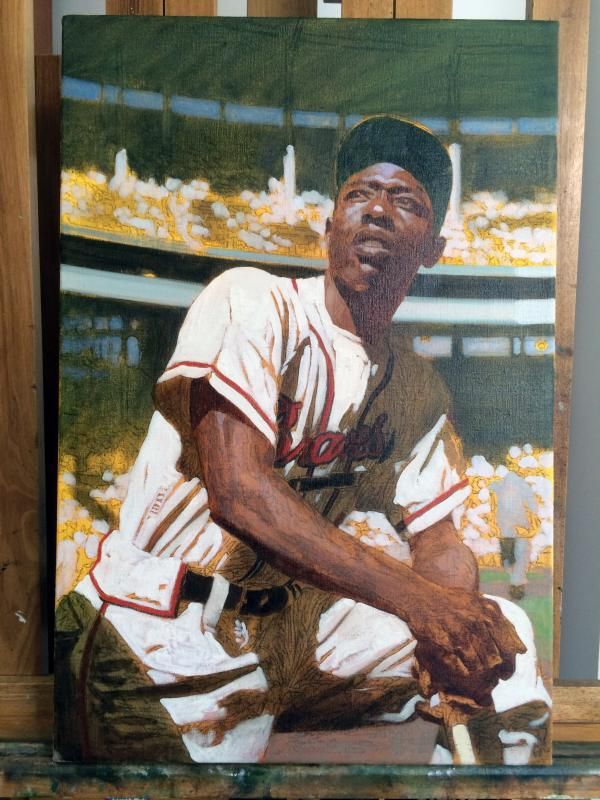 In this first underpainting/dead color stage, my main concern is to get basic value relationships and colors down onto the surface. In a way, it continues with the idea of the drawing in that it acts as a skeletal system for the finished painting. With these initial strokes, it gives me a good chance to just cover the canvas with a block-in, something that has the same amount of detail work throughout (which is important so the whole picture is kept in mind while working). The color ends up being a bit on the dead side because it's somewhat thinly applied, and since oils by nature are somewhat translucent, a lot of the background stuff ends up showing through the paint. It's only going to be through a few more passes that I will be able to create some interplay between the opaque areas and more transparent ones. This will need the (at least) rest of the day to dry, and then everything else that will go on top of it will become the very meat of the painting. This initial block-in is usually a bit weird to me, but it's always the start of the second pass where I start to see things coming together. Anywho, hope you enjoy it! And as per usual, feel free to share any comments, be they good or bad. Graig
__________________
Check out my baseball artwork: www.graigkreindler.com www.twitter.com/graigkreindler www.facebook.com/graigkreindler |
|
#69
|
||||
|
||||
|
So cool! It looks awesome so far...

|
|
#70
|
||||
|
||||
|
Thanks a lot, Scott! I hope by the end of the week, I will have made some serious headway on things.
__________________
Check out my baseball artwork: www.graigkreindler.com www.twitter.com/graigkreindler www.facebook.com/graigkreindler |
|
#71
|
||||
|
||||
|
Enjoying your posts on this, Graig. I just now realized that you were at the National. I'm really disappointed that I didn't get a chance to come see you. (Note to self: make sure you get out of the booth more next year.)
Thanks for posting your step-by-step sequencing. I'm always blown away by how low the % complete is in your words. Your 50% complete would easily register 100% complete for others. That last 50% that you put into it where you really pay attention to the influence of light is what gives your work magic, IMO. I'm eager to watch the progress of this one. |
|
#72
|
||||
|
||||
|
Hey Brian,
Crapola, I didn't know you were there, either. I certainly would have made the effort to come on by and say 'hello.' Where was your booth, anyways? Believe you me, this guy isn't even 25% done - it's got a ways to go. However, now that the first pass as dried, the paint and color that I put down is finally going to start to sing. Here's what we got so far: 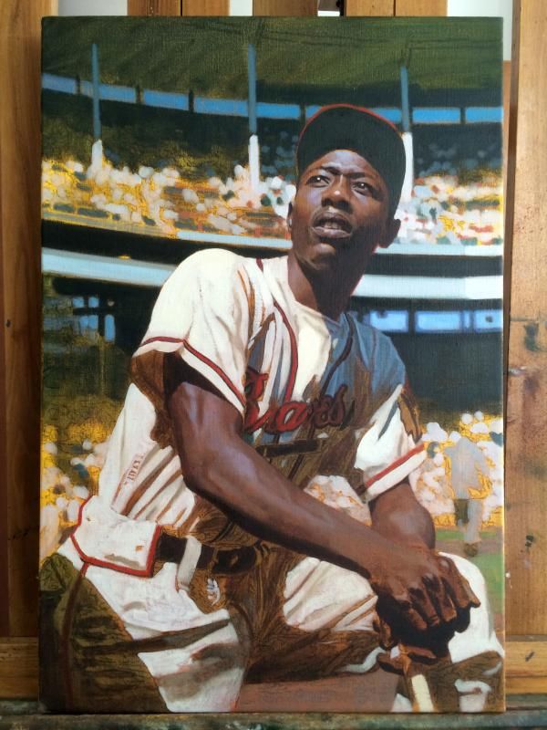 It's definitely on its way to something, even if it's still in its very early stages. One of the things going on with Hank that I'm loving is working with his skin. For the most part, when African American skin starts to get a little sweaty, the sky reflects off of it so nicely, and you get these wonderful mauves, magentas and pinks, especially those who have a darker complexion. With a few exceptions, you don't really get the same kind of colors in Caucasian skin, so this is becoming great fun. Combining that with the different colors in the Milwaukee jersey, and you're gonna have a pretty colorful piece. I'm very much looking forward to that. Hope you guys dig it so far. Graig
__________________
Check out my baseball artwork: www.graigkreindler.com www.twitter.com/graigkreindler www.facebook.com/graigkreindler |
|
#73
|
||||
|
||||
|
Good grief.
I've got to go get my chin sling ready, because if that's only 25% of the way there, I'm going to need some support as this thing nears completion (you know, on account of my jaw dropping and all). If I were John, I'd be investing in some extra pants as well...
__________________
Ebay Store and Weekly Auctions Web Store with better selection and discounts Polite corrections for unidentified and misidentified photos appreciated. Rude corrections also appreciated, but less so. |
|
#74
|
|||
|
|||
|
So when's the next raffle? Amazing!
|
|
#75
|
||||
|
||||
|
Graig,
You said not even 25% done yet???? Holy crap that's so good already. GoBucs, In the fall sometime. Providing everything is a go.
__________________
Norm Cash message to his pitchers, the day after one of his evenings on the town. "If you can hold em till the seventh, I'll be ready" |
|
#76
|
||||
|
||||
|
Looks great so far
|
|
#77
|
||||
|
||||
|
Wow, that is awesome! It is so cool to see this work in progress. Now that I'm seeing it come to life I'm thinking we made the right choice.
I was also a pleasure meeting you at the National. Did you manage to flip those '87 Topps for a profit? 
|
|
#78
|
||||
|
||||
|
This is absolutely amazing! Thanks for sharing the images and thought processes, Graig.
Also kicking myself for not perusing the floor more and finding your booth. Would've been great to shake your hand and also see your great works. Last edited by CW; 08-06-2014 at 09:05 PM. |
|
#79
|
||||
|
||||
|
Thanks, everyone!
 Dan, I hope we have it soon. I think we're hoping that Leon gives us a green light, and also, we might make this next one for a bit of a larger painting. I'm not too sure yet, but I would imagine we'll have it worked out in the coming weeks. John, it was great meeting you, too! I hope I didn't scare you away by my '87 pack busting. I can't say that I turned a profit in the end. Though, I did give the rest of the wax box to a friend to distribute amongst young convention goers. I think they were a hit, though hopefully there was no illness due to gum consumption (though I think Cycleback didn't do so well with aspect). Anywho, here's where we are at the end of today: 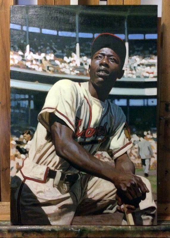 The photo isn't all that good, as the light in the studio is wreaking havoc amongst the color, but that'll happen at night. However, I'm happy to say that it's completely blocked-in. Now, it's just going to be a lot of modulating of color temperatures, values and edges. Actually, I have a feeling that the progress that's going to happen from now on will be a bit less noticeable in these updates. I'll definitely try to be specific about certain sections, though. As of right now, it'll probably need to dry a bit tomorrow, so I'm not sure I'm going to be doing much more to it, but we'll see what the morning brings. Glad to see we're getting somewhere! Graig
__________________
Check out my baseball artwork: www.graigkreindler.com www.twitter.com/graigkreindler www.facebook.com/graigkreindler |
|
#80
|
||||
|
||||
|
This is what we have been looking for since we first started the Kreindler event. Effe, congratulations not only on winning, but on your choice. The finished product will be fantastic. It may not be a bad idea that you download the photos Graig is posting for the history of your piece.
Bill
__________________
Norm Cash message to his pitchers, the day after one of his evenings on the town. "If you can hold em till the seventh, I'll be ready" |
|
#81
|
||||
|
||||
|
I lean towards Aaron flying into the fence. Great action shot with an ad that says paints on a painting? Would no doubt be sweet.
__________________
Always looking for Bob Gibson and Stan Musial. http://www.ebay.com/usr/shopvarsitycollectibles Twitter: @VarsityCollect |
|
#82
|
||||
|
||||
|
Quote:
|
|
#83
|
||||
|
||||
|
Hey all,
More progress on this today. Though I've worked on it for plenty of hours, it probably doesn't look like much: 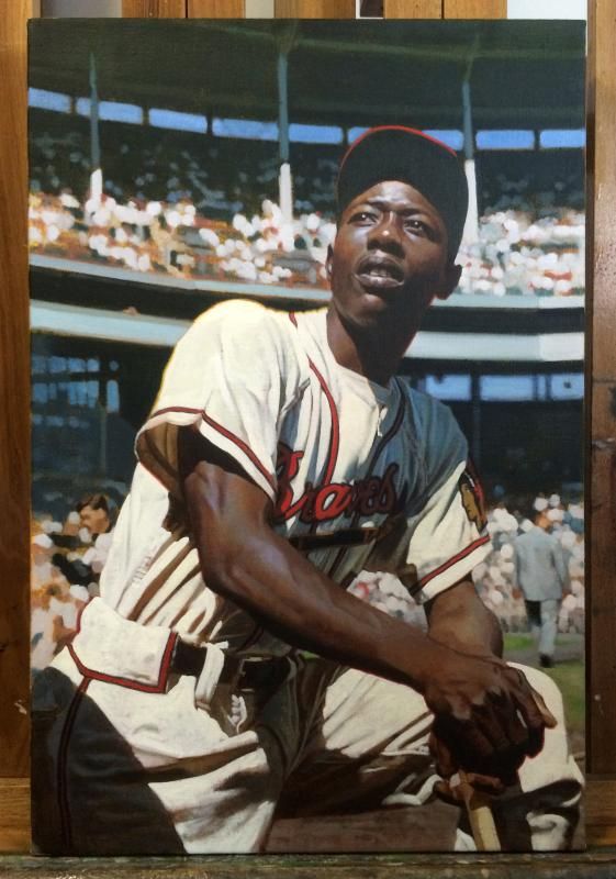 Things are definitely coming together nicely, I think. I'm really enjoying that bright light on Henry's uniform, and have started to have some fun with it. Some of my favorite kind of stuff in painting can be seen in the edges of shadows - especially, when they're against a lighter subject, you're going to get a sort of penumbra of super intense color. It's the kind of thing that gives those bright values a luminous quality, as opposed to just being properly placed. I just really feel that the quality of light can be exploited with the proper manipulation of edges. Though it's a bit crude so far in this stage, here's a better example of what I'm talking about: 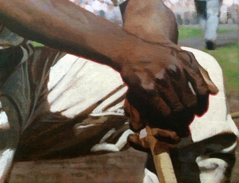 With that red along the edge of Aaron's fingers and lower arm, it would just be a flat shape. It would still give the impression of that light, but with that kind of color choice separating the darker tones from the light, I think it really actually shines off of the surface and makes the white in his jersey seem that much more brilliant, and even makes his arm turn in space a bit better. It might sound a bit crazy, but trust me, when seen on a painting in person, it's a really cool effect. Anywho, hope you're enjoying the process thus far! Graig
__________________
Check out my baseball artwork: www.graigkreindler.com www.twitter.com/graigkreindler www.facebook.com/graigkreindler |
|
#84
|
||||
|
||||
|
Quote:
You know I love you, but what the hell are you talking about???? It doesn't look like much?!?!?! It's a bit crude so far!??!?! HFS. In my wildest dreams I couldn't create anything even in the same universe as your beginning work. Damn man. It looks spectacular. Even unfinished, I would proudly display that in my home. Mark
__________________
My signed 1934 Goudey set(in progress). https://flic.kr/s/aHsjFuyogy Other interests/sets/collectibles. https://www.flickr.com/photos/96571220@N08/albums My for sale or trade photobucket album https://flic.kr/s/aHsk7c1SRL |
|
#85
|
||||
|
||||
|
Unreal, Graig!

|
|
#86
|
||||
|
||||
|
I had my doubts about the photo used, but this is AMAZING!!!
__________________
$co++ Forre$+ |
|
#87
|
||||
|
||||
|
Graig, it looks incredible! Can't wait to see the finished piece.....
Tim |
|
#88
|
||||
|
||||
|
Graig,
What an outstand work of art. Not Finished, Crude????? I totally agree with Mark, "what the hell you talking about". John, (Effie), You have got to be spending hours in front of your monitor just drooling. And I don't blame you. Soon, you will have that beauty in your hands. Hell, if it were mine, I'd hang my wife on the wall and sleep with the painting. Okay, after a couple of days, I would find an excellent wall space for the painting.
__________________
Norm Cash message to his pitchers, the day after one of his evenings on the town. "If you can hold em till the seventh, I'll be ready" |
|
#89
|
||||
|
||||
|
Quote:
Regarding Graig's paintings, I showed one of his studies to a painter, telling him that it was a study for a larger, more detailed painting. You should have seen the look he gave me.
__________________
$co++ Forre$+ |
|
#90
|
|||
|
|||
|
Just thought I'd play around . . .

|
|
#91
|
||||
|
||||
|
That's cool Tim!
|
|
#92
|
||||
|
||||
|
Hey guys,
Sorry, that post probably came off wrong. I just had meant that I had put in a lot of work into it since the last time I posted, but the progress probably seemed minor. And the crudeness was more in reference to where the arm was with that red line, which still needs modifying. But yeah, sorry about that - didn't mean to come off as sounding like a d!ck. Tim, that GIF is friggin' AWESOME. I love it. If you end up doing for the painting when it's complete, I would love to see it. Scott, did he look at you the way Ben looks at a plate of wings? Graig
__________________
Check out my baseball artwork: www.graigkreindler.com www.twitter.com/graigkreindler www.facebook.com/graigkreindler |
|
#93
|
||||
|
||||
|
As in..."That isn't going to do it." (I think I got the quote right).
__________________
$co++ Forre$+ |
|
#94
|
|||
|
|||
|
Quote:
Glad you liked it! I will certainly try to update it as you post more progress pics. |
|
#95
|
||||
|
||||
|
Hey everyone,
Hope this post finds y'all well and ready for the end of the summer. For those of you back in school, I'm sorry. Due to some business with the Gehrig ALS painting, and some attempts to get back to other commissions, I haven't been able to work too much on ol' Hank over the past few weeks. However, these last few days have seen him back on the easel. 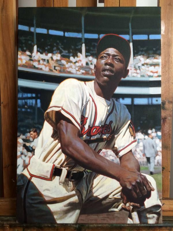 It might seem like not a heck of a lot has been done since the last post. Once stuff gets blocked in completely and I try to focus on rendering and sweetening certain parts up, that's kind of the nature of the beast. But I assure you, a lot has been done. At this point, I'm trying to just be precise in my carving out of the shadow and light shapes throughout the image. And there are tons of areas that need a lot of temperature and color changes, all of which end up being pretty minor, but in my opinion, make all of the difference. There's one spot in particular that I'm talking about in regards to that sort of thing, and that's in the Braves script across his chest. 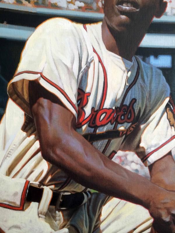 It's even a little tough to tell in the photo, as it doesn't necessarily come across in reproductions. But that spot where the shadow comes across that 'B', there was room for a lot of fun stuff to happen. I tried to play a bit with the compliments there, having some greenish-grayish hues in the cooler, shadowed red area. Also, the line separating the shadow from the light has a toned-down green touch to it, which hopefully accentuates that warmly-lit red curve. That's one of the fun things I've learned about color over the years, as it can always be made to sing louder when it's working with something around it. There are similar things happening in areas throughout the painting, some of which are more finished than others. Hopefully in the next week, I can sweeten them up (along with everything else) and get this thing closer to done. Hope you fellas are enjoying the updates (and my babbling). Graig
__________________
Check out my baseball artwork: www.graigkreindler.com www.twitter.com/graigkreindler www.facebook.com/graigkreindler |
|
#96
|
||||
|
||||
|
Graig,
It's always a pleasure to read your posts. I learn so much about painting techniques. Things that you describe were mostly lost on me, up until now at least. You explaining why a certain color pops here instead of there makes my appreciation of the skill it takes to create these paintings even higher. Great stuff. Best, Mark
__________________
My signed 1934 Goudey set(in progress). https://flic.kr/s/aHsjFuyogy Other interests/sets/collectibles. https://www.flickr.com/photos/96571220@N08/albums My for sale or trade photobucket album https://flic.kr/s/aHsk7c1SRL |
|
#97
|
||||
|
||||
|
Graig,
That painting is just amazing. Your descriptions in this process shows your dedication you put into each painting. Mark is right, that it makes us understand better, and appreciate more, your skills. Keep up the great work.
__________________
Norm Cash message to his pitchers, the day after one of his evenings on the town. "If you can hold em till the seventh, I'll be ready" |
|
#98
|
||||
|
||||
|
Hey all,
So, we're reaching the final moments of this one, finally. 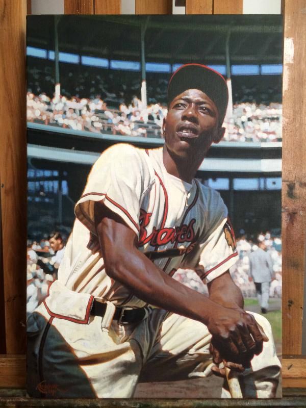 Right now, there are a lot of things in the background that are gonna need work, mainly stuff with the stands. However, for the most part, Hank is pretty close to completion. It's at the point where the whole painting needs to dry for at least a week or so, and then I can throw some Galkyd on it to enrich up the painting surface. For those of you who may have any pieces of mine, the Galkyd is what makes the surface shiny and glossy. When it's applied, all of the areas that appear matte and dull will come back to their initial states of application, where the color looked wet and vibrant. In part of the oxidation process of oil paints, they're certain colors that go a surface and keep a bit of their sheen, though others might not. - it all depends on the nature of the pigment. Anywho, it's through that medium application that I'll be able to see the exact problems going on in the background stands. In this case, they're rather dark and dull, so not only are the values a little askew, but it's tough to make out whether the actual lines are even straight. At the same time, Hank will also really start to pop after the Galkyd, and I'll be able to fix anything on him that isn't quite noticeable to me in its current state. I'll be excited to see if his jersey still maintains that sense of bright light, as there's a lot of subtle temperature changes within it right now which almost seem like they might be in need of some value control. But yeah, like I said, he's pretty darn close now. And that makes me happy. Graig
__________________
Check out my baseball artwork: www.graigkreindler.com www.twitter.com/graigkreindler www.facebook.com/graigkreindler |
|
#99
|
||||
|
||||
|
Effie,
Hey John, when you finally get this beauty, you better wear a diaper, because you just may wet your pants. It is that good.
__________________
Norm Cash message to his pitchers, the day after one of his evenings on the town. "If you can hold em till the seventh, I'll be ready" |
|
#100
|
||||
|
||||
|
Agree.... an ongoing supply of adult undergarments should be stored in your man cave. You'll need some for visitors, as well.
This is just phenomenal work... and that Braves Flannel is such a classic (and so beautifully executed by Graig). I love how the sun peeks through the back side of his sleeve, right behind the tricep. Just another jaw-dropper! Last edited by perezfan; 09-10-2014 at 06:16 PM. |
 |
|
|
 Similar Threads
|
||||
| Thread | Thread Starter | Forum | Replies | Last Post |
| Graig Kreindler dream event | billyb | Net54baseball Sports (Primarily) Vintage Memorabilia Forum incl. Game Used | 162 | 05-14-2014 06:49 PM |
| Kreindler vs...... | Forever Young | Net54baseball Sports (Primarily) Vintage Memorabilia Forum incl. Game Used | 41 | 07-26-2012 10:42 AM |
| Kreindler mania is going strong!!! | milkit1 | Net54baseball Sports (Primarily) Vintage Memorabilia Forum incl. Game Used | 9 | 02-23-2011 12:16 PM |
| Kreindler's Mathewson | jacksons | Net54baseball Sports (Primarily) Vintage Memorabilia Forum incl. Game Used | 34 | 11-09-2009 02:50 PM |
| Kreindler's Cobb Stealing Third | Kawika | Net54baseball Sports (Primarily) Vintage Memorabilia Forum incl. Game Used | 6 | 10-05-2009 03:03 PM |