|
||||||
 |
|
|||||
|
||||||
|
|
|||||
|
#1
 09-10-2013, 07:00 PM
|
||||
|
||||
|
Top picture is of 2 real 1989 Fleer Bill Ripken F Face version cards.
Second Picture is of 2 PSA 9 counterfeit(my opinion) cards. Besides the obvious cropping differences the 2 PSA 9 cards also differ in the following ways. The card stock is 0.005 thinner, I know that does not sound like much but in card stock it is a lot. The actual photo not print quality is lower because it is a second generation picture. The ink glows different under a black light than it does on a known real 89 Fleer card so different ink was used. I would like to hear any info or opinions anyone has on the PSA 9 cards. There is an article on them on the Bill Ripken website. http://www.billripken.com/ Click on the versions link and then it is called the Mystery Card.   One of the Mystery cards(PSA 9) was submitted to SGC and it was rejected for being Counterfeit. Last edited by bnorth; 09-10-2013 at 08:59 PM. Reason: Add SGC info. 
|
|
#2
09-11-2013, 11:05 AM
|
|||
|
|||
|
I can not tell just from looking at these scans what's real or what's fake. What do PSA 9 or 10 FF's sell for ? There are so many of them I am surprised there are counterfeiting efforts.
I was aware that many of the remedial cards were faked, particularly the white outs and cut outs. In fact, it seems to me some of the counterfeits have become collectibles in their own right. In addition to a Topps run, I do have a Fleer run ..1923 and 1959 to 2007. I have not been as dedicated to variations in the Fleer sets as the Topps sets, but tried to get any Fleer variations listed in SCD through 1989, including this one. Here are a few of mine, some of which I know are fakes. But I was not aware of any fakes of the actual FF card. I'd like to get one, but not sure if I could tell it from the real thing.  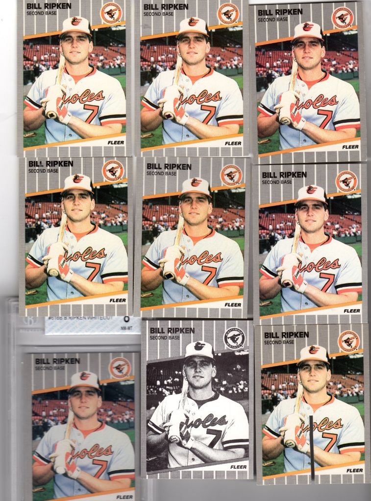
|
|
#3
09-11-2013, 12:23 PM
|
||||
|
||||
|
The PSA 9's are selling in the $15-25 range and the PSA 10's are selling in the $60-80 range right now.
I have about 15 different real Ripken versions and a few fakes. The B/W test issues are all fakes. As are most hole punch and whiteouts. There are also a lot of fake saw cut versions out there. I have owned one of the Mystery cards and in hand it is real easy to tell from a real card.
|
|
#4
09-11-2013, 12:58 PM
|
|||
|
|||
|
Ah, now that's some details I'm glad to see.
.005 is a big difference. As a point of reference, I've measured probably 50+ T206s out of curiosity, and there is only +- .001 difference, And that's on 100 year old cardboard. I didn't know SGC had rejected one. Also I didn't know about the different reaction of the ink. The things I think we can agree on are that Fleer and the other main producers used multiple printers and produced cards in multiple print runs between say 1986 and 1994. Fleer made around 12 different corrections to the Ripken card, so it's certain they made multiple runs probably at different locations. So, I guess I'll go over the differences and what my take on them is. I'll quote Bens assessment and refer to the other one posted on http://www.billripken.com/mystery/mystery1b/report.html This is the bulk of Bens assessment quoted directly from http://www.billripken.com/mystery/report2.html My comments will be in red. 1) Grey dot bars are different because they need to go past the edges of card so you do not see white edges like test run cards and that is the pattern available in there print shop program. The pattern of the bars is different. And to me that's an important difference. As one of the main features of the design it shouldn't change. In the E98 thread I said there were a few things that would convince me the PSA 9 is real. One of those would be an 89 Fleer common with the gray bars screened at an angle like the card in question. The reason isn't that they have to be to avoid white lines at the side. That portion can be screened any way that's wanted and merely extended past where the card should be cut, just as the normal 89 Fleer cards were done. 2) Orioles Logo on front is also just pasted using photo shop pics. available from program. The logo IS also different in a few ways. Another point against, and a fairly strong one. The platemaking process in 89 was more photographic than computerized, and the logos should have all come from the same piece of original art. I don't have Photoshop, so I can't say if there's an orioles logo, or if it matches the one on the odd card. I would like to have a look at the upper left card here.http://www.billripken.com/versions/big/flaw4.jpg It has some of the traits of the odd one. It would be interesting to see the logo and the gray bars. 3) The photo of Bill is larger than on a normal card. This is done so there is no white edge around photo from copying and pasting. Printing Dies do not magically change size for one card version. That and the fact real Fleer printing dies are the size of a whole sheet not one card. The ones you by on ebay are cut from full size dies just like cards are cut from full sheets. Yes, it's different. I wouldn't rule a card from that era out based on just the cropping. Many sets from then have a lot of differences, usually small. Some, like 91 fleer have nearly every card cropped differently. 4) The coloring on entire front of card is not consistent with known real cards. Using a magnifying loop look at the orange stripes at top and bottom of photo on front on the Mystery card they are put on backwards, but in the right pattern on the rest of orange/red on the card. This means that a different program was used to separate the colors when making the printing plates for mystery card and there is no way this happened at Fleer. I'm not sure what is meant by the stripes being put on backwards. The colors are darker, not uncomon for 80's cards to show color differences. The stripes are also screened with the screen at a different angle from the normal cards and from the rest of the same card. The photographic process used at the time had different screens available, different ones used on the same card might be unusual, but not impossible. 5) Ink is of a different higher quality. I never done the black light ink test because I do not have one. I would have discounted this one altogether before learning the blacklight results in the original post. Quality is subjective, and different shops often use different inks depending on what that shop prefers. Reactive vs non-reactive ink is possibly another point against. I haven't looked at 89 fleer with the blacklight, but I can say that 91 Topps has three different inks used for the backs. One in non-reactive, another reacts by glowing bright orange-red, the third barely reacts, but looks like a very deep red. (That last one is actually somewhat hard to find) 6) Card stock is not even close in thickness. Real 1989 Fleer card stock is thicker. The card stock(smoother) is why the black print looks to be sharper and of better quality on entire card. As I said above, .005 is a large difference, and a serious point against. 7) 95% of the back is just copied and pasted from a real card. The copyright line and Printed in USA are different because they had to use the grey dot patten lines from the photo shop program again to not get the fake looking white line on top or bottom of the card. Yes, the back is screened differently as well as the front. I've already addressed the percieved need to use a different screen to avoid white lines. The gray on the back is so different I couldn't call it copied and pasted from a real card. It's worse in some areas better in others. 8) Yellow on back covering stats has a different print pattern also from color separation program. I can't comment much on this. None of the information so far has shown scans of that area. considering that most areas of the card have been rescreened I'm not surprised. If the area is screened rather than solid I would count that as a major point against. 9) I almost forgot the photo itself actually made one of my print friends LOL when he seen it. The photo itself is copied from a real card and you can tell because it is of a lower quality. If it was a real Fleer card they would have used the original like they used on every other card/die and there would be no difference in photo quality. Every time a photo is copied it looses some quality. If you take a Mystery card and a real card and put then side by side and scan and print them on a home printer the photo quality difference will stick out even more. I'm not seeing much quality difference in the closeup scans. And the cropping has already been covered above. On to the other assessment. It's very scan heavy, so I won't quote it entirely. I think it's failings are mostly in how narrow of a view they took. With so many differences I'd have like to see them look at more areas of the card. As well as the inks and cardboard. The points I think are important are these. The details of the pattern in the bat knob of the logo are very interesting. The odd card  A regular Ripken error.  The spot they identify as number 8 is indeed unusual and identical. This presents a real puzzle. The logos are different, and have different screened areas, especially area of the hat. But in at least one area appear to be from the same negative (The plates are made photographically from large assembled negatives called masks. ) This would happen if the mask for the logo was reused but altered for the normal cards. OR if the negative was taken by the same camera through the same screen at eacatly the same place. combined with the rest of the front being screened differently I think that's highly unlikely. I also think that someone having the ability to scan and copy a detail as small as the faults on that particular dot and then carry that over into the printing wouldn't need to do any of the other alterations. They could simply print from the detailed scan. So why is the logo screened identically while the rest of the card is drastically different? That's the puzzle. Another is that nearly every fake made around that time had the same sort of flaws, typically screening in areas that should be solid. While this card doesn't. They were also produced in large quantities, where this card seems to be much less common. Even the absurd black and white fakes were everywhere and are still easy to find. I don't think it's a recent digital copy. I do think it was made arround 1989 if not in 1989 and on typical commercial printing equipment. So why make this much effort to produce a handful of cards if it's fake? I'm not 100% convinced the card is fake. I am convinced that it's not normal 1989 fleer production. The options I see are. 1) Fake 2) Very early production, maybe from a rejected batch from one printer. 3) "Special" production. Were the errors ever offered in quantity on home shopping? I know they had some exclusive cards, and it's not inconceivable that Fleer might have had someone run a few hundred for them. And I'd bet that most of the HSN exclusives were sold outside the hobby. 4) Faked by someone inside Fleer or one of Fleers printers using partial original elements and new ones they made from the original art. Playing around with stuff isn't unheard of, either officially or unofficially. (UD reprinted their own cards at least once and supplied fakes to a major retailer on another occasion. ) 5) genuine, but from a printer that only did a small bit of production just before the change to the corrected version. 6) From a planned Fleer set to be sold outside the US. (Canada, UK, south america, through the us military- something like that ) If the printing was done for an unannounced program, and the error was found before the announcement, that might have been enough to cancel the whole thing because reprinting or pulling the card and replacing it would have been too expensive for that product. Things that would convince me enough to be sure of a category- Another 89Fleer, preferably a common with similarly different screening. A similar card accompanied by a reciept from HSN, bonus if it comes with the original packaging. Documentation from Fleer rejecting a printing for being too different. Documents from Fleer telling a backup printer to stop production documents about a planned release for some other market that was called off. I do think that PSA shouldn't have slabbed it as a normal Ripken error. and that they should have declined slabbing or opinion until what it actually is has a bit more backup. I'd be ok with fakes being slabbed as fakes. Label this one as "89 Fleer Billy Ripken error fake type 1" The same could be done for the others produced during the late 80's. Steve B
|
|
#5
09-11-2013, 01:05 PM
|
||||
|
||||
|
steve, that's ALOT of analysis and scrutiny for a modern day mass-produced card, although it is an interesting topic. appreciate the info!
|
|
#6
09-11-2013, 01:23 PM
|
||||
|
||||
|
Thank you for the great response Steve.
The 2 different views on the Bill Ripken Web site are from Sean the card owner who writes reports all the time for work and spent a lot of time on what you read. The other opinion is mine. It was just a quick response to Jon the site owner when he asked my opinion on the card because of my knowledge of altered/counterfeit cards. When I wrote it I had no idea it was going to end up on his site or I would have done a much better job explaining stuff.
|
|
#7
09-11-2013, 01:39 PM
|
|||
|
|||
|
I put 2 and 2 together on it being you.
It's actually a good overview for most people. As you can see I get a bit long in the explanations. Most people stop reading after a few sentences.  I'm planning on checking some of my 89 Fleer tonight with the blacklight, as well as looking for odd ones. I'm sort of hoping I don't find any reactive ones. That would make me go get a bunch more looking for a set of each. I found the 91 topps by accident. I had a new blacklight for checking stamps and being me I shined it on everything in the room. BIG surprise when I got to the boxful of 91 Topps. I'd used a blacklight before, as a kid hunting minerals, so I was expecting to see different papers and some socks glowing some not. But having about half a monster box light up bright orange wan't expected. I briefly considered the possibility that UD had made a bunch to capitalize on the popularity. Mostly because of their track record. But their equipment was a lot more modern than everyone elses. Very different screens, which made for the nicer looking pictures. So that didn't make sense. Steve B
|
|
#8
10-18-2013, 08:42 AM
|
||||
|
||||
|
Spending too much time on the Pre-War side and overlooked this thread - Thanks Ben for starting it.
This 'Mystery' card still amazes me. Thanks Steve for the analysis. Just amazes me that this card (I've seen about 6 total over the years) has clearer fonts on the back. Statistics and MLB logo etc. Print dot patterns on the front match 1990 Fleer Canadian - as does the 'feel' of the card. Odd. I did send one to SGC years ago (along with a note stating my doubts). They returned it as 'Questionable'. PSA has graded at least 2 of these recently. Thanks to everyone that has helped with this card. For more info from my website - check out: http://www.billripken.com/mystery/mystery.html Lots of detailed pictures etc. Long live the FF!
|
|
#9
10-18-2013, 09:25 AM
|
|||
|
|||
|
Great stuff as usual Steve. I am never letting you near my cards for fear you would discover they were all reproductions made in China
|
|
#10
10-18-2013, 09:32 AM
|
|||
|
|||
|
Incredible analysis, Steve. Thank you.
|
|
#11
10-18-2013, 10:16 AM
|
||||
|
||||
|
I tend to favor the idea that these were extra production from the inside. Only card to get this special production. HSN or other market is a possibility. Made by the same printing process as the '90 Fleer Canadian?
Billy was married a couple of weeks after the F-Face news broke. I've heard that cards may have been given out as party gifts. Maybe a 'special' batch was made per his request. Not likely, however. I've seen the fake '86 Jordan, the fake '79 Gretzky etc - this one is just different. Hard to explain. I have seen about 6-8 of these over the years. The ones I've picked up have all come from different parts of the country. Not much real 'value' with it, but it must have a story..... 
|
|
#12
10-18-2013, 07:00 PM
|
||||
|
||||
|
Figured I would add a little more info. I have owned one of these cards like Jon has/does and to me the card stock is no where close to the Canadian Fleer. I compared the 2 when I owned one. It is a thin smooth card stock more similar to a thinner 89 Upper Deck card. The cards surface being smooth instead of rough also makes the print on the back of the card more crisp(clearer fonts).
In hand they are very different in feel and appearance. I believe these cards unlike most counterfeit cards was actually printed using a printing press unlike the Gretzky, Jordan and Thomas cards that was printed on a printer. Steve I wish we could both have one in hand to discuss these nice cards a little more in depth. I hope to run across one again. Edited to ad that one of the first "Mystery Cards" found had rough rounded edges like it was cut with a hand operated mat cutter with a dull blade or maybe just a ruler and utility knife. Last edited by bnorth; 10-18-2013 at 08:04 PM.
|
|
#13
10-13-2014, 10:37 AM
|
||||
|
||||
|
I recently run across another of these "Mystery Cards" like the 2 in the PSA 9 slabs. This one is a little different than the first one I owned because it is on card stock very similar to real 89 Fleer card stock only slightly thinner unlike the much thinner 89UD like card stock the first one was printed on.
Has anyone else seen one of these cards before? Card on left is what is being called the Mystery Card and one on right is a real 89 Fleer card.
|
|
#14
10-14-2014, 03:30 PM
|
||||
|
||||
|
I see the photo on the "mystery card" is cropped slightly tighter than the "normal" card.
Sorry if this has been mentioned previously; I didn't go ack and read the whole thread.
__________________
My (usually) vintage baseball/football card blog: http://boblemke.blogspot.com Link to my custom cards gallery: http://tinyurl.com/customcards
|
|
#15
10-28-2014, 07:10 PM
|
||||
|
||||
|
Quote:
Thanks to it I can now better describe my opinion on the www.billripken.com website about the Mystery card. Still believe that opinion to be 100% correct, now I just know how to convey that opinion much better. My opinion now and always has been this card is counterfeit. If anybody else have one and if so I would really like to hear your opinion on it.
|
|
#16
10-29-2014, 02:47 PM
|
||||
|
||||
|
Thanks for keeping this thread alive. Here is close up picture of the most noteworthy differences. Not including card stock etc. I always look for the Trademark R on the logo and the MLB logo on the back. The 'FF Mystery' card is on the left and the original FF is on the right in both examples.

|
|
#17
10-29-2014, 04:06 PM
|
||||
|
||||
|
My inexpert opinion is that these differences in logos, trademarks, etc., are the result of the use of more than one printer by Fleer, as they did in 1991.
__________________
My (usually) vintage baseball/football card blog: http://boblemke.blogspot.com Link to my custom cards gallery: http://tinyurl.com/customcards
|
|
#18
10-29-2014, 04:20 PM
|
||||
|
||||
|
I'm no print expert so I'll let others chime in. I just go by what I see. The Orioles logo is clearer than on the original. The trademark R is larger/different. The Ripken photo is cropped slightly different on both. The print dots are different - diagonal vs. horizontal. The back has different MLB logo/font.
It's the only '89 Fleer to show these traits - that I'm aware of. I first became aware of it over 10 years ago. To date, about a dozen have been identified. Steve B. is currently looking over one of my 'FF Mystery' cards right now.
|
|
#19
10-29-2014, 04:54 PM
|
||||
|
||||
|
Quote:
Quote:
I do have 2 of these and for the right offer I would part with one.
|
|
#20
10-30-2014, 10:17 AM
|
|||
|
|||
|
I've started writing it up, Jon sent me a few other cards as well for comparison, and I've picked up a couple normal corrected versions and an odd corrected card with some differences. There's some really interesting stuff going on with them.
Steve B
|
 |
|
|
 Similar Threads
|
||||
| Thread | Thread Starter | Forum | Replies | Last Post |
| 72 Venezuelan Rose counterfiet warning! | hcv123 | Postwar Baseball Cards Forum (Pre-1980) | 4 | 09-09-2013 12:37 PM |
| Fake Bill Ripken Whiteout on eBay | bnorth | Modern Baseball Cards Forum (1980-Present) | 9 | 07-22-2013 08:37 PM |
| Cal Ripken Jr. | Orioles1954 | Postwar Baseball Cards Forum (Pre-1980) | 6 | 06-20-2011 01:24 AM |
| CAL RIPKEN JR | Archive | Baseball Memorabilia B/S/T | 0 | 04-22-2007 05:26 PM |
| Help Me Out With Ripken? | Archive | Net54baseball Vintage (WWII & Older) Baseball Cards & New Member Introductions | 5 | 05-30-2003 01:29 PM |


 Linear Mode

