|
||||||
 |
|
|||||
|
||||||
|
|
|||||
|
|
|
#1
 01-07-2015, 10:51 AM
|
||||
|
||||
|
Nice idea on a thread topic...
I think the e90 Jax is just ugly as all hell... The t3 Cobb does seem to have a tiny head...kinda thought that was just me but I am glad someone else sees it... 
|
|
#2
01-07-2015, 11:31 AM
|
||||
|
||||
|
Would it really have been that hard to put the correct Young on these cards? 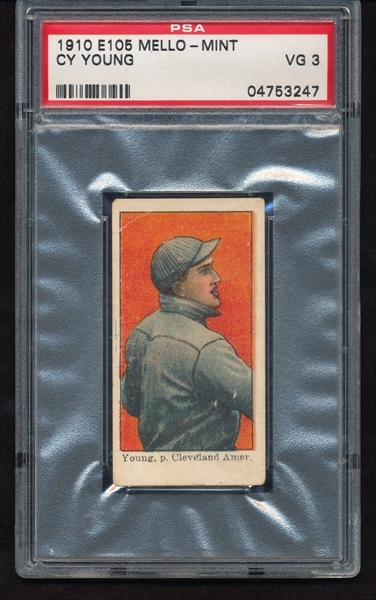
|
|
#3
01-07-2015, 01:11 PM
|
||||
|
||||
|
Quote:
Regardless I've never liked that pose of Cy...or Irv...or whomever it is!
|
|
#4
01-07-2015, 01:27 PM
|
||||
|
||||
|
Quote:
Quote:
reversed.jpg Last edited by 4815162342; 01-07-2015 at 01:28 PM.
|
|
#5
01-07-2015, 01:31 PM
|
||||
|
||||
|
T206 Speaker. It looks bland and cartoonish to me. I need one for my T206 collection but I've not purchased it just because I don't like the look of it.
__________________
Read my blog; it will make all your dreams come true. https://adamstevenwarshaw.substack.com/ Or not... Last edited by Exhibitman; 01-07-2015 at 01:32 PM.
|
|
#7
01-07-2015, 02:31 PM
|
||||
|
||||
|
I agree on the cartoonish Joe D but respectfully couldn't disagree more on the Shoeless and the Ruth. But as said in the top post, different strokes, etc.
Personally, I love the e90-1 Jackson; I think the pose, leaning on the bat, is very cool, very dapper. I also love the regal, purple background. I also am a huge fan of the US Caramel Ruth; he looks like a rumpled, lovable bulldog and the crooked hat, to me, is a touch of style and flavor. I always give the DeLong props because of its unique design and color, though it's a distant choice for me to other Gehrig issues.
|
|
#8
01-07-2015, 11:33 AM
|
||||
|
||||
|
I'm so used to seeing images from certain pre-war cards that it takes friends of mine outside of the hobby to point out how aesthetically displeasing or goofy they look.
I had a T3 Mathewson I was proud of that was seen as being effeminate by some people who saw it for the first time. They pointed out that Matty looked to be consciously posing for the camera, "Vogueing" with his hair pulled down from the front of his hat in an effort to "look pretty". I think of this now every time I see one or even the t206 poses with his hat pulled back. "Hey Matty, its picture day. Go get yourself pretty for the camera, people are gonna see this." GB
|
|
#9
01-07-2015, 12:35 PM
|
||||
|
||||
|
Quote:

__________________
T206 gallery
|
|
#10
01-07-2015, 12:47 PM
|
||||
|
||||
|
That matty was sure a dandy...
|
|
#12
01-07-2015, 01:09 PM
|
||||
|
||||
|
I agree with you on #1 & #3, but I like the fact that the Delong Lou is different from most cards as well as the 38 Joe D, and I really like the US Caramel Ruth as it is a nice face image and to me looks way nicer than Goudey Ruths, and more scarce.
__________________
Collector of Nashville & Southern Memorabilia Last edited by DixieBaseball; 01-07-2015 at 01:10 PM.
|
 |
|
|
 Similar Threads
|
||||
| Thread | Thread Starter | Forum | Replies | Last Post |
| Iconic non Rookie Cards | bn2cardz | Net54baseball Vintage (WWII & Older) Baseball Cards & New Member Introductions | 30 | 09-19-2014 11:59 AM |
| Two things you love about the hobby & Two things you hate | skelly | Net54baseball Vintage (WWII & Older) Baseball Cards & New Member Introductions | 37 | 07-03-2012 09:00 PM |
| cards I hate... | chiprop | Net54baseball Vintage (WWII & Older) Baseball Cards & New Member Introductions | 64 | 09-03-2009 08:51 PM |
| T206 Poll, Love em or hate em | Archive | Net54baseball Vintage (WWII & Older) Baseball Cards & New Member Introductions | 32 | 11-28-2006 07:42 PM |
| Various prewar E, T, and R cards | Archive | 1920 to 1949 Baseball cards- B/S/T | 0 | 11-27-2006 11:18 PM |


 Hybrid Mode
