|
|
|
|
#1
|
||||
|
||||
|
Quote:
 So...what took you so long to find one?!? I wrote you "hours" ago!  All kidding aside thanks so much for taking your time to look for an error/variation of Brooks. I, for one, have never noticed the difference in the 1967 Checklist #531. Now I need to locate and see which of the two checklist variation that I have and which one I need to pick up. You just gave me something to add the search. I agree with you cool stuff! |
|
#2
|
||||
|
||||
|
And here's another one
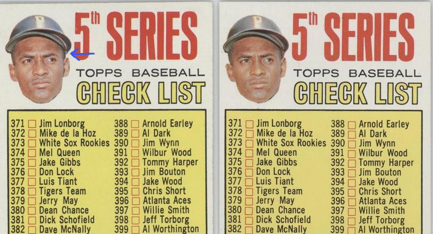
1967 Topps Checklist #361  The most obvious difference between the two versions is the dark connection between his left ear and his hat/helmet combo (emphasized via the blue arrow). It appears or disappears depending on which card you have. The other telltale signs are a more rounded/smooth helmet compared to a more jagged look and the appearance of a very noticeable, small, dark spot on top of the black box directly beneath his chin. Also, there is a marked difference between the two versions of the shadowing of his entire chin region. Lastly, the dark shadow on the far edge of his left ear comes and goes.
__________________
All the cool kids love my YouTube Channel:
Elm's Adventures in Cardboard Land  https://www.youtube.com/@TheJollyElm Looking to trade? Here's my bucket: https://www.flickr.com/photos/152396...57685904801706 I was such a dangerous hitter I even got intentional walks during batting practice. Casey Stengel Spelling "Yastrzemski" correctly without needing to look it up since the 1980s. Overpaying yesterday is simply underpaying tomorrow.  |
|
#3
|
||||
|
||||
|
Let's keep the train a-rollin'
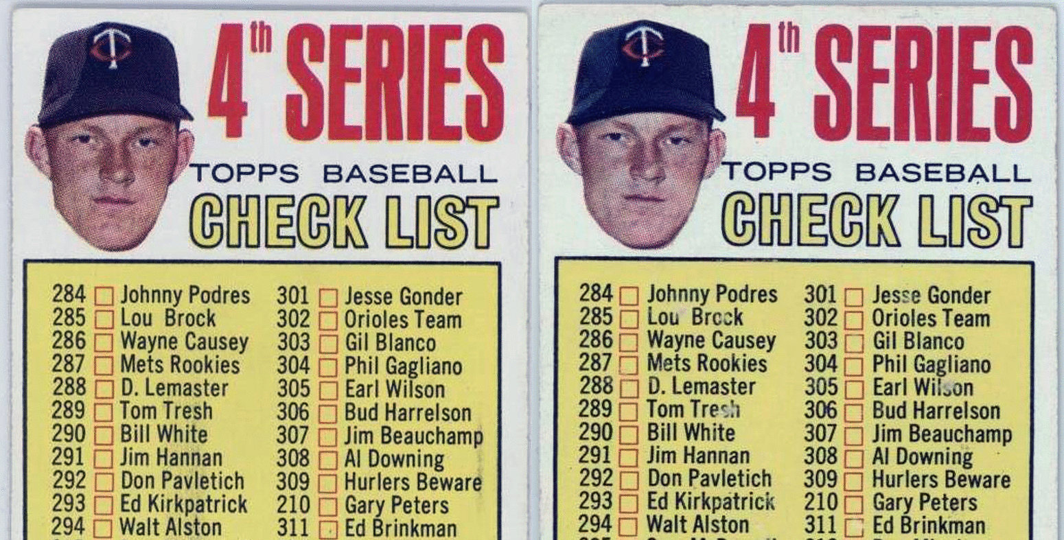
1967 Topps Checklist #278  Version one is Ole Pointy Hat as the top right part of Kaat's hat forms a squared corner. His left earlobe appears to be of the rounded, 'free' persuasion. The shadowing/hat slopes down and smoothly connects with his right ear. Version two is Doctor Roundness as the top right portion of his hat curves naturally. His left earlobe looks to be the 'attached' variety and the shadowing/hat is cropped differently above his right ear.
__________________
All the cool kids love my YouTube Channel:
Elm's Adventures in Cardboard Land  https://www.youtube.com/@TheJollyElm Looking to trade? Here's my bucket: https://www.flickr.com/photos/152396...57685904801706 I was such a dangerous hitter I even got intentional walks during batting practice. Casey Stengel Spelling "Yastrzemski" correctly without needing to look it up since the 1980s. Overpaying yesterday is simply underpaying tomorrow.  |
|
#4
|
|||
|
|||
|
Remember they were usually issued in both the previous series packd and then in the packs of that specific series.
So there are probably subtle (or not so subtle differences) in almost every checklist from about 1961-73 Rich
__________________
Look for our show listings in the Net 54 Calendar section |
|
#5
|
|||
|
|||
|
I agree Rich and think I now have two of every checklist for those years. There are back differences as well
Last edited by ALR-bishop; 06-21-2015 at 07:58 AM. |
|
#6
|
||||
|
||||
|
I am not aware of any variations on the 1973 checklists. If anyone has any please show a scan.
|
|
#7
|
||||
|
||||
|
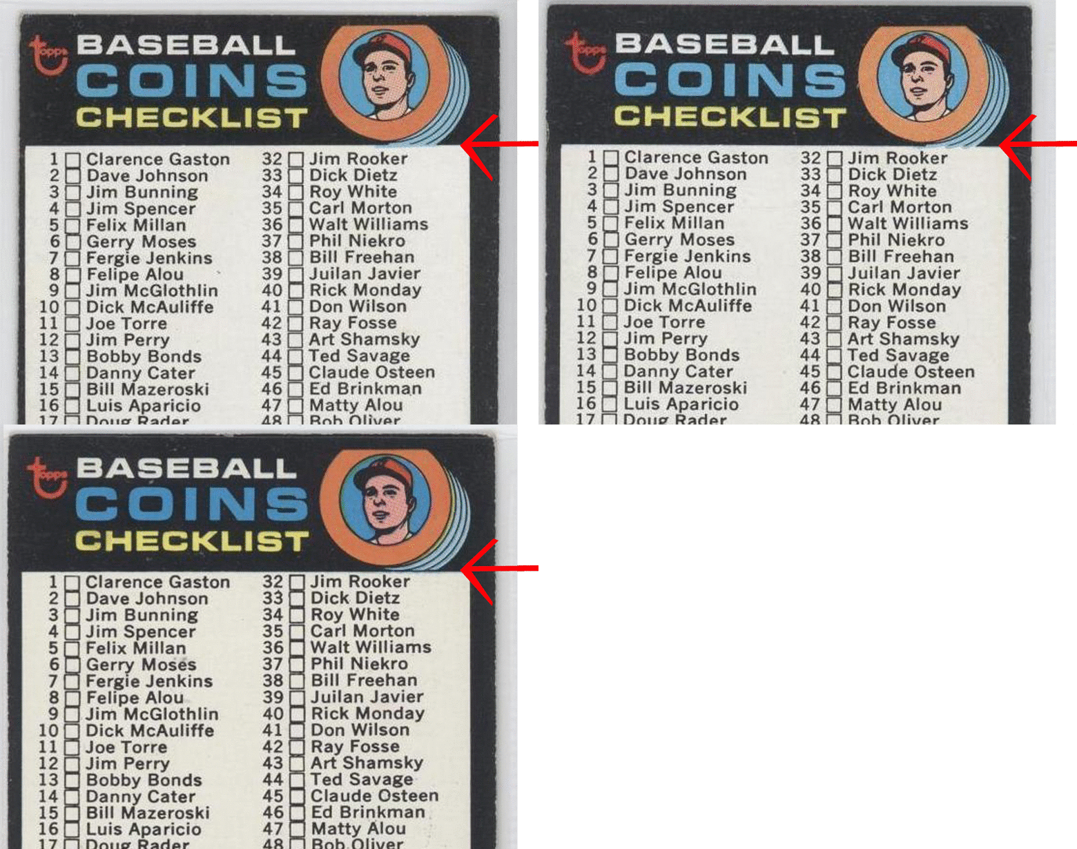
Here's one from 1971 that I discovered a number of years ago. It's the Coins Checklist, #161.
Although you rarely see it listed as such anywhere, many people knew this card came in two versions because the card number on back was either positioned 'high' or 'low' (two noticeably different placements) and the fronts were slightly dissimilar (explained below). But when I studied these cards, it soon became very apparent that there were, in fact, three total variations: 1. Beneath the coins graphic, a solid black line is present. It 'completes' the white box. 2. In that same area, the black line is not present and the blue from the coins forms a straight edge across the gap. 3. The black line is not present and the blue from the coins is cropped differently, forming three distinct curved edges.  For those of you keeping score, the straight blue edge version has the card number in the 'high' position. The other two both have it 'low.' None of these cards seem to be any rarer than their counterparts. And to Mark, Brooks Robinson appears listed on the back of this card, so it may fit into your ultimate Brooksie checklist.
__________________
All the cool kids love my YouTube Channel:
Elm's Adventures in Cardboard Land  https://www.youtube.com/@TheJollyElm Looking to trade? Here's my bucket: https://www.flickr.com/photos/152396...57685904801706 I was such a dangerous hitter I even got intentional walks during batting practice. Casey Stengel Spelling "Yastrzemski" correctly without needing to look it up since the 1980s. Overpaying yesterday is simply underpaying tomorrow.  Last edited by JollyElm; 06-23-2015 at 01:15 AM. |
|
#8
|
|||
|
|||
|
Good one Darren
|
|
#9
|
|||
|
|||
|
Cliff---I do not have variants for the 73 CLs either. I know there has been some lively debate here about whether 73 or 74 was the first year Topps started releasing their sets at one time rather than in series. While I do think 74 was the first year they did it nationwide, I think the entire 73 set was released in some places at one time and so the way they formatted the CLs in in the printing process in 73 was likely different from what it had been in the 60s and early 70s. At least that is what I think

|
|
#10
|
||||
|
||||
|
Quote:

|
|
#11
|
||||
|
||||
|
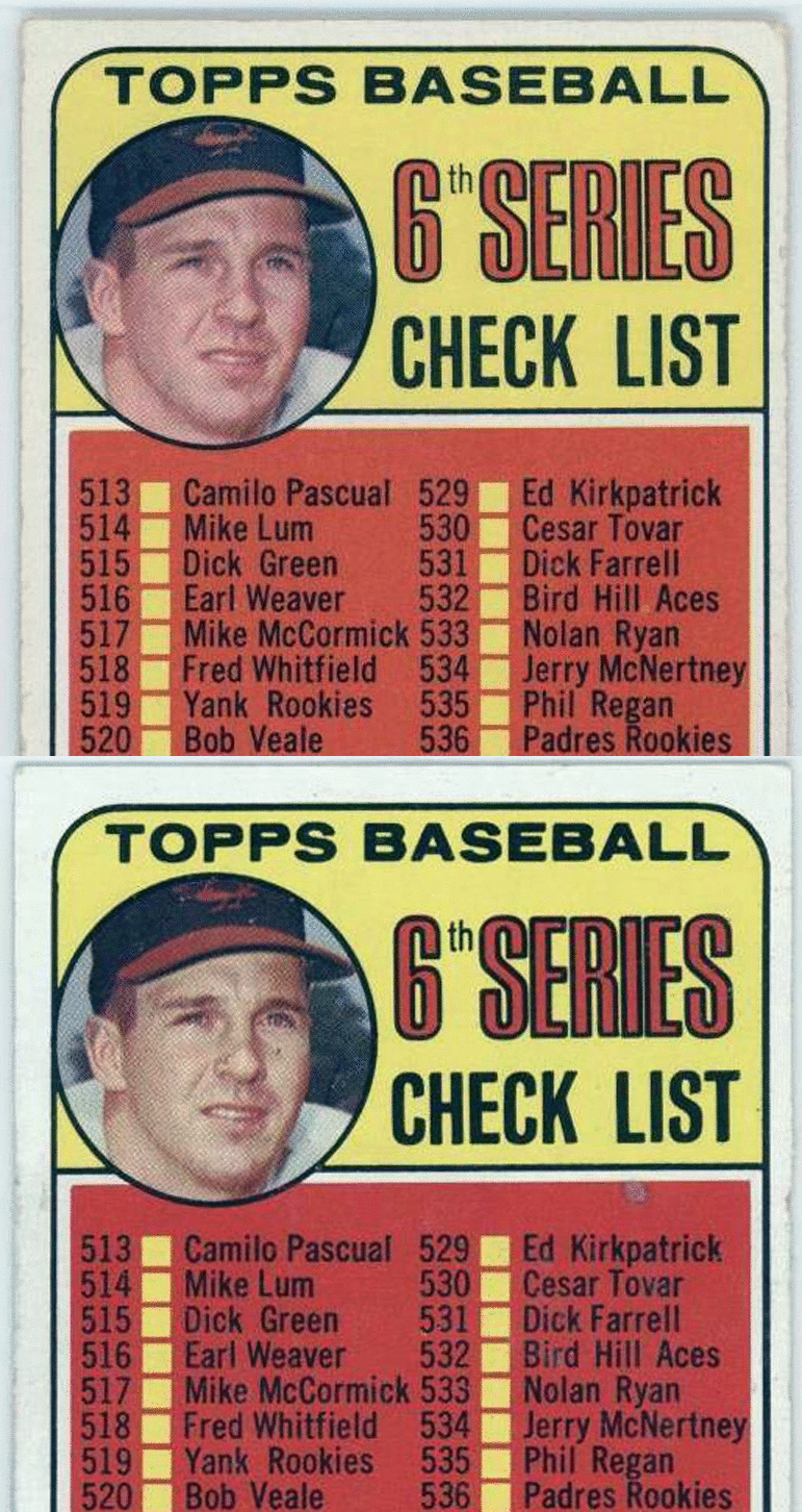
I decided to check out the other Brooksie checklist I know of, 1969 #504, and I found there is a variation there. It is so frickin' subtle that it almost doesn't even count, but there is a slight difference in the cropping of the image.
 The easiest way to see it is by focusing on the edge of his hat brim at far right. On some/most versions of this card it touches the black, circular border. On a smaller number of these cards it falls short of reaching the border. If you concentrate on the image I created here, you can see how the picture is shifted very slightly upward and to the right. Look at the dark shadow on his jersey to the right of his chin and the upper left and right portions of his hat (as well as the top of the Orioles logo). The spacing in these areas changes between the two versions.
__________________
All the cool kids love my YouTube Channel:
Elm's Adventures in Cardboard Land  https://www.youtube.com/@TheJollyElm Looking to trade? Here's my bucket: https://www.flickr.com/photos/152396...57685904801706 I was such a dangerous hitter I even got intentional walks during batting practice. Casey Stengel Spelling "Yastrzemski" correctly without needing to look it up since the 1980s. Overpaying yesterday is simply underpaying tomorrow.  |
 |
|
|
 Similar Threads
|
||||
| Thread | Thread Starter | Forum | Replies | Last Post |
| 1967 Topps Baseball #500 Marichal variation | variation-man | 1950 to 1959 Baseball cards- B/S/T | 3 | 08-20-2014 08:47 PM |
| 1967 Phillies Rookies Variation | Gr8Beldini | Postwar Baseball Cards Forum (Pre-1980) | 2 | 10-03-2013 04:16 PM |
| New Minor 1967 Variation | JollyElm | Postwar Baseball Cards Forum (Pre-1980) | 3 | 08-22-2013 03:11 PM |
| 1967 Master Reference File of Packard Bell's 1967 sponsorship of the L.A. Dodgers | Archive | Net54baseball Sports (Primarily) Vintage Memorabilia Forum incl. Game Used | 0 | 05-25-2008 05:46 PM |
| 1967 Master Reference File of Packard Bell's 1967 sponsorship of the L.A. Dodgers | Archive | Baseball Memorabilia B/S/T | 0 | 05-25-2008 05:44 PM |