|
||||||
 |
|
|||||
|
||||||
|
|
|||||
|
|||||||
| View Poll Results: Which set was the worst set produced by Toops in the 1960's | |||
| 1960 |
|
12 | 10.91% |
| 1961 |
|
13 | 11.82% |
| 1962 |
|
5 | 4.55% |
| 1963 |
|
6 | 5.45% |
| 1964 |
|
16 | 14.55% |
| 1965 |
|
3 | 2.73% |
| 1966 |
|
3 | 2.73% |
| 1967 |
|
9 | 8.18% |
| 1968 |
|
35 | 31.82% |
| 1969 |
|
8 | 7.27% |
| Voters: 110. You may not vote on this poll | |||
 |
|
|
Thread Tools | Display Modes |
|
|
|
#1
 07-08-2015, 07:54 PM
|
|||
|
|||
|
The 1960s are incredibly bland. Small photos and awkward horizontal design. With exception to Yaz, the rookie class is very weak.

|
|
#2
07-08-2015, 09:28 PM
|
||||
|
||||
|
I went with 1962. The wood grain borders just seem incredibly tacky to me, even for the sixties. The 1965 and 1966 sets were right on its heels, though. Those two designs just seemed very bland and uninspired.
__________________
Signed 1953 Topps set: 264/274 (96.35 %)
|
|
#3
07-08-2015, 10:17 PM
|
||||
|
||||
|
1960 or 1968! I went with 60, just dont like the little B&W photo or the multi colored name lettering. '68 was saved by the backs as I like the full stats.
|
|
#5
07-09-2015, 05:13 AM
|
||||
|
||||
|
Quote:
|
|
#6
07-09-2015, 05:23 AM
|
|||
|
|||
|
I'm in the minority, I love the 68s. It's the only 60s cards i have in any real numbers and I have the whole set. A family friend gave me a handful when I was 7-8 and I was mesmerized. I don't like the 1960 horizontals.
|
|
#8
07-09-2015, 07:40 AM
|
||||
|
||||
|
Quote:

|
|
#9
07-09-2015, 08:04 AM
|
|||
|
|||
|
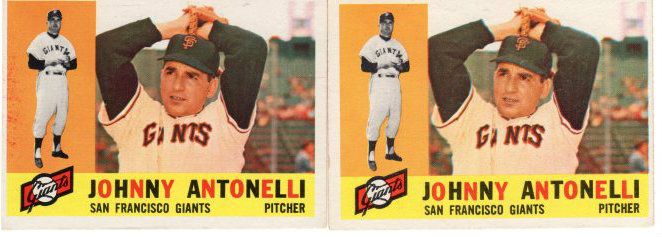
Jason---then the 1960 Antonelli with the uneven colored letters must sing to you
|
|
#10
07-09-2015, 12:39 PM
|
||||
|
||||
|
Quote:
|
|
#11
07-09-2015, 12:49 PM
|
||||
|
||||
|
For what it's worth, I think the 1960 Topps Mantle and Clemente are the two most attractive cards of those stars that Topps ever produced.
|
|
#12
07-09-2015, 08:54 AM
|
|||
|
|||
|
Quote:
I agree - I love the multi-color lettering on the 60s (I also love the 57s that have the colorful blue/red letters for name/team). At the same time, I agree that the 60 horizontal two-picture format can be distracting, and the number of players without caps bothers me (e.g., Maris, Koufax) To me though every set has some clunkers and some winners, which is why no matter which set through the 50s-70s, there are always cards I love in each
|
|
#13
07-09-2015, 10:23 AM
|
|||
|
|||
|
'61's for me. Muddy photography, boring design. Same with '57 and '69 Topps, muddy photography
Rich, '65's are your least favorite? After '53 Bowman and '67 Topps, that is my favorite design post war. While '68 is leading, no one set seems to stand out as the absolute worst. Wonder if you took out sentimental favorites ('68 and '70 iare not designs liked by most, but they are my sentimental favorites) what the vote would be?
|
|
|
|
 Similar Threads
|
||||
| Thread | Thread Starter | Forum | Replies | Last Post |
| Vote! Worst Topps produced set of the 50's | almostdone | Postwar Baseball Cards Forum (Pre-1980) | 60 | 12-27-2015 07:03 PM |
| What was the last year Topps produced their cards in series? | wilkiebaby11 | Postwar Baseball Cards Forum (Pre-1980) | 6 | 05-21-2015 02:38 PM |
| 2003 Topps Vintage Embossed ( 1961 #85 Gil Hodges ) One of Two Cards Produced | DinoPro | Ebay, Auction and other Venues Announcement- B/S/T | 0 | 03-08-2015 01:15 PM |
| My vote for worst slab design | Archive | Net54baseball Vintage (WWII & Older) Baseball Cards & New Member Introductions | 9 | 12-20-2005 10:39 PM |
| Vote for Worst Condition Card on EBAY | Archive | Net54baseball Vintage (WWII & Older) Baseball Cards & New Member Introductions | 25 | 04-15-2004 10:54 AM |


 Hybrid Mode
