|
||||||
 |
|
|||||
|
||||||
|
|
|||||
|
|
|
#1
 11-19-2017, 12:13 PM
|
|||
|
|||
|
Thanks as always for your input Steve. My definition is more narrow but as you know I collect recurring print oddities whatever they are, and agree the 69s and 58s could involve intentional changes in the printing process either way.
Not sure if we did this one. The one on the bottom left is pretty tough. The slight differences on this one remind me of those on the font of the 55 Sullivan (106) and 56 Pepper ( 103), and the back of the 56 Schmidt (322) 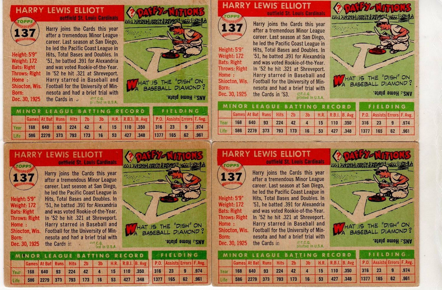

|
|
#2
11-22-2017, 05:49 PM
|
||||
|
||||
|
Here is another example of a variant, that has slight differences, that could be considered a progressive variant like Al's 55 Elliot card. With the 1972 Topps 534 Hickman card, the known variation is the example with no green on the team name. In looking, I found a few examples that have just a very light green instead of only the yellow.
What I find interesting is that no other cards (at least none that are known) from this series have a similar color variation to them. Not sure what caused this progressive variation to occur(on this card only), but my guess is Steve would be able to help explain the cause.
|
|
#3
11-22-2017, 06:44 PM
|
||||
|
||||
|
Some people call the #607 Frank Duffy card a variation due to the coloring differences in the shadowy areas of the team name, relatively similar to the Hickman you illustrated above. What I found was on the print sheet there were multiple Duffy cards represented, and one of them had the much lighter shadowing on it--although all the other coloring and all of the other cards looked perfectly fine. So it seems to have been an 'error' in the actual layout of the cards and not some freakish anomaly in the printing process. I'm wondering if the Hickman variation was created in the same manner.
__________________
All the cool kids love my YouTube Channel:
Elm's Adventures in Cardboard Land  https://www.youtube.com/@TheJollyElm Looking to trade? Here's my bucket: https://www.flickr.com/photos/152396...57685904801706 I was such a dangerous hitter I even got intentional walks during batting practice. Casey Stengel Spelling "Yastrzemski" correctly without needing to look it up since the 1980s. Overpaying yesterday is simply underpaying tomorrow. 
|
|
#4
11-28-2017, 03:21 PM
|
|||
|
|||
|
Acouple of defects similar to the one Patrick posted of Lee Maye
|
|
#5
12-03-2017, 02:36 PM
|
||||
|
||||
|
This print variation, caused by a color shift, is the Yankee logo on the cap appearing green instead of white. I could only find this copy.
|
|
#6
12-03-2017, 05:05 PM
|
||||
|
||||
|
That's an interesting one; the red and black passes are registered, but the blue and yellow (make green!) passes are both mis-registered to the right the same amount.
Actually gives it a pretty cool 3-D affect to the face.
__________________
-- PWCC: The Fish Stinks From the Head PSA: Regularly Get Cheated BGS: Can't detect trimming on modern SGC: Closed auto authentication business JSA: Approved same T206 Autos before SGC Oh, what a difference a year makes. Last edited by swarmee; 12-03-2017 at 05:05 PM.
|
 |
|
|
 Similar Threads
|
||||
| Thread | Thread Starter | Forum | Replies | Last Post |
| 1966 Topps High # Print Variations | 4reals | Postwar Baseball Cards Forum (Pre-1980) | 9 | 04-27-2014 07:05 PM |
| Are these variations or print defects? | savedfrommyspokes | Postwar Baseball Cards Forum (Pre-1980) | 16 | 02-09-2013 12:52 PM |
| Well known print defects. Do variations exist without? | novakjr | Postwar Baseball Cards Forum (Pre-1980) | 9 | 01-28-2011 05:32 PM |
| Finally confirmed - d311 print variations exist! ("bluegrass" variations) | shammus | Net54baseball Vintage (WWII & Older) Baseball Cards & New Member Introductions | 8 | 09-03-2010 08:58 PM |
| Wanted: T206 Print Variations and Errors | Archive | Tobacco (T) cards, except T206 B/S/T | 1 | 01-04-2007 08:23 PM |


 Hybrid Mode
