|
||||||
 |
|
|||||
|
||||||
|
|
|||||
|
#901
 11-16-2017, 09:30 AM
|
|||
|
|||
|
I know this is getting in beating a dead horse territory, but I have a Q on the 69 Perry. I think I have 6 of the 8 known possibles, but my Q for the print experts is how did it occur that both the YN and WN versions have have all 3 variants ( blue line front and partial or major distortion of number on back) ?

|
|
#902
11-16-2017, 04:39 PM
|
||||
|
||||
|
Quote:
__________________
All the cool kids love my YouTube Channel:
Elm's Adventures in Cardboard Land  https://www.youtube.com/@TheJollyElm Looking to trade? Here's my bucket: https://www.flickr.com/photos/152396...57685904801706 I was such a dangerous hitter I even got intentional walks during batting practice. Casey Stengel Spelling "Yastrzemski" correctly without needing to look it up since the 1980s. Overpaying yesterday is simply underpaying tomorrow. 
|
|
#903
11-16-2017, 07:22 PM
|
|||
|
|||
|
I did see that and can understand the 3 different backs showing up on both the YN and WN, but seems weird both would also have the blue streak front.
|
|
#904
11-16-2017, 07:58 PM
|
||||
|
||||
|
I imagine the actual layout of the Perry card was unchanged (and perhaps the two versions, with and without the blue streak, simply appeared in different places on the print sheet) between the white letter and yellow letter versions, because the absence of a color wasn't caused by editing the physical layout of the cards. Or it's possible the Perry cards were exactly the same in layout, but something occurred during the the printing of the cyan layer and the blue splotch appeared?
__________________
All the cool kids love my YouTube Channel:
Elm's Adventures in Cardboard Land https://www.youtube.com/@TheJollyElm Looking to trade? Here's my bucket: https://www.flickr.com/photos/152396...57685904801706 I was such a dangerous hitter I even got intentional walks during batting practice. Casey Stengel Spelling "Yastrzemski" correctly without needing to look it up since the 1980s. Overpaying yesterday is simply underpaying tomorrow.
|
|
#905
11-16-2017, 10:07 PM
|
||||
|
||||
|
2 more, how would you describe these variants? I've looked at a lot of vintage cards but have never seen anything like the Fregosi... The other '61 has a "streak" what do you call that? Those I think are much more common.
|
|
#906
11-16-2017, 10:12 PM
|
||||
|
||||
|
That Fregosi has a Jay Johnstone wet sheet transfer on it...or the two cards were once stuck together and ripped apart??
__________________
All the cool kids love my YouTube Channel:
Elm's Adventures in Cardboard Land https://www.youtube.com/@TheJollyElm Looking to trade? Here's my bucket: https://www.flickr.com/photos/152396...57685904801706 I was such a dangerous hitter I even got intentional walks during batting practice. Casey Stengel Spelling "Yastrzemski" correctly without needing to look it up since the 1980s. Overpaying yesterday is simply underpaying tomorrow.
|
|
#907
11-17-2017, 01:31 PM
|
|||
|
|||
|
Quote:
69 Topps had a fairly complex layout, with different a and B sheets, and some doubleprints. (actually double prints and triple prints, a fine distinction) So some cards have 3 positions, and most have 2. Each color should be taken on its own, so the WN/YN is a change in the Yellow, but the Blue mark is a change to Cyan*. So one of the positions could have had a fault in the Cyan layer, that they didn't fix. When they fixed the Yellow layer the new set of plates would have the fixed yellow, but still have one position with the unrepaired Cyan. At the craziest not likely, but possible - A first set of plates gets made with a good cyan layer but a bad yellow layer. The cyan mask gets damaged, and later the yellow layer is fixed and new plates are made. Still later the blue is fixed, and the yellow is still fixed, resulting in three versions, two of which are very hard to tell apart. (Or mix in a hand done fix for the blue mark, which would be a pretty rare thing) Think that can't happen? I just went through the 49 leaf set, and found three -four major changes, plus transitional cards. And that's just in a month or so of looking seriously for the different varieties on Ebay. *It can also be a change in any or all the other colors, I'd have to see a high res scan or have one in hand to be sure. That would indicate a problem on the pasteup that got fixed.
|
|
#908
11-17-2017, 02:07 PM
|
|||
|
|||
|
Thanks for input Steve. Would you classify the WN v YN cards print defects or variations ? Same Q for 58 Y v Ws. I guess it would depend in part on what definition of a variation is assumed
|
|
#909
11-17-2017, 07:56 PM
|
||||
|
||||
|
Quote:
|
|
#910
11-18-2017, 08:21 AM
|
||||
|
||||
|
Quote:
__________________
Successful transactions with: Chesboro41, jimivintage, Bocabirdman, marcdelpercio, Jollyelm, Smanzari, asoriano, pclpads, joem36, nolemmings, t206blogcom, Northviewcats, Xplainer, Kickstand19, GrayGhost, btcarfango, Brian Van Horn, USMC09, G36, scotgreb, tere1071, kurri17, wrm, David James, tjenkins, SteveWhite, OhioCard Collector, sysks22, ejstel. Marty
|
|
#911
11-18-2017, 06:01 PM
|
|||
|
|||
|
Quote:
For the Y/Ws it's pretty clear that the yellow layer was set up wrong, and corrected. I suppose some could stretch that to say that setting the plate up wrong is a print error, but I think that runs afoul of stuff that's even more clear like the 79 Bump Wills. My definition of a variation is really a loose one. I count anything that appears to be caused by a difference on the plate, or a clear difference in the cardstock or ink. Most of those differences are probably unintentional, I can't imagine the UV reactive backs on late 80's early 90's Topps were intentional. Considering the range of stuff I'll set aside as "different" trying to determine intent is a rabbit hole I just don't choose to go down. I do also save stuff that's obviously related to some production issue, either in printing, cutting packing, or even in the manufacture of the cardstock. I've got a card that has what I'd call a massive inclusion, something manufactured into the cardstock that's about half as big as a watermelon seed. So Registration problems fisheyes Inking problems cardboard flaws Die cut on the wrong end, or with the wrong pattern All those go in the printing mistakes box Cutting guidelines Different screening Die cuts that shouldn't have been obvious(88 score) Different holograms Marks from scratches on the plate Consistent stray marks (not caused by ink spatter) Printed on a different sort of cardstock (mostly 69 and 70 Topps) All those go in the main set as variations. A few can be hard to decide, like if one color foil should have been used but a different color was. Technically an error, so I'd file it there. Which may seem to contradict the placing different holograms as variations, but the different holograms were often a difference between series. (Like one hockey year where the main set has one hologram, but the update set was packed with low # cards and all of them had the next years hologram) And yes, it's about as confusing as it can be. That's one of the reasons I don't get worked up about the variation/not a variation question.
|
|
#912
11-19-2017, 12:13 PM
|
|||
|
|||
|
Thanks as always for your input Steve. My definition is more narrow but as you know I collect recurring print oddities whatever they are, and agree the 69s and 58s could involve intentional changes in the printing process either way.
Not sure if we did this one. The one on the bottom left is pretty tough. The slight differences on this one remind me of those on the font of the 55 Sullivan (106) and 56 Pepper ( 103), and the back of the 56 Schmidt (322) 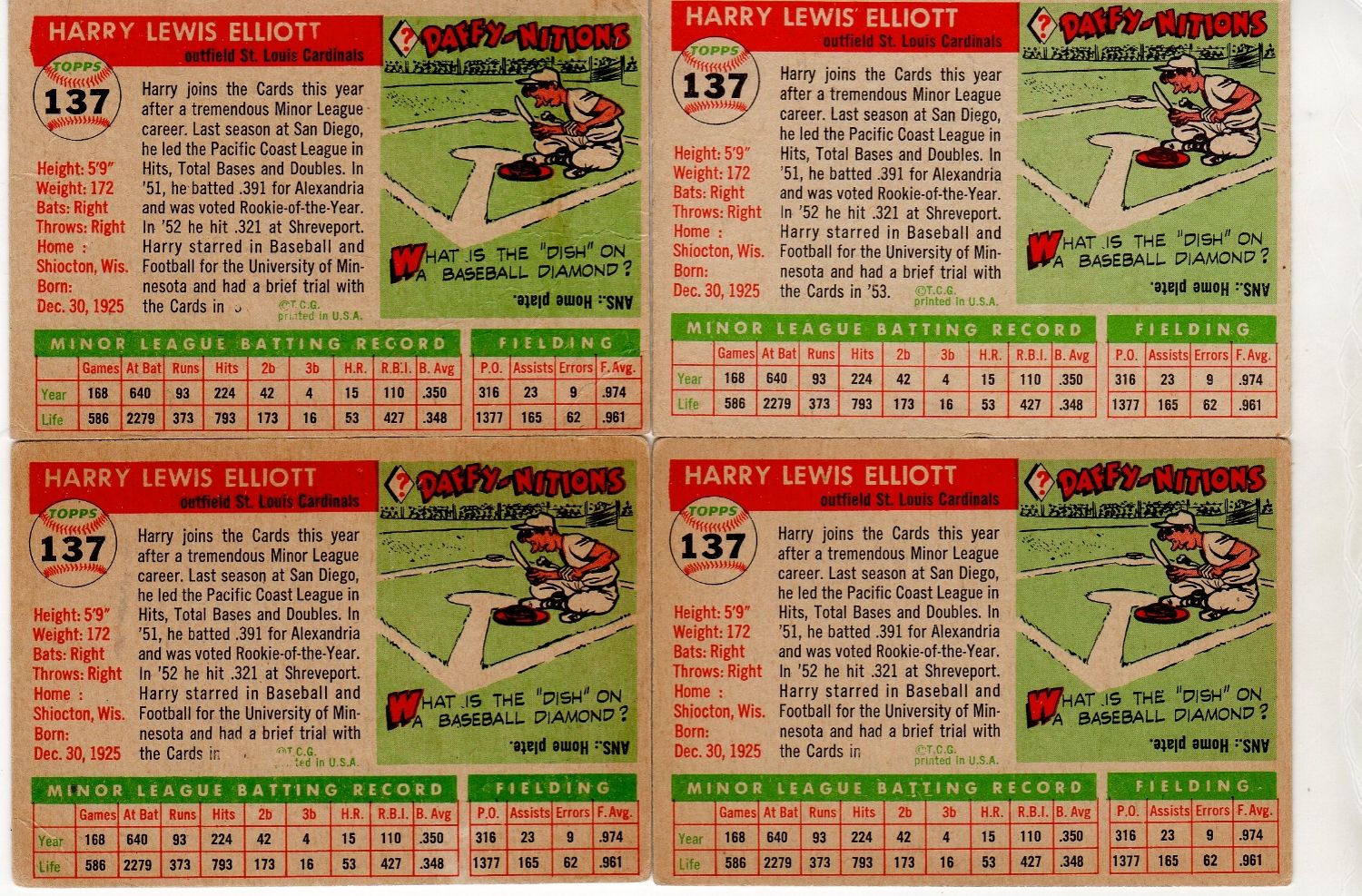
|
|
#913
11-22-2017, 05:49 PM
|
||||
|
||||
|
Here is another example of a variant, that has slight differences, that could be considered a progressive variant like Al's 55 Elliot card. With the 1972 Topps 534 Hickman card, the known variation is the example with no green on the team name. In looking, I found a few examples that have just a very light green instead of only the yellow.
What I find interesting is that no other cards (at least none that are known) from this series have a similar color variation to them. Not sure what caused this progressive variation to occur(on this card only), but my guess is Steve would be able to help explain the cause.
|
|
#914
11-22-2017, 06:44 PM
|
||||
|
||||
|
Some people call the #607 Frank Duffy card a variation due to the coloring differences in the shadowy areas of the team name, relatively similar to the Hickman you illustrated above. What I found was on the print sheet there were multiple Duffy cards represented, and one of them had the much lighter shadowing on it--although all the other coloring and all of the other cards looked perfectly fine. So it seems to have been an 'error' in the actual layout of the cards and not some freakish anomaly in the printing process. I'm wondering if the Hickman variation was created in the same manner.
__________________
All the cool kids love my YouTube Channel:
Elm's Adventures in Cardboard Land https://www.youtube.com/@TheJollyElm Looking to trade? Here's my bucket: https://www.flickr.com/photos/152396...57685904801706 I was such a dangerous hitter I even got intentional walks during batting practice. Casey Stengel Spelling "Yastrzemski" correctly without needing to look it up since the 1980s. Overpaying yesterday is simply underpaying tomorrow.
|
|
#915
11-28-2017, 03:21 PM
|
|||
|
|||
|
Acouple of defects similar to the one Patrick posted of Lee Maye
|
|
#916
12-03-2017, 02:36 PM
|
||||
|
||||
|
This print variation, caused by a color shift, is the Yankee logo on the cap appearing green instead of white. I could only find this copy.
|
|
#917
12-03-2017, 05:05 PM
|
||||
|
||||
|
That's an interesting one; the red and black passes are registered, but the blue and yellow (make green!) passes are both mis-registered to the right the same amount.
Actually gives it a pretty cool 3-D affect to the face.
__________________
-- PWCC: The Fish Stinks From the Head PSA: Regularly Get Cheated BGS: Can't detect trimming on modern SGC: Closed auto authentication business JSA: Approved same T206 Autos before SGC Oh, what a difference a year makes. Last edited by swarmee; 12-03-2017 at 05:05 PM.
|
|
#919
12-04-2017, 10:39 AM
|
|||
|
|||
|
Thomas-- now you need one showing him as right hander
|
|
#920
12-04-2017, 10:35 PM
|
||||
|
||||
|
The 1969 Gaylord Perry train keeps a rollin'...I think. At least it's possible it does.
In looking at some more Perry cards (not mine), I noticed some have a thin bolt of electricity emanating from his hat into the sky. You can see it pretty clearly to the right of the SF logo on the card to the left. So I started looking to see if all of the back number variations we were talking about come with and without this anomaly on front. 1969perryantenna485.jpg The card on the right doesn't have this bolt, but...it may in fact actually be there, only not as electrified, and perhaps just a dull bluish line that blends into the sky?? I'm not sure. So I say check your Perry cards again and see if it appears. (The versions posted earlier in this thread seem to have something there.) If there's clearly no lightning bolt there, please post a scan/pic of it.
__________________
All the cool kids love my YouTube Channel:
Elm's Adventures in Cardboard Land https://www.youtube.com/@TheJollyElm Looking to trade? Here's my bucket: https://www.flickr.com/photos/152396...57685904801706 I was such a dangerous hitter I even got intentional walks during batting practice. Casey Stengel Spelling "Yastrzemski" correctly without needing to look it up since the 1980s. Overpaying yesterday is simply underpaying tomorrow.
|
|
#921
12-05-2017, 07:59 AM
|
|||
|
|||
|
This shows how far the sickness can go. Now we are looking for cards with nothing there.
 If the bolt exits in different forms, or exists on some cards but not others, and exists in both yellow and white, and on each kind of back, how many versions are possible  I have 7 of the 8 I thought I was looking for, now have to check them for bolts Last edited by ALR-bishop; 12-05-2017 at 08:01 AM.
|
|
#923
12-06-2017, 11:16 AM
|
||||
|
||||
|
Quote:
|
|
#924
12-06-2017, 11:17 AM
|
|||
|
|||
|
Sorry Thomas, bad joke reference to this one...Opps, Larry beat me to it
Last edited by ALR-bishop; 12-06-2017 at 11:18 AM.
|
|
#926
12-18-2017, 07:32 PM
|
||||
|
||||
|
Hi, guys. Enjoy the thread. Any ideas on this Robin Yount and what variant you would call it? Thinking just missing ink, right? Have you seen other '75s like this or '75 Younts? sHoping your answer is "sun fading" but methinks the one area of orange makes it not the case.
|
|
#927
12-18-2017, 07:39 PM
|
||||
|
||||
|
Quote:
__________________
All the cool kids love my YouTube Channel:
Elm's Adventures in Cardboard Land https://www.youtube.com/@TheJollyElm Looking to trade? Here's my bucket: https://www.flickr.com/photos/152396...57685904801706 I was such a dangerous hitter I even got intentional walks during batting practice. Casey Stengel Spelling "Yastrzemski" correctly without needing to look it up since the 1980s. Overpaying yesterday is simply underpaying tomorrow. Last edited by JollyElm; 12-18-2017 at 07:40 PM.
|
|
#928
12-18-2017, 08:12 PM
|
||||
|
||||
|
Quote:
__________________
-- PWCC: The Fish Stinks From the Head PSA: Regularly Get Cheated BGS: Can't detect trimming on modern SGC: Closed auto authentication business JSA: Approved same T206 Autos before SGC Oh, what a difference a year makes.
|
|
#929
12-19-2017, 06:43 AM
|
|||
|
|||
|
There is a recurring print defect or variance of this card. Copies posted on page 1 of this this thread.
|
|
#930
12-19-2017, 11:10 AM
|
|||
|
|||
|
Of course, for 75's there's this one.
No sign of fading anywhere but the photo area. And pulled from a commons box, so if it was selectively faded, that's a bit of work for maybe 10 cents. There must be more of them, I just haven't seen any.
|
|
#931
12-20-2017, 12:13 AM
|
||||
|
||||
|
I had never seen the Mazzilli or the Revering before but I knew they had to exist because they were next to the Niekro and the Clark on the 1980 D*uncut sheet. I found both of them recently on eBay. I can't remember if the Jones and the Vail from the 1980 B* uncut sheet have been mentioned here before, but it has the same flaw as the Niekro-Mazzilli.
|
|
#932
12-20-2017, 10:42 PM
|
||||
|
||||
|
Thanks for the responses on the Yount, I think you are dead on. But what about these two? The Butkus has a dark strip near bottom, so not a sticker/sun fade issue on this? Missing ink? Thanks!
|
|
#933
12-20-2017, 11:04 PM
|
||||
|
||||
|
Same as the Yount, sitting in a sports card store glass display case faded by sunlight. They both have the rectangle in the upper right corner where the price tag protected the small area from sunlight fading. Apparently both cards had the bottom edge covered by another card or something else that shielded the sunlight.
|
|
#934
01-02-2018, 08:21 PM
|
||||
|
||||
|
Lil some for ya
 [br]  [br]  [br]  [br] 
__________________
EBAY STORE: ROOKIE-PARADE
|
|
#935
01-03-2018, 08:53 AM
|
||||
|
||||
|
Quote:
|
|
#936
01-03-2018, 10:13 AM
|
||||
|
||||
|
Quote:
|
|
#937
01-03-2018, 11:17 AM
|
||||
|
||||
|
Thank you Cliff, as always, spot on input.
Besides the 73 Topps with the wacky backs, how many other Topps issues from the 70s-90s can be found with a different issue on the back due to scraps getting out the back door? I have one of the 91 Topps cards with a baseball front and a FB back, but was not sure what other years may have something like this.
|
|
#938
01-03-2018, 06:11 PM
|
|||
|
|||
|
I forget which year, but there were baseball backs with non-sticker mork and mindy sticker fronts.
There were also 78 baseball backs inside bazooka boxes and black hole card backs inside bazooka boxes.
|
|
#939
01-03-2018, 09:07 PM
|
||||
|
||||
|
Quote:
Last edited by Cliff Bowman; 01-03-2018 at 09:08 PM. Reason: Grammar
|
|
#940
01-05-2018, 08:02 AM
|
|||
|
|||
|
Thanks Cliff.
I have one or two, but I was too lazy to go find them. The 79front/78 backs were originally sold by a dealer I think from the Baltimore area, in strips. What I heard was that they knew where Topps printer dumped trash, and had a bit of a find one day being there at the same time as the truck that had Topps stuff. I have a strip I ordered back then, not sure where it is but I know I didn't cut it. It got a bit squashed in shipping, put me off mailorder for a few years. Topps must have had a ton of leftover 78back only sheets. Steve B
|
|
#941
01-09-2018, 08:03 PM
|
||||
|
||||
|
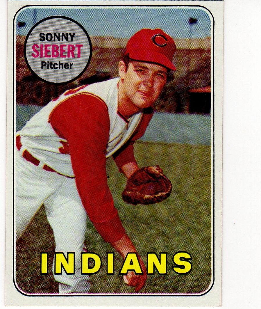
Found this limited, but recurring print variant on the 69 455 Siebert card. Above the first "I" in Indians there is what appears to be a pen mark, but it is indeed a recurring mark. This is another variant that looks much more obvious in hand.
|
|
#942
01-10-2018, 11:07 AM
|
|||
|
|||
|
Larry---had not seen that one. I do have the one with a blue line to right of the bill of his cap, one with a broken spot in that same "I", and one with a reddish brown color between his legs. Isakur has the first two of those up on ebay now
|
|
#943
01-10-2018, 03:12 PM
|
||||
|
||||
|
Quote:
. Same photo, though.
|
|
#944
01-10-2018, 04:23 PM
|
|||
|
|||
|
My Bad
 Even worse, in checking my set I have that one. I need a "normal" one Last edited by ALR-bishop; 01-10-2018 at 04:43 PM.
|
|
#945
01-10-2018, 06:23 PM
|
||||
|
||||
|
Quote:
|
|
#946
01-10-2018, 07:10 PM
|
|||
|
|||
|
I would like to say I was just being devious rather than stupid....but
|
|
#948
01-15-2018, 03:54 PM
|
|||
|
|||
|
Also have one with red dot to to left and below ear
|
|
#949
01-16-2018, 04:56 PM
|
|||
|
|||
|
Red at bottom ?
|
|
#950
01-16-2018, 06:50 PM
|
||||
|
||||
|
That's probably just a misaligned sheet going to the magenta plate.
__________________
-- PWCC: The Fish Stinks From the Head PSA: Regularly Get Cheated BGS: Can't detect trimming on modern SGC: Closed auto authentication business JSA: Approved same T206 Autos before SGC Oh, what a difference a year makes.
|
 |
|
|
 Similar Threads
|
||||
| Thread | Thread Starter | Forum | Replies | Last Post |
| 1966 Topps High # Print Variations | 4reals | Postwar Baseball Cards Forum (Pre-1980) | 9 | 04-27-2014 07:05 PM |
| Are these variations or print defects? | savedfrommyspokes | Postwar Baseball Cards Forum (Pre-1980) | 16 | 02-09-2013 12:52 PM |
| Well known print defects. Do variations exist without? | novakjr | Postwar Baseball Cards Forum (Pre-1980) | 9 | 01-28-2011 05:32 PM |
| Finally confirmed - d311 print variations exist! ("bluegrass" variations) | shammus | Net54baseball Vintage (WWII & Older) Baseball Cards & New Member Introductions | 8 | 09-03-2010 08:58 PM |
| Wanted: T206 Print Variations and Errors | Archive | Tobacco (T) cards, except T206 B/S/T | 1 | 01-04-2007 08:23 PM |


 Linear Mode

