|
||||||
 |
|
|||||
|
||||||
|
|
|||||
|
|
|
#1
 12-17-2018, 12:47 PM
|
||||
|
||||
|
There are also differences on the backs of the 1963 Topps double prints Norm Cash and Johnnie Wyatt, although they are more subtle. In the stat box on half of the Cash cards the line can be continuous all the way through between 3B and HR nearly touching the career HR 102 or it can be found with a shorter line on the other half of the Cash cards so that the line is not touching the number of 102 career HR’s, and on half of the Wyatt cards the line between Year and Team is continuous and nearly touches the 1957-58 stat, on the other half of Wyatt cards the line is purposely broken so that it doesn’t touch 1957-58.
Last edited by Cliff Bowman; 12-17-2018 at 10:27 PM. Reason: Added scans 
|
|
#2
12-17-2018, 05:41 PM
|
||||
|
||||
|
Al, that was a good article. It has been a few years since I last read it, so I didn't remember the parts about the differences on these card backs. Like Cliff mentions, there are differences on many of the backs of these 11 cards. For example, on the Davenport card back, the white card number box is bigger on one version than the other.
|
|
#3
12-18-2018, 10:55 AM
|
|||
|
|||
|
Notice in the left version that the ball in the inset is touching the inset margin, while in the right version it is not touching. His body in the inset is more present in the left version as well. In the main photo, the left version has the know of theta into the left margin, while the right version has the knob almost entirely IN the picture. The right version has his sweatshirt almost touching the right margin while the left one has it more into the photo. Also on the left version, a small part of his uniform is visible right above the red border and left of the inset circle as a result of this shift. The version with the shift to the right is on the front of the version that has the 3B/HR line on the back going past the number 102 to the bottom.
Last edited by Sliphorn; 12-18-2018 at 12:01 PM.
|
|
#4
12-19-2018, 03:28 PM
|
||||
|
||||
|
Here's a 1968 Rich Reese "Head in the Clouds" variation.

__________________
Now watch what you say, or they'll be calling you a radical, a liberal, oh, fanatical, criminal Won't you sign up your name? We'd like to feel you're acceptable, respectable, presentable, a vegetable If we are to have another contest in the near future of our national existence, I predict that the dividing line will not be Mason and Dixon's but between patriotism and intelligence on the one side, and superstition, ambition and ignorance on the other.- Ulysses S. Grant, 18th US President.
|
|
#6
12-24-2018, 09:37 AM
|
|||
|
|||
|
Quote:
|
|
#7
12-28-2018, 02:20 PM
|
||||
|
||||
|
I just noticed the name stripe on the 1987 Donruss Kevin Brown:
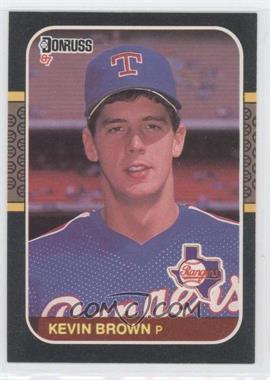 1987 Donruss - [Base] #627 - Kevin Brown Courtesy of COMC.com 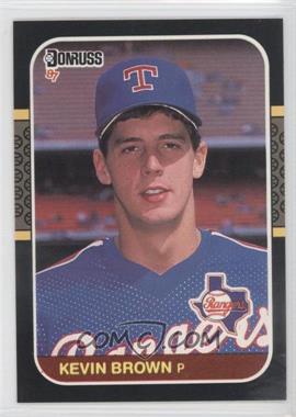 1987 Donruss - [Base] #627 - Kevin Brown Courtesy of COMC.com
__________________
-- PWCC: The Fish Stinks From the Head PSA: Regularly Get Cheated BGS: Can't detect trimming on modern SGC: Closed auto authentication business JSA: Approved same T206 Autos before SGC Oh, what a difference a year makes.
|
 |
|
|
 Similar Threads
|
||||
| Thread | Thread Starter | Forum | Replies | Last Post |
| 1966 Topps High # Print Variations | 4reals | Postwar Baseball Cards Forum (Pre-1980) | 9 | 04-27-2014 06:05 PM |
| Are these variations or print defects? | savedfrommyspokes | Postwar Baseball Cards Forum (Pre-1980) | 16 | 02-09-2013 11:52 AM |
| Well known print defects. Do variations exist without? | novakjr | Postwar Baseball Cards Forum (Pre-1980) | 9 | 01-28-2011 04:32 PM |
| Wanted: T206 Print Variations and Errors | Archive | Tobacco (T) cards, except T206 B/S/T | 1 | 01-04-2007 07:23 PM |


 Hybrid Mode
