|
||||||
 |
|
|||||
|
||||||
|
|
|||||
|
|
|
#1
 01-13-2021, 06:28 PM
|
|||
|
|||
|
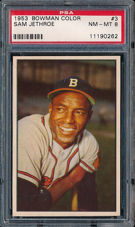
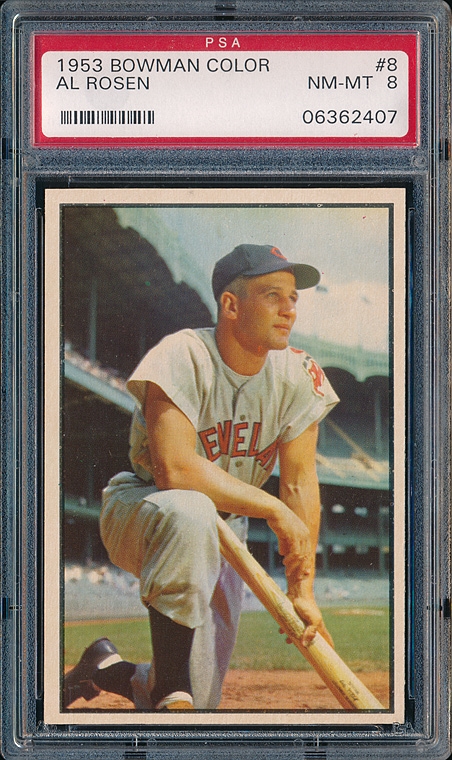
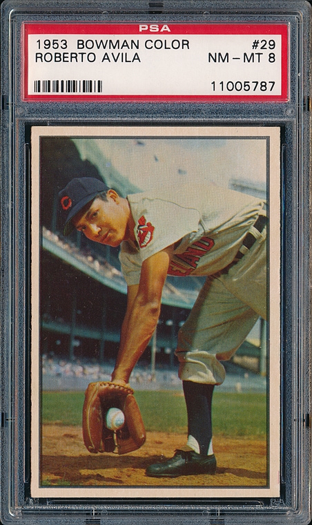
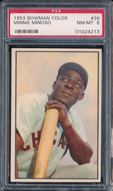
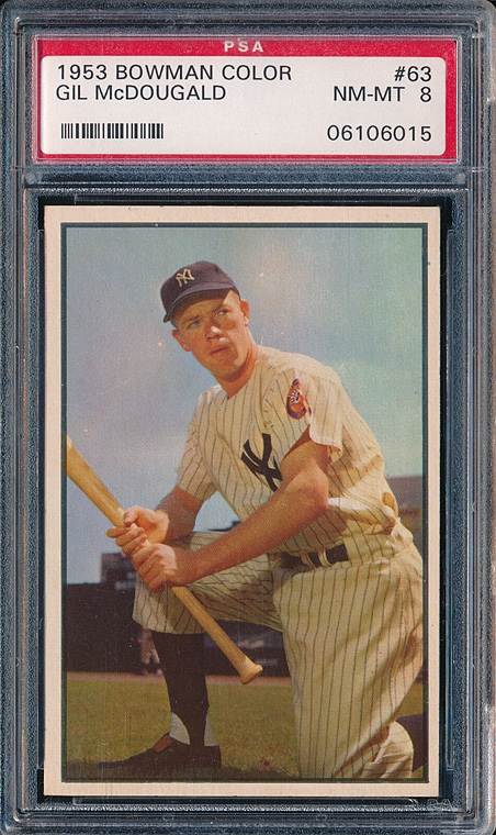
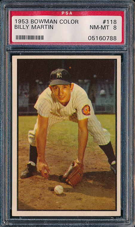
A great visual set because of the ability of the photographers. No out of focus snapshots from across the field in this set. Fantastic composition that captures the moment - and, the designers purposely kept the cards clean and simple w/no detracting banners, headers, or logos. A perfect example of how less is more. Of course I love the '72 topps set as well


|
|
#2
01-13-2021, 07:05 PM
|
|||
|
|||
|
The cards have a certain warmth, unlike newer cards which have a brighter, crisper image. No criticism intended by the comparison.
As I mentioned the set for the most part offers beautiful photography, but there are certain numbers that didn't benefit from the process. It's hard to discern the facial features of Hector Rodriguez, #98, and the Lown, Surkont, Lollar, and Fox all appear to be a bit murky. Lie many previous sets quality control leaves something to be desired for this set- too many off-center and miscut cards to begin with. I've also wondered why there are two cards of Al Corwin in the set. Are there any certain cards that collectors would like to point out for their artistry?
|
|
#3
01-13-2021, 08:20 PM
|
||||
|
||||
|
I can't believe no one has at least posted a card. Here's a Musial.
|
|
#5
01-13-2021, 09:00 PM
|
||||
|
||||
|
a few
__________________
Four phrases I have coined that sum up today's hobby: No consequences. Stuff trumps all. The flip is the commoodity. Animal Farm grading.
|
|
#7
01-14-2021, 08:20 AM
|
|||
|
|||
|
Quote:
|
|
#8
01-14-2021, 09:29 AM
|
||||
|
||||
|
|
#9
01-13-2021, 10:47 PM
|
||||
|
||||
|
I have long wondered who the photographer was? He was certainly a master of working with light. I suppose he could have been a she. That might explain why just about every player in the set seems like he's in such a good mood. Or maybe the photographer brought a pretty woman along to flirt with the players. I would have done it. They're all smiling and seem relaxed.
I like every photo in the set except the one of Alvin Dark. To have so many great shots, it makes me wonder how many shots of each player were taken. And what became of the negatives. I'm guessing they also photographed a bunch of players who never made it into the set. Quote:
|
|
#10
01-13-2021, 11:18 PM
|
||||
|
||||
|
Kodachrome, just like the movies filmed in Kodachrome the colors are richer than standard film.
|
|
#11
01-14-2021, 06:03 AM
|
|||
|
|||
|
Quote:
|
|
#12
01-14-2021, 01:36 PM
|
|||
|
|||
|
Quote:
|
 |
|
|
 Similar Threads
|
||||
| Thread | Thread Starter | Forum | Replies | Last Post |
| Trade 2 1953 Bowman Color for 53 Bowman Color Needs | Tere1071 | 1950 to 1959 Baseball cards- B/S/T | 0 | 05-26-2020 11:31 AM |
| 1953 Topps #89 Stobbs, 1953 bowman color #47 Garver 1953 Archives signed #318 Simmons | Republicaninmass | 1950 to 1959 Baseball cards- B/S/T | 8 | 05-16-2016 04:21 PM |
| FS: 1953 Bowman Color Lot of 23 REDUCED 1950 Bowman Lot Added | boneheadandrube | 1950 to 1959 Baseball cards- B/S/T | 1 | 01-11-2016 07:21 PM |
| FSH - 1953 Bowman Color & 1954 Bowman graded lots | tribefan | 1950 to 1959 Baseball cards- B/S/T | 0 | 11-08-2014 09:55 PM |
| FS 1955 Bowman 1953 Bowman Color Ralph Kiner $30 | jjcollects | 1950 to 1959 Baseball cards- B/S/T | 0 | 02-09-2013 09:28 PM |


 Hybrid Mode
