|
||||||
 |
|
|||||
|
||||||
|
|
|||||
|
|
|
#1
 08-20-2021, 07:21 PM
|
||||
|
||||
|
Quote:

|
|
#2
08-26-2021, 07:01 PM
|
|||
|
|||
|
..
Both vars : 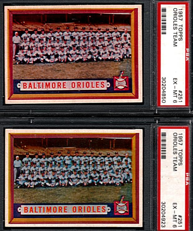 ...White uniforms -brown grass and blue uniforms -green grass ..
|
|
#3
08-26-2021, 09:36 PM
|
|||
|
|||
|
I do think you can find at least two versions of every 57 card with coloring differences such as this one. I think someone offered a bunch of examples in this or another thread
|
|
#4
08-27-2021, 04:27 PM
|
|||
|
|||
|
Quote:
..  ..A true master set of 1957 Topps is now up to 800 or so.... ..
|
|
#5
08-28-2021, 09:24 AM
|
|||
|
|||
|
Quote:
|
|
#6
08-29-2021, 09:14 PM
|
|||
|
|||
|
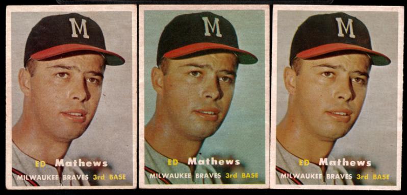
Several years have "blue tints" like this; where it's not just a color being darker in a print run but the color present in places it should not be. 1968 football and 1971 football are pretty obvious, 1967 baseball has them in at least a couple of the series.
1957 has at least two of each card, some have red tint, blue tint and a "proper" one. I count these as true variations, though it makes my spreadsheets a pain to manage sometimes.
|
|
#7
08-29-2021, 09:23 PM
|
|||
|
|||
|
And while I'm thinking about 1967 Topps and happen to have my box out:
139 Dalton Jones - Blue line in top border or correct. 198 Chuck Hiller - Blue line in bottom border, or correct. 323 Herhbserger - Blue in team name on front extends low (not the color layer being mis-set), or correct 326 - Uecker, white line through position, height and and birth year on back. Tough. 382 Dave Mcnally can be found with a white line through the first line of his text biography write up on back. Also green smear in the lower left of his stat boxes, as well as the known purple object variation. Some are tough. 399 Worthington - Green hangs below the black divider at top of the stat area, or correct. 403 Dick Nen - Green spots on both arms, or correct. Not the easiest. 412 astro's Rookies - some copies show the edge of a stat box on the back right, even when they are not at all miscut to show an adjacent card. Easy 438 Chuck Dobson - several versions with the cartoon white extending high, extra white and green squiggly shapes below the cartoons, green ink bleed into the cartoon, Athletics logo on front extending low. At least 5 combinations I can show them but Net54 hates iPhone pics and requires a downsizing process that takes too much time and ruins the quality a lot. Apologies if I missed these being publicly known, I don't think any of them are.
|
 |
|
|
 Similar Threads
|
||||
| Thread | Thread Starter | Forum | Replies | Last Post |
| 1966 Topps High # Print Variations | 4reals | Postwar Baseball Cards Forum (Pre-1980) | 9 | 04-27-2014 06:05 PM |
| Are these variations or print defects? | savedfrommyspokes | Postwar Baseball Cards Forum (Pre-1980) | 16 | 02-09-2013 11:52 AM |
| Well known print defects. Do variations exist without? | novakjr | Postwar Baseball Cards Forum (Pre-1980) | 9 | 01-28-2011 04:32 PM |
| Wanted: T206 Print Variations and Errors | Archive | Tobacco (T) cards, except T206 B/S/T | 1 | 01-04-2007 07:23 PM |


 Hybrid Mode
