|
||||||
 |
|
|||||
|
||||||
|
|
|||||
|
|
|
#1
 07-02-2022, 08:53 PM
|
||||
|
||||
|
Quote:
__________________
Eric Perry Currently collecting: T206 (135/524) 1956 Topps Baseball (195/342) "You can observe a lot by just watching." - Yogi Berra 
|
|
#2
07-03-2022, 12:02 PM
|
||||
|
||||
|
Quote:
Shh...don't feed the trolls.
__________________
Read my blog; it will make all your dreams come true. https://adamstevenwarshaw.substack.com/ Or not...
|
|
#3
07-05-2022, 07:26 PM
|
|||
|
|||
|
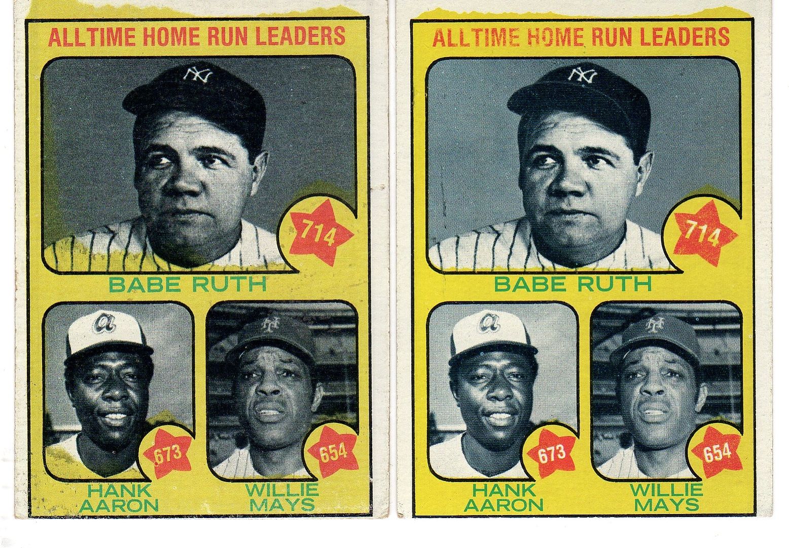
Now you could send people or a cruel scavenger hunt by showing this card in a new thread, saying this is a newer before seen typo error you recently discovered.
__________________
Looking for: Unique Steve Garvey items, select Dodgers Postcards & Team Issue photos
|
|
#4
07-05-2022, 11:18 PM
|
||||
|
||||
|
Quote:
|
|
#5
07-06-2022, 05:47 AM
|
||||
|
||||
|
Doubtful this was considered a mistake at the time. Topps didn't always get an A in grammar and punctuation, especially if you look at the back of some 1950's and 60's cards.
__________________
Postwar stars & HOF'ers. Currently working on 1956, '63 and '72 Topps complete sets. Last edited by jchcollins; 07-06-2022 at 05:50 AM.
|
|
#6
07-06-2022, 07:07 AM
|
||||
|
||||
|
Quote:
|
|
#7
07-06-2022, 10:03 AM
|
|||
|
|||
|
Someone at Topps did not like this card
|
 |
|
|


 Hybrid Mode
