|
||||||
 |
|
|||||
|
||||||
|
|
|||||
|
#1
 04-19-2022, 01:01 AM
|
|||
|
|||
|
It seems more than time the Football side has it's own thread. There are quite a few recurring variations or defects in the major football sets, many of which are rarely noted or have not been publicly shown discussed.
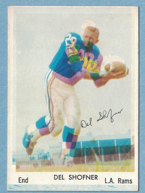
Starting off with Jimmy Brown. Jim Brown's 61 Topps comes with a big white blob to the left, or no blob. The blob appears to me to be on 5% or less of the cards thus far. 
|
|
#4
04-19-2022, 01:41 AM
|
|||
|
|||
|
There is natural color differences between cards, sometimes drastic, without there being any kind of variant to go after. However, the Cardinals row in 1956, one of the 2 short printed rows, appears to be a bit more than that.
Cards have 1 of 2 looks - a light orange name plate box, with a 'smoother' look to the image and the dark blue background color. The players faces appear properly rendered, uniforms correct. The second aesthetic is a dark orange name plate box, red ink more prominent in the players uniform, not just in the red top but often visible in the pants, and areas where red ink is not needed at all. The background doesn't look so smooth, it has a scratchier, less clean look that I'm not quite sure how to describe. These differences all come in combination, on all Cardinals. It appears to me to be a legitimate variation, and does not really come in gradients but is clearly 1 or the other type of print.
|
|
#6
04-19-2022, 03:56 PM
|
|||
|
|||
|
Anyone have any variants for 61 Fleer ?
|
|
#8
04-21-2022, 05:12 PM
|
|||
|
|||
|
1956 Topps Billy Wilson can be found with this weird shape on the right side, some design element of the sheet. It intrudes on some cards that are almost perfectly centered, doesn't take a drastically bad cut like this one for part of it to appear.
|
|
#9
04-22-2022, 05:28 PM
|
|||
|
|||
|
I don't know what this one is. Many Topps cards of this period have inconsistently appearing cutting lines. 2nd series 1972 Football isn't one of them, from what I have seen. The line is also far too low, too close to the team name, to be a cutting line. It is recurring on Fernandez' card, though rare. I imagine it appears on some other cards on this sheet too, but I have not actually seen any other player with it.
|
|
#12
06-28-2022, 04:47 PM
|
||||
|
||||
|
1961 Topps #32 can be found can be found with the blue flame fart variation.
Larry
__________________
Member of OBC (Old Baseball Cards), the longest running on-line collecting club www.oldbaseball.com
|
|
#13
06-29-2022, 09:05 AM
|
||||
|
||||
|
That fart might have been squishy LOL
Quote:
__________________
Leon Luckey www.luckeycards.com
|
|
#14
06-29-2022, 11:18 PM
|
||||
|
||||
|
Quote:
__________________
interesting to some absolute garbage to others. - Error cards and variations are for morons, IMHO.
|
|
#15
06-30-2022, 01:27 AM
|
|||
|
|||
|
Thank you! I don't know the sheet layout for 1972, but it makes sense it's on a full row. It looks like there is also a 'partial line' variation here, like these 2 (saw multiple on Lamonica).
Don't get what this line is; it's way too low to be a properly placed cutting line.
|
|
#16
06-30-2022, 09:45 AM
|
||||
|
||||
|
I found another partial sheet with three more cards on that row, I don't know if the Gossett is to the immediate right of Lamonica or if the five remaining unknown cards are between them, but I'm guessing the first six cards in the row are Fernandez-Mulligan-Lamonica-Gossett-Snow-Robertson and the line ends in the middle of Snow. I couldn't find a Robertson with any trace of a line.
__________________
interesting to some absolute garbage to others. - Error cards and variations are for morons, IMHO. Last edited by Cliff Bowman; 06-30-2022 at 09:47 AM. Reason: Correction
|
|
#19
07-11-2022, 06:40 PM
|
||||
|
||||
|
This is recurring and isn't rare, the color changing blob is always in the same spot but is always in varying sizes. All of these are currently on eBay.
__________________
interesting to some absolute garbage to others. - Error cards and variations are for morons, IMHO.
|
|
#20
07-16-2022, 11:41 AM
|
||||
|
||||
|
I saw this card listed on eBay years ago as being a variation where the sheet makers hand drew a '2' on the bottom left edge for whatever reason. The card is on the left edge of the original uncut sheet but I believe it's probably just a recurring fisheye.
__________________
interesting to some absolute garbage to others. - Error cards and variations are for morons, IMHO.
|
|
#21
07-17-2022, 12:38 AM
|
|||
|
|||
|
A lot like the Butkus, Donny Anderson has a big yellow blob in the name box that is difficult to miss. It seems to vary heavily in size and exact shape, but all of them are really obvious.
As far as I have noticed, all Donny Anderson's have the small white jut into the black name box.
|
|
#22
07-19-2022, 10:27 PM
|
||||
|
||||
|
It seems like there should be a Kuechenberg but I don't think I have ever seen one.
__________________
interesting to some absolute garbage to others. - Error cards and variations are for morons, IMHO.
|
|
#23
07-19-2022, 10:57 PM
|
|||
|
|||
|
Quote:
|
|
#25
07-19-2022, 11:03 PM
|
||||
|
||||
|
Quote:
__________________
interesting to some absolute garbage to others. - Error cards and variations are for morons, IMHO.
|
|
#28
07-21-2022, 06:55 AM
|
|||
|
|||
|
Lots of great print defects in this thread! Keep'em coming.
jeff
|
|
#29
07-30-2022, 09:43 PM
|
|||
|
|||
|
Walt Sweeney in the 1965 Topps set, card 173, comes with or without this partial line and full line beneath it on the bottom of his card. It does not appear to be cutting line visible from being off-center, but a stray mark or something.
|
|
#31
08-11-2022, 11:28 PM
|
|||
|
|||
|
And this one is a true variation that I believe has never been mentioned online. Galen Fiss 1963 Topps card #21 had a cut above his eye removed.
His Purple sky card can be found with the cut above his eye present, and the bruising beneath his eye more severe. The Purple sky card was then adjusted to reduce the bruising and remove the cut above his eye. The regular version of the card with a proper, blue sky has the cut removed and the bruising beneath reduced further. The version with the full cut is, I think at this point, pretty difficult.
|
|
#34
08-15-2022, 02:43 AM
|
|||
|
|||
|
This one is recurring, but pretty darn rare. Note the big blue cloud everywhere. 1960 Fleer print defects are almost cheating, though. This set was not printed well for some reason, even though Fleer's other card offerings of 1959 and 1960 were just fine. You don't see big problems all the time in the 1959 and 1960 baseballs, for example.
|
|
#36
08-16-2022, 06:45 PM
|
|||
|
|||
|
Tommy Nobis comes the same way as the Sayers. I found a couple more Sayers on eBay that are listed. It can't be the whole sheet available this way or more would be evident; it looks like it strikes Sayers about as often as it does Nobis. I wonder where they were placed on the sheet.
|
|
#38
12-04-2022, 05:43 AM
|
|||
|
|||
|
Quote:
|
|
#41
12-18-2022, 01:54 PM
|
||||
|
||||
|
Bell Rams are not easy anyway
 Blackless   Miscuts   
__________________
Read my blog; it will make all your dreams come true. https://adamstevenwarshaw.substack.com/ Or not...
|
|
#43
12-24-2022, 03:28 PM
|
|||
|
|||
|
Quote:
I don't think this is a print variation so much as a true variation.
|
|
#44
12-30-2022, 12:15 AM
|
|||
|
|||
|
1968 Topps 171 Len Dawson comes with or without this black line in the right border. Even on cards off center this way, it seems to be on less than half the cards.
Dawson often comes with this flared lower right (probably a right edge card on the sheet). The copy I have in hand looks the same.
|
|
#46
01-01-2023, 12:04 PM
|
|||
|
|||
|
How ironic is it for the Galloping Ghost to ... have a ghost?
  jeff
|
 |
|
|
 Similar Threads
|
||||
| Thread | Thread Starter | Forum | Replies | Last Post |
| Show...me...your print variations! | 4reals | Postwar Baseball Cards Forum (Pre-1980) | 3125 | 11-17-2025 05:43 PM |
| Error variations vs. Print Variations: 1990 Fleer Martinez | deweyinthehall | Modern Baseball Cards Forum (1980-Present) | 19 | 01-20-2025 04:51 PM |
| FS: Topps Print Variations | 4reals | 1980 & Newer Sports Cards B/S/T | 0 | 05-10-2020 01:33 PM |
| Are these variations or print defects? | savedfrommyspokes | Postwar Baseball Cards Forum (Pre-1980) | 16 | 02-09-2013 12:52 PM |
| Finally confirmed - d311 print variations exist! ("bluegrass" variations) | shammus | Net54baseball Vintage (WWII & Older) Baseball Cards & New Member Introductions | 8 | 09-03-2010 08:58 PM |


 Linear Mode

