|
||||||
 |
|
|||||
|
||||||
|
|
|||||
|
|
|
#1
 11-28-2022, 10:17 AM
|
|||
|
|||
|
I've been working off and on doing a spreadsheet of 49 Leaf Images.
Hardly complete, and I still find new ones. As things are now, I'm up to at least 4 different runs, maybe as high as 6. The obvious Pink ones. these so far always have the sides to the portraits, or the lines across the ends of bats. On some cards it can be tough to spot. The ones with lines across the bats and portraits, but with red instead of Pink. With lines, but shaded or dark hats Without the lines regular hats Without lines Shaded hats. That's all sort of preliminary. the hat shading may not be consistent, but I think it is. Where the background does not make a line across a bat, the yellow extends to the edge, but the black does not. On ones with the lines, the yellow often doesn't extend to the edge, but I have seen at least one where it does. Most of the easily recognizable color differences are consistent with only one version. I believe the yellow backgrounds Like the Johnson here are a different printing where no blue was used to mix with yellow. An amazingly complex set for just 50 cards. (I think of the rare numbers as their own set. ) 
|
|
#2
11-28-2022, 11:00 AM
|
|||
|
|||
|
Quote:
My thought is that the plate changes represent a definite "variation" as there was a physical change made to the printing plate, though the rest of the card stayed the same. Those variations are measurable and not as subjective as the tints of the inks, though those tints are SUPER important in decoding how many different printing runs were made. The Rizzuto that you have shown has two changes made to it (outside of ink colors), the detail of his hat was removed making it blue, and the background red was extended to the nameplate. The only other player that I have found to get this treatment is Jackie Robinson, though the Babe Ruth card has a variation where the "background connector" is added, but the hat is untouched. Complex is certainly the best way to characterize it, as I have gotten deeper into the research I have really started to enjoy the quirkiness of the cards, outside of their value in the hobby, but also representing a fascinating time in the game.
|
|
#3
11-28-2022, 11:57 AM
|
|||
|
|||
|
What I'm thinking of doing is assigning a number to the identifiable plates for each basic color. So like R1 and R2 to indicate a particular red plate as opposed to another.
But that ends up making the overall "number" for a card something like card #3 - C1 R2 Y2 K2 Which is fine for a start but awkward, and there's no real idea which should be 1 or 2 - did the ones with the extra lines come first or second? The pink ones - actual Magenta- would probably be something like R2P... At least it would help group things. Most cards with anything close to the border have diferences in that area. The lines next to portraits and across the end of bats. Hats get cut down in multiple colors, and often there are three different is the hat is cut down. Normal hat Hat cut down background normal Hat and background cut down (And probably ones with the background cut down but the hat normal. It might be possible to limit how many intermediate types I have to look for, since the typical process is to print light to dark. So YMCK or YCMK. But I suspect Leaf didn't necessarily follow that. (Fleer star stickers in 81 were sometimes printed with the blue over the black, and T206s are known with just yellow and brown, so it's not really a hard rule.
|
|
#5
11-28-2022, 01:12 PM
|
|||
|
|||
|
Quote:
Still a barrel of nuts to crack on this one.
|
|
#8
12-23-2022, 07:59 AM
|
||||
|
||||
|
Quote:
with as many as 4 possible variations with 2 color variations for for each one of them for a total of 8 possible variations for each subject on the first series sheet. On the background color variations I think it has more to do with a difference in cardstock than it does the the actual ink color used. On the pink or pinkish variations the fronts seem to be a whiter stock and it also feels thicker to me. I researched 386 Jensen cards and here's what I found This is the first variation and by far the most common with 236 or 61.13% of the Jensen's I checked. This variation has no white above the hat and they all have a round black dot in the J The one on the right has a pinkish hue in hand but for some reason it looks more orange in my scan [IMG]  [/IMG] [/IMG][IMG] 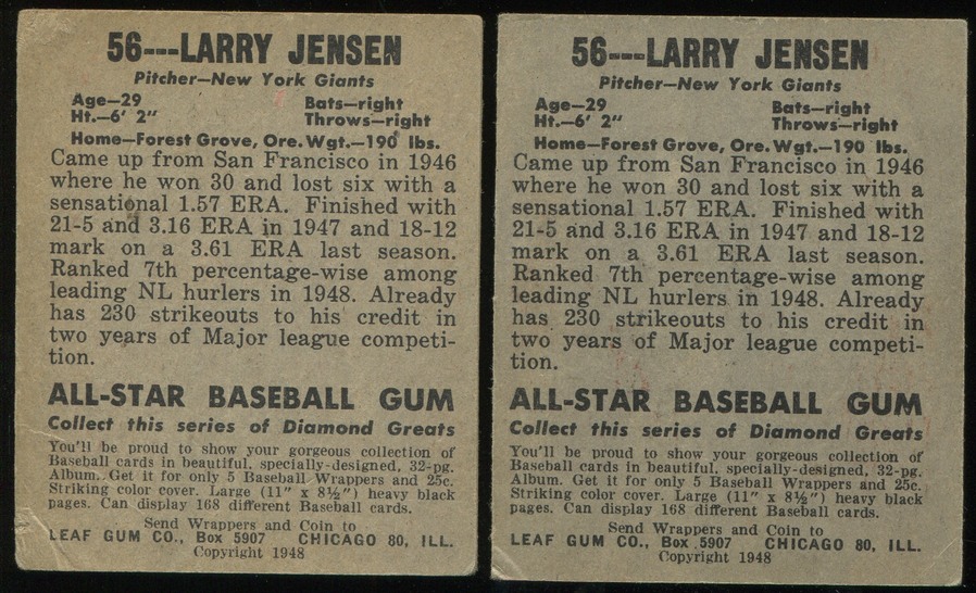 [/IMG] [/IMG][IMG]  [/IMG] [/IMG]The next variation has a big white area above his hat and this is the variation that has all of the pink variations in it. There were 62 of the 386 or 16.06% of this variation and 25-30% were pink or around 5% of the 386. I also think this is the variation on the sheet Ted posted. [IMG]  [/IMG] [/IMG][IMG]  [/IMG] [/IMG][IMG]  [/IMG] [/IMG]The next variation has a smaller white area above his hat and is the least common with 28 or 6.99% of the 386. The one on the right is also pinker in hand than it is in the scan [IMG]  [/IMG] [/IMG][IMG]  [/IMG] [/IMG]the Last variation has no white above his hat and no black dot in the J there were 60 or 15.54% of the 386 of this variation. I don't have the two variations of this one yet. [IMG]  [/IMG] [/IMG]
|
|
#9
12-23-2022, 10:03 AM
|
|||
|
|||
|
I think the stock differences do affect the color of the red a bit.
I hadn't started doing the stock differences, as I've concentrated on the large variety of differences on the fronts. Of the ones Pat has posted, the last one is the only one I didn't have an image of. Up close, do any of them show yellow anywhere? Having or not having the yellow could affect how the red seems too. One thing I like is the images of the edges. You can see the diagonal lines where the cutting blade had tiny nicks.
|
|
#10
12-23-2022, 12:07 PM
|
||||
|
||||
|
Great work as always Pat, your patience is amazing. A question for you or maybe better for SteveB. If a complete sheet has four panels & four Jensens, how are those panels created? ie; would we expect a variation in one panel or a change in the entire sheet as a print run goes on. And a similar question, if the hat variations are blue registration issues, how consistent would we expect those to be? That is, are registration issues gradual in nature or stepped? Jensens ear on the right below shows a separated red & blue layer for instance and caught my eye. Just curious on the nuts & bolts of actual print process.
|
|
#11
12-23-2022, 12:49 PM
|
|||
|
|||
|
Quote:
One thing that my Uncle also said, there was no adding elements to the plate, unless you etched a new plate. He said the only time that you would change a plate would be when a plate would wear down, or if they we moved to a different factory, different printer. So this makes cards like Aberson, Ruth, Rizzuto, and Robinson and potentially Jensen interesting variations. I do think the PINK versions were late in the game, and from the conversations I had with my Great Uncle, he thinks that the pink may have more about the ink that was available or what was cheapest to buy at the time. I have a running theory that the cards were printed at the factory in Chicago where the candy packaging was printed. The stock looks similar to the packaging of WHOPPERS that was produced by Overland Confectionary, a brand that was consolidated and under the Leaf Brands family name in 1947. I have seen images of that stock, and it looks similar. My Uncle did say whoever printed these, were "Not the guys you would want to print a copy of a Van Gogh." I asked him what would lead to this many errors and variations, he laughed and said "they may have been drunk." Which caught me off guard! He said "these guys printing would be the equivalent of "bringing the space shuttle to be serviced at the corner mechanic."
|
|
#12
12-23-2022, 03:03 PM
|
||||
|
||||
|
Quote:
|
|
#13
12-23-2022, 04:45 PM
|
||||
|
||||
|
This is purely speculation but I wonder if this was just packaging or if there were any cards involved in this fire.
July 1949 img301.jpg
|
|
#15
12-23-2022, 09:17 PM
|
|||
|
|||
|
Quote:
|
 |
|
|
 Similar Threads
|
||||
| Thread | Thread Starter | Forum | Replies | Last Post |
| 1949 Leaf BB cards....show us your Leaf's | tedzan | Net54baseball Vintage (WWII & Older) Baseball Cards & New Member Introductions | 130 | 01-13-2023 02:43 PM |
| WTB: 1948 Leaf, 1949 Leaf Baseball/Football cards | tnosmoothly | 1920 to 1949 Baseball cards- B/S/T | 0 | 06-11-2020 12:40 AM |
| 1949 leaf | steve B | Postwar Baseball Cards Forum (Pre-1980) | 16 | 12-17-2017 10:23 PM |
| 1948 & 1949 LEAF FB cards....show us your LEAF's | tedzan | Football Cards Forum | 29 | 12-28-2016 04:51 AM |
| 1948 Leaf vs. 1949 Leaf? | Archive | Football Cards Forum | 3 | 03-31-2009 05:54 AM |


 Hybrid Mode
