|
||||||
 |
|
|||||
|
||||||
|
|
|||||
|
#1
 08-30-2009, 10:56 AM
|
||||
|
||||
|
I can't hold it in any longer. There are a few cards that when I see them, I cringe. It doesn't matter what the signifigance of this Ruth card is, I just can't stand it. Ruth holding a bird with a bat in his crotch and a dude with pants too short staring at the camera freeks me out. What cards bring about a negative vibe for you?


|
|
#2
08-30-2009, 11:19 AM
|
|||
|
|||
|
that certainly is an odd card
|
|
#4
08-30-2009, 11:48 AM
|
||||
|
||||
|
E91s.
|
|
#5
08-30-2009, 12:34 PM
|
||||
|
||||
|
My take on this historic image. The Bird., In those days, carrier pigeons were used to haul messages and film from the 'scene' directly to the press office. The Rags' legman would often carry several during big events, evidenced by the size of the Camel cigs box.
This shot represents the breaking of Roger Connor's Home Run record 1921 and Ruth having the honor of sending off the skinny. I believe the little fellow is a local Detroit clothier Rocco Capri  It's a weird but interesting image.
|
|
#7
08-30-2009, 01:48 PM
|
||||
|
||||
|
J=K very fragile and impossible to find.
Rawn
__________________
Not a forensic examiner, nor a veterinarian, but I know a horse's behind from a long ways away.
|
|
#11
08-30-2009, 06:11 PM
|
||||
|
||||
|
T3 Home Run Baker (Jack Barry).
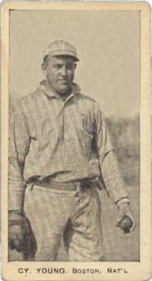
Not sure of the set, but the E-card of Frank Chance that shows nothing but his rear-end. The afore-mentioned Cy (Irv) Young cards. E90-1 Cy Young (Cleveland) - side view with the big pointed nose...it just doesn't look like him. E91's (except for Johnny Evers and John McGraw) I also agree with the Babe's bird card. I just don't get it, and the bat is just wrong. Steve Last edited by Steve D; 08-30-2009 at 06:12 PM.
|
|
#13
08-30-2009, 07:34 PM
|
||||
|
||||
|
MP & Co. and Joe Wood's Cracker Jacks.
__________________
jasoncarota.com | hickory + hide
|
|
#15
08-30-2009, 08:41 PM
|
||||
|
||||
|
Quote:
I am right with you on the MP & Co. but would have to respectfully disagree with the E-145's of Smokey  . Is it the lips? . Is it the lips?
|
|
#16
08-30-2009, 08:50 PM
|
||||
|
||||
|
I'll add to the chorus - the E91's and strip cards. I'll also agree with Jeff's sig that there is definite need for a sarcasm font. -- Mike
__________________
T207's - Sale/Trade Info T207 image collections @ ImageEvent. T207 Master/Master - stopped at 676/705 - 96%..
|
|
#17
08-30-2009, 08:56 PM
|
||||
|
||||
|
Good golly...so much hate for the E91's...if only you knew (and you will shortly)....
Brian
|
|
#18
08-30-2009, 09:00 PM
|
||||
|
||||
|
Quote:
Quote:
__________________
jasoncarota.com | hickory + hide
|
|
#20
08-31-2009, 08:34 AM
|
|||
|
|||
|
Along with all other Black Sox material. I never got and never will get the allure.
|
|
#22
08-31-2009, 10:01 AM
|
||||
|
||||
|
Quote:
__________________
Leon Luckey www.luckeycards.com
|
|
#23
08-31-2009, 10:03 AM
|
||||
|
||||
|
Quote:
|
|
#24
08-31-2009, 10:17 AM
|
||||
|
||||
|
Quote:

|
|
#25
08-31-2009, 10:23 AM
|
||||
|
||||
|
Hard to argue against MP & Co's.
|
|
#26
08-31-2009, 12:53 PM
|
||||
|
||||
|
Someone want to fill me in on the unpopularity of the E91 set? I think they're o.k...
__________________
My wish list: V357 1933 WWG Ice Kings Hockey 1921 Exhibits Babe Ruth & Walter Johnson Greg Maddux PSA 10 Cannon Pedro Martinez PSA 10 1992 Leaf Gold Insert
|
|
#27
08-31-2009, 12:55 PM
|
||||
|
||||
|
DK,
why so much hate? i love your e90-1 jax and e92 croft blue back wagner! edit: i just bid $500 on this card, what do you think DK, smart investment if it ends there or still too much? 
Last edited by chaddurbin; 08-31-2009 at 01:14 PM.
|
|
#29
08-31-2009, 03:09 PM
|
|||
|
|||
|
The E90-1 Jackson is purple...I love purple.
|
|
#31
08-31-2009, 03:20 PM
|
|||
|
|||
|
Homer Simpson said that.
|
|
#32
08-31-2009, 03:23 PM
|
|||
|
|||
|
Quote:
|
|
#34
08-31-2009, 06:12 PM
|
||||
|
||||
|
Quote:
|
|
#36
08-31-2009, 07:25 PM
|
||||
|
||||
|
Quote:
")
__________________
Leon Luckey www.luckeycards.com
|
|
#37
08-31-2009, 07:38 PM
|
|||
|
|||
|
Leon - I'm also partially colorblind and I also don't like the "noseless" Joe Jackson. Maybe it looks better to people who can see the full spectrum.
|
|
#38
08-31-2009, 08:12 PM
|
|||
|
|||
|
E254 Colgan Chips/ Red Borders/ Tin Tops
(Not fond of undersized round cards.) F50 Tharp / Harrington / Yuengling / Sweetman / etc. (These are not horrible, but the images are recyled in 6 + sets.) E91 (Images are recycled and do not look like the players depicted) D355 Niagara Baking / E98 Old Put / E94 overprints (Hate the overprints that were done after the actual production process.)
|
|
#39
08-31-2009, 08:24 PM
|
||||
|
||||
|
Quan- good investment... Yes at $500.00 --------- Ugly? Yep!!
I love the fact that some don't find the allure of blacksox players. Stay away! Sometimes we make fun of that which we don't understand. Kinda like the difference between a t206 with a 460 rather than a 360 back. HU? Now a Marten's, Victory, and red Croft's I understand. Wes- I'm with you. I owned a few overprints, and they just don't do it for me. Not worth the premium and too easily reproduced.
|
|
#40
08-31-2009, 09:33 PM
|
||||
|
||||
|
Quote:
__________________
http://www.flickr.com/photos/calvindog/sets
|
|
#42
08-31-2009, 11:08 PM
|
|||
|
|||
|
I am sure I am in the minority on this one.....T206 Cobb Red Background. The blank stare on his face makes him look like he is either stoned or hypnotized (or both). I'm also not a fan of the T205 Cobb with his head kind of floating there. I do like most other Cobb's.
Jim
|
|
#43
08-31-2009, 11:09 PM
|
||||
|
||||
|
I'll probably catch some heat for it (as there are many that love the set) but I have always disliked the 1912 Boston Garters.
Now, the 1913 color set is one of the most beautiful sets ever produced, but half naked men changing clothes just doesn't do it for me. Especially disturbing is the Hughie Jennings, he just has WAY to big of a smile on his face as he is standing there with his hands on his hips. -Rhett
__________________
Check out my YouTube Videos highlighting VINTAGE CARDS https://www.youtube.com/channel/UCbE..._as=subscriber ebay store: kryvintage-->https://www.ebay.com/sch/kryvintage/...p2047675.l2562
|
|
#44
09-01-2009, 12:11 AM
|
||||
|
||||
|
I'm with Leon on the E90-1 Jackson. One of my least favorite cards in the hobby, and I never understood its allure. Pales in comparison with the Cracker Jack, if a color card of Shoeless is what you're looking for.
I also am not a fan of the Duke cabinets. The players have tiny heads and huge, broad, square shoulders. -Al
|
|
#46
09-01-2009, 12:34 AM
|
||||
|
||||
|
C46's. They took great B &W photos and ruined them with faux wood paneling that looks like it was strip mined from The Brady Bunch's basement.
|
|
#47
09-01-2009, 12:40 AM
|
||||
|
||||
|
I agree about the Duke Cabinets to an extent.
Ironically, the one in least demand (the Nash) is the only one that doesn't have that awkward look to it, the Robinson looks absolutely ridiculous, with the Delahanty being not much better. The Davis still off a bit but is more presentable than the Robinson & Delahanty. -Rhett
__________________
Check out my YouTube Videos highlighting VINTAGE CARDS https://www.youtube.com/channel/UCbE..._as=subscriber ebay store: kryvintage-->https://www.ebay.com/sch/kryvintage/...p2047675.l2562
|
|
#48
09-01-2009, 01:00 AM
|
|||
|
|||
|
Quote:
I don't get the allure of the 1912 Boston Garters either. Many collectors really love the images on those cards, but they're just not for me. Price notwithstanding, I prefer both the 1913 and 1914 sets. The 1913 colors and design are fantastic. Additionally, the player selection is much stronger with cards of both Cobb and Jackson. I even prefer the looks of the 1914 black and white set over that of the 1912 set.
|
|
#49
09-01-2009, 07:21 AM
|
|||
|
|||
|
and am a sucker for other true Rookie ( or pre-rookie ) cards of the best players.
|
 |
|
|
 Similar Threads
|
||||
| Thread | Thread Starter | Forum | Replies | Last Post |
| FOOTBALL Cards For Sale - Raw & Graded - From 1935 Chicles to 2000 | Archive | Everything Else, Football, Non-Sports etc.. B/S/T | 1 | 03-29-2010 05:04 PM |
| FIRE SALE 20 % OFF 70 VINTAGE GRADED BOXING CARDS PRICED TO SELL LOT DISCOUNTS | Archive | Everything Else, Football, Non-Sports etc.. B/S/T | 2 | 02-12-2008 11:08 AM |
| Stolen Cards Returned - More Detailed Info | Archive | Net54baseball Vintage (WWII & Older) Baseball Cards & New Member Introductions | 17 | 12-14-2006 06:11 PM |
| Grading strip cards and hand cut cards | Archive | Net54baseball Vintage (WWII & Older) Baseball Cards & New Member Introductions | 10 | 08-06-2005 01:16 PM |
| Grading Pre-WW2 cards | Archive | Net54baseball Vintage (WWII & Older) Baseball Cards & New Member Introductions | 11 | 02-21-2004 07:34 AM |


 Linear Mode

