|
||||||
 |
|
|||||
|
||||||
|
|
|||||
|
|
|
#1
 08-24-2011, 09:34 AM
|
||||
|
||||
|
Hey all,
So, since I joined this board a couple of years back, you guys have always been so wonderful to me with your encouraging words and support. All of it is appreciated more than you know. Because of all of that, I feel a lot more comfortable showing you guys my work than I do with others. Which is why I wrote this post. Ever since meeting me in 2007, Dean, my agent, had been suggesting for a while that I try doing a quick, loose painting at some point, just to see what the results would be. He wanted something that didn't have the same attention to detail and was more expressive. Well, I finally took him up on the idea a few months back, and came out with this: 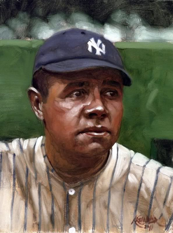 Babe Ruth, 1922 He went bananas over it. He thought that I captured something in his eyes that he described as 'real emotion.' I told him that it wasn't my doing, but Conlon's (as it was based from his photograph), but he insisted that I had something special here. Anywho, I was wondering if some of you might be willing to lend your thoughts about this little study. Be they good, bad, indifferent, comparable to the 'finished works', or whatever, I would just really love to hear from you. Any feedback you can provide is greatly appreciated. As usual, you guys rock. Thanks, Graig
__________________
Check out my baseball artwork: www.graigkreindler.com www.twitter.com/graigkreindler www.facebook.com/graigkreindler 
|
|
#2
08-24-2011, 10:04 AM
|
||||
|
||||
|
well I think what I like the most about your paintings is the realism. especially in the wide action shots. this painting of ruth is an A no doubt but when I see the paint strokes and the overall loose ness (is that a word? lol) it loses a bit for me. this is just nit picking obviously by I say if it ain't broke don't fix it. I prefer your A + style of painting.

|
|
#3
08-24-2011, 10:11 AM
|
||||
|
||||
|
Graig,
As usual, your painting rocks. You could paint a pile of poo and it would probably look good. My feeling on this painting is that I prefer your other work more. For me the attention to detail is the thing that really breathes life into your work. Joe Jackson's hands and glove, Matty's face and uniform, Tyree and Harrison's image, Gehrig's face, Babe's nose and your manipulation of shadows in paintings too numerous to mention are the things that make your work speak to me and elicit that emotional response and connection. (Those of you who have followed this thread will understand which paintings I am referring to) I can see what Dean means about the eyes, but I don't prefer that as the main effect. There is a certain fluidity of movement to your paintings that I think comes from the detail. We've discussed this before, so you know what I mean. I just don't get that from this one and it's one of the effects that I most admire in your work. Now, I freely admit, that there are others out there who will appreciate this style. After all art appreciation is very subjective. Perhaps the non baseball people would like these more as Neiman has this looser style to his work and is arguably the most commercially successful sport artist ever. What do I know, I always thought his stuff was ugly. I guess different strokes for different folks. All that being said, If you really don't know what to do with it, you can send it to me for safe keeping on a wall in my home.  (Note to self: Damn, I gotta start saving money for my next painting) Best, Mark EDIT: Graig, I have a better idea. Why don't you paint the same image in your regular style and send them both to me so I can inspect and compare them in person on my wall. That would be the fairest way to truly see which style I would like better. ")
__________________
My signed 1934 Goudey set(in progress). https://flic.kr/s/aHsjFuyogy Other interests/sets/collectibles. https://www.flickr.com/photos/96571220@N08/albums My for sale or trade photobucket album https://flic.kr/s/aHsk7c1SRL Last edited by Lordstan; 08-24-2011 at 10:27 AM. Reason: spelling
|
|
#5
08-24-2011, 12:35 PM
|
|||
|
|||
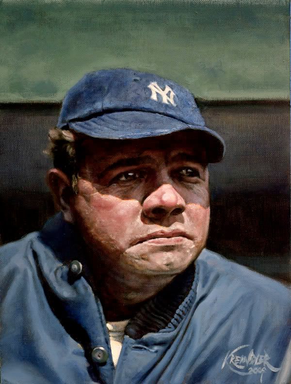 My thoughts. Two Kreindler Ruth's. The first is what we've come to love. The second is nice, but it is completely different. If I had not known the first, I imagine that I would be more enamored with the 2nd than I am. The implication is that I do not have the same appreciation for the 2nd as the 1st. In real simple terms, with your usual style I find myself wishing that I could afford a piece, and longing for my sons to finish up college and start supporting themselves. With the second style, it is nice but I don't have a desire to have one. Again second style is nice, but I think that it lacks the character that your normal style has, which seems to tell a story. With the second style I find myself looking at it from the outside, as opposed to your normal style where I can feel immersed in it, like I am able to imagine being there. Would I appreciate it if someone gave it to me? Yes. Would I buy it myself? No. If I were to see the 2nd style with your name on it, without seeing it here from you first, I would think that it was a very poor forgery of your work. Without your name on it, I wouldn't be able to pick it out as yours. That's just one man's thoughts and opinon though. And since Nieman was already mentioned, I am not a fan of his work either. Go figure. Last edited by timzcardz; 08-24-2011 at 12:38 PM.
|
|
#6
08-24-2011, 01:03 PM
|
|||
|
|||
|
The above posters have put it very well. I think that what may come to be known as your "Realist Period" is not yet over, and you should wait to begin the "Abstract Period" for a personal/artistic yearning to explore different means of expression, not because your agent thinks you can crank out more saleable work that way!*
*This last clause is totally a joke.
|
|
#8
08-24-2011, 06:14 PM
|
||||
|
||||
|
Wow, guys. Thank you SO much. This was exactly what I was hoping for.
I'm definitely on the same page as all of you, as it's pretty hard for me to do a quick sketch and call it 'finished'. That has a lot to do with the fact that I can show a lot of OCD when it comes down to the kind of minutia some of these paintings demand. Additionally, beyond feeding into those obsessions, I think those little things are what really make the pictures fun to me. Well, the whole thing is really fun, but you know what I mean. I guess since I end up doing so much research regarding weather, advertisement colors, game situations and everything in-between, I feel like I just yearn to show it all. And in a way, I feel like most baseball enthusiasts want to see it all. I mean, not in my paintings per se, but in whatever they collect. I think that's one of the reasons the game is so wonderful: their history just becomes so strict, that if done 'right', all of that minutia is able to evoke a specific era that much more. Now, I don't intend on making a habit of doing these sketches for any purpose other than for color studies, so none of you will have to worry about me changing my approach or anything. Not that you're worried. But you know what I mean. Perhaps when I'm older and can't really get as tight as I want to be, things will become more expressive. Until then I'll be keepin' it tight!! Thanks again, Graig
__________________
Check out my baseball artwork: www.graigkreindler.com www.twitter.com/graigkreindler www.facebook.com/graigkreindler
|
 |
|
|
 Similar Threads
|
||||
| Thread | Thread Starter | Forum | Replies | Last Post |
| 68 Topps 3D Easel | Archive | Postwar Baseball Cards Forum (Pre-1980) | 1 | 04-22-2008 03:17 PM |


 Hybrid Mode
