|
||||||
 |
|
|||||
|
||||||
|
|
|||||
|
#1
 07-19-2017, 11:39 AM
|
||||
|
||||
|
There are quite a few popular cards out there - some of them are worth quite a bit of money - but look butt-ugly. For example, I have always found the 1938 Goudey Dimaggio to be an ugly card. Now I love what Goudey did with this set by putting a player's head on a tiny cartoon body. Doing that was pretty creative, but why on earth did they have to choose that specific face shot of Joe for this set? Take a look at it below:
 That's how I look like when I'm on the toilet seat.  Now I could post a few more examples, but I want everyone on here to participate. So go ahead and tell us which card you find very ugly, but nevertheless is a very popular one among collectors. Oh, and it doesn't have to be baseball either (football, hockey, boxing, etc. is fine). Last edited by samosa4u; 07-19-2017 at 11:40 AM. 
|
|
#3
07-19-2017, 12:06 PM
|
||||
|
||||
|
Pete Rose rookie card....I mean ....really.....floating heads.....shares with 3 other guys?? Fugly.

Last edited by bobbyw8469; 07-19-2017 at 12:46 PM.
|
|
#5
07-19-2017, 12:18 PM
|
|||
|
|||
|
Quote:

|
|
#7
07-19-2017, 12:52 PM
|
||||
|
||||
|
Quote:
|
|
#8
07-19-2017, 01:23 PM
|
||||
|
||||
|
Quote:
__________________
Leon Luckey www.luckeycards.com
|
|
#11
07-19-2017, 01:31 PM
|
||||
|
||||
|
I believe it is Irv-- it looks very much like him. I also believe he is stretching out his right hand to receive the ball and is not in follow-through, although the pose is inconclusive (could be reversed too). It looks nothing like Cy, IMO.
__________________
Now watch what you say, or they'll be calling you a radical, a liberal, oh, fanatical, criminal Won't you sign up your name? We'd like to feel you're acceptable, respectable, presentable, a vegetable If we are to have another contest in the near future of our national existence, I predict that the dividing line will not be Mason and Dixon's but between patriotism and intelligence on the one side, and superstition, ambition and ignorance on the other.- Ulysses S. Grant, 18th US President.
|
|
#13
07-19-2017, 01:35 PM
|
||||
|
||||
|
Quote:

__________________
Leon Luckey www.luckeycards.com Last edited by Leon; 07-19-2017 at 02:27 PM.
|
|
#14
07-19-2017, 01:58 PM
|
||||
|
||||
|
Quote:
http://www.net54baseball.com/showthread.php?t=124640 http://net54baseball.com/showthread.php?t=85582 http://net54baseball.com/showthread.php?t=81776
|
|
#15
07-19-2017, 02:05 PM
|
||||
|
||||
|
Quote:
There was Frank Zupo: 58 ZUPO.jpg
__________________
. "A life is not important except in the impact it has on others lives" - Jackie Robinson If you have a chance to make life better for others and fail to do so, you are wasting your time on this earth.- Roberto Clemente
|
|
#16
07-19-2017, 02:09 PM
|
|||
|
|||
|
I'm sorry. I thought this was a post about Madonna and I just couldn't figure out how it got into a card forum.
|
|
#18
07-19-2017, 03:07 PM
|
|||
|
|||
|
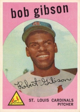
Another one I've never been a big fan of. It's not a great picture of Bob to begin with not to mention the quality of the photo. Add the pink and it just makes him look, well not very intimidating which of course we know he was while on the mound. I know it's actually a great card to own, but I've always felt Bob deserved better for his first card.
|
|
#19
07-19-2017, 03:22 PM
|
||||
|
||||
|
Quote:
For those of you interested in a laugh, check out the old blog baseballcardbust.com. It's no longer active but has a bunch of hilarious 80's cards with funny commentary. The guys who did it were comedic geniuses. I wish they would revamp it.
|
|
#20
07-19-2017, 03:41 PM
|
|||
|
|||
|
This tops the list
|
|
#21
07-19-2017, 05:49 PM
|
||||
|
||||
|
Along the same lines as the '58 Brooksie, for his final card we have Mr. Cub in semi-sneeze or semi-yawn mode at Shea
s-l1600-9.jpg
__________________
All the cool kids love my YouTube Channel:
Elm's Adventures in Cardboard Land https://www.youtube.com/@TheJollyElm Looking to trade? Here's my bucket: https://www.flickr.com/photos/152396...57685904801706 I was such a dangerous hitter I even got intentional walks during batting practice. Casey Stengel Spelling "Yastrzemski" correctly without needing to look it up since the 1980s. Overpaying yesterday is simply underpaying tomorrow. 
|
|
#22
07-19-2017, 06:39 PM
|
||||
|
||||
|
I know this is modern, but I have always loved this card for how bad the picture is...
__________________
Actively building a 1953 Bowman Color PSA Registry Set (Currently 150/160) and attempting a 1947 Tip Top Bread Set.
|
|
#24
07-19-2017, 08:45 PM
|
||||
|
||||
|
I asked Robinson about that card. He said he hated it, that it was taken right after running wind sprints.
Sent from my SAMSUNG-SM-G891A using Tapatalk Last edited by abroome; 07-19-2017 at 08:46 PM.
|
|
#25
07-19-2017, 08:56 PM
|
||||
|
||||
|
Mossi is too easy of a target here .. I remember as a kid I hated this Gaylord Perry Card - reminded me of Herman Munster.

|
|
#26
07-19-2017, 10:35 PM
|
|||
|
|||
|
Quote:
|
|
#27
07-20-2017, 08:20 AM
|
||||
|
||||
|
Prefer the 49B
IMG_6216.jpg
|
|
#28
07-20-2017, 08:51 AM
|
||||
|
||||
|
Quote:
|
|
#29
07-20-2017, 09:45 AM
|
|||
|
|||
|
When I saw the thread name the Mossi card was the first one that popped into my head.
Quote:
|
|
#30
07-20-2017, 11:26 AM
|
||||
|
||||
|
Quote:
|
|
#31
07-20-2017, 01:27 PM
|
||||
|
||||
|
Cards aren't always supposed to be 'beautiful.' I like some of the candid shots, in part because they bring back childhood collecting memories and because they have character. All Carl Horner portraits would be boring. The 72-3 Topps definitely have some bizarre candid shots-- but that makes them interesting. Also cards are made for kids, so some silly and comic designs such as the Goudey Big Heads fit that bill. I've never been fond of some of the 1800s comic trade cards, but they were intended for kids.
Have to say I've never been fond of the 1952 Topps Mantle-- doesn't even look a lot like him. But, hey, as an art historian I know that beauty and art are in the eyes of the beholder. Last edited by drcy; 07-20-2017 at 01:31 PM.
|
|
#32
07-20-2017, 01:31 PM
|
|||
|
|||
|
There's a difference between an ugly card and an ugly guy on a card. I'd go with the oft discussed joe Jackson e90 lipstick card.
|
|
#33
07-20-2017, 01:48 PM
|
||||
|
||||
|
"Hi Ma, this smile is for you 'cause I finally made it to the Big Leagues!" (for one season with the 1924 Senators - "Oyster Joe" Martina also played 21 years in the minors)
__________________
Seeking very scarce/rare cards for my Sam Rice master collection, e.g., E210 York Caramel Type 2 (upgrade), 1931 W502, W504 (upgrade), W572 sepia, W573, 1922 Haffner's Bread, 1922 Keating Candy, 1922 Witmor Candy Type 2 (vertical back), 1926 Sports Co. of Am. with ad & blank backs. Also 1917 Merchants Bakery & Weil Baking cards of WaJo. Also E222 A.W.H. Caramel cards of Revelle & Ryan.
|
|
#34
07-20-2017, 05:03 PM
|
||||
|
||||
|
Quote:
Quote:
__________________
52 Topps cards. https://www.flickr.com/photos/144160280@N05/ http://www.net54baseball.com/album.php?albumid=922
|
|
#35
07-20-2017, 05:13 PM
|
||||
|
||||
|
Quote:
|
|
#36
07-20-2017, 05:15 PM
|
||||
|
||||
|
I always got a chuckle out of these two players/cards.
Torgensen looks afraid of the ball and King looks, well, I'm not sure?
__________________
52 Topps cards. https://www.flickr.com/photos/144160280@N05/ http://www.net54baseball.com/album.php?albumid=922
|
|
#39
07-20-2017, 08:26 PM
|
|||
|
|||
|
Quote:
|
|
#40
07-21-2017, 06:11 AM
|
|||
|
|||
|
It's like a Bazooka Joe comic.
"How much fresh dirt you wanna buy?" "One Molesworth."
__________________
Number5TypeCollection.com, blogging the vintage century one card set at a time. Member of OBC (Old Baseball Cards), the longest-running on-line collecting club. Find us at oldbaseball.com.
|
|
#41
07-21-2017, 02:57 PM
|
||||
|
||||
|
Quote:
IMG_6697.jpg The King card reminds me of Sling Blade... I like them French fried potaters. Sent from my iPhone using Tapatalk
__________________
Instagram: https://www.instagram.com/nufcedcards/ YouTube: https://www.youtube.com/channel/UCOd...OlzJxdgP56pxvg Last edited by Andrew1975; 07-21-2017 at 03:04 PM.
|
|
#42
07-21-2017, 11:06 PM
|
||||
|
||||
|
Some very interesting posts here. What about the Sporting News Babe Ruth RC?
Now before you Americans start plotting my murder , let me just state my reasons below, and maybe you might agree with some of them:- It has no color - It is small - It has a blank reverse side (some of them do) - It has a blank background - I hate the pose. Ruth looks like he is breakdancing. Due to the above reasons, I find this card to be a little on the ugly side. The best baseball player of all-time deserved a better-looking RC card, IMO. Look at Ty Cobb's T206 cards, don't they look just awesome? It would be nice if Ruth had something like that (2 portrait rookies + 2 in action cards).
|
|
#43
07-21-2017, 11:14 PM
|
||||
|
||||
|
It's true. I've said it before, and I'll say it again. He looks like a clown with a broken leg. It's grotesque.
|
|
#44
07-24-2017, 05:59 PM
|
||||
|
||||
|
Many folks think this jax isn't his best card...me included.
http://www.ebay.com/itm/1909-E90-1-S...YAAOSwqVBZZk8D .
__________________
Leon Luckey www.luckeycards.com
|
|
#45
07-24-2017, 08:56 PM
|
||||
|
||||
|
Quote:
__________________
52 Topps cards. https://www.flickr.com/photos/144160280@N05/ http://www.net54baseball.com/album.php?albumid=922
|
|
#47
07-25-2017, 07:16 AM
|
||||
|
||||
|
Quote:
__________________
Leon Luckey www.luckeycards.com
|
|
#48
07-31-2017, 09:28 PM
|
||||
|
||||
|
Speaking of Brooks Robinson, I've never liked his 57 Topps rookie card either. Its just way too orange. The background is entirely orange sky, which seems to be reflecting off his face and making him look orange too. And the orange bird on his hat to top it off. That card needs more color other than orange!!!
__________________
My blog about collecting cards in Japan: https://baseballcardsinjapan.blogspot.jp/
|
|
#49
07-31-2017, 09:32 PM
|
||||
|
||||
|
Quote:
|
 |
|
|
 Similar Threads
|
||||
| Thread | Thread Starter | Forum | Replies | Last Post |
| ugly (IMO) Ruth | w7imel | Autograph Forum- Primarily Sports | 20 | 08-19-2014 11:36 PM |
| More Popular: 71 or 75 BB | mintacular | Postwar Baseball Cards Forum (Pre-1980) | 12 | 11-08-2013 10:34 PM |
| and the ugly | Matthew80 | Postwar Baseball Cards Forum (Pre-1980) | 21 | 12-16-2012 09:17 PM |
| Popular set, but... WHY!? | Archive | Net54baseball Vintage (WWII & Older) Baseball Cards & New Member Introductions | 4 | 10-10-2007 12:07 AM |
| They`re Ugly I Know, But...... | Archive | Pre-WWII cards (E, D, M, etc..) B/S/T | 0 | 08-10-2005 06:28 PM |


 Linear Mode

