|
||||||
 |
|
|||||
|
||||||
|
|
|||||
|
#1
 01-13-2021, 12:22 PM
|
|||
|
|||
|
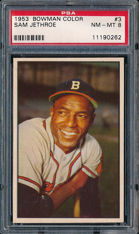
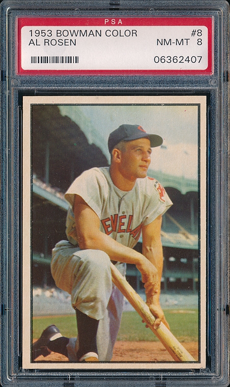
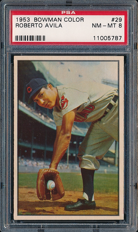
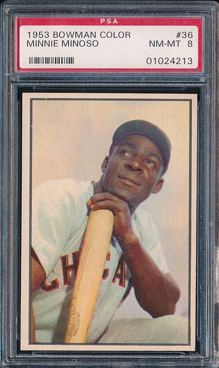
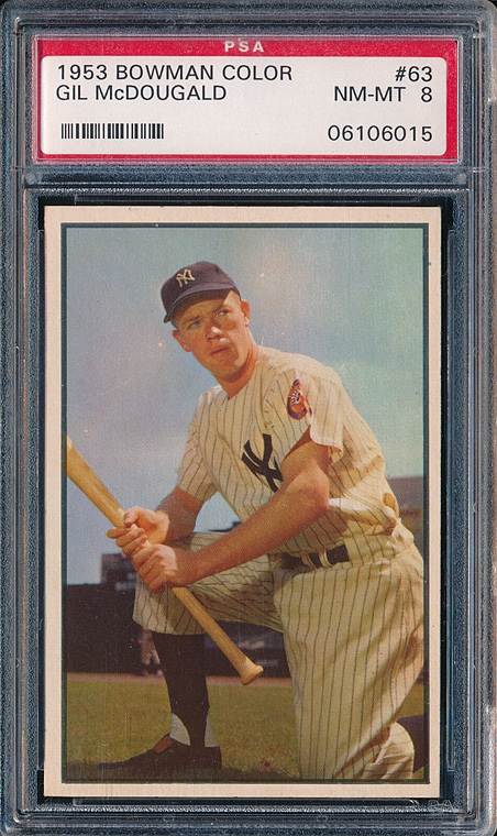
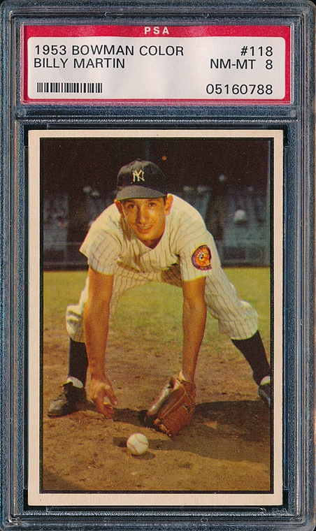
Lately I've been struck by how amazing the 1953 Bowman color set looks. The photos are just incredible - the colors and the contrast are orders of magnitude more vivid and lifelike than other sets of the era, and even (I dare say) going up through the '60s and '70s.
The Richie Ashburn, for example - it's like you're standing next to him in the dugout. Can anyone shed any light on why they are head and shoulders above everything else? Something in the technique or technology that was used in taking or processing the photos, or the printing? I have a feeling I may have found my next collecting project after I make some more progress on my HOFers... 
|
|
#2
01-13-2021, 12:52 PM
|
|||
|
|||
|
Quote:
I love my set, but there are a number of cards that weren't shot or produced well, particularly in the higher numbers. There are a number of 53 Bowman color collectors on this board, let's share your input about this set.
|
|
#3
01-13-2021, 12:56 PM
|
|||
|
|||
|
Quote:
They give us the greens of summers Makes you think all the world's a sunny day, oh yeah Now that's going to be stuck in my head all day...at least it's a good (and apparently accurate) song. Last edited by ASF123; 01-13-2021 at 12:57 PM.
|
|
#4
01-13-2021, 01:15 PM
|
|||
|
|||
|
The Paul Simon song immediately came to my mind, too. The Bowman company HAD TO DO SOMETHING, to deal with Topps, since their monster cards of '52 virtually captured the card market in one year. At least Bowman vastly increased the size of their football cards for fall '52, unveiling what would come to be considered the finest football cards ever made.
Back to the OP, Bowman's use of Kodachrome was an inspiration. As I ponder what Bowman did, it would seem they used a much better printing method to capture the fineness of detail the Kodachrome offered, for their image resolution is off the charts! --- Brian Powell
|
|
#5
01-13-2021, 03:25 PM
|
||||
|
||||
|
Bowman definitely covered all the bases in 1953. If you didn't like beautiful cards you could buy their black and white sister set.
__________________
Baseball cards will get you through times of no money better than money will get you through times of no baseball cards.--The Fabulous Furry Freak Bros. (paraphrased)
|
|
#6
01-13-2021, 05:28 PM
|
|||
|
|||
|
A great visual set because of the ability of the photographers. No out of focus snapshots from across the field in this set. Fantastic composition that captures the moment - and, the designers purposely kept the cards clean and simple w/no detracting banners, headers, or logos. A perfect example of how less is more. Of course I love the '72 topps set as well

|
|
#7
01-13-2021, 06:05 PM
|
|||
|
|||
|
The cards have a certain warmth, unlike newer cards which have a brighter, crisper image. No criticism intended by the comparison.
As I mentioned the set for the most part offers beautiful photography, but there are certain numbers that didn't benefit from the process. It's hard to discern the facial features of Hector Rodriguez, #98, and the Lown, Surkont, Lollar, and Fox all appear to be a bit murky. Lie many previous sets quality control leaves something to be desired for this set- too many off-center and miscut cards to begin with. I've also wondered why there are two cards of Al Corwin in the set. Are there any certain cards that collectors would like to point out for their artistry?
|
|
#8
01-13-2021, 07:20 PM
|
||||
|
||||
|
I can't believe no one has at least posted a card. Here's a Musial.
|
|
#10
01-13-2021, 08:00 PM
|
||||
|
||||
|
a few
__________________
Net 54-- the discussion board where people resent discussions.  My avatar is a sketch by my son who is an art school graduate. Some of his sketches and paintings are at https://www.jamesspaethartwork.com/
|
|
#12
01-13-2021, 09:47 PM
|
||||
|
||||
|
I have long wondered who the photographer was? He was certainly a master of working with light. I suppose he could have been a she. That might explain why just about every player in the set seems like he's in such a good mood. Or maybe the photographer brought a pretty woman along to flirt with the players. I would have done it. They're all smiling and seem relaxed.
I like every photo in the set except the one of Alvin Dark. To have so many great shots, it makes me wonder how many shots of each player were taken. And what became of the negatives. I'm guessing they also photographed a bunch of players who never made it into the set. Quote:
|
|
#13
01-13-2021, 10:18 PM
|
||||
|
||||
|
Kodachrome, just like the movies filmed in Kodachrome the colors are richer than standard film.
|
|
#14
01-14-2021, 05:03 AM
|
|||
|
|||
|
Quote:
|
|
#15
01-14-2021, 07:20 AM
|
|||
|
|||
|
Quote:
|
|
#16
01-14-2021, 08:29 AM
|
||||
|
||||
|
|
#17
01-14-2021, 12:36 PM
|
|||
|
|||
|
Quote:
|
|
#18
01-14-2021, 01:35 PM
|
|||
|
|||
|
Quote:
|
|
#19
01-14-2021, 02:02 PM
|
|||
|
|||
|
I love this set but it was a market bust for Bowman in 1953 in terms of sales versus the Topps offering
|
|
#20
01-14-2021, 03:07 PM
|
||||
|
||||
|
The Topps sets are Flexichromes.
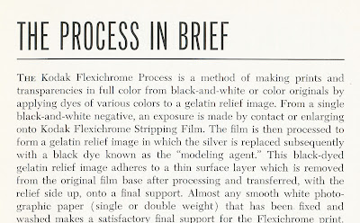 Credit: http://www.thetoppsarchives.com/2011...rome-away.html The Topps cards are black and white images colored with the Flexichrome process. That is why they have the character of photorealistic paintings rather than photographs. The Bowmans are Kodachrome color photos reproduced as prints.
__________________
Read my blog; it will make all your dreams come true. https://adamstevenwarshaw.substack.com/ Or not...
|
|
#21
01-17-2021, 05:57 AM
|
|||
|
|||
|
My 53 Bowman collection doesn't quite reach the heights of the cards that have been posted, but I'm doing so to keep the discussion going in general.
Last edited by Tere1071; 01-17-2021 at 06:03 AM.
|
 |
|
|
 Similar Threads
|
||||
| Thread | Thread Starter | Forum | Replies | Last Post |
| Trade 2 1953 Bowman Color for 53 Bowman Color Needs | Tere1071 | 1950 to 1959 Baseball cards- B/S/T | 0 | 05-26-2020 10:31 AM |
| 1953 Topps #89 Stobbs, 1953 bowman color #47 Garver 1953 Archives signed #318 Simmons | Republicaninmass | 1950 to 1959 Baseball cards- B/S/T | 8 | 05-16-2016 03:21 PM |
| FS: 1953 Bowman Color Lot of 23 REDUCED 1950 Bowman Lot Added | boneheadandrube | 1950 to 1959 Baseball cards- B/S/T | 1 | 01-11-2016 06:21 PM |
| FSH - 1953 Bowman Color & 1954 Bowman graded lots | tribefan | 1950 to 1959 Baseball cards- B/S/T | 0 | 11-08-2014 08:55 PM |
| FS 1955 Bowman 1953 Bowman Color Ralph Kiner $30 | jjcollects | 1950 to 1959 Baseball cards- B/S/T | 0 | 02-09-2013 08:28 PM |


 Linear Mode

