|
||||||
 |
|
|||||
|
||||||
|
|
|||||
|
#102
 08-22-2010, 06:33 PM
|
|||
|
|||
|
Here is a post attributed to Wayne Varner in a previous thread on this subject:
Ted Z and others, I can shed a little light on this proof strip. Back in 1978 Bill Zimpleman, Mike Wheat, Ken Blazek, and myself, Wayne Varner were on a buying trip in the Pittsburgh area and we purchased this strip from a gentleman who had purchased Wagner's house. We bought a number of items he found in the house. I cannot remember all the details, but after we purchased the strip, we had a drawing, and I won the strip. I sold it in 1980 to Barry Helper, who to my knowledge owned the strip until he passed away. I can tell you from holding the strip many times, it is not cards pasted together. Could that have been done at the factory and then potographed to send to Wagner, possibly, but not likely. However it was done, it was definately done at the factory, and has the proof lines like all the proof cards I have ever seen. I have seen the strip on several occasions since Barry passed away and it is in the same orginial condition as when I owned it from 1978 until 1980. There is no question it is orginial and unaltered no matter what anyone says. Hope this helps a little. Wayne Varner SHOEBOX CARDS 
|
|
#103
08-22-2010, 07:21 PM
|
|||
|
|||
|
Thanks Rob.
I have never seen that thread. It's interesting to me after reading it that Ted says the same thing in that thread as he does in this thread. I especially like his post #63 in that thread. .................................................. .................................................. ... 05-23-2010, 10:10 PM tedzan Ted Zanidakis Member Join Date: Apr 2009 Location: Pennsylvania Posts: 1,499 Jon -------------------------------------------------------------------------------- I'm not sure I understand your "overlaping" comment ? The cross-hair proof marks are very precise ID's for aligning the 6-color registration process in the printing of these cards. Therefore, when these cards are placed adjacent to each other, I fully expect these marks to be in perfect alignment from card to card. Everyone has to realize that this is a pre-production piece. These are not completed cards, but thin-film like FRONTS that I claim were affixed on a horizontal strip. Again, I repeat, the inconsistency of the colors of these 5 cards with respect to each other is a total PRINTING IMPOSSIBILITY. I dare anyone to show me an UNCUT sheet, or strip with "crazy" colors as these; and, lines between the cards ? ? ? ? Regarding your last statement......."Even if you could imagine all 5 cards being precisely cut so that they could be pasted on a strip together in such a way that all proof marks line up (I'm sure that would be an extremely difficult process itself)" Jon....we are talking about the foremost Lithographic Co. in America back then. These printers were world class craftsmen. This "junk" that we are mulling over here is incidental compared to the large pieces of complex artwork that they produced on a daily basis during that era. TED Z .............................End of post.............................................. .............. You posted Wayne's post #68 from that thread. Ted never posted on that thread again after Wayne posted. Very interesting.
|
|
#104
08-22-2010, 09:09 PM
|
|||
|
|||
|
WOW !
We have a new Gotcha Tandem (Rob D & Tom P) in motion here to bust Ted's chops. When you have nothing constructive or meaningful to bring to the discussion, you try to go after the messenger. Hey Tom, you don't know me....and, by your sarcastic posts here towards me, I don't care to know you. This last statement of yours..... is quite ridiculous, as it shows either how ignorant you are, or worst yet, it's a sign of a sick mind. "You posted Wayne's post #68 from that thread. Ted never posted on that thread again after Wayne posted. Very interesting. " Look, I did not respond to Wayne Varner's post (dated 6/12/10) since my family and I were vacationing in Virginia that week. But, I'll tell you what, NEWBIE ! ....the Philly Show is next month and Wayne Varner's booth is next to my booth. We will have a "knock- down, drag-out" battle discussing this Wagner artifact....and, I'll be sure to fill you in with the blow-by-blow details. T-Rex TED
|
|
#105
08-22-2010, 09:27 PM
|
|||
|
|||
|
Ted,
You can't admit that you "might" be wrong just this once? You can say what you will about my written tone but I was just telling the facts as I saw them after examining the card thoroughly. I wasn't actually trying to sound scarcastic. Nothing I said here is not true. There is no need to attack Wayne in Philly for giving an opinion different from yours either. It's just a debate over baseball cards. I'm not sure why you signed your post "T-Rex Ted"? Is that another dinosaur joke about your age or something? I would hope so. Because if it was supposed to be some kind of a threat it was a classless attempt over a trivial matter. Regards, Newbie
|
|
#107
08-22-2010, 10:06 PM
|
||||
|
||||
|
Nm, not trying to start a fight.
Al Last edited by Al C.risafulli; 08-22-2010 at 10:36 PM.
|
|
#108
08-23-2010, 06:26 AM
|
|||
|
|||
|
Some folks here actually post meaningful, erudite, insightful posts about old cards... exclusively or primarily. Some folks sit at their pc's like buzzards, waiting to swoop down on others, but they seldom if ever actually post anything that is about cards. Maybe about something tangentially associated to cards, but hardly ever about cards, for they know not about them.
Who of us have not bought something from someone who maybe didn't fully, completely understand and appreciate what they had? Many of us. Who of us have ever seen a slab that was incorrect as to the identity of what was inside. Most of us. So what a former owner thought isn't a slam-dunk argument-ender. Nor is a slip on a slab. Wayne Varner is a good guy, he's quite knowledgeable about old ball cards. Ted Z knows a right smart, too. Neither are infallible. SGC certainly isn't infallible. For those of you who have total faith that SGC got it right, I wish you well. Wayne saying it's one way doesn't resolve it in my mind. It was years ago when he owned it, I don't know he was particularly looking for the paste-up aspect of it, sometimes an item's flaws and shortcomings aren't apparent to its owner... Wayne mentions proof lines, I don't see those. The proof marks I've seen on T206 proofs look like this " + ", not this " l ". I've not seen this piece in person. It would have been a good reason to have gone to the National, but there are buzzards there (a good reason to avoid the National). I'm not certain Ted's right about it, but at this time I think similarly, but I'm not certain. I'm fairly sure it isn't a "proof", notwithstanding SGC's label. The traditional proof cross-marks aren't there. We can go back and forth forever. Peace.
|
|
#109
08-23-2010, 07:13 AM
|
||||
|
||||
|
FYI
Ted has been using 'T-Rex' on his signature for a long long time... 
|
|
#110
08-23-2010, 07:24 AM
|
||||
|
||||
|
Quote:
You really don't see the "+" signs? They're pretty obvious.
__________________
Jim Van Brunt
|
|
#111
08-23-2010, 08:12 AM
|
|||
|
|||
|
Frank & Ted,
I, at least, thoroughly examined the proof strip and heard the testimony of others that thoroughly examined it before I came to a semi-rigid conclusion. In the end it really makes no difference to me what your opinion is on this particular topic. I was trying to have a factual debate but when those facts cornered some of you into a box you decided I'm a newbie buzzard who know nothing about old cardboard. I have seen that happen hundreds of times on N54. The truth is I have a hard time sharing anything with people that know everything already and spend so much time spreading negativity about the hobby we are supposed to love (I'm not specifically talking about you two). You can continue to call me anything you choose if that makes you feel better. It means very little to me. Some characters on N54 have always verbally flipped-off anyone new to this forum who's opinion might differ and I suspect that childish execise of urinating around the perimeter will never change. I'd rather associate with positive open-minded pre-war collectors and do so everyday. As always, I will continue to navigate the B/S/T forums daily to pick-up more goodies and, on occasion, I will chime in over here if the mood strikes just like I have done for many years. Like it. Don't like it. Who really cares? ") It's just baseball cards guys. I wish you both well. Tom
|
|
#112
08-23-2010, 08:44 AM
|
||||
|
||||
|
why do those "Proof" "+" lines look as though they were added by someone with an inkpen??
|
|
#113
08-23-2010, 09:24 AM
|
|||
|
|||
|
The + marks were drawn in with a black ink called tusche. If the T206 cards had say Eight colors plus a keystone, all eight of the stones would have the little registration marks ruled in in the exact same position. When each color was printed one over the other they make the the little black registration marks.
|
|
#114
08-23-2010, 09:29 AM
|
||||
|
||||
|
Quote:
It was nice finally meeting you at the National. Our dealings have always been top notch and I hope we have a ton more in the future. Unfortunately, I feel your frustration. There is so much sarcasm and antagonistic remarks (sometimes) on the board it makes me puke. You might think that as moderator I can control it. I can't. It's a no win situation. I usually just leave for a short period (hours or a day) and then come back, make a positive post or two, start a factual thread...and forget about the few people who always look at the negative, offer condolences in a sarcastic manner, and just antagonize because they are probably not happy with themselves. I can't figure it out any other way. Ya know, if I was in a hobby where all I did was complain and look at the negative (not saying we shouldn't expose fraud etc....we should) then I would find another hobby. Maybe those few people that are like that will eventually go away. We can only hope.
__________________
Leon Luckey www.luckeycards.com
|
|
#115
08-23-2010, 12:15 PM
|
||||
|
||||
|
Quote:

|
|
#116
08-23-2010, 01:15 PM
|
||||
|
||||
|
Quote:

__________________
Galleries and Articles about T206 Player Autographs www.SignedT206.com www.instagram.com/signedT206/ @SignedT206
|
|
#117
08-23-2010, 01:24 PM
|
|||
|
|||
|
Jim, I now stand corrected, and was previously mistaken. I do now see the " + " marks. And those marks are how the proof marks appear. I do thank you for posting that image so I can clearly see it.
My recollection is that most of the proofs lack the name caption, maybe someone can post images of 2 or 3 proofs that show the " + " marks and either do or don't have the caption. Does anyone recall seeing vertical lines like that on any other T206 item? I'm not 'blahhing' the piece, I admire it. It's great. Wish it was mine. I just don't think that proof is the correct term for it, still. And I still think it's assembled. Could be wrong about that, too.
|
|
#118
08-23-2010, 06:08 PM
|
||||
|
||||
|
I too examined the strip at the National. I could see nothing that indicated to me it was created by pasting together multiple images. I believe it to be one continuous strip of cards printed at the same time.
Looking closely at the image you can see several printers marks on the strip. On the left and right of each image there is a "+" mark. On the top of each image there is a "+" mark and on the bottom there is a "l" mark. But most importantly concerning the main focus of this thread, there are "l" marks between each image top and bottom with most falling directly on the line separating the images. The one on the bottom between Bowerman and Young falls just off the line. Several are not visible as creasing has destroyed them. These marks IMO show guidelines used in the printing process for maintaining the proper separation between each image that was being printed at the same time on the same strip. 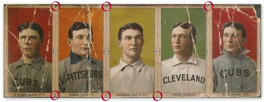
Last edited by Abravefan11; 08-23-2010 at 06:09 PM.
|
|
#119
08-24-2010, 10:53 AM
|
||||
|
||||
|
Quote:
|
|
#120
08-24-2010, 07:01 PM
|
|||
|
|||
|
Dan (dstudeba)
No need to apologize, I was the 1st to post on this forum my reservations regarding this strip. However, I and several other hobby "dinosaurs" have always been skeptical of this strip's make up. Tim C. Those "guidelines" you referred to are simply printer's cutting marks found on most sheets (or strips). TED Z Last edited by tedzan; 08-24-2010 at 07:03 PM.
|
|
#121
08-24-2010, 07:04 PM
|
|||
|
|||
|
Hey guys, I aint conceding yet. Not until, some one (anyone) with color printing expertise can explain the following color anomalies on this 5-card strip.
1st....here is an example of how the colors on this 5-card strip should look like, if it was an intact strip of these 5 images. ![[linked image]](http://i603.photobucket.com/albums/tt113/zanted86/browagbowcyoukli.jpg) 2nd....for those who are unfamiliar with American Lithographic's 6-color printing process involved in producing the T206's. These 6 ink colors were layered over each other in the following sequence and each layer of ink was applied simultaneously to ALL cards on a given sheet (or strip). YELLOW BLACK BROWN BLUE DARK GREEN RED Now, compare the Wagner strip with the above simulated "strip" and tell us why...... 1....Wagner's collar is Blue, while the collars of Brown, Bowerman and Kling ARE NOT Blue ? 2....Why is CYoung's uniform color missing, while the uniforms of the other 4 subjects are their proper colors ? 3....Brown and Kling have Red backgrounds; however, Bowerman's uniform missing the Red "B" ? These are valid points that engender serious doubts regarding the claim that the images on this strip were printed simultaneously. And, so far, no one here has yet to provide a credible explanation for these color printing anomalies. I still maintain that what we have here are 5 individual T206 front images that were professionally pieced together by an American Litho. employee in the T206 pre-production phase in the Spring of 1909. TED Z
|
|
#122
08-24-2010, 07:15 PM
|
||||
|
||||
|
Quote:
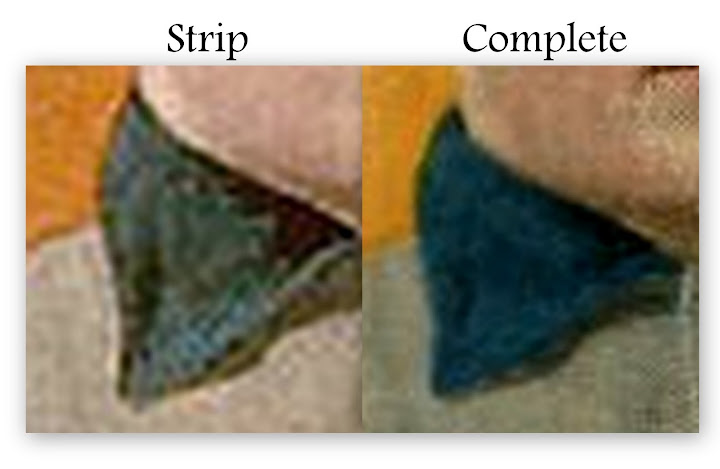 What appears to be blue on the strip collar is shading in the art work. If you look closely at the complete image you will see this shading under the blue. All of the collars on the strip are missing the blue ink.
|
|
#124
08-24-2010, 07:27 PM
|
|||
|
|||
|
Ted,
Good questions that I have no answer for. You say these 6 colors were applied in layers as follows: YELLOW BLACK BROWN BLUE DARK GREEN RED Can you tell me why (1) If that is the color sequence how did Brown and Kling get a RED background when they did not yet have BLUE collars yet?, and (2) How did Cy Young get a DARK GREEN background without yet having a BLUE jersey? So much for your color sequencing. Edited to add I think all of these points about color clearly show changes were made between the time this strip was made and production started. We would be short sighted to think this couldn't happen. That would account for all three of your points, Ted, and both of mine. Last edited by GoSoxBoSox; 08-24-2010 at 07:50 PM. Reason: typo
|
|
#125
08-24-2010, 07:29 PM
|
|||
|
|||
|
Ted,
I don't understand the printing process, but don't the plates (or something else) determine the "mask" of where the color actually falls on a particular color run? In other words, there is some sort of masking process which causes the red to be printed on the background only portion of kling and brown and a different mask prevents the other 5 colors from also being mixed into that background. Presumably the mask for the bowerman would also have a "hole" so the red bleeds through in the shape of the "B" in the boston uniform. Now, can't it be at least *plausible* that the masks used in preparing this 5 card strip (assuming for a moment its a single strip - not individual cards) were pre-production or in some way not yet setup to print the colors as we know them today? I don't see why thats a technical impossibility. maybe they hadn't yet finalized the masks for each color run at the time they made this strip. heck...they may have just cobbed together 5 plates of players they thought would make a compelling argument to honus - for just this test run. Then in the real press runs (all with proper masks) the plates were actually printed on different sheets with different "neighbors". I am an engineer and we make prototype and "checksample" runs prior to production to uncover anomolies, production inefficiencies, bugs, and provide these as pre-production marketing units to get customers interested, etc, so the concept seems perfectly feasible. By the way, I am not questioning anyone's knowledge, and I've never seen it in person. Just trying to understand how the knowledge of the printing process makes it implausible that it is a single strip printed together. Last edited by parkerj33; 08-24-2010 at 07:39 PM. Reason: poor grammar!
|
|
#126
08-24-2010, 07:45 PM
|
||||
|
||||
|
Quote:
Last edited by Abravefan11; 08-24-2010 at 08:01 PM.
|
|
#127
08-24-2010, 08:08 PM
|
|||
|
|||
|
Tom P
Regarding your...... " Can you tell me why (1) If that is the color sequence how did Brown and Kling get a RED background when they did not yet have BLUE collars yet? " You are making my case with this statement of yours, that these are individual images. The Blue ink application was simply omitted. I have had T206's with the Blue color missing and others with the Red color missing. " (2) How did Cy Young get a DARK GREEN background without yet having a BLUE jersey? " Check again.....CYoung in the strip has background color that is a pale Green. Regarding changes by American Litho. in their color sequencing....they used this 6-color sequence since 1895 when this Litho. Company was founded. TED Z
|
|
#128
08-24-2010, 08:13 PM
|
|||
|
|||
|
Ted,
I guess I just don't understand what you're getting at with your three points? Because your three points along with my two points simply tell me that changes were made to the design of the cards between the time the cards on this strip were designed and the final cards were designed. To me, that accounts for this entire color issue. Tom Edited to add that I checked and the green's look the same to me no matte rhow many times I look. Besides, the shades of color aren't the issue here. The timing of art designs is the issue. Last edited by GoSoxBoSox; 08-24-2010 at 08:39 PM.
|
|
#129
08-24-2010, 08:36 PM
|
||||
|
||||
|
Part of what i do for a living is buy printing. I am not a printer, I am a customer of printers. I release artwork to a printer every day of my life, and i have done so for the last six years.
Given that each of the people who I have spoken with at have actually held this sheet in its raw form have stated that it's a continuous strip, and each of those people is more knowledgeable about cards than me, I tend to believe them. In terms of the colors and whatnot, that is fairly easily explained, IMO, as some sort of pre production press sheet. Im sure that there were many of these made before the final art was approved, and it certainly wouldn't have been difficult for someone to slice off a row of five of them and give them to a friend, after all, in 1909 these were just cigarette pack stiffeners and not six figure pieces of American history. Al
|
|
#130
08-24-2010, 08:51 PM
|
||||
|
||||
|
Ted wrote
"Tim C. Those "guidelines" you referred to are simply printer's cutting marks found on most sheets (or strips)." So doesn't that suggest that it is indeed an intact strip and not 5 cards glued together?
__________________
Net 54-- the discussion board where people resent discussions. My avatar is a sketch by my son who is an art school graduate. Some of his sketches and paintings are at https://www.jamesspaethartwork.com/
|
|
#131
08-24-2010, 08:55 PM
|
|||
|
|||
|
I believe there are more than six colors and that there are nine. eight colors plus a key. The key being the halftone image base on a photograph or ink drawing.
I have progressive proof books of cigar labels made by ALC contemporary in time frame with the T206. I will post some of the pages. the color anomolies are entirely explainable. Everything I see really points to this being a proof. it must have been done during the proving phase of production, more specifically on the top floor of the ALC building. The way the color anomolies can be explained is as follows: The artwork for each color was executed on stones or metal plates. a separate one for each. When a proof was run each color was run one over the other through a proof press for my ALC cigar labels it went like this: yellow (opaque) red (opaque) light brown (transparent) Dark brown I think mostly opaque Buff- this is the flesh color in the faces light blue transparent Dark blue (mostly opaque) pink-transparent lake or sometimes called medium red finally Grey And in the case of my cigar labels gold-think gold border cards. In the case of the T206 card the color order is I believe a bit different due to the use of the Halftone image being used for the dark and midtone aspect of the image, at least in the portraits. some inks were transparent meaning the color below showed through Now what if you ran each color through the press before the artist was done? the first picture (Proof1) is the first page of the proof book, technically the last as the book was compiled from back to front, This image is in my opinion is analogous to the proof strip, It does not match the production image. this was run before the corrections were made to the image. This is what I love about my proof books is that the image in front is very very unique. The second picture (Proof2) is the original Lake plate run in black with the a printer's note in pencil saying what material needs to be added. the third picture (Proof3) is from a second run in black ink which reflects the change that was made. this impression is glued into the book after the first black impression. I hope this helps some as far as printing knowledge I am a graphic designer so I am somewhat familiar with modern techniques in printing. Not printer knowledge but enough. This is what started me on this whole thing, I saw the high res cards on the LOC site and was absolutley amazed at what I was looking at and HAD to find out how these were printed. As my wife will attest to this has become my obsession for the last two years and am satisfied that I now have a pretty darn good grasp of how 19th century lithography was done.
|
|
#132
08-24-2010, 09:03 PM
|
||||
|
||||
|
Outstanding post.
Al
|
|
#133
08-24-2010, 09:03 PM
|
|||
|
|||
|
Quote:
Good stuff. Last edited by GoSoxBoSox; 08-24-2010 at 09:05 PM.
|
|
#134
08-24-2010, 09:06 PM
|
|||
|
|||
|
So T206s were the result of a 9 color printing process. We learn something new about the issue every day it seems.
Fascinating post. Last edited by Matt; 08-24-2010 at 09:07 PM.
|
|
#135
08-24-2010, 09:10 PM
|
||||
|
||||
|
"I believe there are more than six colors and that there are nine. eight colors plus a key."
I'm not sure I'm counting correctly, but aren't there nine colors plus a key? Max
__________________
Max Weder www.flickr.com/photos/baseballart for baseball art, books, ephemera, and cards and Twitter @maxweder Last edited by baseballart; 08-24-2010 at 09:11 PM.
|
|
#136
08-24-2010, 09:38 PM
|
|||
|
|||
|
Several things first the presence of the proof marks, when the image from the original stone or plate was transferred to the larger production stone or plate the proof marks were removed from the transfers.
transfers: when the art on the original stone was done it was etched and inked with transfer ink then was printed on to a transfer paper (a paper sized with some time of gelatin surface) This was done multiple times and applied face down to the large stone in perfect alighnment to one another which is a whole other story. If you look closely at the high res Bowerman card on LOC and look at the right side you will see that the register mark on the pink transfer was not removed. 2. I think comments have been made on the vivid colors which is indicitive of an image that has not "suffered" through the transfer process and the wear associated with a large press run. It looks like something run from the original art stone or plate. 3. Another aspect is the dead on register. This was likely run by one person on a small press, one small sheet at a time. 4. The last is the color anomolies. This looks to be an image in prototype phase just like the first image in the proof books. What makes me think this is a continuous proof strip? mostly to me It simply looks like a duck.......
|
|
#137
08-24-2010, 09:56 PM
|
|||
|
|||
|
"I believe there are more than six colors and that there are nine. eight colors plus a key."
I'm not sure I'm counting correctly, but aren't there nine colors plus a key Sorry about that, the colors I listed were those used in the label proof. I believe there are less used in the cards due to the fact a Halftone image was used. I think only one red was used, could be wrong. These cards and the other items created by ALC and many many others Are extraordinary examples of a nearly lost art by insanely talented craftsman and artists.
|
|
#138
08-24-2010, 10:15 PM
|
||||
|
||||
|
Here is a super close-up of Ted's examples directly compared to the strip.
To me, it shows the strip lacks both blue and red. Looking at the lips, cheeks and other places red is located, it seems that (like the blue) various shading methods were used to give a red-like appearance. The skin tones might even suggest that yellow may(?) be missing or faded as well. Shading again?  Kevin
|
|
#139
08-25-2010, 06:01 AM
|
|||
|
|||
|
Thanks mkdltn, Kevin and Peter.
I am more convinced than ever it is a continuous strip.
|
|
#141
08-25-2010, 07:14 AM
|
||||
|
||||
|
Quote:
Look at Kevin's side by side comparison. Especially the Cy Young next to the Johnny Kling. Even though its creased & tattered, there is no seperation of the 2 cards. You would think if the piece was this beat up after a century, the cards would start to seperate.
|
|
#142
08-25-2010, 07:14 AM
|
|||
|
|||
|
Following up on that excellent post (#131).....in the latter part of the 19th Century, lithography was at it's peak. And, as many as 9 color passes were
employed to create the more elaborate art of that era. Shown here is the 1889 Goodwin Champions Album. It was produced by the Geo. Harris & Sons Lithographic Co. (Philadelphia). Here is the cover of this album and one of its 12 pages. In my opinion, this is the most remarkable example of sports art. It is absolutely sports lithography at it's best....and, my most favorite piece in my collection. ![[linked image]](http://i529.photobucket.com/albums/dd339/tz1234zaz/A36cover.jpg) ![[linked image]](http://i529.photobucket.com/albums/dd339/tz1234zaz/Champions2.jpg) Early in the 20th Century, Joseph P. Knapp (founder of American Lithographic Co.) refined color lithography, by using 6 color layers in the printing process. Scot Reader's well researched book "Inside T206" (pages 5-7) describes the 6-color sequence used to print the T206 cards...... YELLOW BLACK BROWN BLUE DARK GREEN RED Modern color printing (the past 70+ years) employs the layering of only 4 colors...... BLACK YELLOW CYAN (blue) MAGENTA Gentleman, just check-out the ink cartridges in your Copier/Printer to verify this. TED Z
|
|
#143
08-25-2010, 08:13 AM
|
|||
|
|||
|
I checked my HP ink jet printer Ted. I have five small color cartridges and one big black ink cartridge. Do you have any other irrelevant requests?
Back to the topic at hand.
|
|
#144
08-25-2010, 08:29 AM
|
|||
|
|||
|
Tom, that was a polite, civil post. Very helpful.
|
|
#145
08-25-2010, 08:37 AM
|
|||
|
|||
|
What the hell is your problem ?
And, to your...... " Do you have any other irrelevant requests? " In an earlier post, you disparaged the "6-color printing process used to produce the T206's", that I spoke of. And, I just clarified it in my last post by referring to Scot Reader's research....is that RELEVANT....or what ? If you can't conduct a positive, meaningful discussion here....THEN DROP OFF ! TED Z
|
|
#146
08-25-2010, 08:55 AM
|
|||
|
|||
|
Grow up guys.
Ted asked us gentlemen to check our printers and I did. It's just that I find that checking the number of color printer cartridges in the year 2010 to be totally irrelevant to the issue at hand and I said so. I fail to see how that is seen as me being uncivil? To each his own, I guess.
|
|
#147
08-25-2010, 09:10 AM
|
||||
|
||||
|
A nice polite discussion on the strip would be good. It's cardboard guys. We are all passionate collectors. Lets quit making it so personal. It's not. It's a baseball card discussion. No one is going to be better or worse because of it. I know Tom a little bit and Ted a little bit more. You are both nice guys....and I am sure in person you will shake hands and have a polite discussion without anyone getting defensive. Lets try to do it here too....best regards
__________________
Leon Luckey www.luckeycards.com
|
|
#148
08-25-2010, 09:25 AM
|
|||
|
|||
|
Agreed. Ted made a very fair and civil post and was needlessly attacked for it.
This has been a fascinating thread for many reasons, and the last 24 hours have been filled with information. Kudos to mkdltn (that's not your real name, is it?) for some incredibly helpful information on the early color printing process. Might I suggest that at the least it should be archived as it is useful information and a valuable resource. All that said, I am amazed that we are approaching 150 posts on a thread dealing with whether or not this is a continuous strip or a amalgamation of parts. Pretty amazing.
|
|
#149
08-25-2010, 09:31 AM
|
||||
|
||||
|
I think Tom was sort of written off by Ted as a "newbie" who didn't know what he was talking about, maybe five or six pages ago. As a friend of Tom's, when I read that, it stung. Had it been me, I'd be a little belligerent towards Ted as well.
As an acquaintance of Ted's, I think this debate has really been put to bed for quite some time, and I can't understand why it keeps being brought up. It seems less out of a desire for a scholarly debate, and more out of stubbornness. Every logical argument is being illogically refuted or ignored, and I don't understand why. So maybe some of us are getting a little frayed as a result. -Al Last edited by Al C.risafulli; 08-25-2010 at 09:32 AM.
|
|
#150
08-25-2010, 09:36 AM
|
||||
|
||||
|
Perhaps we should have a poll?
__________________
Net 54-- the discussion board where people resent discussions. My avatar is a sketch by my son who is an art school graduate. Some of his sketches and paintings are at https://www.jamesspaethartwork.com/
|
 |
|
|
 Similar Threads
|
||||
| Thread | Thread Starter | Forum | Replies | Last Post |
| T206 Honus Wagner Backs | swschultz | Net54baseball Vintage (WWII & Older) Baseball Cards & New Member Introductions | 3 | 10-04-2009 06:09 PM |
| T206 Wagner reprint on ebay...Blah Blah Blah... | iggyman | Net54baseball Vintage (WWII & Older) Baseball Cards & New Member Introductions | 21 | 08-10-2009 02:43 PM |
| FS: T206 Heine Wagner ("the other T206 Wagner") PSA 4 - $79 | Archive | 1920 to 1949 Baseball cards- B/S/T | 0 | 12-19-2007 08:46 PM |
| Yet another T206 Wagner Ques.?? | Archive | Net54baseball Vintage (WWII & Older) Baseball Cards & New Member Introductions | 8 | 11-13-2007 04:23 PM |
| T206 Wagner | Archive | Net54baseball Vintage (WWII & Older) Baseball Cards & New Member Introductions | 5 | 09-26-2002 02:12 PM |


 Linear Mode

